This post is all about the perfect spring colour scheme.
Freshening up your home with a new spring colour scheme is one of the most effective ways to capture the season’s lightness and warmth. Spring is a time for renewal, and your interiors can reflect that energy through colour, bringing softness, brightness, and vibrancy into your everyday spaces.

As the seasons change, updating your home’s palette can completely shift its atmosphere. In this post, we’ll explore how to choose colours that not only feel right but also complement your space and lighting. You’ll learn how to mix tones confidently, draw inspiration from nature, and find the right balance between trend and timelessness. Whether you’re repainting, redecorating, or simply refreshing a few details, this guide will help you create a cohesive look that feels joyful and natural this season.
This Post Is All About The Perfect Spring Colour Scheme.
Step 1: Understand the Mood You Want to Create
Before diving into paint charts or fabric swatches, it’s important to think about the mood you want your home to evoke. Every colour affects how a space feels. Soft greens bring calm, muted yellows and blush tones add warmth, while light blues and whites create a sense of openness. Choosing a spring colour scheme starts with understanding the feeling you want to live with every day.

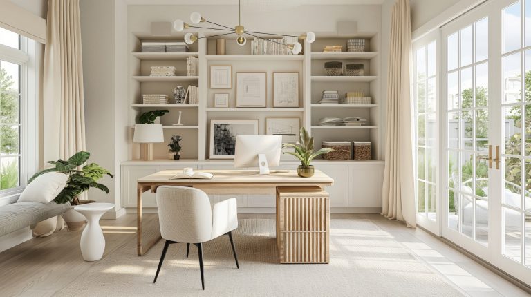
When building a palette, start with an anchor colour, something that feels right for your personality and the natural light in your home. From there, layer in complementary shades to enhance depth and flow. For instance, a palette of sage, cream, and soft terracotta can create a grounded yet refreshing atmosphere.
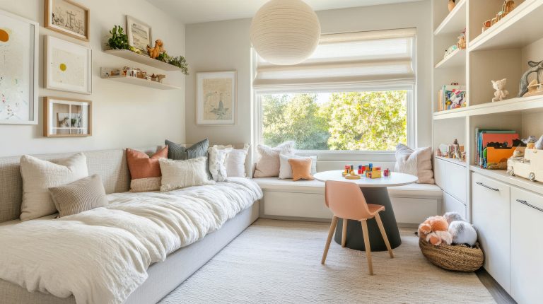
Think about how you use each room as well. A living space might benefit from energy and lightness, while a bedroom often calls for soothing, understated tones. Let your spring colour scheme support the emotion of each space rather than distract from it. This approach ensures that your home feels balanced and welcoming through every season.
Step 2: Draw Inspiration from Nature and Trends
Spring offers an incredible palette if you take cues directly from nature. Think about the soft greens of new leaves, delicate blush petals, and the gentle blues of a clear morning sky. These natural tones are not only timeless but also form the foundation of a well-balanced spring colour scheme that feels effortless and organic.

Using nature as a reference point helps keep your colours grounded. For example, you might draw inspiration from the layered hues of a garden; a combination of pale lilac, warm cream, and earthy beige can evoke the feeling of early spring blooms. When these tones are brought indoors, they create a calm and inviting setting that mirrors the season’s beauty without feeling overstyled.
Design trends can also be a great way to refresh your approach. Each year brings new interpretations of spring colours, often with subtle twists that modernise classic palettes. This year, tones like sage green, muted coral, and buttery yellow are all in focus. They pair beautifully with neutrals and can be introduced through small accents such as cushions, throws, or artwork before fully committing to paint or upholstery.
When building your spring colour scheme, balance is key. Aim for a combination of three to five shades: one dominant colour, two secondary tones, and a few accent colours for contrast. This structure ensures your interiors feel cohesive but never flat. If you find your palette leaning too heavily toward one shade family, pull in a subtle complementary tone to harmonise it.

By blending inspiration from both nature and current design directions, you’ll create a spring colour scheme that feels fresh yet enduring. It’s about capturing the essence of the season in a way that reflects your own taste and home, rather than chasing temporary trends.
Step 3: Consider Your Home’s Lighting and Space
Even the most beautiful colour can look completely different once it’s on your walls. Light plays a huge role in how your chosen spring colour scheme appears throughout the day, so it’s important to understand how natural and artificial lighting influences your palette.

North-facing rooms, especially in Australia, often receive softer, cooler light. These spaces benefit from warmer undertones like dusty peach, buttery cream, or muted coral to balance the coolness. South-facing rooms, on the other hand, can handle cooler hues such as pale blue, sage, or soft grey-green that stay serene and fresh. If you’re unsure, paint a few test patches on your walls and observe them at different times of day: morning, midday, and evening, to see how they shift under changing light.
Smaller rooms tend to feel more open when lighter shades are used, while larger, sun-filled areas can handle deeper or more saturated tones without feeling heavy. When finalising your spring colour scheme, think about the direction of your windows and how much natural light your rooms receive. Even the colour temperature of your light bulbs, whether warm or cool, can subtly change how your palette reads.

This step is all about observation and testing. Don’t rush the process. Seeing how colours react in your own environment ensures you’ll love them in every type of light. A thoughtfully chosen spring colour scheme should feel vibrant in daylight yet comfortable and cosy once the evening sets in.
Step 4: Coordinate with Existing Furniture and Décor
Once you’ve narrowed down your palette, the next step is ensuring that your new spring colour scheme works in harmony with your existing furniture and décor. This is where good design really comes together, creating flow between what you already have and the fresh touches you’re adding for the season.

Start by identifying the core tones in your furniture and larger décor pieces. If your sofa is a warm beige or soft grey, it can act as the perfect foundation for almost any set of accent colours. Introduce your spring colour scheme through layers: cushions, rugs, curtains, art, or even floral arrangements. These smaller elements allow you to explore colour freely without major changes.
For instance, if you love gentle greens and blush tones, you might pair pale green linen cushions with subtle pink ceramics and natural wood finishes. If your furniture leans more modern or monochromatic, pastel accents in coral, lilac, or butter yellow can instantly uplift the mood without clashing.
Balance is key. Try to distribute colour evenly around the room rather than concentrating it in one area. Repeating a tone, for example, through a patterned rug, a print on the wall, or a throw, helps tie the room together visually. This repetition makes your spring colour scheme feel well-planned and cohesive, rather than randomly added.

Finally, don’t be afraid to mix old and new. Layering pieces you already love with lighter spring accents creates a feeling of familiarity and freshness at the same time. A well-coordinated spring colour scheme doesn’t just update your space, it enhances what’s already there and brings new life to your home.
Step 5: Test, Sample, and Finalise Your Palette
Even when you feel confident about your choices, testing your colours before committing is an essential step in perfecting your spring colour scheme. What looks ideal on a screen or in a paint sample booklet can appear very different when applied to real surfaces under your home’s lighting conditions.

Start by selecting two or three variations of each colour you’re considering, for instance, a few different shades of soft green, pale blue, or blush. Apply generous test patches on several walls so you can see them in full daylight, at dusk, and under artificial light. Observe not only how the colour changes but also how it interacts with your furniture, flooring, and other materials in the room.
If you’re updating textiles, try placing fabric samples next to one another and against existing finishes. This helps you visualise how your spring colour scheme will flow through different textures and surfaces. Digital design tools can also be useful companions. Many paint brands and interior apps let you preview a space with selected colours, giving you a rough sense of how your room might look before you pick up a brush.

Once you’ve spent a few days living with your chosen shades and seeing them under varying conditions, finalise your selections by focusing on what consistently feels right. Trust your instincts, if a tone makes the space feel fresh, inviting, and reflective of the season, it’s likely the perfect fit. A carefully tested spring colour scheme not only looks balanced but also feels personal and harmonious within your home.
Step 6: Final Touches – Bringing Your Spring Colour Scheme to Life
With your colours chosen and tested, it’s time to bring your home together through thoughtful styling and subtle details. This is where your spring colour scheme truly comes to life when shades, textures, and personal touches blend naturally to create a space that feels consistent and uplifting.

Start by introducing your palette through décor that adds personality and comfort. Textiles are an effortless way to do this; use lightweight curtains, textured throws, or new cushions that echo your chosen hues. Incorporating natural textures like linen, rattan, jute, or light timber enhances the airy feel that’s perfect for spring.
Greenery also plays an important role. Fresh plants or floral arrangements not only connect you back to nature but also link beautifully with your spring colour scheme, reinforcing the sense of freshness throughout your home. Even a single vase of seasonal flowers can tie a look together and anchor your colour palette with ease.
Pay attention to small styling details. Artwork, tableware, and candles are subtle ways to repeat key tones around the space. For example, if you’ve chosen a palette of sage, blush, and cream, a ceramic piece or a framed print in one of those shades keeps the visual rhythm consistent. These elements don’t have to match perfectly; slight variations of tone and texture often make a room feel more natural and lived in.

The goal is to achieve a sense of effortless cohesion, where nothing feels overly coordinated but everything feels like it belongs together. Once your spring colour scheme is applied through paint, textiles, and accents, take a step back and let the space breathe. A well-balanced room doesn’t need to be filled with colour everywhere; sometimes, restraint is what allows your palette to shine.
Choosing the right spring colour scheme is about more than just picking pretty shades; it’s about creating an atmosphere that feels fresh, balanced, and reflective of the season. By understanding how colour affects mood, drawing inspiration from nature, and considering your home’s lighting, you can build a palette that works beautifully across every room.

Wow, this paragraph is fastidious, my younger sister is analyzing these kinds of things, so I am going to let know her.