Skip to content
Instagram
Facebook
Pinterest
YouTube
Search
-
The Spaces
Expand
The Living Areas
The Kitchen & Bath
The Bedrooms
The Outdoor
The Furniture
The Look
Expand
The Styles
The Palette
The Accents
The Season
The How-To
Expand
The Basics
The Projects
The Hacks
Kesaa Interiors
The Kesaa Edit
The Finds
About
Expand
Contact
Privacy Policy
Kesaa Interiors
Toggle Menu
Ideas
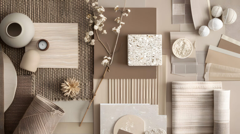
How to Choose the Perfect Spring Colour Scheme for Your Home
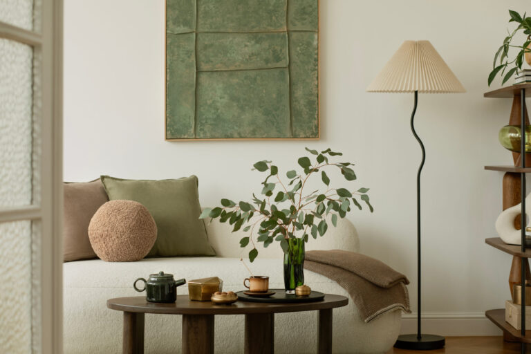
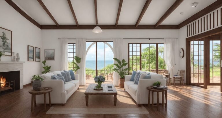
Chic & Coastal: Modern Interior Design Ideas for Beach House Living
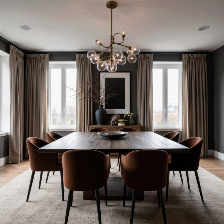
How to Design a Dark Dining Room: Ideas for a Space That’s Cosy, Not Cramped
The 9 Step Formula for How to Choose a Wall Colour You’ll Love
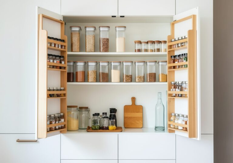
The Ultimate Guide to Kitchen Pantry Door Storage Solutions
15 Glamorous Art Deco Home Interior Design Ideas for a Luxe Look
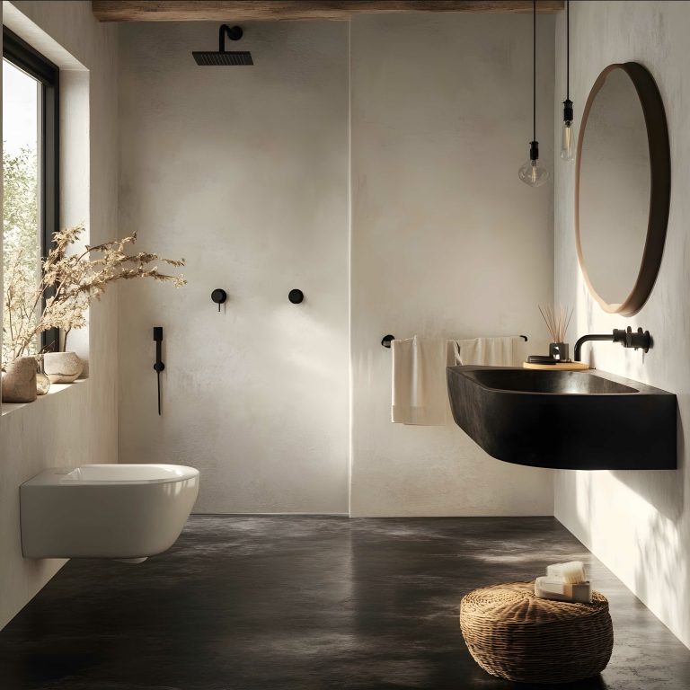
13 Small Bathroom Makeover Ideas
Page navigation
1
2
Next Page
Next
Scroll to top
Scroll to top
The Spaces
Toggle child menu
Expand
The Living Areas
The Kitchen & Bath
The Bedrooms
The Outdoor
The Furniture
The Look
Toggle child menu
Expand
The Styles
The Palette
The Accents
The Season
The How-To
Toggle child menu
Expand
The Basics
The Projects
The Hacks
The Finds
Instagram
Facebook
Pinterest
YouTube
The Shop
Toggle Menu Close
What are you looking for?
Search for:
Search