Skip to content
Instagram
Facebook
Pinterest
YouTube
Search
-
The Spaces
Expand
The Living Areas
The Kitchen & Bath
The Bedrooms
The Outdoor
The Furniture
The Look
Expand
The Styles
The Palette
The Accents
The Season
The How-To
Expand
The Basics
The Projects
The Hacks
Kesaa Interiors
The Kesaa Edit
The Finds
About
Expand
Contact
Privacy Policy
Kesaa Interiors
Toggle Menu
accessories
How to Mix Patterns in a Room Like a Pro (Do’s & Don’ts)
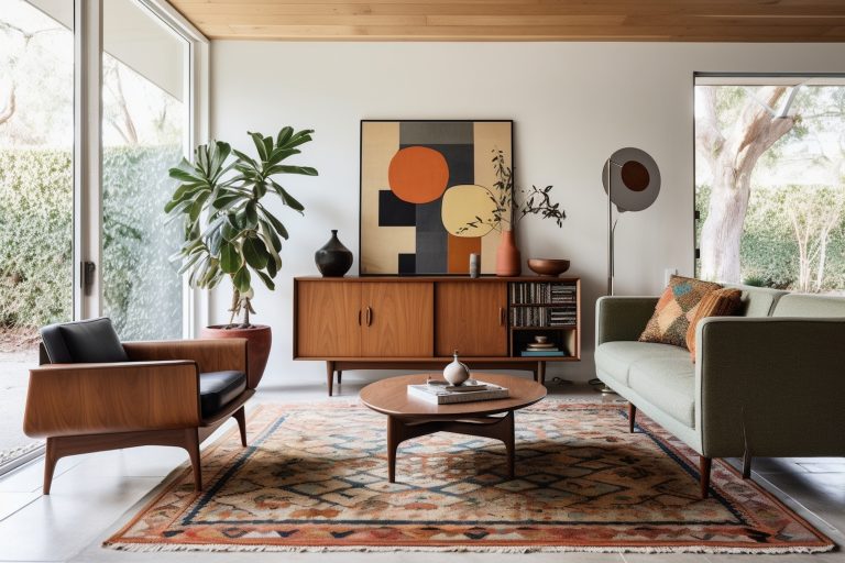
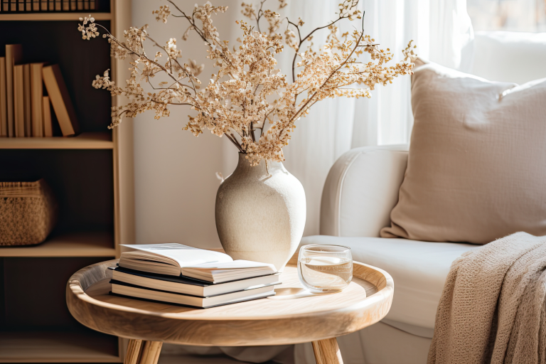
11 Tips For The Ultimate Living Room Table Decor
Scroll to top
Scroll to top
The Spaces
Toggle child menu
Expand
The Living Areas
The Kitchen & Bath
The Bedrooms
The Outdoor
The Furniture
The Look
Toggle child menu
Expand
The Styles
The Palette
The Accents
The Season
The How-To
Toggle child menu
Expand
The Basics
The Projects
The Hacks
The Finds
Instagram
Facebook
Pinterest
YouTube
The Shop
Toggle Menu Close
What are you looking for?
Search for:
Search