This post is all about How to Mix Patterns in a Room!
Pattern mixing is one of those design skills that separates rooms with real personalities from spaces that feel like they’re playing it safe. After years of working with patterns in every imaginable combination, I’ve learned that most people avoid mixing patterns not because they don’t want to—but because they’re terrified of getting it wrong. The fear of creating visual chaos keeps so many beautiful rooms stuck in solid-colour limbo.
Here’s what I know for certain: learning how to mix patterns in a room isn’t about following rigid rules or copying what you see in magazines. It’s about understanding a few core principles that give you the confidence to experiment. Once you grasp these fundamentals, you’ll start seeing pattern opportunities everywhere—and more importantly, you’ll know exactly how to bring them together.
In this guide, we’ll walk through the essential do’s and don’ts that professional designers use daily, plus the common mistakes that even experienced decorators sometimes make. By the end, you’ll have a clear framework for mixing patterns like you’ve been doing it for years.

Why Pattern Mixing Matters in Interior Design
Let’s address the elephant in the room first: yes, you can absolutely create a beautiful space using only solids. But here’s what you’re missing out on—patterns add layers of visual interest that solid colours simply can’t achieve on their own. They create movement, establish rhythm, and give your eye interesting places to land as it travels around the room.
When you understand how to mix patterns in a room properly, you’re essentially adding another dimension to your design toolkit. Think about it this way: using only solid colours is like cooking with salt as your only seasoning. Sure, it works, but you’re missing out on so much flavour and complexity.
Pattern mixing also solves a common design challenge: how to make a room feel cohesive without being boring. When done right, mixed patterns create visual connections between different elements in your space. That geometric throw pillow suddenly makes sense with your floral curtains when they share a common colour. Your striped rug grounds everything when its scale complements rather than competes with other patterns in the room.
The biggest misconception I encounter is that patterns need to match or come from the same collection. This matchy-matchy approach actually works against you, creating spaces that feel more like showrooms than homes. Real pattern mixing is about finding harmony in diversity, and that’s exactly what we’re going to explore.
The Golden Rules of Pattern Mixing
After working with countless pattern combinations over the years, I’ve noticed that the most harmonious rooms follow three fundamental principles. These aren’t arbitrary rules—they’re based on how our eyes naturally process visual information. Master these, and you’ll have the foundation for mixing patterns in any space.
1. The Scale Rule
This is your starting point for understanding how to mix patterns in a room without creating visual competition. The concept is straightforward: vary the scale of your patterns by choosing large, medium, and small designs that complement rather than fight each other.
Picture a large-scale floral wallpaper paired with medium-sized geometric pillows and a small-scale striped throw. Each pattern has its own visual weight and breathing room. When patterns are too similar in scale, they compete for attention and create that chaotic feeling everyone wants to avoid.
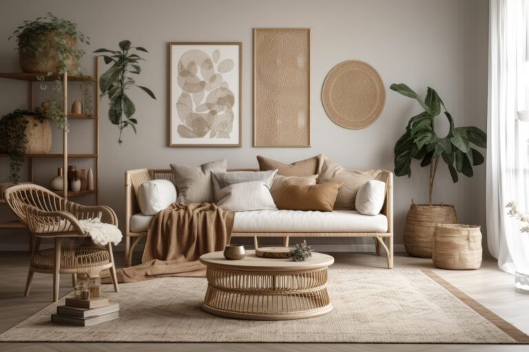
Here’s how I approach scale: your largest pattern should be your anchor—maybe it’s on your curtains, an area rug, or an accent wall. Medium patterns work beautifully on furniture upholstery or larger pillows. Small-scale patterns shine on accent pieces like lampshades, small cushions, or ottoman tops.

2. The 60-30-10 Colour Rule
You’ve probably heard of this ratio for colour schemes, but it’s equally powerful when learning how to mix patterns in a room. The principle remains the same: 60% dominant colour, 30% secondary colour, and 10% accent colour—but now you’re threading these proportions through your patterns.
Start by identifying a colour that will appear in most (if not all) of your patterns. This becomes your visual thread, the element that ties everything together. Maybe it’s navy blue appearing in your striped curtains, geometric rug, and floral pillows. The key is ensuring this dominant colour shows up consistently enough to create cohesion.
Your secondary colour should appear in about a third of your patterns, while that 10% accent colour adds just enough pop without overwhelming the palette. This approach gives you structure while still allowing creative freedom.
3. The Odd Number Rule
There’s something inherently pleasing about odd numbers in design, and pattern mixing is no exception. Three patterns feel balanced but not predictable. Five patterns create richness without chaos. Even numbers, particularly two or four, often feel either too sparse or too symmetrical.
When working with three patterns, I typically choose one as the star, one as the supporting player, and one as the accent. This natural hierarchy prevents patterns from competing for the spotlight. With five patterns, you have more flexibility, but the principle remains: create a clear visual hierarchy so your eye knows where to focus first.

The beauty of these rules is that they work together. When you combine varied scales with thoughtful colour distribution and odd-numbered groupings, you create spaces that feel intentional rather than random. These principles give you the structure to experiment confidently, knowing you have a solid foundation to build on.
Types of Patterns and How to Combine Them
Understanding pattern categories is like learning a new language—once you know the vocabulary, you can start creating sentences that actually make sense. Each pattern type brings its own energy and visual weight to a room, and knowing how they interact is crucial for mastering how to mix patterns in a room.
Pattern Categories:
Geometric Patterns include stripes, chevrons, lattices, and Greek keys. These patterns bring structure and often have a modern or crisp feeling. They’re incredibly versatile because they can act as either a neutral base or a bold statement, depending on their scale and colour contrast.
Organic Patterns encompass florals, botanicals, abstract shapes, and anything with flowing natural lines. These soften spaces and add movement. Don’t limit yourself to traditional flowers—modern botanical prints and abstract organics can work in any style of room.
Traditional Patterns like damask, toile, paisley, and medallions carry historical weight and formality. They’re perfect for adding sophistication, but they also mix surprisingly well with contemporary patterns when you play with scale and colour.
Textural Patterns are the unsung heroes of pattern mixing. Think subtle herringbone, nubby linens, or tone-on-tone designs. These add visual interest without demanding attention, making them perfect bridges between bolder choices.
Foolproof Combinations:
Stripes + Florals + Geometric
This classic trio works because each pattern has a distinct personality. The linear nature of stripes provides structure, florals add softness, and a geometric pattern (like a small-scale lattice) bridges the gap between the two. The key to making this combination work is ensuring they share at least two colours.
Large Floral + Small Polka Dot + Solid
Here’s where scale really shines. A large-scale floral commands attention, while small polka dots add whimsy without competing. The solid grounds everything and gives your eye a place to rest. This combination feels fresh and approachable in any room.
Plaid + Toile + Stripe
This might sound traditional, but it’s all about execution. A modern plaid in unexpected colours paired with an updated toile and a simple stripe creates sophisticated layers. The linear elements in both plaid and stripe create natural harmony, while the scenic toile adds narrative interest.
When figuring out how to mix patterns in a room using these combinations, remember that colour is your best friend. Pull one or two colours from your anchor pattern and repeat them throughout your other choices. This creates cohesion even when the patterns themselves are quite different.

The magic happens when you start seeing beyond the obvious combinations. A geometric doesn’t always have to be bold—a subtle Greek key trim can act almost like a solid. An organic pattern doesn’t have to mean grandmother’s roses—abstract watercolours and modern botanicals open up entirely new possibilities.
I’ve found that the most interesting rooms often break expected pattern partnerships. Try mixing a traditional damask with a modern geometric, or pair an ethnic ikat with contemporary stripes. When the scale relationships are right and the colours connect, these unexpected combinations create rooms with real personalities.
The goal isn’t to memorise every possible combination but to understand why certain patterns work together. Once you grasp the interplay between structure and flow, tradition and modernity, bold and subtle, you’ll start seeing pattern possibilities everywhere.
The Do’s of Pattern Mixing
Let’s get into the practical strategies that make pattern mixing work every time. These aren’t just suggestions—they’re the techniques I rely on to create rooms that feel cohesive rather than chaotic.
DO: Start with a Statement Pattern
Every well-designed room needs an anchor, and when you’re learning how to mix patterns in a room, your statement pattern serves this purpose. Choose one pattern that you absolutely love—maybe it’s a bold floral fabric you’ve been eyeing or a geometric wallpaper that speaks to you. This becomes your starting point, the pattern that sets the tone for everything else.
Your statement pattern should be the largest or most prominent in the room. From there, pull colours and complement its style with your supporting patterns. If your anchor is a large-scale traditional damask, your secondary patterns might include a coordinating stripe and a small geometric that echoes one of the damask’s background colours.
DO: Use Solids as Breathing Space
Here’s something that took me years to fully appreciate: solid colours aren’t cop-outs when mixing patterns—they’re essential breathing spaces. Aim for about 40% solids in your overall scheme. These might be solid-coloured walls, a neutral sofa, or simple window treatments. They give your patterns room to shine without overwhelming the senses.
Think of solids as the punctuation in your pattern story. Without them, everything runs together in one exhausting visual sentence.
DO: Repeat Colours Throughout
Colour repetition is your secret weapon for making disparate patterns feel intentional. When the same blue appears in your curtains, throw pillows, and area rug—even if the patterns are completely different—your brain registers the connection and sees harmony instead of chaos.
This doesn’t mean everything needs to match exactly. In fact, slight variations in shade often look more sophisticated than perfect matches. The goal is to create visual threads that tie your patterns together.
DO: Consider Pattern Placement
Where you place patterns matters as much as which patterns you choose. Larger patterns typically work better on larger surfaces, such as area rugs, curtains, or upholstered furniture. Smaller patterns excel on accent pieces where their detail can be appreciated up close.
Also, consider sight lines and how patterns interact as you move through the space. A bold pattern on curtains might overwhelm you if it’s the first thing you see when entering a room, but it could be perfect on an accent chair in the corner.

DO: Test with Samples First
This might sound basic, but it’s crucial: always test patterns together before committing. Order fabric samples, paper swatches, or even print-out patterns you’re considering. Tape them up in your actual space and live with them for a few days.
Natural light, artificial lighting, and the room’s existing colours all affect how patterns look and interact. What seems like a perfect combination online might feel completely different in your space. Testing saves you from expensive mistakes and builds confidence in your choices.
The Don’ts of Pattern Mixing
Understanding what to avoid is just as important as knowing what works. These common mistakes can derail even the most promising pattern combinations.
DON’T: Use All Bold Patterns
This is the fastest route to visual chaos. When every pattern screams for attention, nothing stands out and the room becomes exhausting. Even if you love bold patterns, incorporating quieter options creates the necessary contrast.
If you’re drawn to high-impact patterns, balance them with subtle textures or tone-on-tone designs. A room with a bold floral, a loud geometric, and a high-contrast stripe needs calming elements to work. Replace one of those with a subtle textural pattern, and suddenly the whole room breathes easier.
DON’T: Forget About Texture
Texture functions as a subtle pattern that adds depth without overwhelming. When learning how to mix patterns in a room, remember that smooth and rough, matte and shiny, flat and dimensional all create visual interest.
A nubby linen sofa, smooth cotton pillows, and a plush velvet throw each contribute pattern through texture. These elements bridge the gap between your more obvious patterns and add sophisticated layering.
DON’T: Match Everything Perfectly
Nothing says “amateur” quite like patterns that all come from the same collection. You know the look—matching curtains, pillows, and bedding all in the same print, just in different scales. This catalogue approach lacks personality and sophistication.
Instead, aim for coordination without being matchy-matchy. Patterns should converse with each other, not echo each other exactly. When patterns share colours or themes but come from different sources, the result feels collected and intentional.

DON’T: Ignore the Room’s Architecture
Your room’s existing elements—architectural details, flooring, built-ins—all contribute to the pattern and must be considered in your overall scheme. A highly patterned wood floor, for instance, already adds visual texture that needs to be balanced, not competed with.
Work with what you have rather than against it. If your room has ornate crown moulding, that decorative element counts as a pattern. Strong architectural lines from windows or built-ins create geometric patterns that influence your fabric and décor choices.
DON’T: Rush the Process
Pattern mixing is a skill that develops over time. Start small—maybe with throw pillows or a single patterned chair—and build your confidence gradually. Living with patterns for a while helps you understand what you truly enjoy versus what just looked good in the moment.
The rooms that feel most successful are often those that evolved naturally, with patterns added thoughtfully over time rather than all at once. Give yourself permission to experiment, adjust, and even change your mind as you develop your pattern-mixing skills.
Room-by-Room Pattern Mixing Guide
Every room has its rhythm and purpose, which directly influences how patterns should work within the space. Let’s walk through specific strategies for each area of your home.
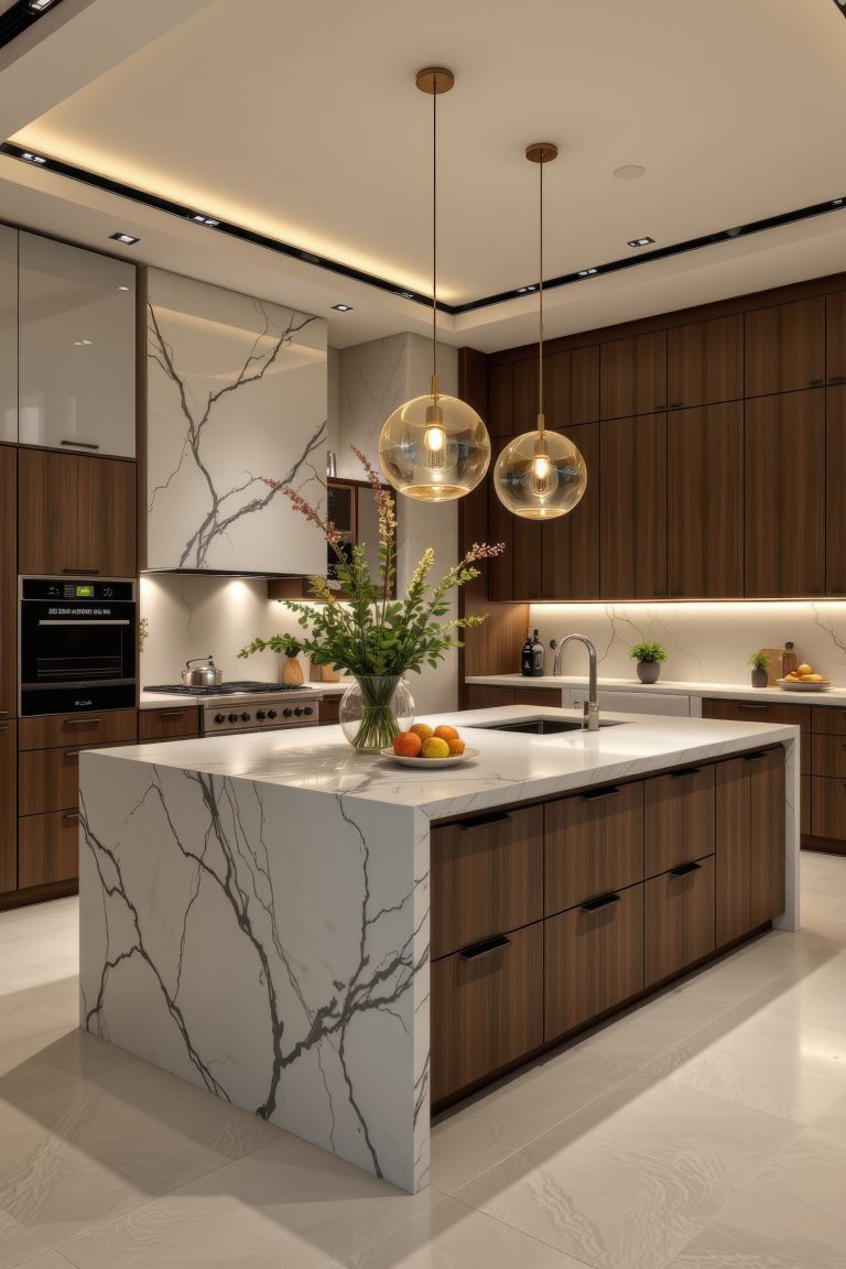
Living Room
The living room is where most people want to make a pattern statement, and for good reason—it’s typically the largest space and the one where you entertain. Start with your biggest piece: the sofa. If you’re going with a patterned sofa, keep it to a medium or large-scale design that won’t feel busy when you’re sitting on it for hours.
For a solid sofa, you have more freedom with pillows and throws. Try this reliable formula: one large-scale pattern on your biggest pillows, a medium geometric on smaller pillows, and a textural throw that bridges everything together. Your rug can handle patterns if your furniture is mostly solid, but if you have patterned upholstery, consider a subtle textural rug instead.
Window treatments offer another opportunity for pattern, but consider their relationship to your seating. Busy patterns at eye level can be distracting, so if your curtains hang near seating areas, opt for subtle patterns or solids with interesting textures.

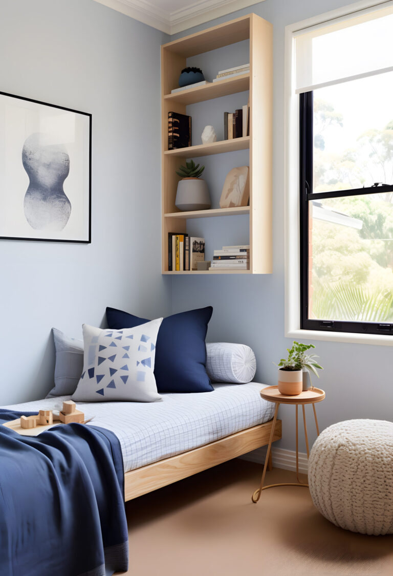
Bedroom
Bedrooms require a more delicate approach to pattern mixing. While you want visual interest, the space still needs to feel restful. The bed naturally becomes your focal point, so start there when figuring out how to mix patterns in a room designed for sleep.
Layer patterns on the bed, starting with your largest scale on the duvet or comforter. Add medium-scale patterns through Euro shams or decorative pillows, then incorporate small-scale patterns or textures in accent pillows and throws. The key is creating layers that can be adjusted—you might want all the patterns during the day but prefer simplicity at night.
If you’re using patterned curtains in the bedroom, ensure they complement rather than compete with your bedding. A good rule: if your bedding is bold, keep window treatments subtle, and vice versa. An upholstered headboard in a small-scale pattern or interesting texture adds another layer without overwhelming the space.

Dining Room
Dining rooms offer unique opportunities for pattern play because you’re working with different elements than in living spaces. Chair upholstery is your primary canvas—consider a medium-scale pattern that’s sophisticated but not so busy it competes with food presentation or table settings.
For formal dining rooms, mixing patterns through table linens adds flexibility. You can change the mood entirely by switching between patterned and solid table runners, placemats, and napkins. If your chairs are patterned, keep table linens simpler. Solid chairs? Go bold with your table settings.
Don’t forget the walls—dining rooms can handle more dramatic pattern choices since you typically spend less continuous time in them. A bold wallpaper or large-scale art creates a stunning backdrop for dinner parties.

Small Spaces
Small rooms require strategic thinking about pattern scale and placement. The old rule about keeping small rooms simple? Ignore it. Small spaces can absolutely handle patterns—you just need to be thoughtful about scale and contrast.
In powder rooms, entries, and other compact spaces, one statement pattern can actually make the room feel larger by creating a focal point. The key is choosing patterns with movement and depth rather than flat, repetitive designs. A wallpaper with perspective or a pattern that draws the eye upward can visually expand the space.
For small bedrooms or living areas, focus on how to mix patterns in a room without cluttering. Use the same colour palette throughout your patterns to create flow, and ensure at least one pattern has plenty of negative space to prevent the room from feeling cramped.
Advanced Pattern Mixing Techniques
Once you’re comfortable with the basics, these advanced strategies will elevate your pattern game even further.
The Bridge Pattern Method
This technique uses transitional patterns that share elements from your other patterns, creating seamless connections throughout the room. For example, if you have a floral with blue and green plus a geometric in blue and white, your bridge pattern might be a subtle stripe incorporating all three colours.
Bridge patterns often work best in smaller doses—on lampshades, small ottomans, or throw pillow piping. They’re the supporting actors that help your star patterns shine while creating cohesion.
The Neutral Pattern Base
Starting with patterns in neutral colours—think cream-on-white damask, grey herringbone, or taupe geometric—creates a sophisticated foundation. These patterns add visual texture without committing to colour, giving you the flexibility to layer in colourful patterns through easily changeable elements.
This approach works particularly well if you like to update your space seasonally or if you’re still developing confidence in mixing patterns. Build your neutral pattern base through larger investments like rugs and upholstery, then play with colourful patterned accessories.
Cultural Pattern Mixing
Combining patterns from different design traditions creates rooms with real character and depth. A Persian rug, African mud cloth pillows, and Scandinavian geometric throws might sound chaotic, but when unified by colour or scale, they create globally inspired spaces that feel collected over time.
The key is respecting each pattern’s cultural significance while creating harmony through your mixing principles. Avoid using sacred or ceremonial patterns as simple decoration, and research the meanings behind patterns that interest you.

Common Pattern Mixing Mistakes to Avoid
Even experienced decorators stumble over these pattern-mixing pitfalls. Recognising them helps you sidestep issues before they derail your design.
Competing Focal Points happen when multiple patterns fight for dominance. If your eye doesn’t know where to land first, you’ve created competition rather than harmony. Every room needs a clear hierarchy—one pattern leads, others support. When two bold patterns of similar scale occupy the same sightline, neither can properly shine.
Ignoring the Room’s Purpose leads to pattern choices that work against how you actually use the space. A home office filled with busy, high-contrast patterns might look stunning in photos but prove distracting during work hours. Similarly, ultra-formal patterns in a family room where kids play daily creates unnecessary stress. Always consider function alongside form.
Forgetting About Existing Furniture is surprisingly common when people get excited about pattern mixing. That wood grain dining table? It’s adding a pattern. Your leather sofa’s texture contributes visual weight. Before adding new patterns, catalogue what you already have—including wood tones, metal finishes, and textural elements that affect your overall pattern story.
Scale Mishaps in Small Rooms occur when people automatically default to tiny patterns in compact spaces. Counterintuitively, one large-scale pattern often works better than several small ones in tight quarters. Small, busy patterns can make a room feel cramped and cluttered, while a single bold pattern can actually expand the visual space.
Quick Pattern Mixing Formulas
Think of these formulas as training wheels—use them to build confidence, then adapt as you develop your own style. Each formula shows you how to mix patterns in a room with guaranteed harmony.
Classic Formula: 1 Geometric + 1 Floral + 1 Solid
This timeless combination works in any style of room. Your geometric provides structure (stripes, lattice, or Greek key), your floral adds organic movement (contemporary or traditional), and your solid grounds everything. The key is ensuring these three elements share at least two colours.
Modern Formula: 2 Abstracts + 1 Linear + Textural Solids
Perfect for contemporary spaces, this formula plays with artistic patterns. Choose two abstract patterns in different scales—perhaps a large watercolour-inspired print and a small organic dot pattern. Add one clean linear element like stripes or a grid, then balance with textural solids in linen, wool, or nubby cotton.
Eclectic Formula: 1 Ethnic + 1 Contemporary + 1 Traditional
This formula creates a collected-over-time appeal. Mix a global pattern (ikat, suzani, or mud cloth), a contemporary geometric, and a traditional element like toile or damask. The unexpected combination works when unified by a consistent colour story or similar pattern weights.
[Image placement: Visual formula guide showing each combination with real room examples and pattern swatches]
Remember, these formulas are starting points, not rules. Once you understand why they work—the balance of structure and flow, the varied scales, the unifying elements—you can create your own combinations with confidence.
Mastering how to mix patterns in a room transforms your decorating from safe to sophisticated. We’ve covered the essential principles—varying scale, following the 60-30-10 colour rule, and working in odd numbers. You now understand how different pattern categories interact and have specific formulas to try in your own space.