Skip to content
Instagram
Facebook
Pinterest
YouTube
Search
-
The Spaces
Expand
The Living Areas
The Kitchen & Bath
The Bedrooms
The Outdoor
The Furniture
The Look
Expand
The Styles
The Palette
The Accents
The Season
The How-To
Expand
The Basics
The Projects
The Hacks
Kesaa Interiors
The Kesaa Edit
The Finds
About
Expand
Contact
Privacy Policy
Kesaa Interiors
Toggle Menu
ROOMS
Sort By:
No categories
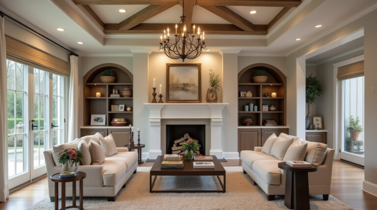
Traditional Interior Design Characteristics: A Guide to Classic Style
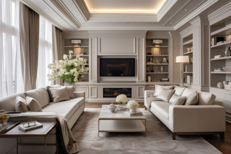
How to Arrange Living Room Furniture With TV and Fireplace: 7 Best Layouts
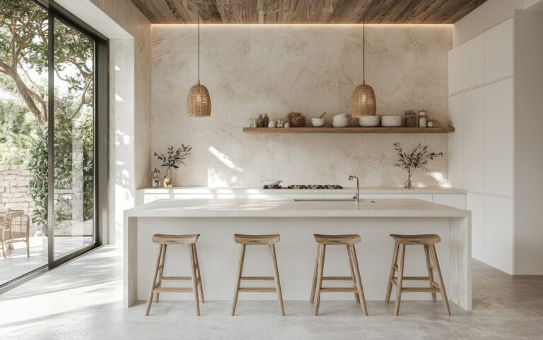
The Complete Guide to Rustic Minimalist Interior Design
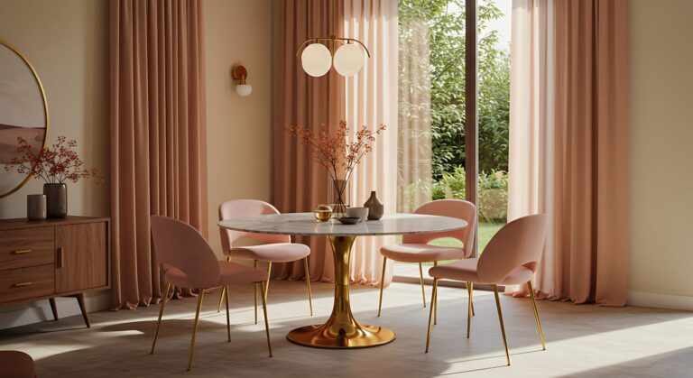
15 Modern Dining Room Drapes Ideas to Elevate Your Space
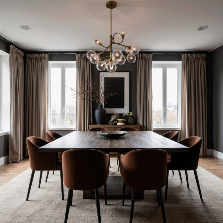
How to Design a Dark Dining Room: Ideas for a Space That’s Cosy, Not Cramped
Scroll to top
Scroll to top
The Spaces
Toggle child menu
Expand
The Living Areas
The Kitchen & Bath
The Bedrooms
The Outdoor
The Furniture
The Look
Toggle child menu
Expand
The Styles
The Palette
The Accents
The Season
The How-To
Toggle child menu
Expand
The Basics
The Projects
The Hacks
The Finds
Instagram
Facebook
Pinterest
YouTube
The Shop
Toggle Menu Close
What are you looking for?
Search for:
Search