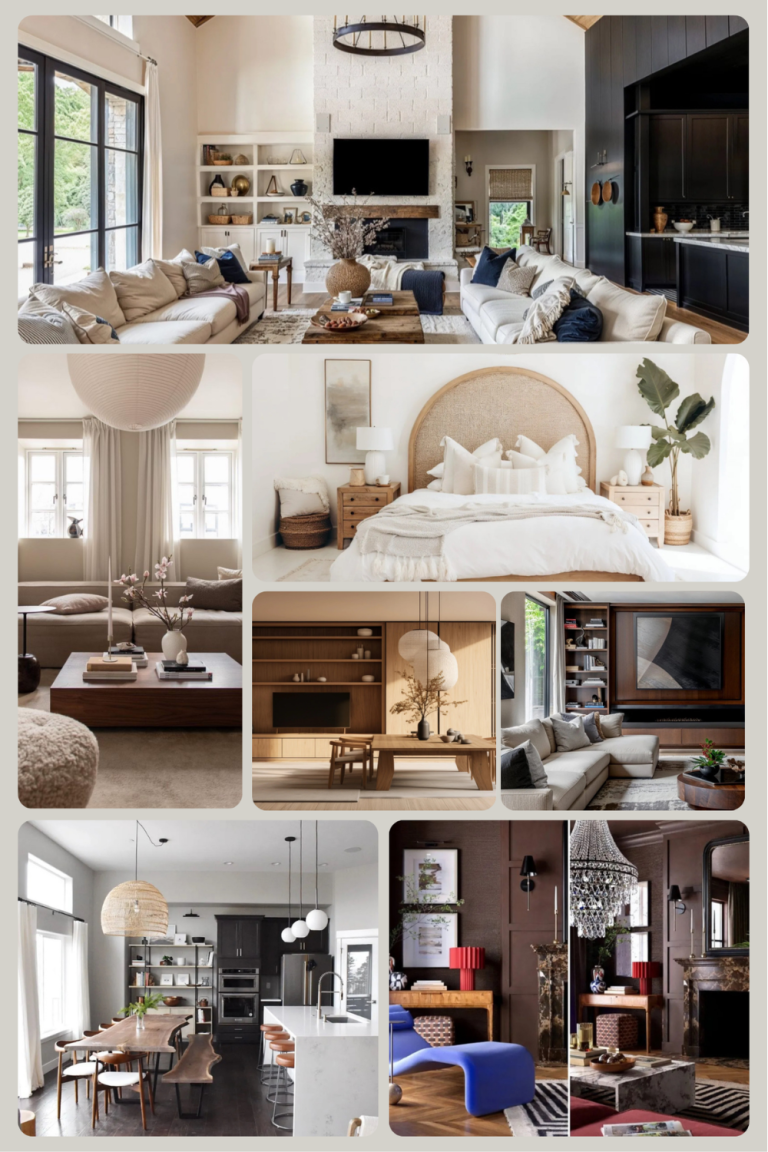
Introduction
One of the most exciting parts of decorating your home is learning how to choose a wall colour that truly fits your space. The right shade can make a room feel calm, warm, bold, or bright; it sets the tone for everything else in your design.

Choosing paint isn’t just about what looks good on a swatch. It’s about how colour interacts with light, furniture, and the overall mood of your home. With so many options out there, it’s easy to feel unsure where to start, but by following a simple step-by-step approach, you can make smart choices that look and feel right. This guide breaks down the 9 steps that will help you confidently find a wall colour that complements your space and your personal style.
Read Along To Learn How To Choose A Wall Colour.
Step 1 – Get Inspired by Your Space
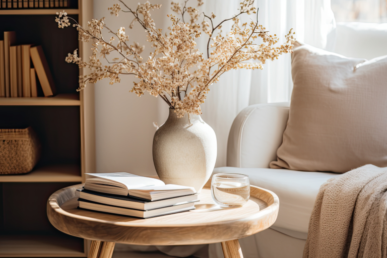
Before you even think about paint chips or sample pots, start by looking at what’s already in your room. Every element in your space, furniture, flooring, fabrics, and artwork, offers clues to the colours that will naturally work well together.
When figuring out how to choose a wall colour, let your current space be your guide.
A few ways to find colour inspiration:
- Look closely at your furniture and décor. What tones stand out in your favourite pieces?
- Notice your flooring. Warm timber floors often pair beautifully with earthy neutrals, while cool tiles look great with soft greys and blues.
- Study your artwork or textiles. Cushions, rugs, and wall art can inspire accent tones or overall palettes.
- Save what catches your eye. Use Pinterest or mood boards to collect images that capture the feeling you want in your room.
Once you’ve gathered some inspiration, notice any patterns; are you drawn to warm, earthy tones or cooler, coastal shades? This gives you a good starting point for exploring specific paint colours later on.
Pro Tip:
Hold paint cards or small colour samples next to key items in your room (like your sofa, flooring, or curtains). Seeing tones side by side helps clarify which direction to take before you even open a tin of paint.

Step 2 – Understand Natural and Artificial Light
Light is one of the biggest influences on how a wall colour looks once it’s on your walls. The same shade can appear completely different in a north-facing room compared to a cosy, low-light space. This is why understanding how light affects colour is a key part of learning how to choose a wall colour that actually works for your home.
Start by observing your space at different times of day. Watch how the light moves and shifts, and notice whether it tends to be warm and golden or cooler and more neutral.
Here’s how to factor light into your choice:
- North-facing rooms: Usually receive softer, cooler light. They often suit warmer tones like beige, taupe, or creamy whites that add warmth.
- East-facing rooms: Catch the morning sun, which can make colours look brighter early in the day and cooler in the afternoon.
- West-facing rooms: Tend to glow in the afternoon with a warmer hue, so soft blues and greys can balance that richness.
- South-facing rooms: Get strong, consistent light, so most colours work well, though you may want to avoid pure whites that can feel stark.
Artificial light plays a role too. Bulbs with a yellow tint (warm light) will bring out warm undertones in your paint, while cool LED lighting can make blues or greys appear sharper.
Pro Tip:
Always test your paint samples on at least two walls and look at them during different times of day. What looks perfect in daylight might feel completely different under evening light, so take the time to live with your samples before deciding.

Step 3 – Learn About Undertones
Once you’ve considered light, it’s time to understand what’s really happening underneath each colour. Undertones are the subtle hues within a paint colour that can shift its overall look, and they’re often what makes or breaks your decision when learning how to choose a wall colour.
Even when two paints look “white” or “grey,” they may have very different undertones. One might lean slightly blue, while another has a hint of yellow or pink. The key is noticing these subtle variations and understanding how they interact with your furnishings and light.
A simple guide to undertones:
- Warm undertones: Include red, yellow, or orange bases. These create a cosy, welcoming feel.
- Cool undertones: Include blue, green, or violet bases. These tend to feel fresh, calm, and airy.
- Neutral undertones: Sit somewhere in between. Ideal when you want a balanced backdrop that works with both warm and cool décor.
When comparing paint cards, place them next to a true white sheet of paper to reveal their undertones more easily. This trick helps you see which direction the colour leans without being influenced by surrounding tones.
Pro Tip:
If you’re unsure, test a few shades within the same colour family on your wall. Seeing them side by side will quickly show which feels best with your natural light and existing décor.

Step 4 – Align Colour with Mood and Purpose
Every room in your home has a purpose, and the colour on the walls should support that. When you’re deciding how to choose a wall colour, think beyond just how it looks; consider how you want the space to feel. Colour affects mood more than most people realise. A soothing tone can calm a busy mind, while something more vibrant can uplift your energy.
Here’s a quick guide to matching mood with space:
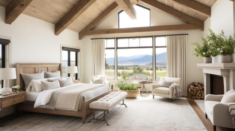
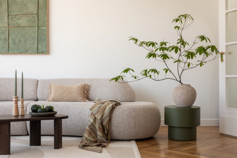
- Bedrooms: Soft, muted tones like warm greys, sage greens, or gentle blues encourage rest and relaxation.
- Living areas: Warm neutrals and mid-tone colours make spaces feel inviting and cosy.
- Kitchens: Crisp whites, light greys, or pale yellows can create a sense of cleanliness and vibrancy.
- Home offices: Greens and blues support focus and balance, both calming yet slightly energising.
- Bathrooms: Lighter, airy shades can make small areas feel more open and fresh.
When it comes to how to choose a wall colour, the goal is to match the emotional energy of the room to the function of the space. A colour that’s perfect for your study may not suit the relaxed, restful vibe of a bedroom.
Pro Tip:
If you’re drawn to a bold or dark shade, consider using it on one feature wall rather than the entire room. It gives character and depth without overpowering the space.

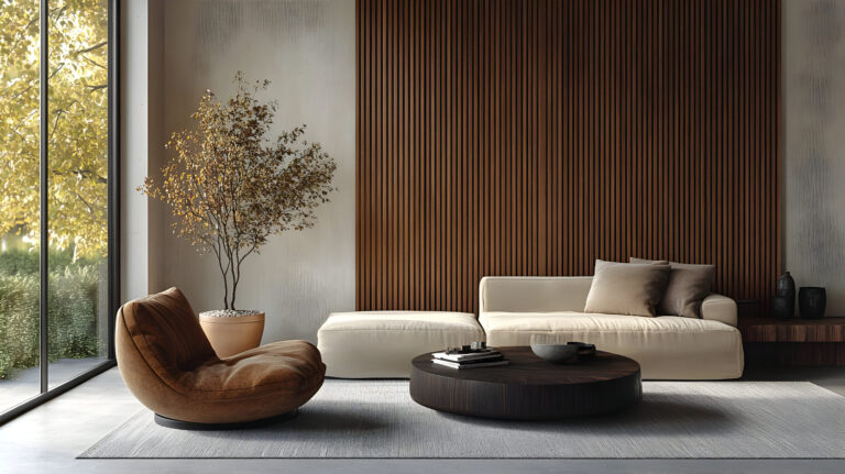
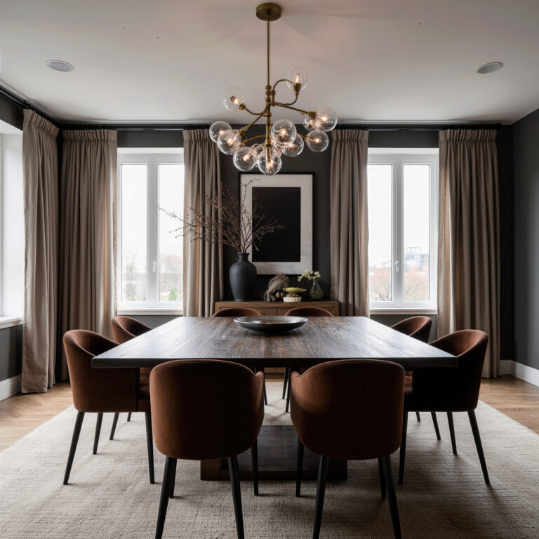
Step 5 – Consider the Room’s Style and Architecture
The architectural design of your home plays a big role in how different colours behave. A wall colour that looks stunning in a sleek apartment might feel completely out of place in a heritage-style home. This step in how to choose a wall colour is about letting the structure and style of your home guide your palette.
Consider these points:
- Classic or heritage homes: Rich creams, muted greens, and soft blues often complement traditional details like wainscoting or high ceilings.
- Modern spaces: Clean neutrals, crisp whites, or dramatic contrasts such as charcoal and pale grey align well with streamlined designs.
- Coastal or relaxed interiors: Natural tones like sand, stone, and muted aqua enhance light and openness.
- Industrial-style settings: Charcoal greys, muted browns, and warm whites tie in with the textures of concrete and metal.
By aligning your choices with your home’s features, you’ll create a colour story that feels organic and unified rather than forced.
Pro Tip:
Don’t forget fixed features like flooring, cabinetry, and trim. These are often expensive to change, so choose a wall colour that complements them instead of competing.

Step 6 – Test Paint Samples Properly
Even the most carefully chosen paint colour looks different once it’s on your actual walls. Light, texture, and the size of the space all influence perception. This is one of the most important parts of learning how to choose a wall colour that truly fits your space.
How to test your samples effectively:
- Paint directly on the wall: Use at least a 60cm patch on different walls, especially where light changes.
- Label your samples: Include both colour name and brand so you can easily compare later.
- View at different times: Look at the samples in morning light, midday brightness, and evening lamplight.
- Live with it: Spend a few days around the samples to see how they feel before committing.
Stepping back and seeing those patches under different conditions gives a realistic idea of how the colour interacts with the rest of your room.
Pro Tip:
Avoid painting over old colours when testing, as they can distort how your new sample reads. Instead, prime a small area first or use large sample sheets to get a true sense of tone.

Step 7 – Balance with the Rest of Your Palette
Once your wall colour samples are looking promising, it’s time to step back and see how they fit within your room’s overall palette. A paint colour never stands alone; it needs to work in harmony with every other tone in the space. Getting this balance right is central to understanding how to choose a wall colour that feels cohesive and intentional.
Think about these key points:
- Use the 60-30-10 rule:
- 60% main colour (usually the walls)
- 30% secondary colour (like furniture or curtains)
- 10% accent colour (decor, cushions, artwork)
- Check the undertones across materials: Make sure your wall colour’s undertone doesn’t clash with flooring, cabinetry, or metal finishes.
- Repeat colours subtly: Pull a shade from artwork, fabric, or a rug into your wall colour to create a sense of flow.
- Keep contrast in mind: A bit of difference between your wall colour and trim or ceiling colour adds dimension and polish.
Balancing colours doesn’t mean everything has to match; rather, it’s about creating an easy visual rhythm throughout the room. When learning how to choose a wall colour, trust that small details, like the reflection of a rug’s tone or brass hardware, can subtly affect how a paint colour reads.
Pro Tip:
If you’re unsure about how your colour palette ties together, lay fabrics, materials, and paint swatches side by side on a flat surface. Step back and look at them as a single unit; this simple trick can reveal imbalances before you commit.

Step 8 – Think About Finish and Paint Quality
Finish can completely change how a wall colour looks and performs. Even with the perfect shade, the wrong finish can alter the feel or practicality of your space. When exploring how to choose a wall colour, make sure to also think about sheen, durability, and how each finish behaves under light.
Common paint finishes and where they work best:
- Matte / Flat: Hides imperfections beautifully, ideal for bedrooms and living rooms.
- Low Sheen / Eggshell: A soft glow that’s easy to maintain, perfect for hallways and family areas.
- Satin: Smooth and slightly reflective, great for kitchens or bathrooms due to its washable surface.
- Semi-gloss / Gloss: Best for trims, doors, and cabinetry — durable and easy to wipe clean.
Higher-quality paint often has stronger pigments and better coverage, which means fewer coats and a longer-lasting result. If you want a rich, even finish that truly shows off your chosen shade, investing in good paint quality pays off.
Pro Tip:
When testing samples, try them in the finish you plan to use. The sheen level can subtly lighten or darken how you perceive the colour once it’s fully dry.

Step 9 – Trust Your Gut
After all the testing, comparing, and analysing, sometimes the best decision is the one that simply feels right. Decorating is both art and intuition, and the process of learning how to choose a wall colour should always reflect your personal taste and connection to your home.
A few things to keep in mind:
- You’re the one living in the space, pick what feels comfortable to you.
- Trends come and go, but timeless combinations rooted in what you love always last.
- If a colour makes you smile when you walk into the room, that’s usually the one.
Design decisions blend logic with emotion. You’ve considered light, undertones, style, and balance; now give yourself permission to enjoy the choice rather than second-guess it.
Pro Tip:
Paint is one of the simplest things to change in a home, so don’t stress too much. If your first choice doesn’t feel perfect, you can always adjust the tone later.

Bonus Tips – Bringing Your Wall Colour Choice to Life
Once you’ve followed all nine steps and found a colour you love, the next phase is making it work in your home. Choosing paint is one thing, but applying it thoughtfully and styling the room around it can make all the difference. Here are a few expert tips to help bring your chosen shade to life.
1. Start with a Clean Canvas
Before painting, make sure your walls are properly prepped; clean, smooth, and primed if necessary. A well-prepared surface helps your paint go on evenly and makes the true colour shine through.
2. Use Paint in More Creative Ways
You don’t have to limit your colour to walls. Consider:
- Painting trim or ceilings in a softer or bolder version of your wall colour for subtle depth.
- Using colour zoning to define areas in an open-plan space, like painting half a wall or framing a workspace.
- Creating contrast with painted features, such as doors or shelving, to give visual interest.
3. Test Paint in the Largest Format Possible
If small swatches still leave you uncertain, try painting large sample boards instead. You can move them around the room without committing right away. Seeing a bigger sample makes undertones and lighting shifts much easier to notice.
4. Don’t Forget the Ceiling and Trim
Your ceiling and trim colours can dramatically influence how the wall shade reads.
- A white or light ceiling makes a room feel higher and more open.
- Matching the ceiling and walls in a soft neutral creates a cocooned, modern look.
- Choosing an off-white trim instead of bright white avoids stark contrast and feels softer overall.
5. Give Your Eyes Time to Adjust
Colours interact with everything around them, and your perception may shift once the whole room is painted. Live with the colour for a few days before deciding whether it feels just right. Sometimes it takes time to appreciate how it transforms with different light and furnishings.

Choosing your wall colour doesn’t need to be overwhelming. With the right process, it can be a creative, rewarding experience. These nine steps show how to choose a wall colour is really about understanding your space, balancing light and texture, and trusting your instincts.