by Kesaa Interiors | Living Spaces, ROOMS, TRENDING
This post is all about How to Mix Patterns in a Room!
Pattern mixing is one of those design skills that separates rooms with real personalities from spaces that feel like they’re playing it safe. After years of working with patterns in every imaginable combination, I’ve learned that most people avoid mixing patterns not because they don’t want to—but because they’re terrified of getting it wrong. The fear of creating visual chaos keeps so many beautiful rooms stuck in solid-colour limbo.
Here’s what I know for certain: learning how to mix patterns in a room isn’t about following rigid rules or copying what you see in magazines. It’s about understanding a few core principles that give you the confidence to experiment. Once you grasp these fundamentals, you’ll start seeing pattern opportunities everywhere—and more importantly, you’ll know exactly how to bring them together.
In this guide, we’ll walk through the essential do’s and don’ts that professional designers use daily, plus the common mistakes that even experienced decorators sometimes make. By the end, you’ll have a clear framework for mixing patterns like you’ve been doing it for years.

Why Pattern Mixing Matters in Interior Design
Let’s address the elephant in the room first: yes, you can absolutely create a beautiful space using only solids. But here’s what you’re missing out on—patterns add layers of visual interest that solid colours simply can’t achieve on their own. They create movement, establish rhythm, and give your eye interesting places to land as it travels around the room.
When you understand how to mix patterns in a room properly, you’re essentially adding another dimension to your design toolkit. Think about it this way: using only solid colours is like cooking with salt as your only seasoning. Sure, it works, but you’re missing out on so much flavour and complexity.
Pattern mixing also solves a common design challenge: how to make a room feel cohesive without being boring. When done right, mixed patterns create visual connections between different elements in your space. That geometric throw pillow suddenly makes sense with your floral curtains when they share a common colour. Your striped rug grounds everything when its scale complements rather than competes with other patterns in the room.
The biggest misconception I encounter is that patterns need to match or come from the same collection. This matchy-matchy approach actually works against you, creating spaces that feel more like showrooms than homes. Real pattern mixing is about finding harmony in diversity, and that’s exactly what we’re going to explore.
The Golden Rules of Pattern Mixing
After working with countless pattern combinations over the years, I’ve noticed that the most harmonious rooms follow three fundamental principles. These aren’t arbitrary rules—they’re based on how our eyes naturally process visual information. Master these, and you’ll have the foundation for mixing patterns in any space.
1. The Scale Rule
This is your starting point for understanding how to mix patterns in a room without creating visual competition. The concept is straightforward: vary the scale of your patterns by choosing large, medium, and small designs that complement rather than fight each other.
Picture a large-scale floral wallpaper paired with medium-sized geometric pillows and a small-scale striped throw. Each pattern has its own visual weight and breathing room. When patterns are too similar in scale, they compete for attention and create that chaotic feeling everyone wants to avoid.
Here’s how I approach scale: your largest pattern should be your anchor—maybe it’s on your curtains, an area rug, or an accent wall. Medium patterns work beautifully on furniture upholstery or larger pillows. Small-scale patterns shine on accent pieces like lampshades, small cushions, or ottoman tops.

2. The 60-30-10 Colour Rule
You’ve probably heard of this ratio for colour schemes, but it’s equally powerful when learning how to mix patterns in a room. The principle remains the same: 60% dominant colour, 30% secondary colour, and 10% accent colour—but now you’re threading these proportions through your patterns.
Start by identifying a colour that will appear in most (if not all) of your patterns. This becomes your visual thread, the element that ties everything together. Maybe it’s navy blue appearing in your striped curtains, geometric rug, and floral pillows. The key is ensuring this dominant colour shows up consistently enough to create cohesion.
Your secondary colour should appear in about a third of your patterns, while that 10% accent colour adds just enough pop without overwhelming the palette. This approach gives you structure while still allowing creative freedom.
3. The Odd Number Rule
There’s something inherently pleasing about odd numbers in design, and pattern mixing is no exception. Three patterns feel balanced but not predictable. Five patterns create richness without chaos. Even numbers, particularly two or four, often feel either too sparse or too symmetrical.
When working with three patterns, I typically choose one as the star, one as the supporting player, and one as the accent. This natural hierarchy prevents patterns from competing for the spotlight. With five patterns, you have more flexibility, but the principle remains: create a clear visual hierarchy so your eye knows where to focus first.

The beauty of these rules is that they work together. When you combine varied scales with thoughtful colour distribution and odd-numbered groupings, you create spaces that feel intentional rather than random. These principles give you the structure to experiment confidently, knowing you have a solid foundation to build on.
Types of Patterns and How to Combine Them
Understanding pattern categories is like learning a new language—once you know the vocabulary, you can start creating sentences that actually make sense. Each pattern type brings its own energy and visual weight to a room, and knowing how they interact is crucial for mastering how to mix patterns in a room.
Pattern Categories:
Geometric Patterns include stripes, chevrons, lattices, and Greek keys. These patterns bring structure and often have a modern or crisp feeling. They’re incredibly versatile because they can act as either a neutral base or a bold statement, depending on their scale and colour contrast.
Organic Patterns encompass florals, botanicals, abstract shapes, and anything with flowing natural lines. These soften spaces and add movement. Don’t limit yourself to traditional flowers—modern botanical prints and abstract organics can work in any style of room.
Traditional Patterns like damask, toile, paisley, and medallions carry historical weight and formality. They’re perfect for adding sophistication, but they also mix surprisingly well with contemporary patterns when you play with scale and colour.
Textural Patterns are the unsung heroes of pattern mixing. Think subtle herringbone, nubby linens, or tone-on-tone designs. These add visual interest without demanding attention, making them perfect bridges between bolder choices.
Foolproof Combinations:
Stripes + Florals + Geometric
This classic trio works because each pattern has a distinct personality. The linear nature of stripes provides structure, florals add softness, and a geometric pattern (like a small-scale lattice) bridges the gap between the two. The key to making this combination work is ensuring they share at least two colours.
Large Floral + Small Polka Dot + Solid
Here’s where scale really shines. A large-scale floral commands attention, while small polka dots add whimsy without competing. The solid grounds everything and gives your eye a place to rest. This combination feels fresh and approachable in any room.
Plaid + Toile + Stripe
This might sound traditional, but it’s all about execution. A modern plaid in unexpected colours paired with an updated toile and a simple stripe creates sophisticated layers. The linear elements in both plaid and stripe create natural harmony, while the scenic toile adds narrative interest.
When figuring out how to mix patterns in a room using these combinations, remember that colour is your best friend. Pull one or two colours from your anchor pattern and repeat them throughout your other choices. This creates cohesion even when the patterns themselves are quite different.

The magic happens when you start seeing beyond the obvious combinations. A geometric doesn’t always have to be bold—a subtle Greek key trim can act almost like a solid. An organic pattern doesn’t have to mean grandmother’s roses—abstract watercolours and modern botanicals open up entirely new possibilities.
I’ve found that the most interesting rooms often break expected pattern partnerships. Try mixing a traditional damask with a modern geometric, or pair an ethnic ikat with contemporary stripes. When the scale relationships are right and the colours connect, these unexpected combinations create rooms with real personalities.
The goal isn’t to memorise every possible combination but to understand why certain patterns work together. Once you grasp the interplay between structure and flow, tradition and modernity, bold and subtle, you’ll start seeing pattern possibilities everywhere.
The Do’s of Pattern Mixing
Let’s get into the practical strategies that make pattern mixing work every time. These aren’t just suggestions—they’re the techniques I rely on to create rooms that feel cohesive rather than chaotic.
DO: Start with a Statement Pattern
Every well-designed room needs an anchor, and when you’re learning how to mix patterns in a room, your statement pattern serves this purpose. Choose one pattern that you absolutely love—maybe it’s a bold floral fabric you’ve been eyeing or a geometric wallpaper that speaks to you. This becomes your starting point, the pattern that sets the tone for everything else.
Your statement pattern should be the largest or most prominent in the room. From there, pull colours and complement its style with your supporting patterns. If your anchor is a large-scale traditional damask, your secondary patterns might include a coordinating stripe and a small geometric that echoes one of the damask’s background colours.
DO: Use Solids as Breathing Space
Here’s something that took me years to fully appreciate: solid colours aren’t cop-outs when mixing patterns—they’re essential breathing spaces. Aim for about 40% solids in your overall scheme. These might be solid-coloured walls, a neutral sofa, or simple window treatments. They give your patterns room to shine without overwhelming the senses.
Think of solids as the punctuation in your pattern story. Without them, everything runs together in one exhausting visual sentence.
DO: Repeat Colours Throughout
Colour repetition is your secret weapon for making disparate patterns feel intentional. When the same blue appears in your curtains, throw pillows, and area rug—even if the patterns are completely different—your brain registers the connection and sees harmony instead of chaos.
This doesn’t mean everything needs to match exactly. In fact, slight variations in shade often look more sophisticated than perfect matches. The goal is to create visual threads that tie your patterns together.
DO: Consider Pattern Placement
Where you place patterns matters as much as which patterns you choose. Larger patterns typically work better on larger surfaces, such as area rugs, curtains, or upholstered furniture. Smaller patterns excel on accent pieces where their detail can be appreciated up close.
Also, consider sight lines and how patterns interact as you move through the space. A bold pattern on curtains might overwhelm you if it’s the first thing you see when entering a room, but it could be perfect on an accent chair in the corner.

DO: Test with Samples First
This might sound basic, but it’s crucial: always test patterns together before committing. Order fabric samples, paper swatches, or even print-out patterns you’re considering. Tape them up in your actual space and live with them for a few days.
Natural light, artificial lighting, and the room’s existing colours all affect how patterns look and interact. What seems like a perfect combination online might feel completely different in your space. Testing saves you from expensive mistakes and builds confidence in your choices.
The Don’ts of Pattern Mixing
Understanding what to avoid is just as important as knowing what works. These common mistakes can derail even the most promising pattern combinations.
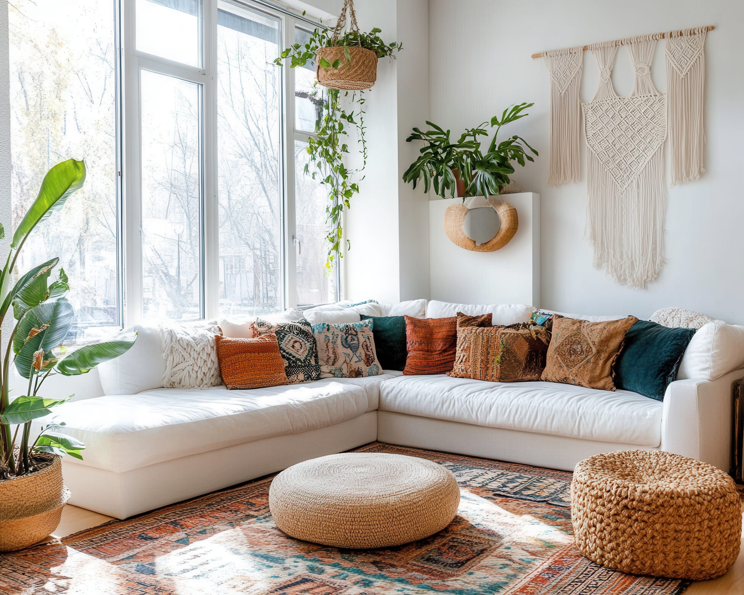
DON’T: Use All Bold Patterns
This is the fastest route to visual chaos. When every pattern screams for attention, nothing stands out and the room becomes exhausting. Even if you love bold patterns, incorporating quieter options creates the necessary contrast.
If you’re drawn to high-impact patterns, balance them with subtle textures or tone-on-tone designs. A room with a bold floral, a loud geometric, and a high-contrast stripe needs calming elements to work. Replace one of those with a subtle textural pattern, and suddenly the whole room breathes easier.
DON’T: Forget About Texture
Texture functions as a subtle pattern that adds depth without overwhelming. When learning how to mix patterns in a room, remember that smooth and rough, matte and shiny, flat and dimensional all create visual interest.
A nubby linen sofa, smooth cotton pillows, and a plush velvet throw each contribute pattern through texture. These elements bridge the gap between your more obvious patterns and add sophisticated layering.
DON’T: Match Everything Perfectly
Nothing says “amateur” quite like patterns that all come from the same collection. You know the look—matching curtains, pillows, and bedding all in the same print, just in different scales. This catalogue approach lacks personality and sophistication.
Instead, aim for coordination without being matchy-matchy. Patterns should converse with each other, not echo each other exactly. When patterns share colours or themes but come from different sources, the result feels collected and intentional.

DON’T: Ignore the Room’s Architecture
Your room’s existing elements—architectural details, flooring, built-ins—all contribute to the pattern and must be considered in your overall scheme. A highly patterned wood floor, for instance, already adds visual texture that needs to be balanced, not competed with.
Work with what you have rather than against it. If your room has ornate crown moulding, that decorative element counts as a pattern. Strong architectural lines from windows or built-ins create geometric patterns that influence your fabric and décor choices.
DON’T: Rush the Process
Pattern mixing is a skill that develops over time. Start small—maybe with throw pillows or a single patterned chair—and build your confidence gradually. Living with patterns for a while helps you understand what you truly enjoy versus what just looked good in the moment.
The rooms that feel most successful are often those that evolved naturally, with patterns added thoughtfully over time rather than all at once. Give yourself permission to experiment, adjust, and even change your mind as you develop your pattern-mixing skills.
Room-by-Room Pattern Mixing Guide
Every room has its rhythm and purpose, which directly influences how patterns should work within the space. Let’s walk through specific strategies for each area of your home.
Living Room
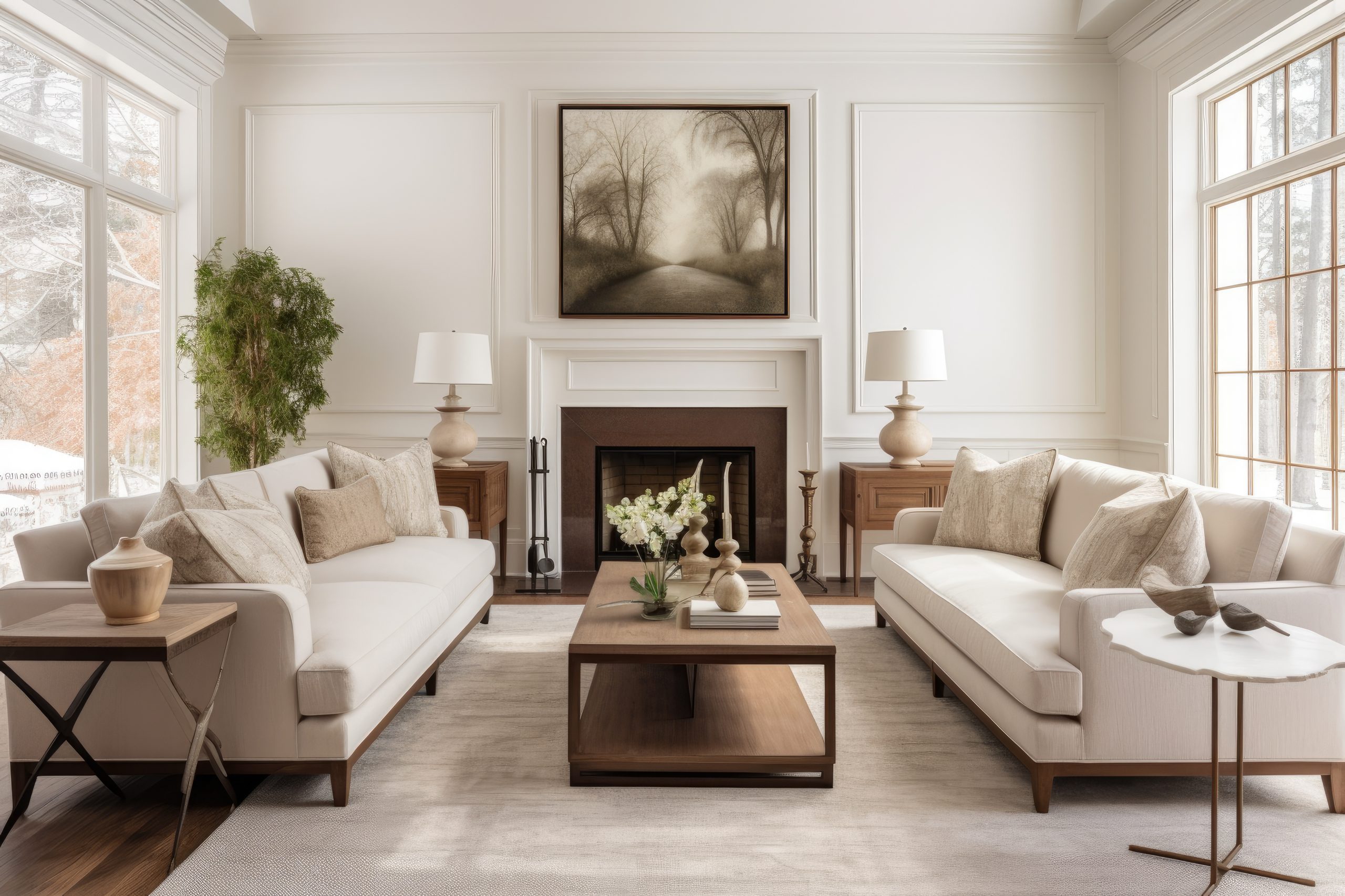
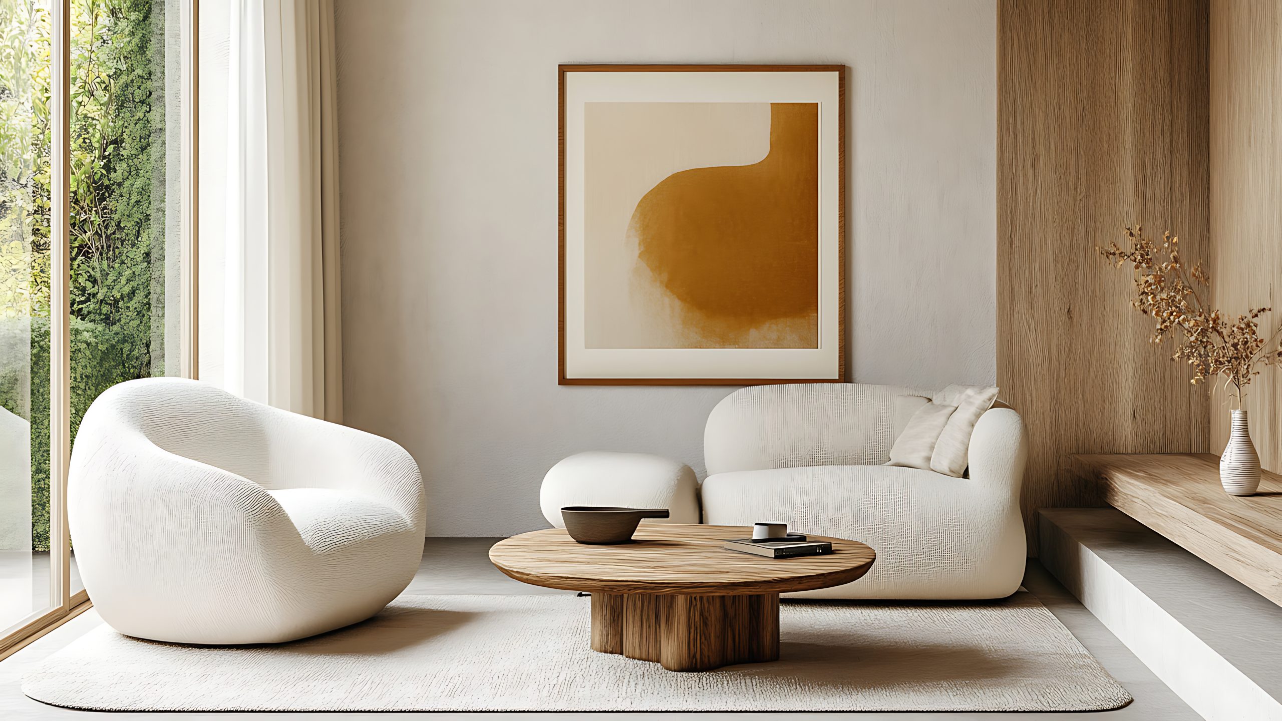
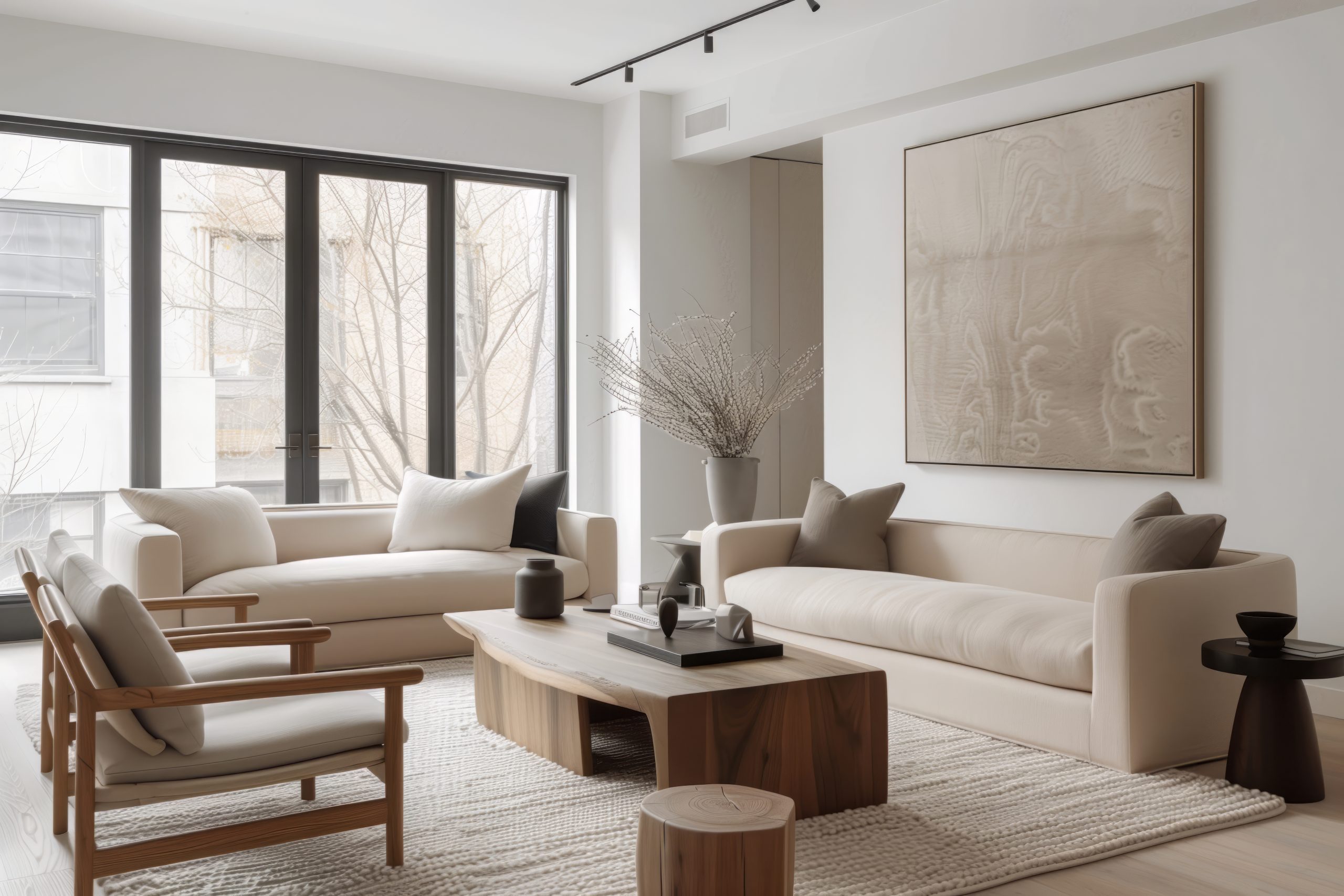
The living room is where most people want to make a pattern statement, and for good reason—it’s typically the largest space and the one where you entertain. Start with your biggest piece: the sofa. If you’re going with a patterned sofa, keep it to a medium or large-scale design that won’t feel busy when you’re sitting on it for hours.
For a solid sofa, you have more freedom with pillows and throws. Try this reliable formula: one large-scale pattern on your biggest pillows, a medium geometric on smaller pillows, and a textural throw that bridges everything together. Your rug can handle patterns if your furniture is mostly solid, but if you have patterned upholstery, consider a subtle textural rug instead.
Window treatments offer another opportunity for pattern, but consider their relationship to your seating. Busy patterns at eye level can be distracting, so if your curtains hang near seating areas, opt for subtle patterns or solids with interesting textures.

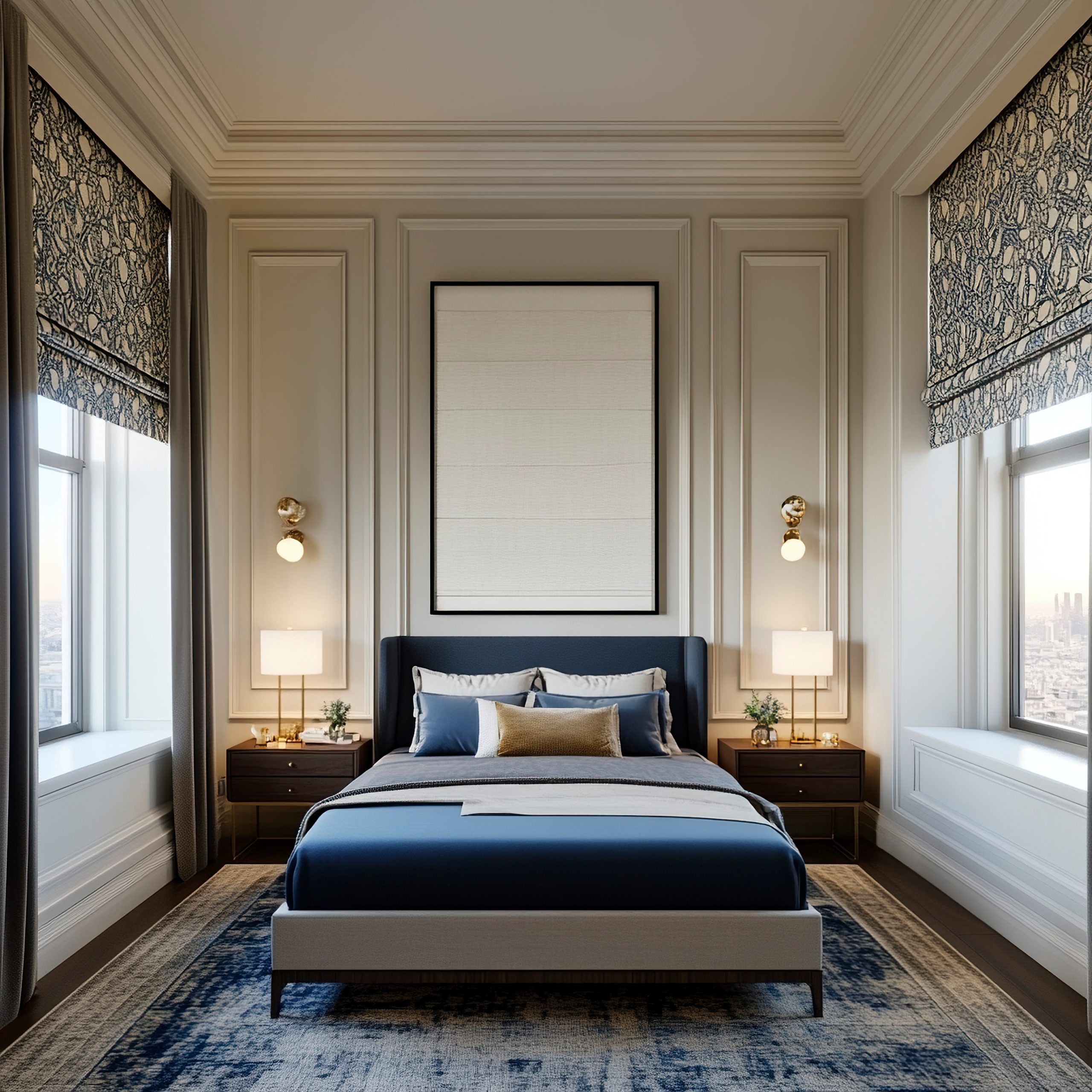
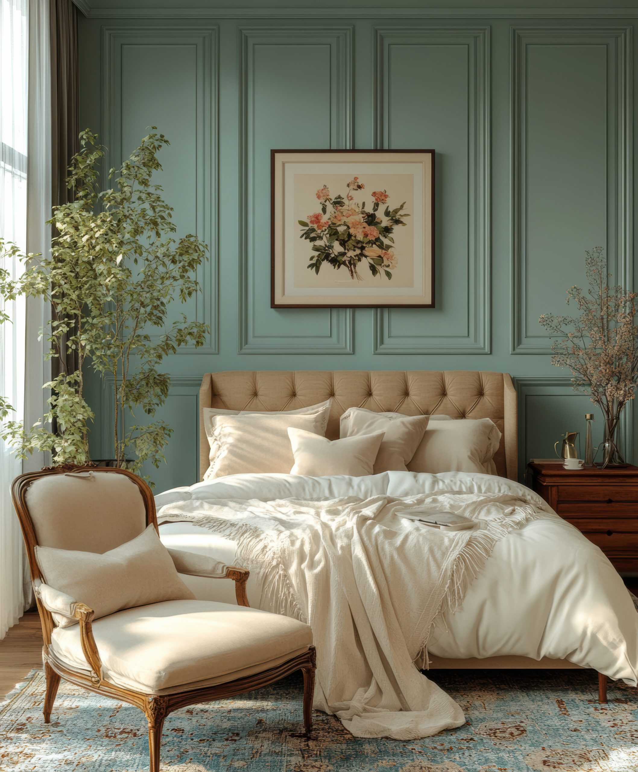
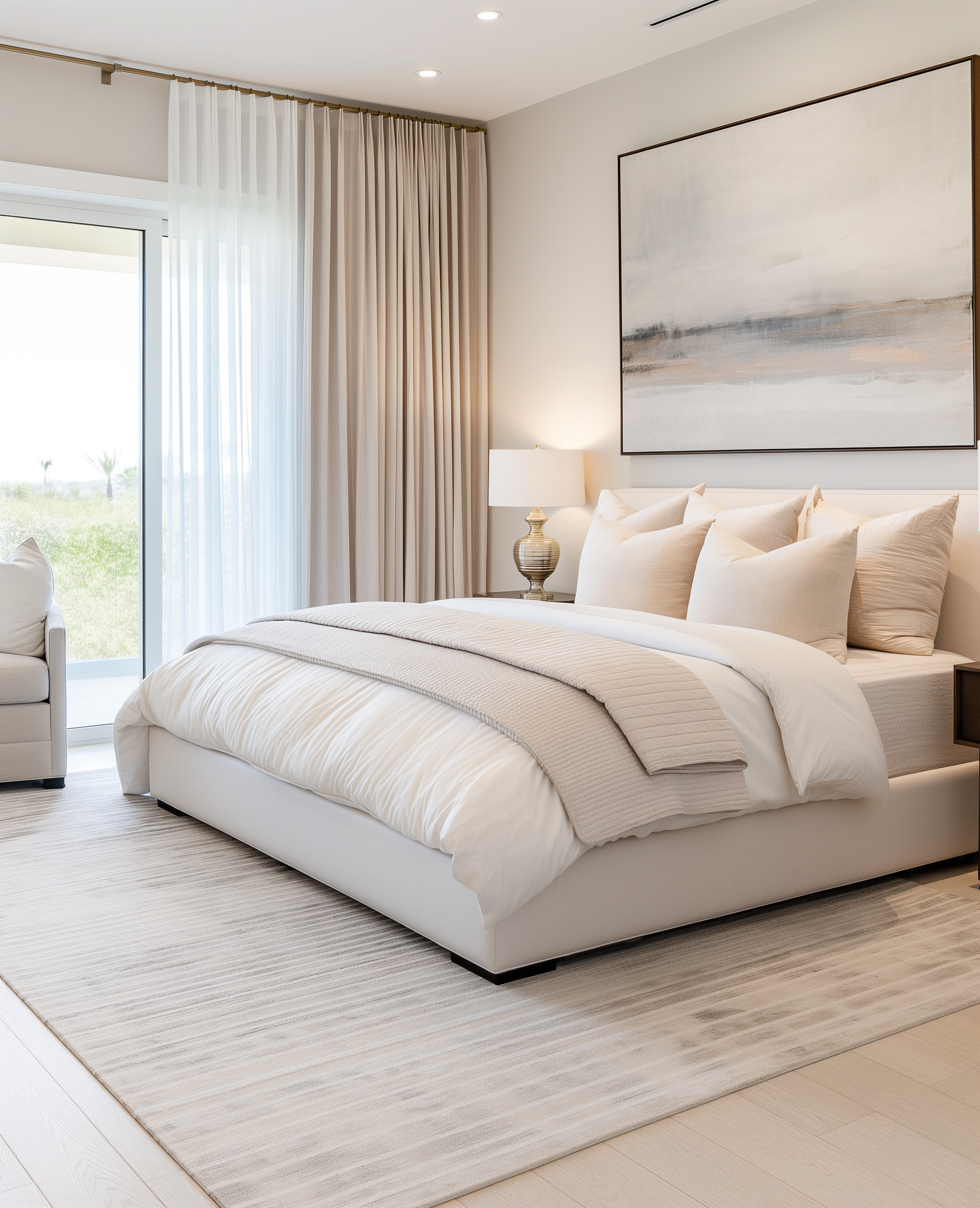
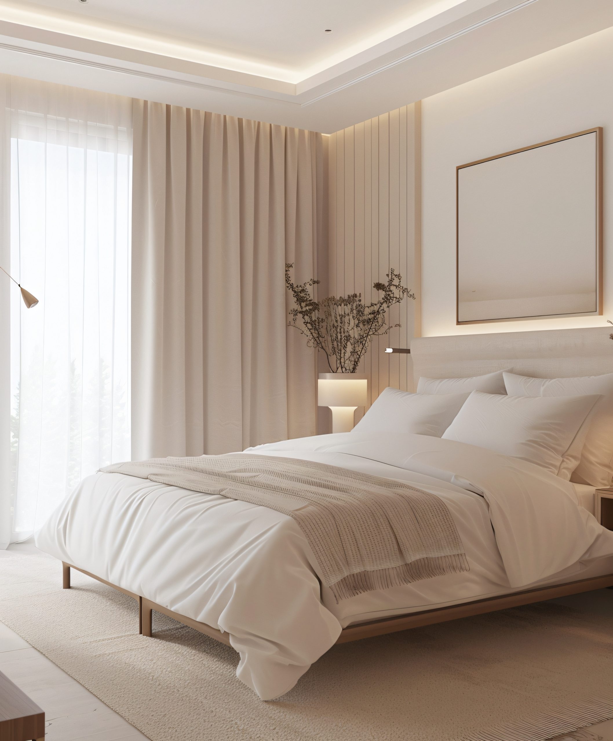
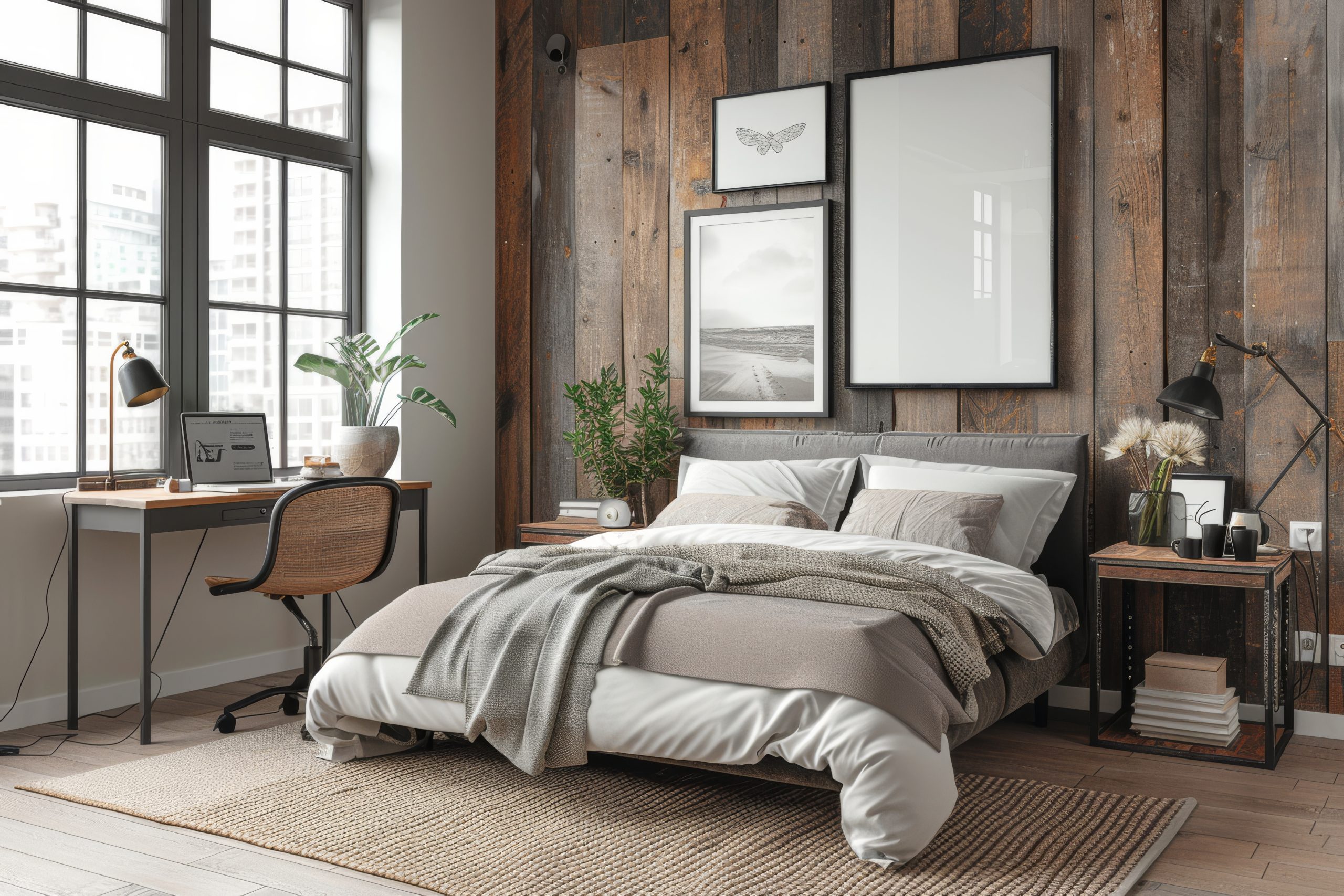
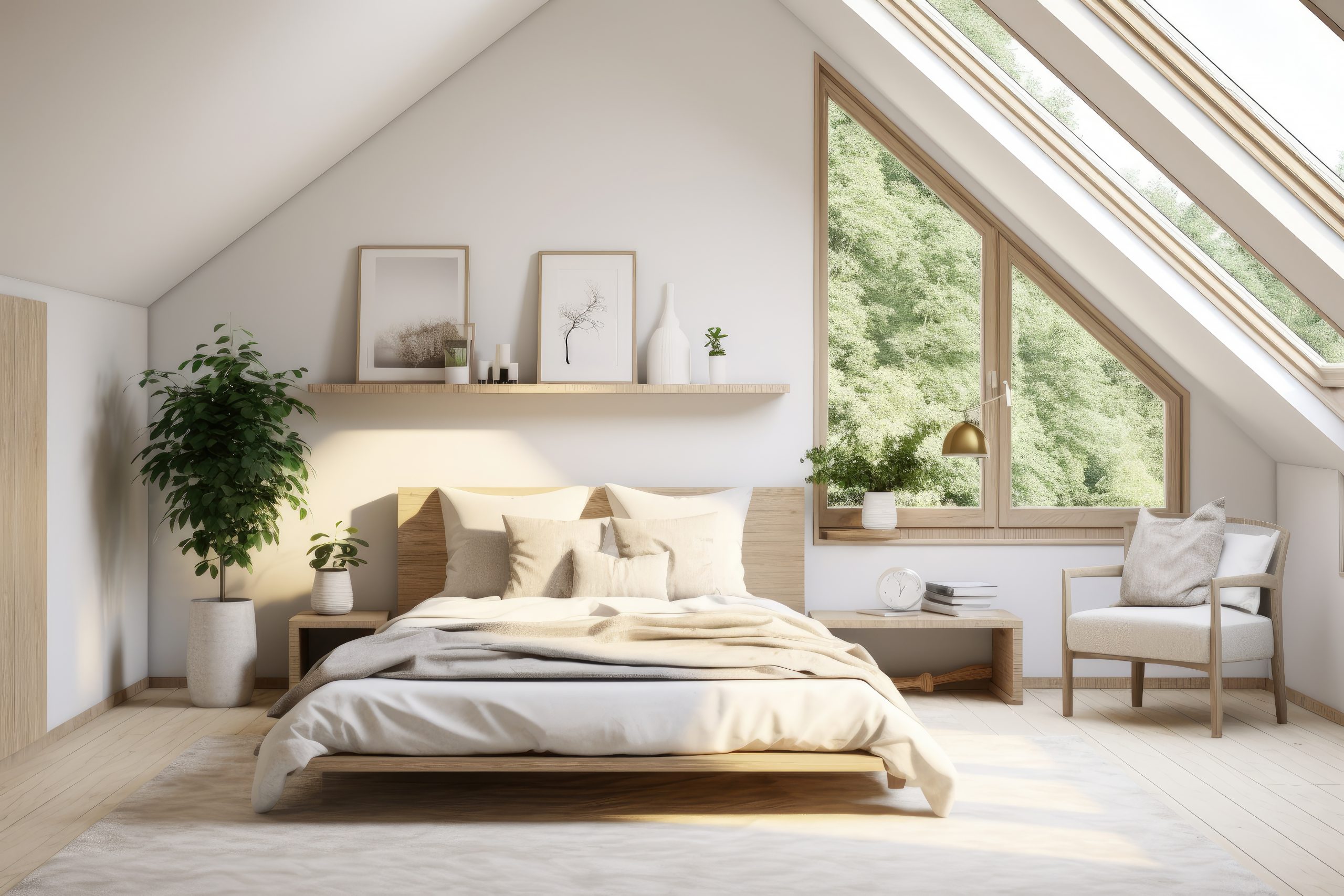
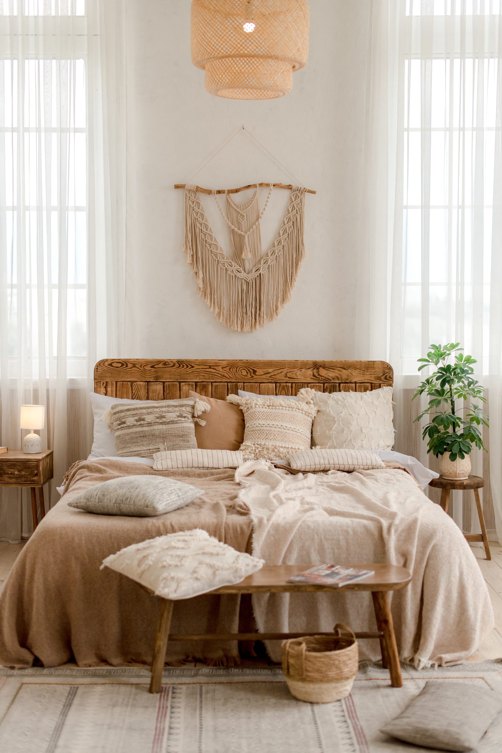
Bedroom
Bedrooms require a more delicate approach to pattern mixing. While you want visual interest, the space still needs to feel restful. The bed naturally becomes your focal point, so start there when figuring out how to mix patterns in a room designed for sleep.
Layer patterns on the bed, starting with your largest scale on the duvet or comforter. Add medium-scale patterns through Euro shams or decorative pillows, then incorporate small-scale patterns or textures in accent pillows and throws. The key is creating layers that can be adjusted—you might want all the patterns during the day but prefer simplicity at night.
If you’re using patterned curtains in the bedroom, ensure they complement rather than compete with your bedding. A good rule: if your bedding is bold, keep window treatments subtle, and vice versa. An upholstered headboard in a small-scale pattern or interesting texture adds another layer without overwhelming the space.

Dining Room
Dining rooms offer unique opportunities for pattern play because you’re working with different elements than in living spaces. Chair upholstery is your primary canvas—consider a medium-scale pattern that’s sophisticated but not so busy it competes with food presentation or table settings.
For formal dining rooms, mixing patterns through table linens adds flexibility. You can change the mood entirely by switching between patterned and solid table runners, placemats, and napkins. If your chairs are patterned, keep table linens simpler. Solid chairs? Go bold with your table settings.
Don’t forget the walls—dining rooms can handle more dramatic pattern choices since you typically spend less continuous time in them. A bold wallpaper or large-scale art creates a stunning backdrop for dinner parties.

Small Spaces
Small rooms require strategic thinking about pattern scale and placement. The old rule about keeping small rooms simple? Ignore it. Small spaces can absolutely handle patterns—you just need to be thoughtful about scale and contrast.
In powder rooms, entries, and other compact spaces, one statement pattern can actually make the room feel larger by creating a focal point. The key is choosing patterns with movement and depth rather than flat, repetitive designs. A wallpaper with perspective or a pattern that draws the eye upward can visually expand the space.
For small bedrooms or living areas, focus on how to mix patterns in a room without cluttering. Use the same colour palette throughout your patterns to create flow, and ensure at least one pattern has plenty of negative space to prevent the room from feeling cramped.
Advanced Pattern Mixing Techniques
Once you’re comfortable with the basics, these advanced strategies will elevate your pattern game even further.
The Bridge Pattern Method
This technique uses transitional patterns that share elements from your other patterns, creating seamless connections throughout the room. For example, if you have a floral with blue and green plus a geometric in blue and white, your bridge pattern might be a subtle stripe incorporating all three colours.
Bridge patterns often work best in smaller doses—on lampshades, small ottomans, or throw pillow piping. They’re the supporting actors that help your star patterns shine while creating cohesion.
The Neutral Pattern Base
Starting with patterns in neutral colours—think cream-on-white damask, grey herringbone, or taupe geometric—creates a sophisticated foundation. These patterns add visual texture without committing to colour, giving you the flexibility to layer in colourful patterns through easily changeable elements.
This approach works particularly well if you like to update your space seasonally or if you’re still developing confidence in mixing patterns. Build your neutral pattern base through larger investments like rugs and upholstery, then play with colourful patterned accessories.
Cultural Pattern Mixing
Combining patterns from different design traditions creates rooms with real character and depth. A Persian rug, African mud cloth pillows, and Scandinavian geometric throws might sound chaotic, but when unified by colour or scale, they create globally inspired spaces that feel collected over time.
The key is respecting each pattern’s cultural significance while creating harmony through your mixing principles. Avoid using sacred or ceremonial patterns as simple decoration, and research the meanings behind patterns that interest you.

Common Pattern Mixing Mistakes to Avoid
Even experienced decorators stumble over these pattern-mixing pitfalls. Recognising them helps you sidestep issues before they derail your design.
Competing Focal Points happen when multiple patterns fight for dominance. If your eye doesn’t know where to land first, you’ve created competition rather than harmony. Every room needs a clear hierarchy—one pattern leads, others support. When two bold patterns of similar scale occupy the same sightline, neither can properly shine.
Ignoring the Room’s Purpose leads to pattern choices that work against how you actually use the space. A home office filled with busy, high-contrast patterns might look stunning in photos but prove distracting during work hours. Similarly, ultra-formal patterns in a family room where kids play daily creates unnecessary stress. Always consider function alongside form.
Forgetting About Existing Furniture is surprisingly common when people get excited about pattern mixing. That wood grain dining table? It’s adding a pattern. Your leather sofa’s texture contributes visual weight. Before adding new patterns, catalogue what you already have—including wood tones, metal finishes, and textural elements that affect your overall pattern story.
Scale Mishaps in Small Rooms occur when people automatically default to tiny patterns in compact spaces. Counterintuitively, one large-scale pattern often works better than several small ones in tight quarters. Small, busy patterns can make a room feel cramped and cluttered, while a single bold pattern can actually expand the visual space.
Quick Pattern Mixing Formulas
Think of these formulas as training wheels—use them to build confidence, then adapt as you develop your own style. Each formula shows you how to mix patterns in a room with guaranteed harmony.
Classic Formula: 1 Geometric + 1 Floral + 1 Solid
This timeless combination works in any style of room. Your geometric provides structure (stripes, lattice, or Greek key), your floral adds organic movement (contemporary or traditional), and your solid grounds everything. The key is ensuring these three elements share at least two colours.
Modern Formula: 2 Abstracts + 1 Linear + Textural Solids
Perfect for contemporary spaces, this formula plays with artistic patterns. Choose two abstract patterns in different scales—perhaps a large watercolour-inspired print and a small organic dot pattern. Add one clean linear element like stripes or a grid, then balance with textural solids in linen, wool, or nubby cotton.
Eclectic Formula: 1 Ethnic + 1 Contemporary + 1 Traditional
This formula creates a collected-over-time appeal. Mix a global pattern (ikat, suzani, or mud cloth), a contemporary geometric, and a traditional element like toile or damask. The unexpected combination works when unified by a consistent colour story or similar pattern weights.
[Image placement: Visual formula guide showing each combination with real room examples and pattern swatches]
Remember, these formulas are starting points, not rules. Once you understand why they work—the balance of structure and flow, the varied scales, the unifying elements—you can create your own combinations with confidence.
Mastering how to mix patterns in a room transforms your decorating from safe to sophisticated. We’ve covered the essential principles—varying scale, following the 60-30-10 colour rule, and working in odd numbers. You now understand how different pattern categories interact and have specific formulas to try in your own space.
by Kesaa Interiors | DESIGN GUIDES, Living Spaces, TRENDING
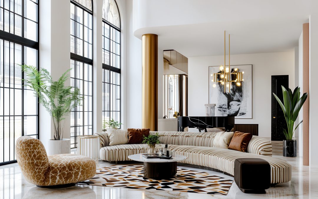
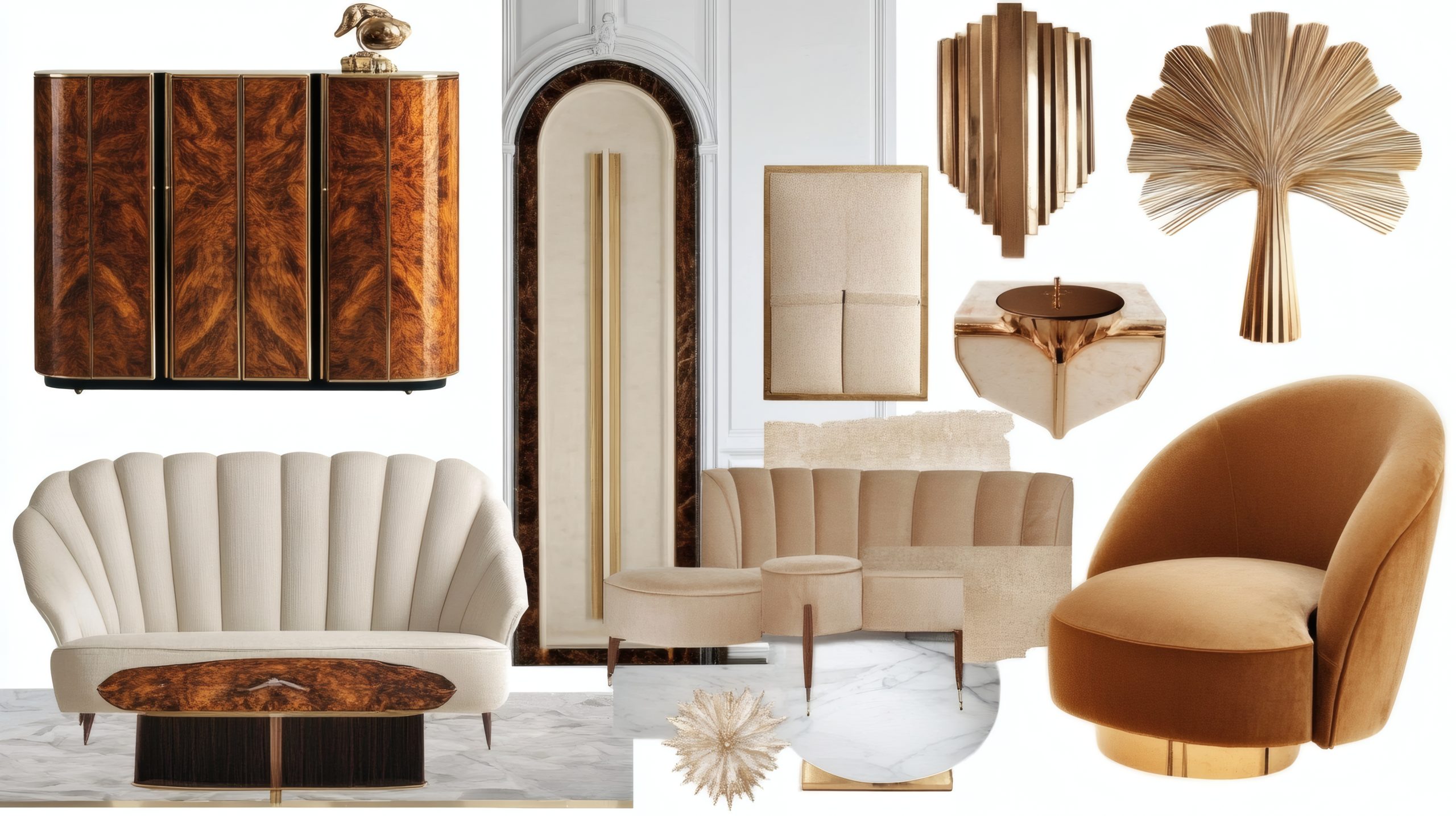
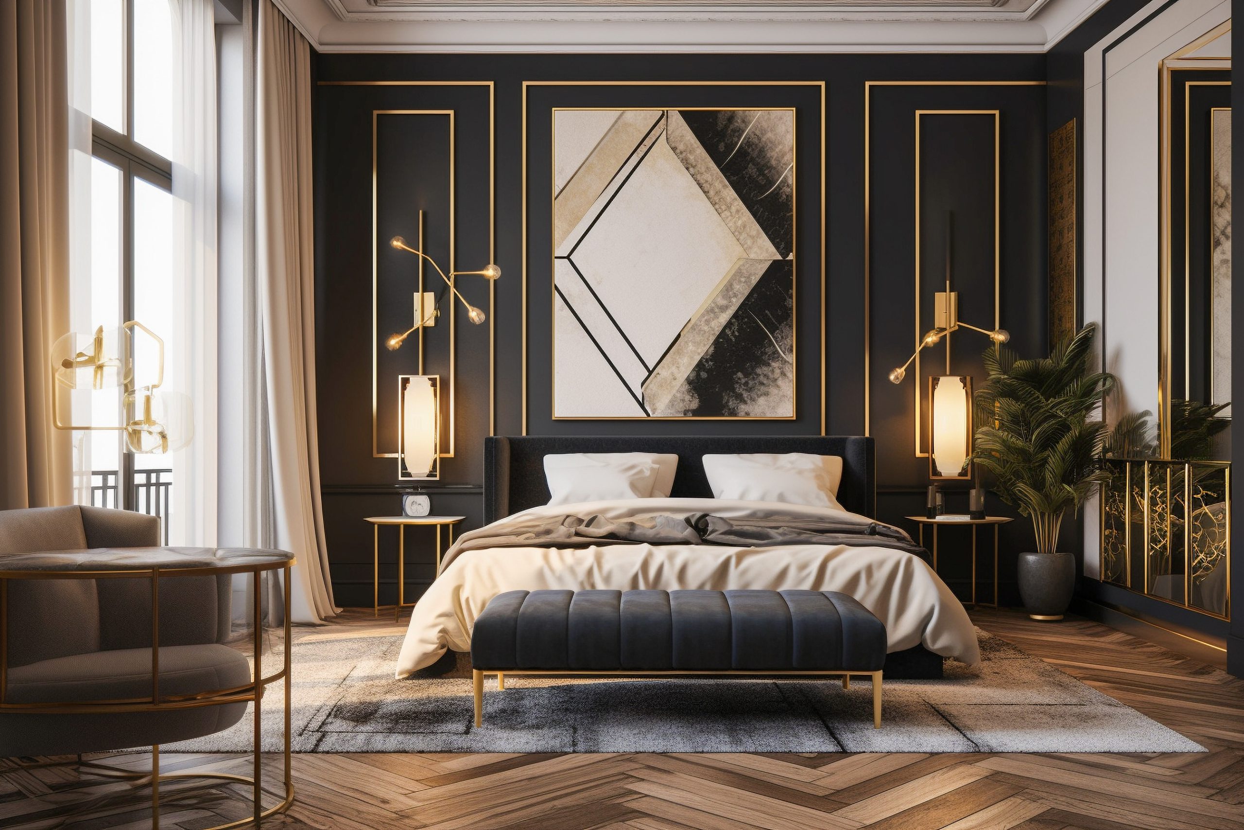
There’s something undeniably magical about Art Deco interior design that keeps drawing me back to this style. I’ve seen how incorporating Art Deco home interior design ideas can transform an ordinary space into something extraordinary. The style’s perfect blend of glamour and sophistication has captivated homeowners and designers alike for decades. I’m thrilled to share my favourite ways to bring this timeless aesthetic into your home.
I’ll walk you through 15 stunning Art Deco home interior design ideas that can help you achieve that perfect luxe look. Whether you’re planning a complete renovation or looking to add just a touch of that signature Art Deco glamour, these tips will help you create the space you’ve been dreaming of.
Geometric Patterns and Bold Lines
If there’s one element that truly defines Art Deco home interior design, it’s the bold use of geometric patterns. These dramatic designs are the heart and soul of the style, and they have an incredible way of transforming even the most basic room into something spectacular.
Here’s my approach to incorporating these patterns:
- Start with one bold geometric element as your focal point. I always suggest beginning with either wallpaper or a large area rug – these anchor pieces set the tone for the entire space.
- Layer in angular furniture pieces that echo your main pattern. Think zigzag-patterned throw pillows or a stunning cabinet with geometric overlay.
- Mix different scales of patterns, but keep them in the same colour family. One of my favourite combinations is pairing a large-scale geometric wallpaper with smaller-patterned cushions or curtains.
Pro tip: If you’re nervous about committing to bold geometric wallpaper, try starting with removable wallpaper panels or focus on incorporating geometric patterns through art pieces and textiles. This is a fantastic way to experiment with Art Deco home interior design ideas without making permanent changes.
Remember, the key to successful Art Deco pattern play is confidence – this isn’t a style for the timid! I always tell my clients that if they’re going to embrace Art Deco, they should embrace it. The beauty of these geometric patterns is that they create an instant focal point and set the stage for all your other Art Deco elements to shine.
These striking patterns aren’t just decorative; they’re conversation starters. The impact of a bold geometric design element is undeniable – it’s exactly the kind of statement we’re looking for with Art Deco home interior design. These patterns command attention and exude confidence, creating spaces that feel both sophisticated and dramatic.
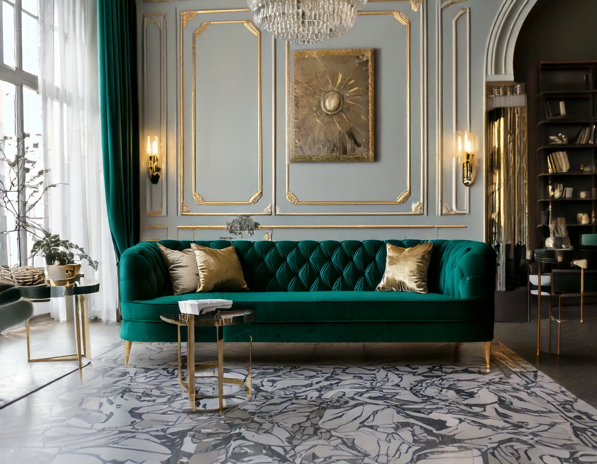
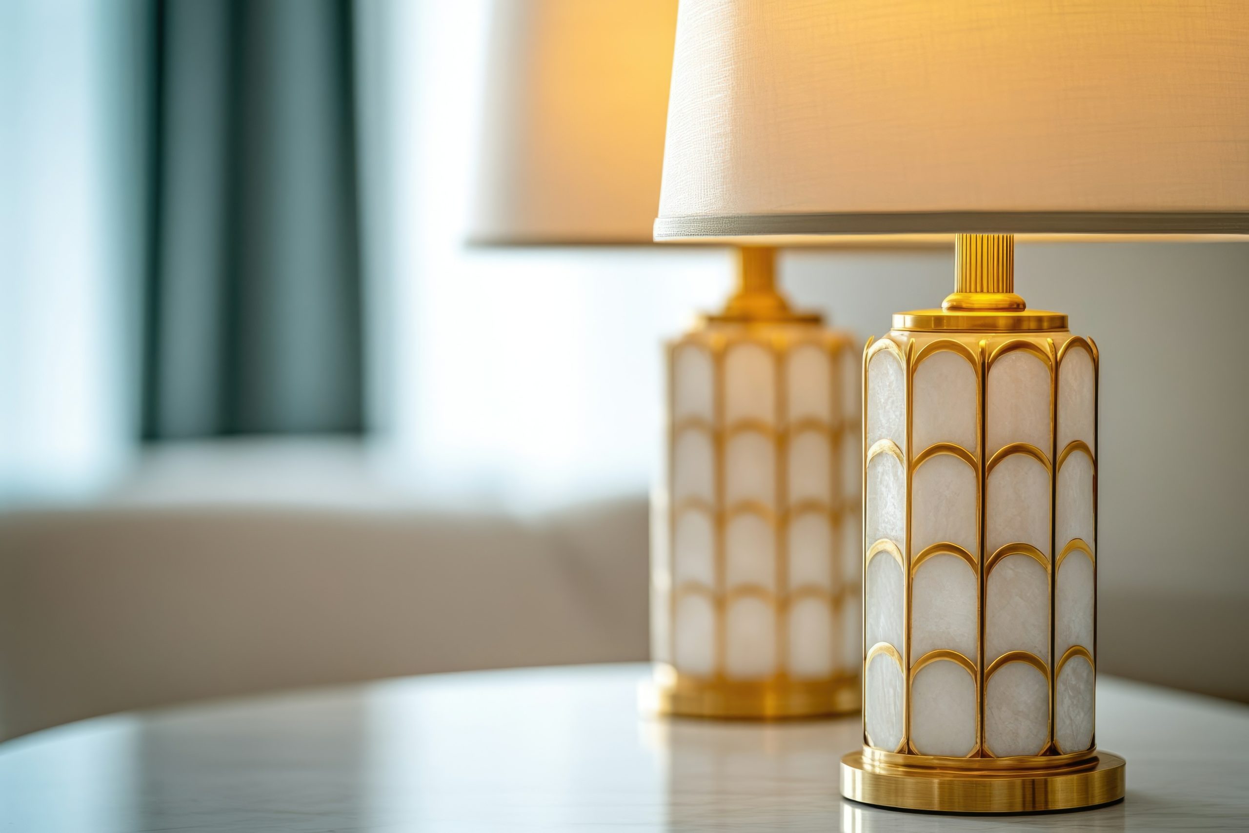
Luxurious Metallics
Nothing says Art Deco home interior design quite like the gleam of metallic finishes. The way metals catch and reflect light adds that essential layer of glamour that’s so characteristic of this style. Gold, brass, and chrome are the holy trinity of Art Deco metallics, and I never tire of seeing how they can elevate a space.
Here’s how I love to incorporate these luxurious elements:
- Start with your hardware: Door handles, cabinet pulls, and light switches in polished brass or chrome make for an immediate Art Deco upgrade.
- Layer in larger metallic pieces: Think mirrors with metal frames, side tables with brass legs, or chrome-finished bar carts.
- Mix your metals thoughtfully: While traditional Art Deco favoured single metal tones, modern interpretations can beautifully blend different metallics – just keep them in the same temperature family.
The key is to distribute these metallic elements evenly throughout your space. I find that treating metals like jewellery for your room works perfectly – they should enhance rather than overwhelm. A metallic ceiling medallion paired with matching wall sconces, for instance, creates a cohesive look that draws the eye around the room.
Pro tip: When incorporating metallics into your Art Deco home interior design ideas, remember that a little shine goes a long way. Balance these gleaming surfaces with rich, matte textures like velvet or wool to create depth and visual interest.
One of my favourite ways to make a statement is with a large metallic piece – perhaps an oversized sunburst mirror or a striking gold-leafed cabinet. These signature pieces become natural focal points while embodying the luxury and drama that make Art Deco so appealing.
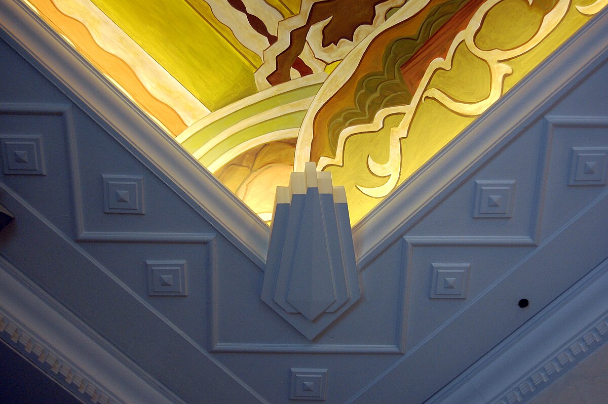
Statement Lighting
If there’s one element that can make or break your Art Deco home interior design, it’s lighting. Art Deco lighting fixtures are like functional sculptures, commanding attention whether they’re switched on or off.
The most impactful Art Deco lighting features include:
- Tiered chandeliers with geometric glass panels
- Sconces with stepped designs and metallic finishes
- Pendant lights featuring clean lines and frosted glass
When selecting lighting, look for pieces that incorporate typical Art Deco motifs – sunbursts, fan shapes, and geometric patterns. The right fixture can become the cornerstone of your entire design scheme, informing the rest of your decor choices.
What makes Art Deco lighting so special is its ability to serve as both illumination and art. During the day, these fixtures act as sculptural elements, while at night, they create dramatic shadow plays and lighting effects that transform your space.
Remember, the placement of your lighting is just as important as the fixtures themselves. Consider creating layers of light with a mix of ceiling fixtures, wall sconces, and table lamps. This layered approach not only provides practical illumination but also adds depth and drama, which are essential elements in Art Deco home interior design.
Rich Colour Palettes
The colours you choose for your Art Deco home interior design set the stage for drama and sophistication. What I love most about Art Deco colour schemes is their boldness – these aren’t your typical safe, neutral palettes. Instead, we’re talking about colours that make a statement and leave an impression.
The most striking Art Deco colour combinations include:
- Deep emerald green paired with gold and black
- Sapphire blue with silver and cream
- Ruby red combined with chrome and white
- Rich tobacco brown with bronze and ivory
When working with these bold colours, I find it’s best to follow the 60-30-10 rule: 60% of your space in a dominant colour, 30% in a secondary colour, and 10% in an accent colour. This creates balance while maintaining that signature Art Deco drama.
Pro tip: Start with one bold colour you absolutely love and build your palette around it. The walls don’t always need to be the boldest element – a deep-coloured velvet sofa can be just as impactful against neutral walls.
Mirrored Surfaces
Nothing captures the glamour of Art Deco home interior design quite like the strategic use of mirrors and mirrored surfaces. These reflective elements add depth, light, and a touch of Hollywood golden age glamour to any space.
Key ways to incorporate mirrored elements:
- Install mirror panels with geometric divisions
- Choose furniture pieces with mirrored accents
- Add mirrored trays and decorative objects
- Consider an Art Deco-style mirror as wall art
The trick with mirrors is to place them thoughtfully. Position them to reflect something interesting – perhaps your statement lighting or a beautiful piece of art. This doubles the impact of your best decorative elements while creating that sought-after Art Deco sparkle.
One word of caution: while mirrors are fantastic, too many can feel overwhelming. I always suggest choosing one or two significant mirrored pieces rather than filling every surface with reflection.
Sophisticated Materials
The materials you choose for your Art Deco home interior design are crucial for creating that luxurious feel. This style is all about combining different textures and surfaces to create a rich, layered effect.
Essential Art Deco materials include:
- Polished woods (especially exotic varieties)
- Plush velvets
- Smooth lacquer finishes
- High-gloss marble
- Sleek glass
The key to working with these materials is contrast. Pair smooth, glossy surfaces with soft, tactile fabrics. Consider a lacquered sideboard topped with velvet-covered boxes, or marble floors softened by a plush geometric rug.
When selecting furniture pieces, look for:
- High-sheen wood finishes
- Upholstery in luxurious fabrics
- Pieces combining different materials
- Clean lines with sophisticated details
Remember, quality matters in Art Deco design. While there are always ways to achieve the look on a budget, investing in a few key pieces made from authentic materials will elevate your entire space.
Bold Artwork and Wall Panels
Art Deco home interior design isn’t complete without making a statement through your wall treatments. The artwork and wall details of this era were never meant to fade into the background – they’re intended to be bold, dramatic, and impossible to ignore.
Key elements to consider:
- Large-scale artwork featuring geometric patterns
- Stylised figures and motifs
- Decorative wall panels with stepped designs
- Bold murals with metallic accents
- Sculptural wall installations
When selecting artwork, look for pieces that embrace typical Art Deco themes: sunbursts, chevrons, stylised animals, and figurative works with elongated forms. I particularly love how oversized pieces can transform an entire wall into a focal point.
For wall panels, consider:
- Wood panels with geometric inlays
- Upholstered panels in luxe fabrics
- Metal or mirror panels with decorative overlays
- Painted panels with metallic details
The beauty of Art Deco wall treatments is their versatility. You might opt for a single dramatic mural behind your sofa, or create an entire wall of geometric panels. Whatever you choose, make sure it complements rather than competes with your other Art Deco elements.
Streamlined Furniture
The furniture in Art Deco home interior design tells a story of elegance through form. These pieces are all about clean lines and curved edges, creating a sense of movement while maintaining sophistication.
Essential furniture characteristics include:
- Curved sofas and club chairs
- Streamlined silhouettes
- Built-in seating nooks
- Furniture with stepped or waterfall edges
- Pieces that combine different materials
When selecting furniture, I always recommend focusing on:
- Low-profile pieces with strong horizontal lines
- Rounded corners and smooth curves
- Symmetrical arrangements
- Pieces that make a statement without being bulky
The key to successful Art Deco furniture placement is balance. Create conversation areas that feel intimate yet sophisticated, and don’t be afraid to mix curved pieces with angular ones – this contrast is what makes Art Deco so dynamic.
Pro tip: If you’re working with a smaller space, choose fewer, more impactful pieces rather than trying to squeeze in too many elements. A single spectacular curved sofa can have more impact than multiple smaller pieces.
Remember, comfort shouldn’t be sacrificed for style. The best Art Deco rooms combine visual drama with practical livability. Look for pieces that invite you to sit and stay while maintaining those classic Art Deco lines.
When it comes to upholstery, opt for:
- Rich, solid colours
- Geometric patterns
- Luxurious textures
- High-quality fabrics that will stand the test of time
The beauty of Art Deco furniture lies in its ability to be both functional and sculptural. Each piece should work as part of your overall design while being striking enough to stand on its own.
Exotic Wood Finishes
The use of luxurious woods is one of the most distinctive features of Art Deco home interior design. These aren’t your everyday wood finishes – we’re talking about spectacular grains and rich colours that immediately elevate a space’s sophistication level.
Key wood varieties to consider:
- Macassar ebony with its dramatic striped grain
- Bird’s eye maple for its unique spotted pattern
- Zebra wood offers bold, natural stripes
- Burled walnut with its swirling patterns
- Rosewood for its deep, rich tones
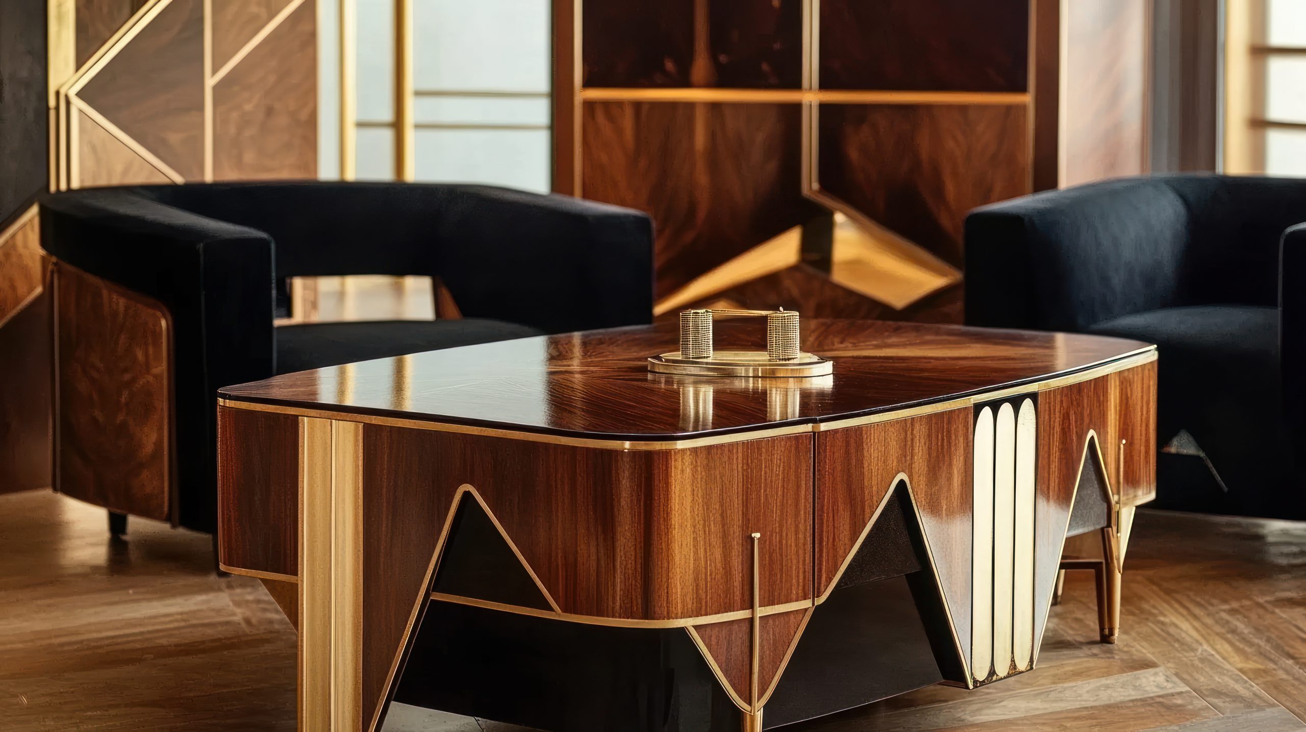
The beauty of these woods lies in their natural patterns. Whether it’s through furniture pieces, wall panels, or built-ins, these materials add organic geometry to your Art Deco scheme. I particularly love how they catch the light and create depth in a space.
Using exotic woods effectively:
- Choose one statement piece as your anchor
- Mix different woods while keeping finishes consistent
- Balance dark and light wood tones
- Consider wood inlays for added detail
Pro tip: If authentic exotic woods are beyond your budget, there are excellent veneers and alternatives available that can create a similar effect. The key is choosing options with strong, distinctive grain patterns.
Statement Staircases
In Art Deco home interior design, staircases aren’t just functional elements – they’re architectural showpieces that can define an entire space. Whether you’re working with a grand curved staircase or a more modest design, there are plenty of ways to incorporate Art Deco elements.
Essential staircase features include:
- Geometric railings with repeated patterns
- Chrome or brass handrails
- Stepped details in the balustrades
- Dramatic runner patterns
- Contrasting materials
The most impactful staircase elements combine:
- Clean lines with decorative details
- Mixed materials like wood and metal
- Strategic lighting to highlight design features
- Pattern play through flooring or runners
When designing or updating a staircase, consider:
- The visual weight of different elements
- How light plays off metallic surfaces
- The balance between plain and decorative components
- The transition between different levels of your home
Even if you’re working with an existing staircase, there are ways to add Art Deco flair:
- Update balusters with geometric designs
- Add metallic accents to handrails
- Install a bold geometric runner
- Create drama with wall treatments alongside the stairs
Remember, your staircase should work in harmony with your other Art Deco elements while still making its own statement. Think of it as a piece of functional sculpture that helps tell your home’s design story.
The real magic happens when you combine these architectural elements with thoughtful lighting and decorative details. A well-designed Art Deco staircase catches the eye while guiding it upward, creating a sense of anticipation for what’s to come.
Luxe Window Treatments
Window treatments in Art Deco home interior design are never an afterthought – they’re an integral part of the room’s architecture and overall drama. The right window treatments can frame your views while adding that essential layer of Art Deco sophistication.
Key elements to consider:
- Layered treatments with sheer and heavy fabrics
- Strong horizontal banding
- Metallic hardware and finials
- Geometric patterns in fabric choices
- Dramatic height with floor-to-ceiling designs
When selecting window treatments, think about:
- Heavy silk or velvet for the main curtains
- Sheer panels with subtle geometric patterns
- Metal rods with decorative ends
- Valances with stepped or angular designs
- Automated systems hidden behind pelmets
Pro tip: Height is crucial in Art Deco design. Mounting curtains close to the ceiling and letting them fall to the floor creates that sought-after sense of drama and luxury.
The hardware you choose is just as important as the fabric:
- Choose bold finials that echo other room elements
- Consider chrome, brass, or black metal finishes
- Look for geometric shapes in curtain rings and holdbacks
- Don’t shy away from substantial curtain rods
Floor Design
The floor is your room’s largest surface area, and in Art Deco home interior design, it deserves special attention. A well-designed floor creates a foundation that supports and enhances all your other decorative elements.
Signature flooring options include:
- Geometric pattern tiles
- Inlaid wood designs
- Bold marble patterns
- High-contrast combinations
- Luxurious carpets with Art Deco motifs
The key to successful Art Deco flooring lies in:
- Strong pattern definition
- Careful material selection
- Thoughtful layout planning
- Balance with other room elements
When working with hard surfaces, consider:
- Contrasting materials like wood and marble
- Geometric inlays that define spaces
- Borders that frame room areas
- Patterns that direct traffic flow
For those working with carpets and rugs:
- Choose bold geometric patterns
- Look for high-quality materials
- Consider custom designs for the perfect scale
- Use rugs to define separate areas within a space
Remember, your flooring should work in harmony with your wall treatments and furniture. While it can be bold, it shouldn’t compete with other key elements in your space. Think of it as the sophisticated canvas upon which your Art Deco story unfolds.
Pro tip: If you’re hesitant about committing to permanent patterned flooring, start with a dramatic Art Deco rug. It can provide the same impact while offering flexibility for future changes.
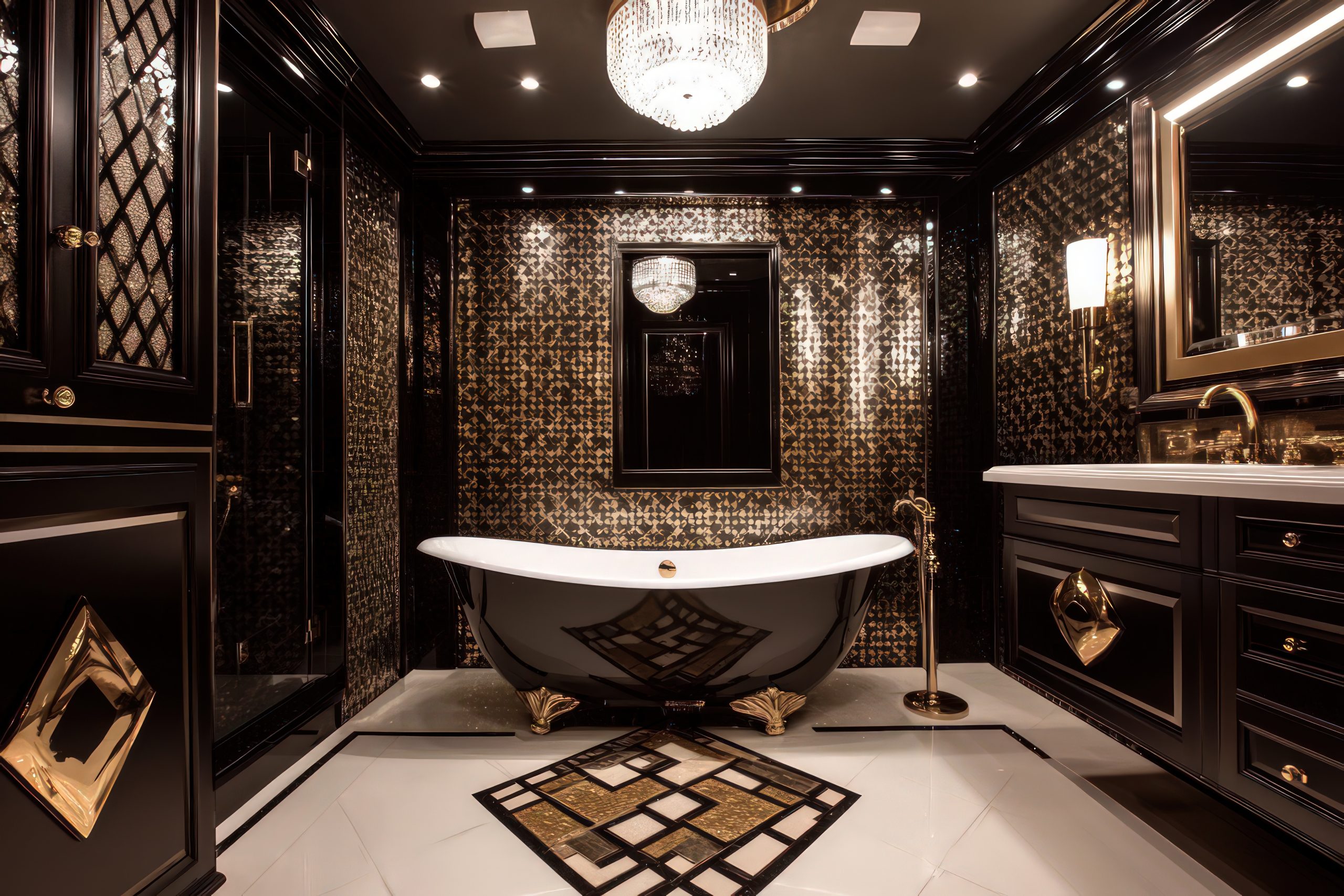
Bathroom Glamour
The bathroom presents a perfect opportunity to fully embrace Art Deco home interior design in all its glamorous glory. This is one space where you can really indulge in luxury and create a stunning private retreat.
Essential Art Deco bathroom elements:
- Black and white tile combinations
- Geometric tile patterns
- Beveled mirrors
- Chrome or gold fixtures
- Marble vanity tops
- Stepped architectural details
What makes an Art Deco bathroom special is attention to detail:
- Consider a statement vanity mirror with a geometric design
- Install wall sconces with frosted glass shades
- Choose fixtures with clean, angular lines
- Add metallic accents through hardware and accessories
When selecting tiles, think about:
- Classic black and white combinations
- Geometric patterns for feature walls
- Marble with strong veining
- Contrasting border details
- Small hexagonal tiles for an authentic period feel
Pro tip: Even in smaller bathrooms, you can create impact through thoughtful material choices and strategic placement of mirrors. The key is to maintain balance while incorporating those signature Art Deco elements.
Ceiling Details
In Art Deco home interior design, the ceiling is often referred to as the fifth wall, and it deserves just as much attention as any other surface. A well-designed ceiling can completely transform the feel of a room.
Key ceiling elements include:
- Stepped crown moulding
- Geometric ceiling medallions
- Painted or applied patterns
- Coffered details
- Integrated lighting designs
When planning your ceiling design, consider:
- The room’s height and proportions
- How light fixtures will integrate
- The balance with wall treatments
- The overall scale of patterns
Lighting plays a crucial role in ceiling design:
- Centre medallions that complement chandeliers
- Cove lighting to highlight architectural details
- Recessed lighting positioned to enhance patterns
- Wall sconces that create interesting shadows
Remember that ceiling treatments should enhance rather than overwhelm your space. The goal is to draw the eye upward naturally, creating a sense of height and grandeur while maintaining harmony with the rest of your design elements.
For rooms with lower ceilings:
- Use lighter colours to create height
- Keep patterns scaled appropriately
- Consider subtle metallic details
- Focus on lighting to create depth
Pro tip: If architectural ceiling details aren’t possible in your space, consider using paint or wallpaper to create pattern and interest. Even simple geometric designs can make a significant impact when executed well.
Accessorising
The art of accessorising in Art Deco home interior design is about selecting pieces that both complement and elevate your space. These finishing touches are what bring personality and completeness to your Art Deco vision.
Key decorative elements to consider:
- Sculptural table objects in metal or glass
- Geometric bookends and vases
- Sunburst or fan-shaped wall decorations
- Period-inspired clocks
- Crystal or cut glass decanters
- Abstract figurines
When selecting accessories, focus on:
- Quality over quantity
- Strong shapes and clean lines
- Materials that reflect light
- Pieces that tell a story together
- Scale and proportion
Pro tip: Group accessories in odd numbers and vary their heights. This creates more interesting compositions while maintaining that essential Art Deco balance between order and drama.
Remember, every piece should serve a purpose:
- Choose items that reflect light and add sparkle
- Include both decorative and functional pieces
- Mix materials for visual interest
- Create small vignettes throughout your space
Practical Tips Section
Now that we’ve covered the essential elements, let’s talk about how to bring it all together successfully in your Art Deco home interior design.
Key considerations for implementation:
Budget-Friendly Approaches:
- Start with one statement piece and build around it
- Use paint to create geometric patterns
- Incorporate metallic finishes through accessories
- Choose quality reproductions for larger pieces
- Focus on lighting as a transformative element
Mixing Modern and Art Deco:
- Keep the colour palette consistent
- Choose modern pieces with Art Deco-inspired lines
- Use contemporary artwork that echoes Art Deco patterns
- Balance old and new elements carefully
- Maintain clean lines throughout
Common mistakes to avoid:
- Overcrowding spaces with too many patterns
- Mixing too many different metals
- Choosing undersized lighting fixtures
- Forgetting about negative space
- Overlooking the importance of quality materials
Pro tip: When in doubt, edit. Art Deco style is about making bold statements, but each element needs room to breathe and be appreciated.
Creating a successful Art Deco home interior design isn’t just about following a checklist – it’s about understanding how all these elements work together to create something truly spectacular. Whether you’re incorporating just a few Art Deco touches or going all-in with a complete transformation, the key is to maintain balance while embracing the style’s inherent drama.
by Kesaa Interiors | DESIGN GUIDES, TRENDING
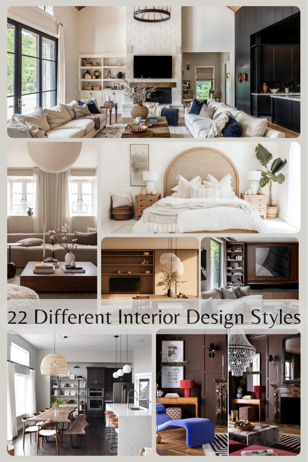
When it comes to decorating your home, understanding different interior design styles is crucial. As an interior designer with over a decade of experience, I’ve seen countless clients feel overwhelmed when trying to define their style preferences. With 22 different interior design styles to explore, it’s no wonder many feel stuck! But don’t worry – I’m here to break down each style in a way that actually makes sense, helping you identify what truly speaks to you.
How to Use This Guide
Before we dive into exploring all 22 different interior design styles, let me share how to make the most of this guide. Think of it as your design roadmap. I’ve organised these styles into broader categories to make them easier to digest. While reading through each style, pay attention to your initial reactions. Which spaces make you think, “I could live there”? Which ones make you want to scroll past quickly? These gut reactions are incredibly valuable in determining your personal style.
Traditional Design Styles
Let’s start our journey through interior design styles with the classics. Traditional design styles have stood the test of time for good reason – they bring a sense of history, elegance, and proven livability to our homes.
1. Classic Traditional
When clients ask me about Traditional style, I often describe it as the equivalent of a perfectly tailored suit in the fashion world – timeless, sophisticated, and always appropriate. This style carries the wisdom of generations of design, refined over centuries to create spaces that feel both elegant and wonderfully livable.
What makes Traditional style special is its attention to detail and commitment to creating balanced, harmonious spaces. It’s the perfect choice for those who appreciate classic literature, fine wine, and things that get better with age.
Key Characteristics:
- Symmetrical arrangements
- Rich wood tones in furniture pieces
- Elegant curves and detailed woodwork
- Refined textiles like silk, velvet, and leather
- Architectural details
- Classic artwork and accessories
Colour Palettes: Traditional design embraces rich, time-tested colours
Primary Colours:
- Warm neutrals
- Deep reds
- Navy blues
- Forest greens
- Rich browns
Accent Colours:
- Burgundy
- Gold
- Deep purple
- Hunter green
- Warm cream
Materials That Define the Style:
- Mahogany and cherry woods
- Crystal and glass
- Polished brass
- Fine silk and velvet
- Oriental rugs
- Damask fabrics
- Carved wood
Pro Tip: Don’t feel like every piece needs to be an antique. I always tell clients that traditional style works beautifully with reproductions, as long as they’re high quality and stay true to classic proportions.
Furniture Elements:
- Wing-back chairs
- Claw-foot tables
- Tufted upholstery
- Queen Anne legs
- Roll-arm sofas
- China cabinets
- Writing desks
- Carved bed frames
Space Planning:
Traditional rooms require thoughtful arrangement:
- Symmetrical furniture placement
- Formal conversation areas
- Clear traffic patterns
- Balanced room layouts
- Designated seating groups
- Formal dining arrangements
- Reading nooks
- Display areas for collections
Styling Guidelines:
- Use pairs to create symmetry
- Layer window treatments
- Include classic artwork
- Display family heirlooms
- Add fresh flowers
- Incorporate table lamps
- Use rich throw pillows
- Feature oriental rugs
Common Mistakes to Avoid:
- Overcrowding rooms
- Using matched sets exclusively
- Forgetting about comfort
- Making it feel too formal
- Overlooking lighting layers
- Using poor quality reproductions
2. French Country
Let’s explore one of my favourite traditional styles – French Country. This style has a magical way of making any space feel like a charming cottage in Provence, no matter where you actually live.
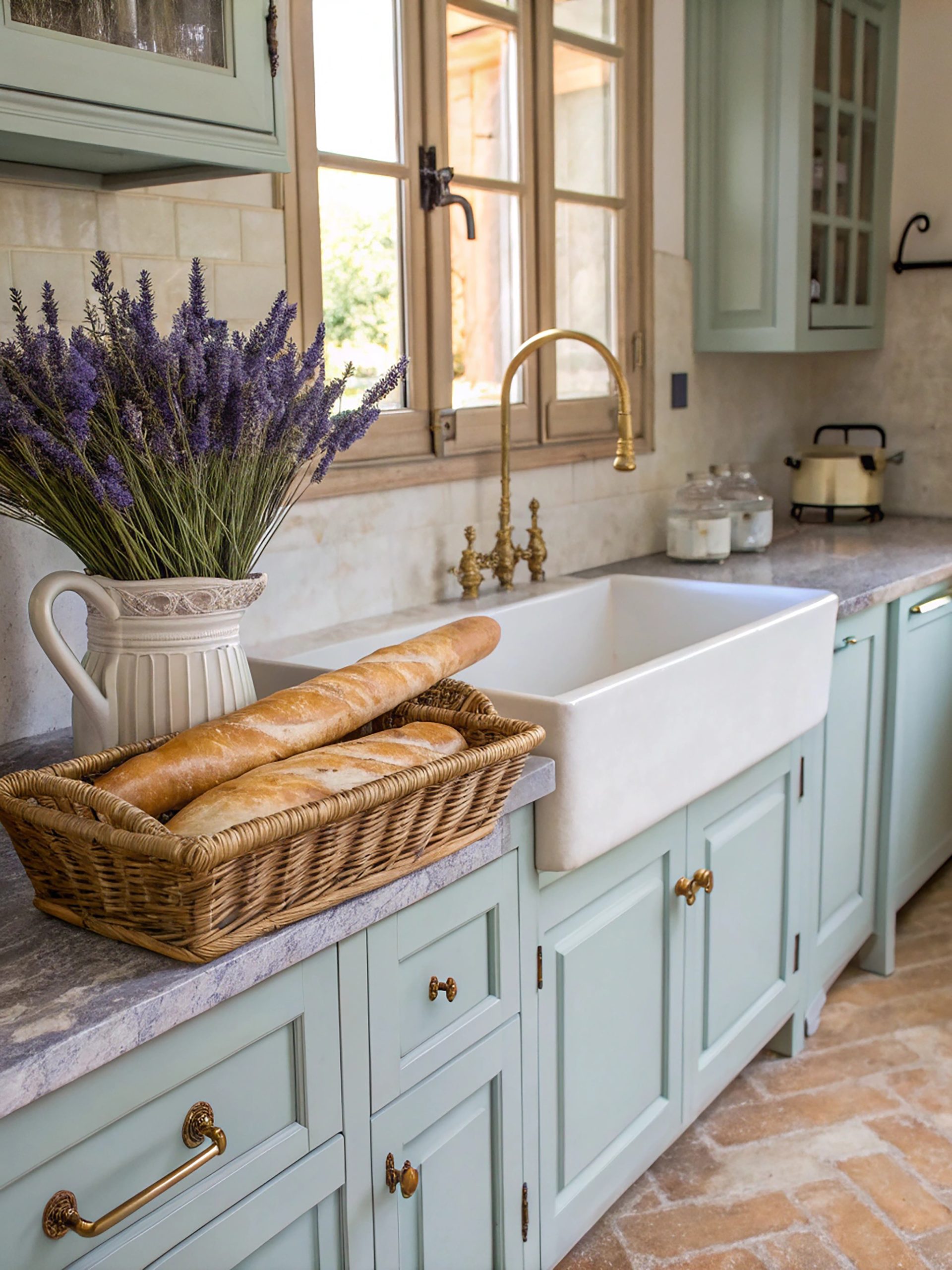
What makes French Country special is its ability to blend elegance with rustic charm. Unlike formal French design, this style embraces imperfection and celebrates the beauty of everyday life. It’s where sophistication meets comfort, and believe me, it’s a beautiful marriage.
Key Characteristics:
- Soft, curved lines
- Distressed finishes
- Mix of formal and rustic elements
- Warm wood tones
- Natural stone
- Hand-painted details
- Wrought iron accents
Colour Palettes: French Country colours are inspired by the French countryside
Primary Colours:
- Warm whites
- Creamy neutrals
- Soft golds
- Terra cotta
- Gentle blues
Accent Colours:
- Lavender
- Sunny yellow
- Sage green
- Rustic red
- Soft black
Materials That Define the Style:
- Natural stone flooring
- Exposed wooden beams
- Wrought iron
- Natural linens
- Cotton toile
- Ceramic tiles
- Copper and brass
Pro Tip: When designing French Country spaces, always remember authenticity is key. Don’t be afraid of a few chips in your painted furniture or wear marks on your wooden table – these “imperfections” add character and charm.
Furniture Elements:
- Carved wooden armoires
- Upholstered dining chairs
- Painted dressers
- Farmhouse tables
- Bergère chairs
- Curved sofas
- Woven chairs
Pattern Play:
French Country embraces specific patterns:
- Toile de Jouy
- Florals
- Stripes
- Checks
- Provincial prints
- Damask
- Plaids
Essential Decor Elements:
- Ceramic pitchers
- Woven baskets
- Fresh and dried herbs
- Copper cookware
- Vintage signs
- Provincial artwork
- Fresh flowers
Space Planning:
French Country design emphasises:
- Comfortable gathering spaces
- Kitchen as the heart of home
- Indoor-outdoor flow
- Intimate seating areas
- Natural light
- Practical workspace
- Cosy corners
3. Victorian
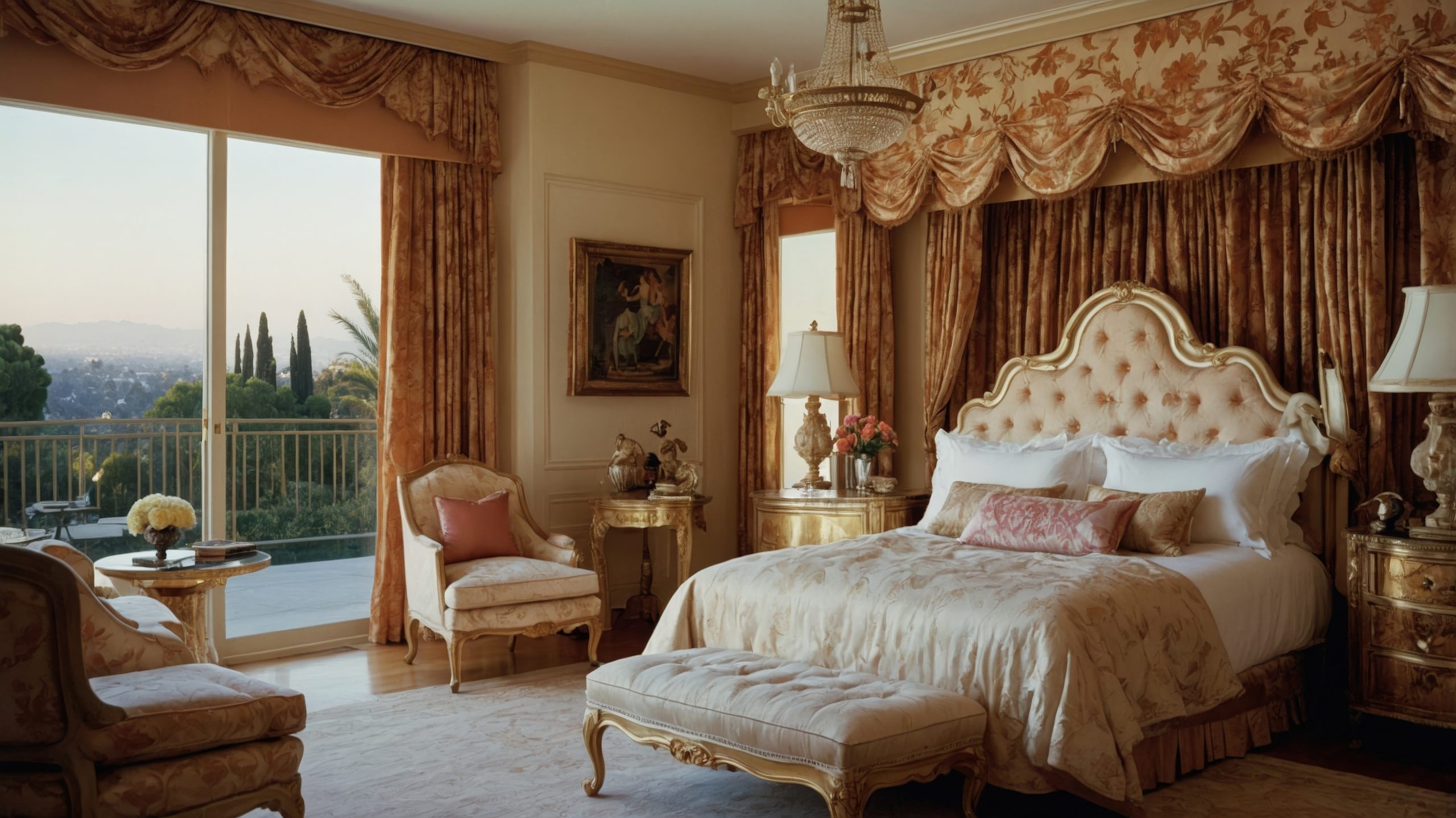
Let’s step back in time to one of the most opulent of our traditional styles – Victorian design. This style is all about embracing decoration, detail, and drama in the most sophisticated way possible.
What makes Victorian style unique is its celebration of abundance and ornamentation. This style emerged during Queen Victoria’s reign (1837-1901), when showing off one’s wealth and taste through interior design was not just acceptable – it was expected. Think of it as the maximalist’s dream come true.
Key Characteristics:
- Ornate decorative elements
- Multiple patterns and textures
- Rich, dark colour palettes
- Layered window treatments
- Abundant accessories
- High ceilings
- Intricate millwork
- Heavy furniture pieces
Colour Palettes: Victorian design embraces rich, dramatic colours
Primary Colours:
- Deep jewel tones
- Burgundy
- Forest green
- Royal purple
- Rich brown
Accent Colours:
- Gold
- Deep red
- Sapphire blue
- Bronze
- Black
Materials That Define the Style:
- Dark, polished woods
- Velvet and silk
- Crystal
- Marble
- Brass and bronze
- Detailed wallpapers
- Oriental rugs
- Lace
Pro Tip: When designing Victorian spaces for modern living, always remember that you can honour the style’s ornate nature while still editing for today’s lifestyle. Not every surface needs to be covered!
Furniture Elements:
- Button-tufted sofas
- Carved wooden pieces
- Fainting couches
- Wingback chairs
- Ottoman footstools
- Heavy draperies
- Ornate beds
- China cabinets
Architectural Details:
- Crown molding
- Ceiling medallions
- Carved doorways
- Bay windows
- Decorative fireplace mantels
- Wainscoting
- Detailed trim work
- Stained glass
Pattern Play:
Victorian style loves layering patterns:
- Damask
- Florals
- Stripes
- Plaids
- Oriental designs
- Gothic motifs
- Nature-inspired patterns
Essential Decor Elements:
- Crystal chandeliers
- Heavy curtains with tassels
- Oil paintings in gilded frames
- Decorative mirrors
- Plants in ornate stands
- China collections
- Family portraits
- Books and globes
Space Planning:
Victorian rooms require thoughtful arrangement:
- Formal furniture groupings
- Conversation areas
- Display spaces for collections
- Reading nooks
- Music corners
- Clear pathways
- Symmetrical layouts
Modern Interpretation:
Here’s how I help clients adapt Victorian style for contemporary living:
- Lighter colour palettes
- Selected ornate pieces
- Updated textiles
- Modern lighting options
- Simplified window treatments
- Edited accessories
- Functional spaces
Modern & Contemporary Styles
Now let’s shift gears completely as we explore designs that embrace clean lines, minimalism, and contemporary living. These styles represent a dramatic departure from traditional ornamentation, focusing instead on the principle that form follows function.
4. Modern
Let me clear up something I discuss with clients almost daily – Modern design isn’t just about being current or trendy. It’s actually a distinct style that emerged in the early to mid-20th century, revolutionising how we think about interior design.
What makes Modern style special is its groundbreaking approach to design. Think of it as the moment when interior design broke free from the past and embraced new materials, technologies, and ways of living. It’s like the difference between classical and jazz music – both beautiful, but with completely different rules and expressions.
Key Characteristics:
- Clean, straight lines
- Minimal ornamentation
- Open floor plans
- Form follows function
- Industrial materials
- Absence of clutter
- Integration with nature
- Emphasis on horizontal and vertical lines
Colour Palettes: Modern design takes a deliberate approach to colour
Primary Colours:
- White
- Black
- Grey
- Earth tones
- Natural wood tones
Accent Colours:
- Primary colours (red, blue, yellow)
- Rust orange
- Forest green
- Deep brown
- Muted metallics
Materials That Define the Style:
- Steel
- Glass
- Concrete
- Natural wood
- Leather
- Molded plywood
- Chrome
- Plastic
Pro Tip: When designing modern spaces, every piece should earn its place through both function and form. If it doesn’t serve a purpose or contribute to the overall aesthetic, it doesn’t belong.
Furniture Elements:
- Low-profile seating
- Platform beds
- Moulded plastic chairs
- Chrome-framed furniture
- Built-in storage
- Floating cabinets
- Glass tables
- Leather loungers
Architectural Elements:
- Floor-to-ceiling windows
- Exposed structural elements
- Flat roofs
- Open floor plans
- Built-in furniture
- Minimal trim work
- Clean-lined fireplaces
- Indoor-outdoor connection
Lighting:
Modern lighting is crucial to the style:
- Architectural fixtures
- Track lighting
- Simple pendant lights
- Floor lamps with clean lines
- Task lighting
- Hidden indirect lighting
- Statement chandeliers
Space Planning:
Modern design emphasises:
- Open concept living
- Uncluttered spaces
- Clear sight lines
- Functional zones
- Connection to the outdoors
- Minimal barriers
- Thoughtful negative space
- Strategic furniture placement
5. Contemporary
Moving through our exploration of modern design styles, let’s talk about Contemporary – and here’s something I’m always explaining to clients: while Modern is a specific style, Contemporary is ever-evolving, reflecting what’s current right now.
What makes Contemporary style unique is its ability to adapt and change. Think of it as design’s equivalent to current fashion – it borrows from various styles and trends while maintaining a fresh, of-the-moment feel. As someone who’s designed countless contemporary spaces, I can tell you it’s one of the most flexible and exciting styles to work with.
Key Characteristics:
- Clean, sophisticated lines
- Mix of textures and materials
- State-of-the-art features
- Emphasis on negative space
- Subtle sophistication
- Technology integration
- Artistic elements
- Sustainability focus
Colour Palettes:
Contemporary design typically features:
Primary Colours:
- Whites
- Grays
- Blacks
- Taupes
- Neutral metallics
Accent Colours:
- Bold jewel tones
- Unexpected colour pops
- Trending colours
- Nature-inspired hues
- Sophisticated pastels
Materials That Define the Style:
- Mixed metals
- Textured fabrics
- Sustainable materials
- Glass
- Composite materials
- Natural stone
- Engineered wood
- Smart materials
Pro Tip: In contemporary spaces, invest in quality staple pieces with clean lines, then add personality through easily changeable accessories and art. This allows the space to evolve with trends.
Furniture Elements:
- Streamlined upholstery
- Mixed material pieces
- Multi-functional furniture
- Statement lighting
- Geometric shapes
- Innovative storage
- Tech-integrated pieces
- Comfort-focused designs
Signature Features:
- Smart home integration
- Sustainable elements
- Abstract art
- Statement lighting
- Mixed metal finishes
- Textural contrasts
- Indoor plants
- Architectural details
Space Planning:
Contemporary spaces prioritise:
- Flexible layouts
- Multi-functional areas
- Technology zones
- Entertainment spaces
- Work-from-home solutions
- Indoor-outdoor flow
- Social gathering areas
- Private retreats
Styling Elements:
- Large-scale art
- Minimal accessories
- Natural elements
- Geometric patterns
- Textural layers
- Strategic colour pops
- Innovative lighting
- Tech-savvy solutions
Modern Interpretation:
What makes Contemporary design special today:
- Integration of smart home features
- Sustainable materials and practices
- Flexible spaces for modern living
- Balance of comfort and style
- Mix of old and new elements
- Focus on wellness
- Outdoor living integration
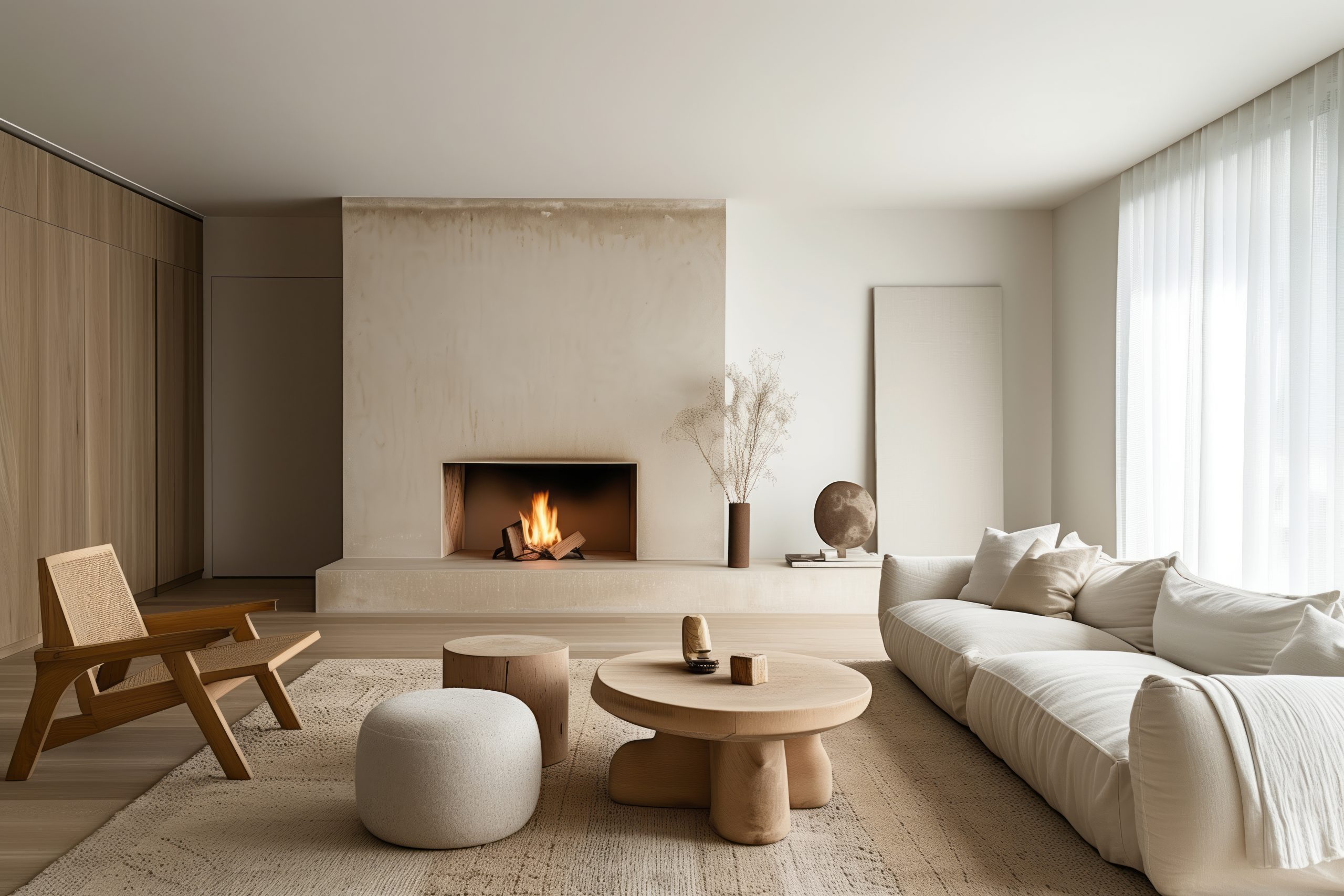
6. Minimalist
Let’s explore one of the most misunderstood of our 22 different interior design styles – Minimalist design. It’s not just about having less stuff; it’s about being intentional with every single element you include.
What makes the Minimalist style special is its focus on the essential. Think of it as the design equivalent of a perfectly edited novel – every element must serve a purpose, and anything that doesn’t enhance the space is removed. It’s about creating calm through clarity.
Key Characteristics:
- “Less is more” philosophy
- Clean, purposeful lines
- Monochromatic colour schemes
- Intentional negative space
- Quality over quantity
- Functional design
- Clutter-free surfaces
- Hidden storage solutions
Colour Palettes: Minimalist design embraces a restricted palette
Primary Colours:
- Pure whites
- Soft whites
- Light grays
- Charcoal
- Black
Accent Colours:
- Single bold accents
- Natural wood tones
- Concrete grays
- Earth tones
- Muted metallics
Materials That Define the Style:
- Smooth woods
- Polished concrete
- Glass
- Steel
- Natural stone
- High-quality textiles
- Matte finishes
- Simple textures
Pro Tip: When designing minimalist spaces, I always remind clients that every item should earn its place. Ask yourself, “Does this piece serve a purpose, either functional or aesthetic?”
Furniture Elements:
- Simple, clean-lined pieces
- Built-in storage
- Platform beds
- Hidden hardware
- Multi-functional furniture
- Low-profile seating
- Floating shelves
- Streamlined tables
Storage Solutions:
This is crucial in minimalist design:
- Hidden closets
- Built-in cabinets
- Drawer organisers
- Wall-mounted solutions
- Under-bed storage
- Seamless closet doors
- Organised pantries
- Multi-functional pieces
Space Planning:
Minimalist spaces require:
- Clear traffic patterns
- Breathing room between pieces
- Strategic furniture placement
- Uncluttered surfaces
- Defined zones
- Natural light maximisation
- Simple window treatments
- Thoughtful negative space
Styling Guidelines:
- Keep surfaces 90% clear
- Choose artwork carefully
- Limit decorative objects
- Focus on form and function
- Embrace empty space
- Use texture for interest
- Maintain clean lines
Common Mistakes to Avoid:
- Creating cold, uninviting spaces
- Forgetting about texture
- Overlooking storage needs
- Making spaces feel sterile
- Sacrificing comfort for style
- Ignoring personality completely
Industrial & Urban Styles
Now let’s explore styles that celebrate city living and architectural elements. These styles embrace raw materials and urban aesthetics while creating wonderfully livable spaces.
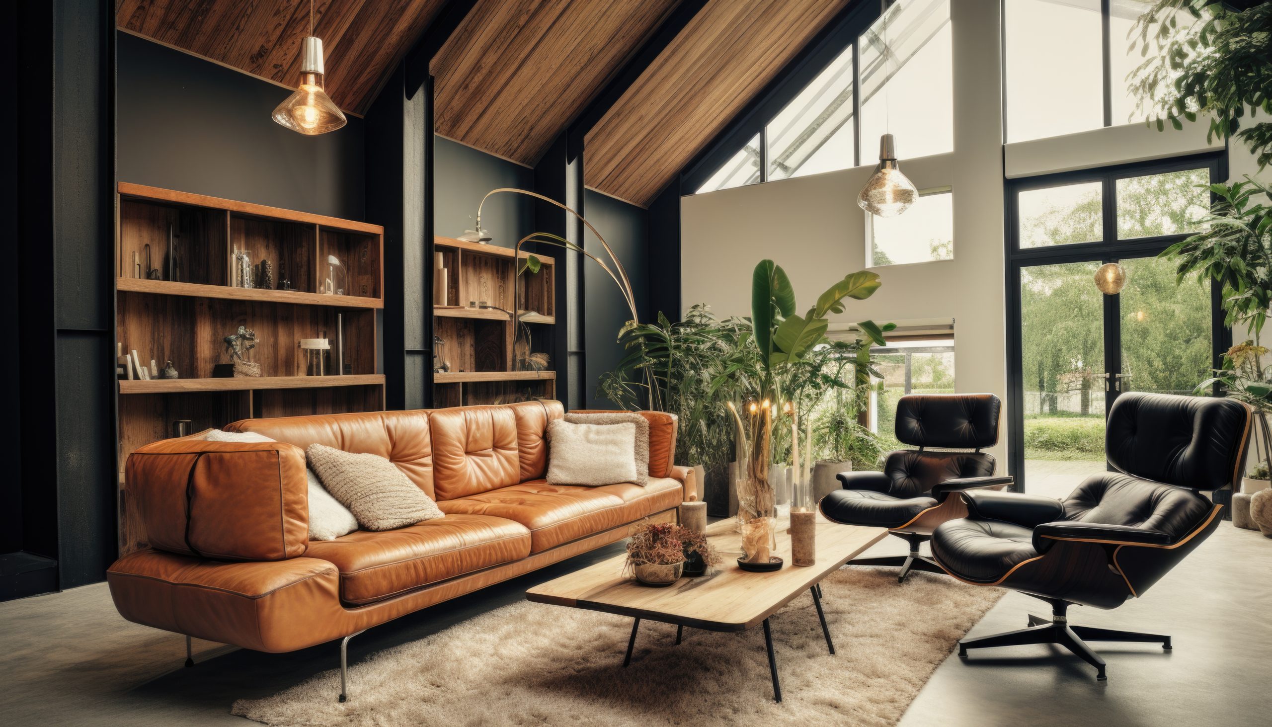
7. Industrial
One of the most exciting transformations I’ve witnessed in my design career is how industrial spaces have evolved from actual factories to some of the most sought-after residential designs. This style tells a story of urban renewal and architectural appreciation.
What makes Industrial style unique is its honest approach to materials and architecture. Think of it as the design equivalent of a documentary film – it reveals and celebrates the true nature of a space rather than trying to hide it.
Key Characteristics:
- Exposed structural elements
- Raw materials
- Open floor plans
- High ceilings
- Large windows
- Visible systems (pipes, ducts, etc.)
- Metal fixtures
- Weathered finishes
Colour Palettes: Industrial design embraces natural material colours
Primary Colours:
- Concrete greys
- Rust browns
- Metal silvers
- Brick reds
- Deep blacks
Accent Colours:
- Navy blue
- Forest green
- Burnt orange
- Weathered brass
- Copper tones
Materials That Define the Style:
- Exposed brick
- Concrete
- Steel beams
- Cast iron
- Reclaimed wood
- Metal pipe
- Wire mesh
- Aged leather
Pro Tip: When designing industrial spaces, don’t fight the building’s bones. If you have exposed pipes or ductwork, celebrate them rather than trying to hide them.
Furniture Elements:
- Metal-framed furniture
- Leather seating
- Reclaimed wood tables
- Rolling carts
- Factory-style lighting
- Workshop stools
- Steel shelving
- Vintage industrial pieces
Architectural Features:
- Exposed brick walls
- Concrete floors
- Visible support beams
- Industrial windows
- Open ductwork
- Metal staircases
- Warehouse doors
- High ceilings
Space Planning:
Industrial spaces need:
- Flexible layouts
- Defined zones in open plans
- Multiple seating areas
- Work spaces
- Entertainment zones
- Clear traffic patterns
- Conversation areas
- Multi-functional spaces
8. Urban Modern
Let’s explore Urban Modern style – a sophisticated evolution of industrial design that perfectly captures contemporary city living. This style masterfully balances metropolitan edge with comfortable living.
What makes Urban Modern special is how it takes the energy of city life and transforms it into livable, sophisticated spaces. Think of it as the perfect blend of industrial edge, modern sophistication, and contemporary comfort – ideal for those who love city living but want their home to feel like a refined sanctuary.
Key Characteristics:
- Clean architectural lines
- Mixed materials
- City influences
- Smart storage solutions
- Sophisticated colour schemes
- Contemporary artwork
- Strategic lighting
- Functional luxury
Colour Palettes: Urban Modern embraces city-inspired colours
Primary Colours:
- Concrete gray
- Charcoal
- Pure white
- Soft black
- Warm neutrals
Accent Colours:
- Deep blues
- Urban green
- Manhattan brown
- Steel blue
- Bronze metallics
Materials That Define the Style:
- Polished concrete
- Sleek metals
- Engineered wood
- Glass
- Leather
- Microfiber
- High-gloss finishes
- Textured wallcoverings
Pro Tip: In Urban Modern spaces, invest in multi-functional pieces. When you’re dealing with city-sized spaces, every piece needs to work twice as hard.
Furniture Elements:
- Low-profile sofas
- Modular seating
- Built-in storage
- Statement lighting
- Multi-functional pieces
- Floating shelves
- Glass dining tables
- Contemporary beds
Technology Integration:
Urban Modern embraces smart living:
- Hidden TV solutions
- Integrated sound systems
- Smart home features
- Automated window treatments
- Modern climate control
- Tech charging stations
- Smart lighting
- Security features
Space Planning:
Urban spaces require:
- Maximised floor plans
- Flexible layouts
- Work-from-home zones
- Entertainment areas
- Dining solutions
- Storage optimisation
- City view enhancement
- Traffic flow consideration
Styling Elements:
- Contemporary art
- City photography
- Geometric patterns
- Metal accents
- Textural contrasts
- Statement pieces
- Urban-inspired decor
- Strategic mirrors
Design Solutions:
Common urban challenges and solutions:
- Small space maximisation
- Storage integration
- Privacy solutions
- Noise reduction
- Light optimisation
- Multi-functional areas
- Entertainment spaces
- Work-life balance
Mid-Century & Scandinavian Styles
Let’s explore styles that revolutionised design through simplicity, functionality, and connection to nature.
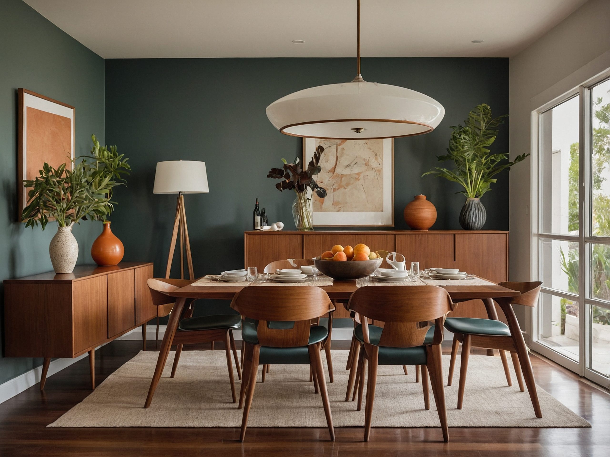
9. Mid-Century Modern
Of all 22 different interior design styles we’re exploring, Mid-Century Modern holds a special place in design history. This style’s enduring popularity isn’t just about nostalgia – it’s about timeless, functional beauty.
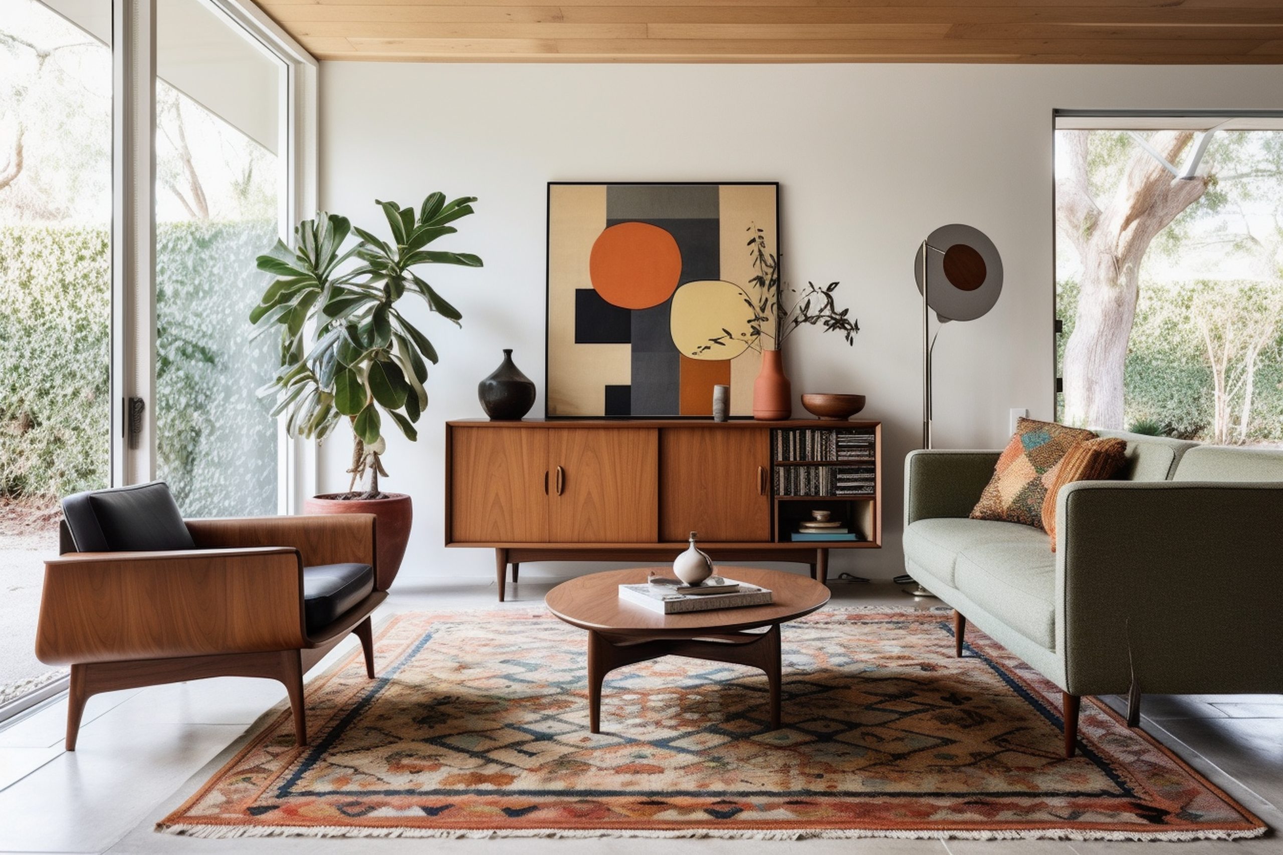
What makes Mid-Century Modern special is its perfect balance of form and function. Born roughly between the 1940s and 1970s, this style revolutionised how we think about home design. Think of it as the moment when interior design became democratic – beautiful, functional design for everyone.
Key Characteristics:
- Clean, organic lines
- Minimal ornamentation
- Mixed materials
- Indoor-outdoor connection
- Geometric patterns
- Contrasting textures
- Functionality focus
- Statement lighting
Colour Palettes: Mid-Century Modern embraces both neutral and bold colours
Primary Colours:
- Warm whites
- Natural woods
- Earthy browns
- Charcoal gray
- Black accents
Accent Colours:
- Mustard yellow
- Burnt orange
- Olive green
- Teal blue
- Brick red
Materials That Define the Style:
- Walnut and teak woods
- Molded plastic
- Glass
- Steel
- Brass
- Leather
- Vinyl
- Textured fabrics
Pro Tip: When designing Mid-Century spaces, you don’t need to fill your home with vintage pieces. Quality modern reproductions can work beautifully alongside authentic pieces.
Furniture Elements:
- Eames-style chairs
- Platform sofas
- Tulip tables
- Floating credenzas
- Tapered legs
- Egg chairs
- Organic shapes
- Built-in cabinetry
Signature Elements:
- Sunburst clocks
- Sputnik chandeliers
- Abstract art
- Geometric patterns
- Bar carts
- Plant stands
- Room dividers
- Statement lighting
Space Planning:
Mid-Century spaces emphasise:
- Open floor plans
- Conversation areas
- Indoor-outdoor flow
- Multiple seating zones
- Clear sight lines
- Natural light
- Functional zones
- Social spaces
10. Scandinavian
Let’s explore one of the most popular and enduring of our 22 different interior design styles – Scandinavian design. This style is about much more than just white walls and IKEA furniture.
What makes Scandinavian design special is its focus on creating bright, functional spaces that promote well-being. Born in Nordic countries where winter daylight is precious, this style masterfully combines beauty with practicality while emphasising connection to nature.
Key Characteristics:
- Light and airy spaces
- Minimal decor
- Natural materials
- Functional design
- Clean lines
- Cosy elements (hygge)
- Abundant light
- Clutter-free surfaces
Colour Palettes: Scandinavian design embraces light, natural colours
Primary Colours:
- Crisp whites
- Soft greys
- Pale woods
- Light beiges
- Gentle blacks
Accent Colours:
- Sage green
- Dusty blue
- Pale pink
- Soft yellow
- Muted terracotta
Materials That Define the Style:
- Light woods (especially pine and birch)
- Natural textiles
- Wool
- Leather
- Sheepskin
- Linen
- Stone
- Glass
Pro Tip: When designing Scandinavian spaces, always remember that creating hygge (cosy comfort) is just as important as maintaining minimalism. It’s about finding that perfect balance.
Furniture Elements:
- Clean-lined sofas
- Wooden dining sets
- Platform beds
- Built-in storage
- Reading nooks
- Window seats
- Functional workspaces
- Simple chairs
Textile Elements:
Creating warmth through:
- Chunky knit throws
- Natural fibre rugs
- Simple curtains
- Sheepskin throws
- Linen upholstery
- Cotton pillows
- Woven textiles
- Natural fibre carpets
Creating Hygge:
Essential elements for cosiness:
- Candles
- Soft lighting
- Reading corners
- Natural elements
- Comfortable seating
- Warm textures
- Personal touches
- Indoor plants
Space Planning:
Scandinavian spaces require:
- Maximised natural light
- Clear pathways
- Functional zones
- Storage solutions
- Social areas
- Quiet corners
- Work spaces
- Family areas
Modern Interpretation:
How to make Scandinavian style work today:
- Smart storage solutions
- Technology integration
- Multi-functional furniture
- Sustainable materials
- Modern conveniences
- Family-friendly solutions
- Work-from-home spaces
- Entertainment areas
Bohemian & Global Styles
Let’s explore styles that celebrate cultural diversity, personal expression, and artistic freedom.
11. Bohemian
Of all the styles we’re exploring, Bohemian (or ‘Boho’) is perhaps the most free-spirited and personal. This style is less about following rules and more about breaking them creatively.
What makes Bohemian style special is its celebration of individuality and artistic expression. Think of it as the design equivalent of jazz improvisation – there’s an underlying structure, but the beauty comes from personal interpretation and unexpected combinations.
Key Characteristics:
- Layer upon layer of textures
- Mixed patterns
- Global influences
- Collected items
- Plants and natural elements
- Rich colours
- Personal mementos
- Artistic expression
Colour Palettes: Bohemian style embraces bold, varied colours
Primary Colours:
- Jewel tones
- Earth tones
- Deep browns
- Rich reds
- Warm oranges
Accent Colours:
- Emerald green
- Peacock blue
- Purple
- Gold
- Turquoise
Materials That Define the Style:
- Natural fibers
- Woven textiles
- Rattan and bamboo
- Vintage fabrics
- Mixed woods
- Metallic accents
- Crystal
- Glass
Pro Tip: When creating Bohemian spaces, start with a neutral base, then layer in colours, patterns, and meaningful pieces over time. It should look collected, not decorated.
Furniture Elements:
- Low-slung seating
- Floor cushions
- Vintage pieces
- Hanging chairs
- Mixed dining chairs
- Carved wooden pieces
- Layered rugs
- Statement headboards
Textiles and Patterns:
Essential to Boho style:
- Persian rugs
- Suzani fabrics
- Ikat prints
- Macramé
- Tapestries
- Kilim pillows
- Moroccan textiles
- Indian block prints
Decorative Elements:
- Plants (lots of them!)
- Global artifacts
- Crystals and geodes
- Vintage maps
- Musical instruments
- Art books
- Handmade pieces
- Gallery walls
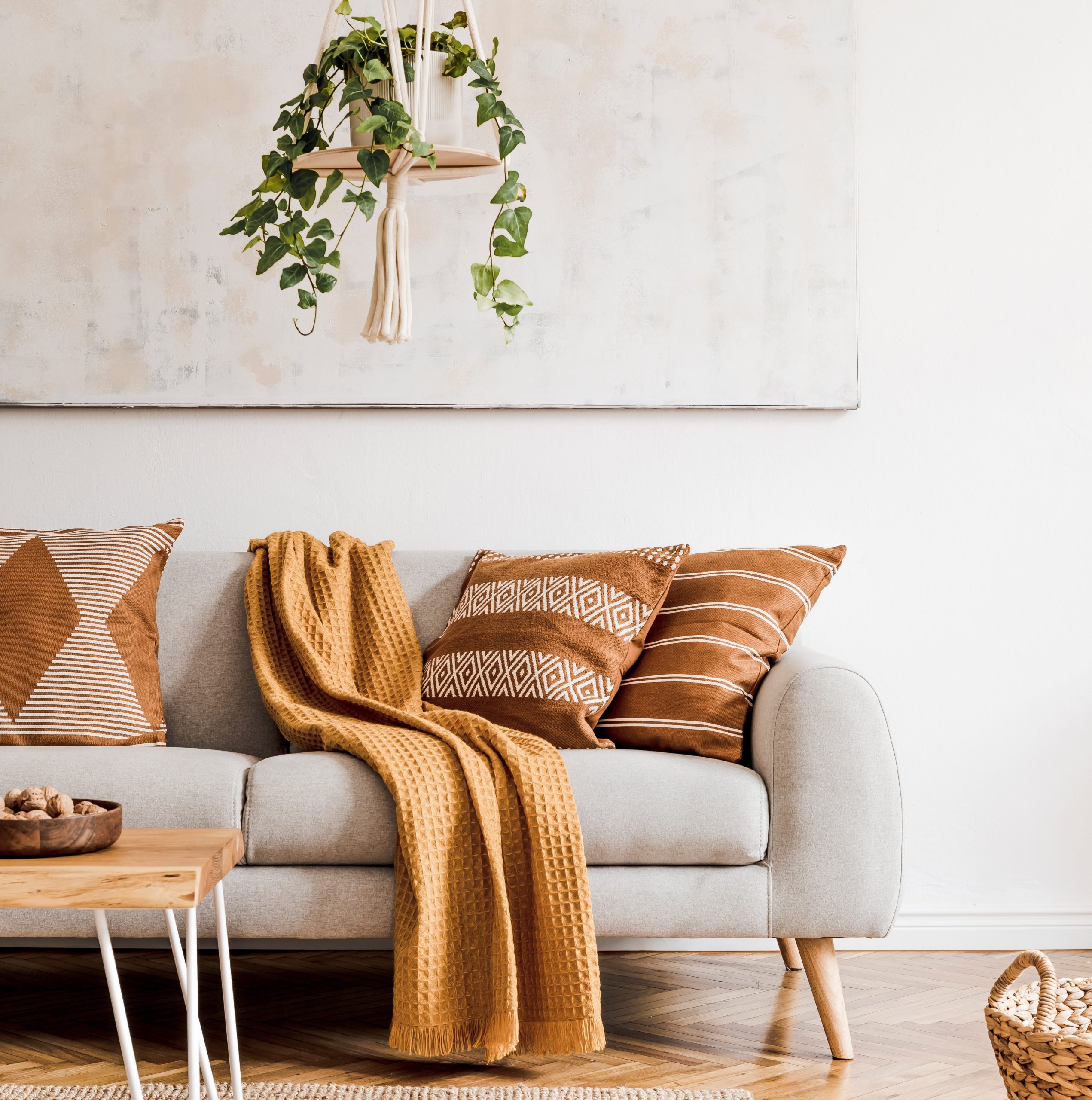
12. Global
As we continue exploring our 22 different interior design styles, let’s dive into Global style – a sophisticated approach to incorporating worldwide design influences. This style is about creating thoughtful, culturally-rich interiors that tell stories of places and traditions.
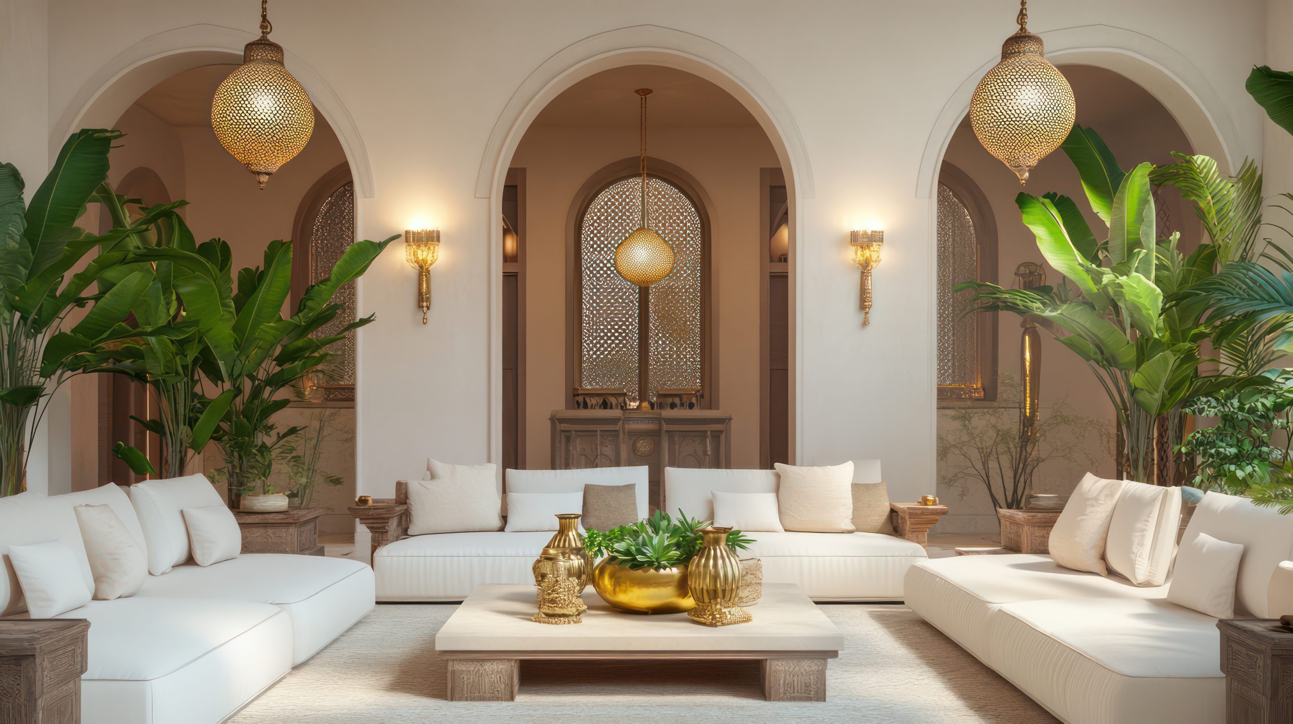
What makes Global style special is its ability to weave together influences from different cultures while maintaining respect for their origins. Think of it as creating a well-curated museum of your world travels, but in a way that’s completely livable and personal.
Key Characteristics:
- Cultural artwork
- Handcrafted elements
- Rich textures
- Traditional patterns
- Natural materials
- Meaningful accessories
- Mixed metals
- Authentic pieces
Colour Palettes: Global style embraces rich, earth-inspired colours
Primary Colours:
- Spice market reds
- Terra cotta
- Deep browns
- Rich golds
- Warm neutrals
Accent Colours:
- Indigo blue
- Saffron yellow
- Mediterranean blue
- Desert rose
- Forest green
Materials That Define the Style:
- Hand-carved woods
- Hammered metals
- Natural fibers
- Handwoven textiles
- Ceramic tiles
- Stone
- Leather
- Silk
Pro Tip: When designing Global spaces, remember that authenticity is key. One genuine piece tells a better story than multiple mass-produced “global-inspired” items.
Furniture Elements:
- Hand-carved chairs
- Low seating options
- Wooden chests
- Metal-worked tables
- Floor cushions
- Painted cabinets
- Prayer benches
- Intricate screens
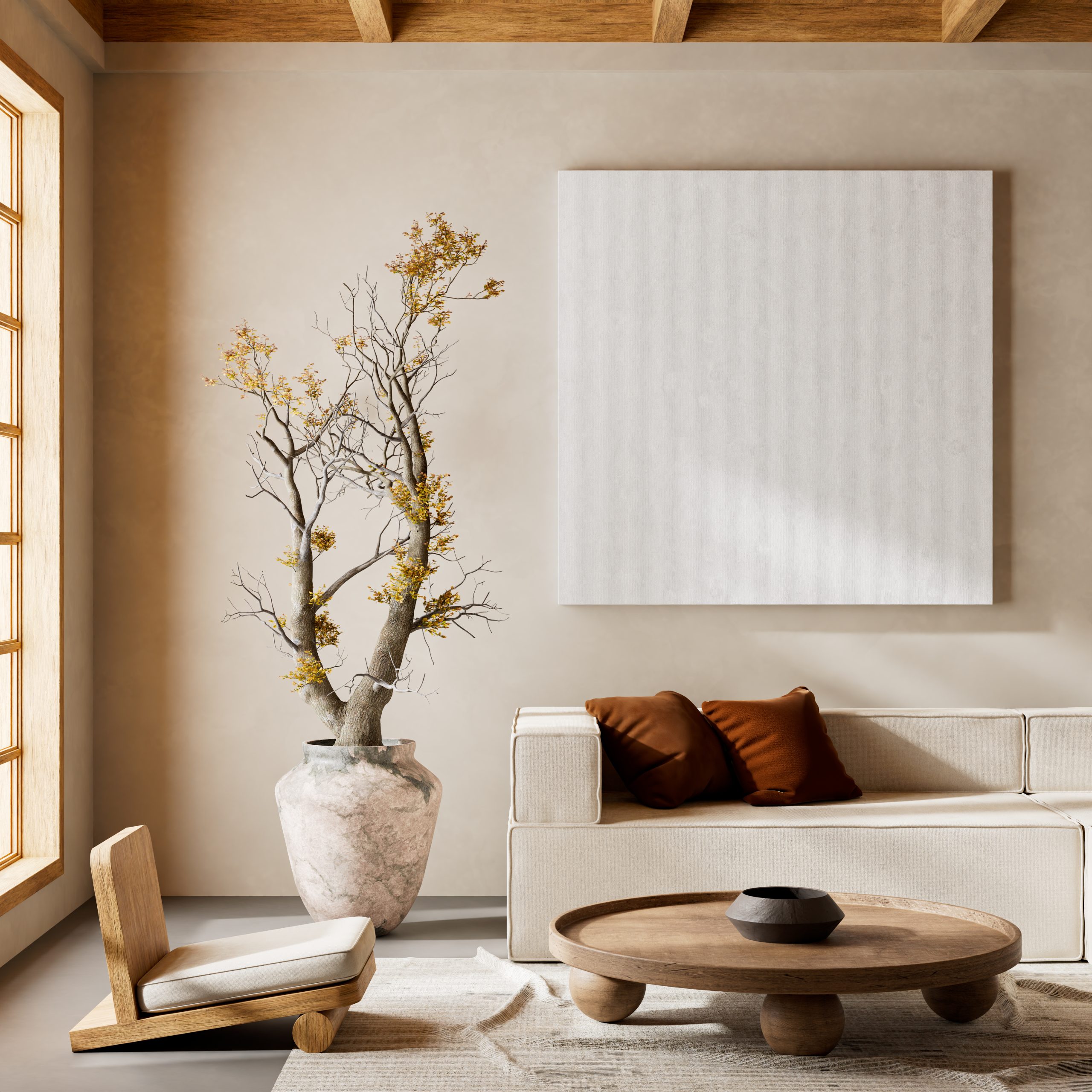
Cultural Elements:
Thoughtful incorporation of:
- African masks
- Moroccan lanterns
- Indian textiles
- Chinese ceramics
- Turkish rugs
- Japanese screens
- Mexican pottery
- Persian carpets
Space Planning:
Global spaces require:
- Conversation areas
- Display spaces
- Meditation corners
- Social gathering spots
- Cultural zones
- Reading nooks
- Collection displays
- Flexible seating
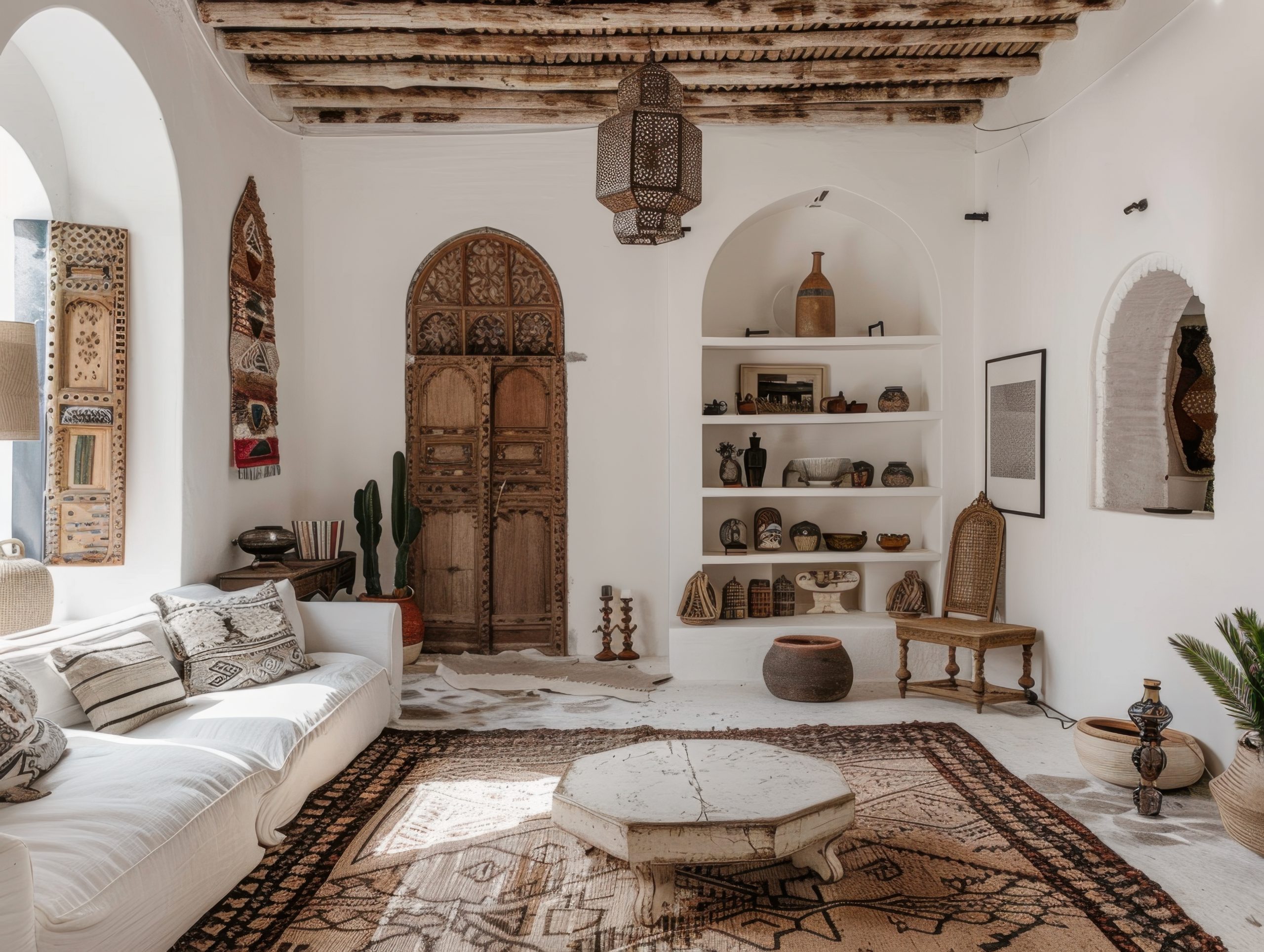
Styling Guidelines:
- Mix textures thoughtfully
- Layer patterns carefully
- Create visual stories
- Group similar items
- Balance colours
- Include natural elements
- Add meaningful lighting
- Create focal points
Common Mistakes to Avoid:
- Over-mixing cultures
- Using inauthentic pieces
- Creating a bazaar look
- Forgetting about comfort
- Overlooking quality
- Missing personal connection
Coastal & Mediterranean Styles
Let’s explore styles that bring the essence of waterfront living and sun-drenched shores into our homes.
13. Coastal
Of all the styles we’re discussing, coastal design instantly transports you to a more relaxed state of mind. This style is about much more than seashells and anchors.
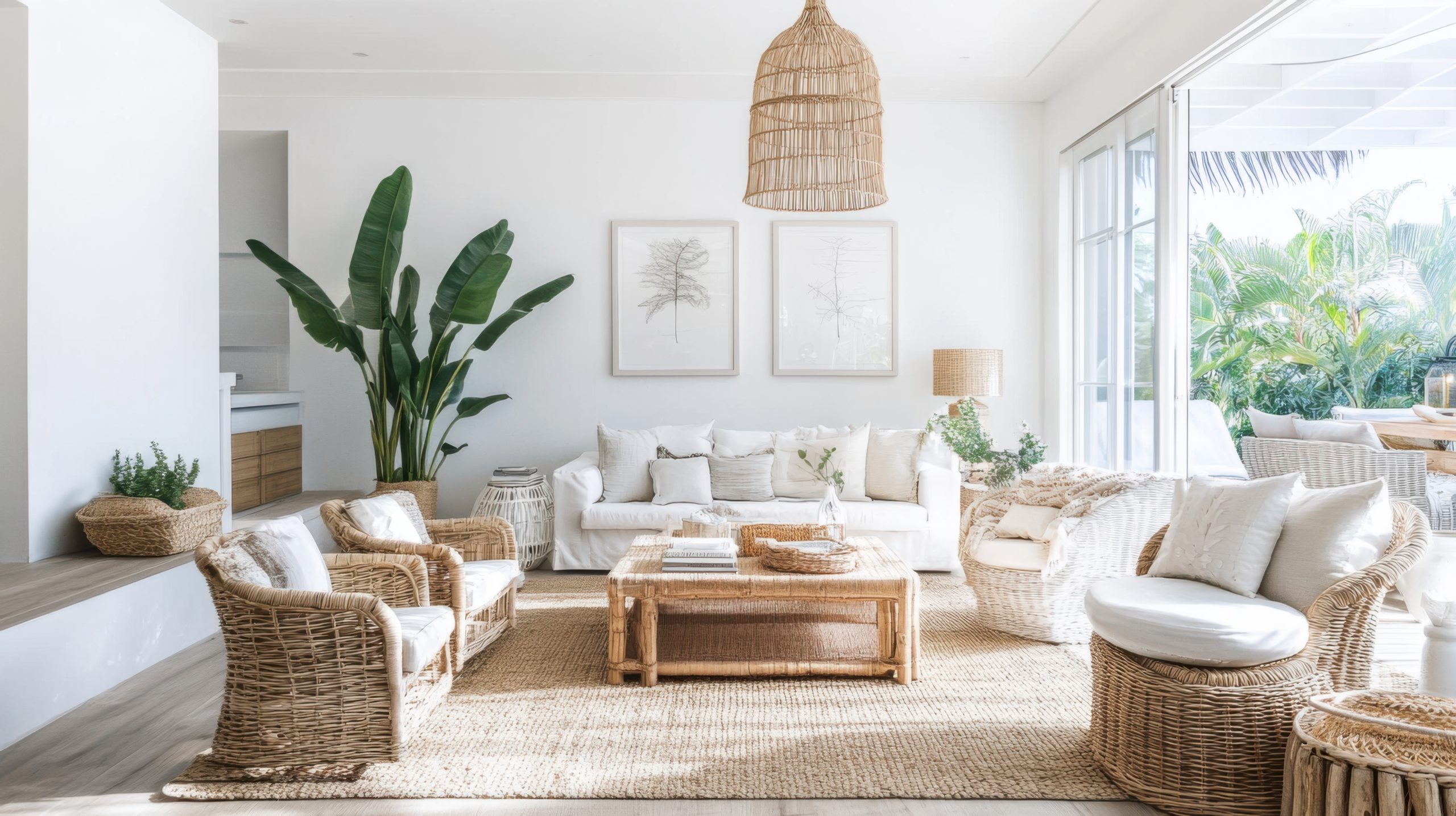
What makes Coastal style special is its ability to create a vacation-like atmosphere while maintaining sophistication and livability. Think of it as bottling the feeling of a perfect beach day and infusing it into your daily living space.
Key Characteristics:
- Light and airy spaces
- Natural light abundance
- Ocean-inspired colours
- Relaxed furnishings
- Natural textures
- Clean lines
- Beachy elements
- Uncluttered spaces
Colour Palettes: Coastal design draws from nature’s seaside palette
Primary Colours:
- Crisp whites
- Sandy beiges
- Ocean blues
- Soft greys
- Driftwood taupes
Accent Colours:
- Sea glass green
- Coral pink
- Navy blue
- Shell pink
- Seafoam
Materials That Define the Style:
- Weathered wood
- Natural fibers
- Linen
- Cotton
- Rope
- Seagrass
- Jute
- Glass
Pro Tip: When designing coastal spaces, suggest the beach rather than recreate it literally. One beautiful piece of coral on a coffee table speaks volumes more than a room full of seashells.
Furniture Elements:
- Slipcovered sofas
- Woven chairs
- Painted wood pieces
- Glass-top tables
- Upholstered headboards
- Window seats
- Rattan accents
- Built-in storage

Textile Choices:
- Cotton duck
- Linen
- Performance fabrics
- Natural fibre rugs
- Textured throws
- Striped pillows
- Woven blinds
- Light curtains
Essential Elements:
- Natural fibre rugs
- Woven baskets
- Glass vessels
- Driftwood pieces
- Abstract seascapes
- White ceramics
- Beach grass
- Mirror accents
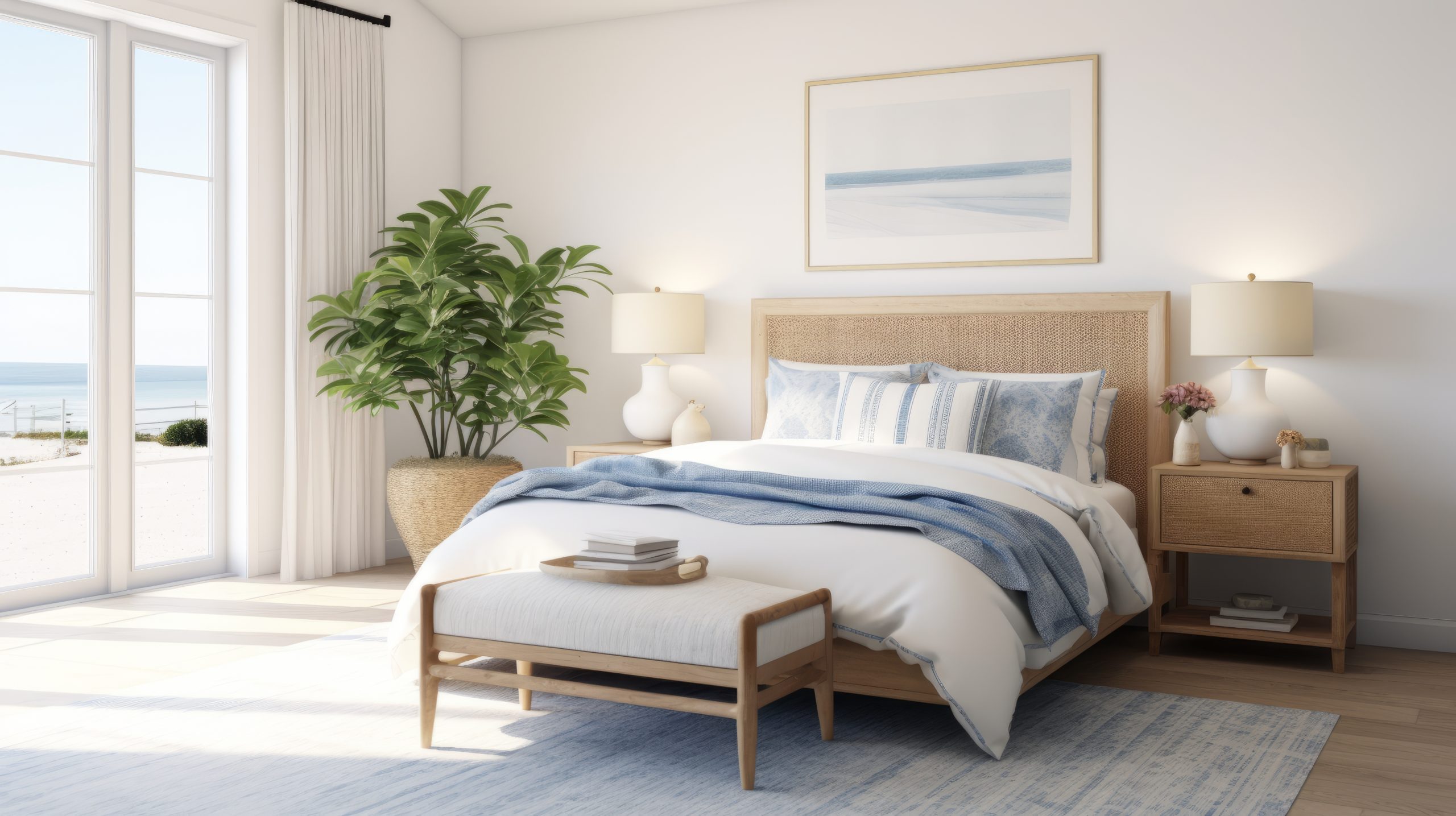
14. Mediterranean
Let’s explore Mediterranean style – a design approach that captures the warmth and romance of seaside villas in Italy, Spain, and Greece. This style is about creating spaces that feel both luxurious and incredibly livable.
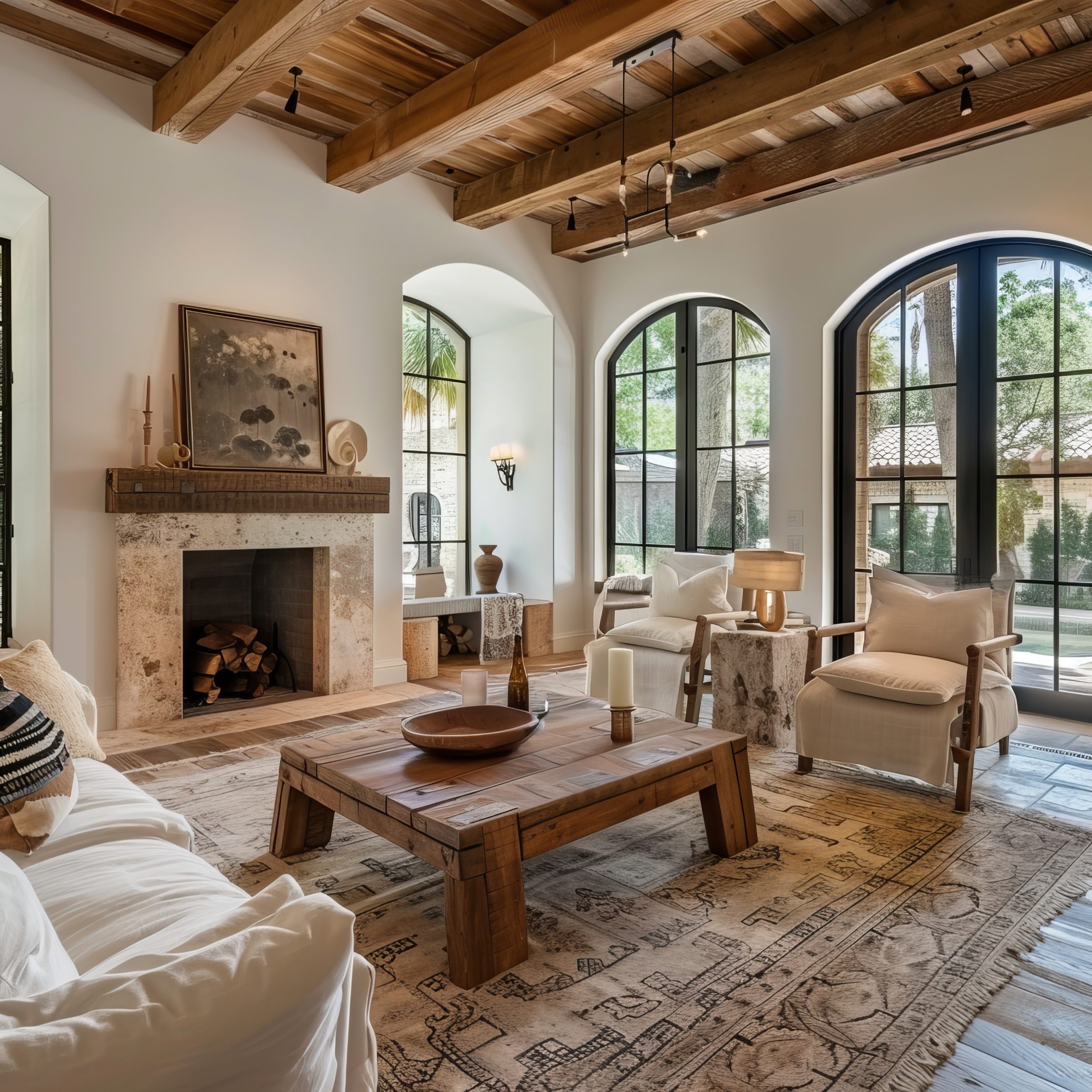
What makes Mediterranean style special is its ability to blend indoor and outdoor living while celebrating craftsmanship and natural materials. Think of it as bringing the sun-drenched charm of the Mediterranean coast into your daily life, complete with all the texture and warmth that implies.
Key Characteristics:
- Textured walls
- Arched doorways
- Terra cotta tiles
- Wrought iron details
- Indoor-outdoor flow
- Warm colours
- Hand-crafted elements
- Natural materials
Colour Palettes: Mediterranean design embraces sun-warmed colours
Primary Colours:
- Terra cotta
- Warm whites
- Sandy beiges
- Ocean blues
- Olive greens
Accent Colours:
- Burnt orange
- Deep reds
- Sea blue
- Cypress green
- Golden yellow
Materials That Define the Style:
- Terra cotta
- Natural stone
- Wrought iron
- Ceramic tiles
- Carved wood
- Marble
- Copper
- Mosaic tiles
Pro Tip: When designing Mediterranean spaces, always remember that authenticity in materials is key. One real terra cotta floor will add more character than any amount of faux finishing.
Furniture Elements:
- Heavy wooden pieces
- Wrought iron beds
- Carved details
- Upholstered dining chairs
- Built-in seating
- Wooden benches
- Ornate occasional tables
- Outdoor furniture
Architectural Elements:
- Stucco walls
- Arched windows
- Carved doors
- Exposed beams
- Tiled roofs
- Stone floors
- Column details
- Courtyard connections
Decorative Features:
- Colourful tiles
- Pottery and urns
- Iron light fixtures
- Fountain features
- Mediterranean art
- Ceramic plates
- Fresh herbs
- Olive trees
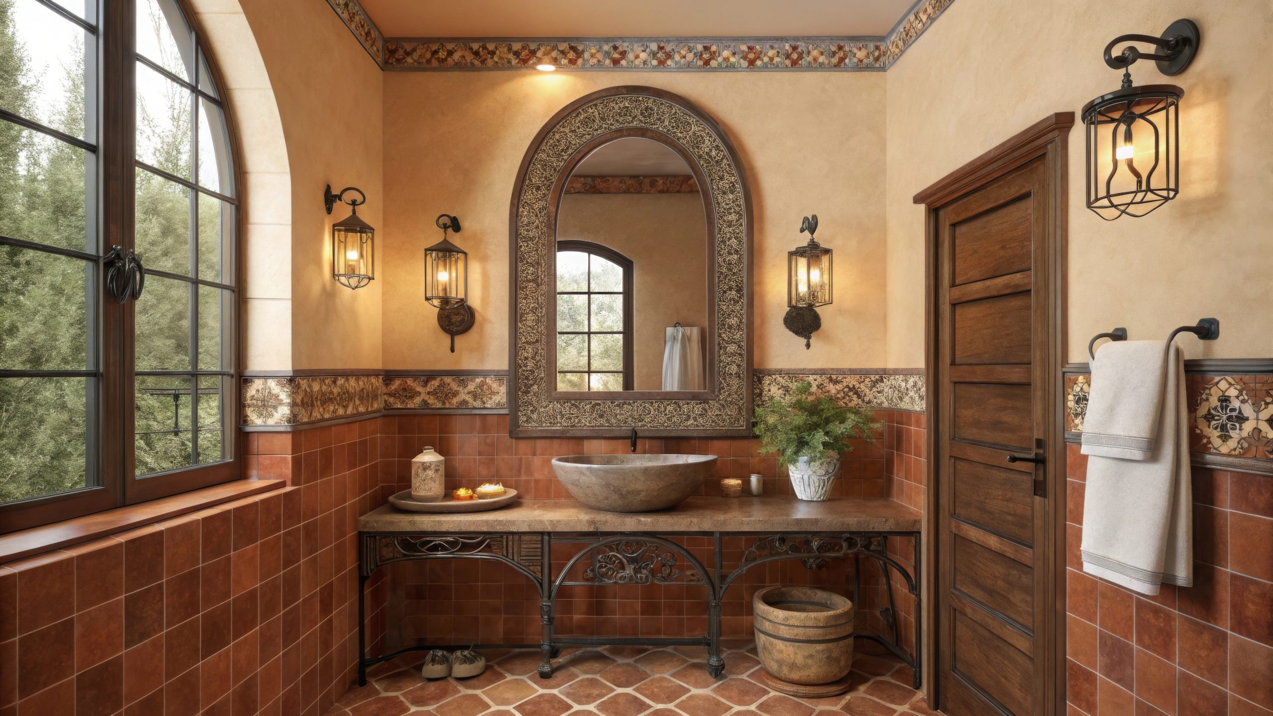
Space Planning:
Mediterranean homes emphasise:
- Flow between spaces
- Outdoor living areas
- Formal dining spaces
- Gathering spots
- Kitchen as a focal point
- Courtyard access
- Natural light
- View maximisation
Creating Authenticity:
Essential elements for true Mediterranean style:
- Use genuine materials
- Include water features
- Embrace outdoor living
- Add handcrafted touches
- Include local materials
- Create gathering spaces
- Incorporate plants
- Focus on natural light
Rustic & Farmhouse Styles
Let’s explore styles that celebrate natural materials, simplicity, and a connection to rural living.
15. Rustic
Among our 22 different interior design styles, Rustic design stands out for its raw authenticity. This style is about celebrating nature in its most honest form.
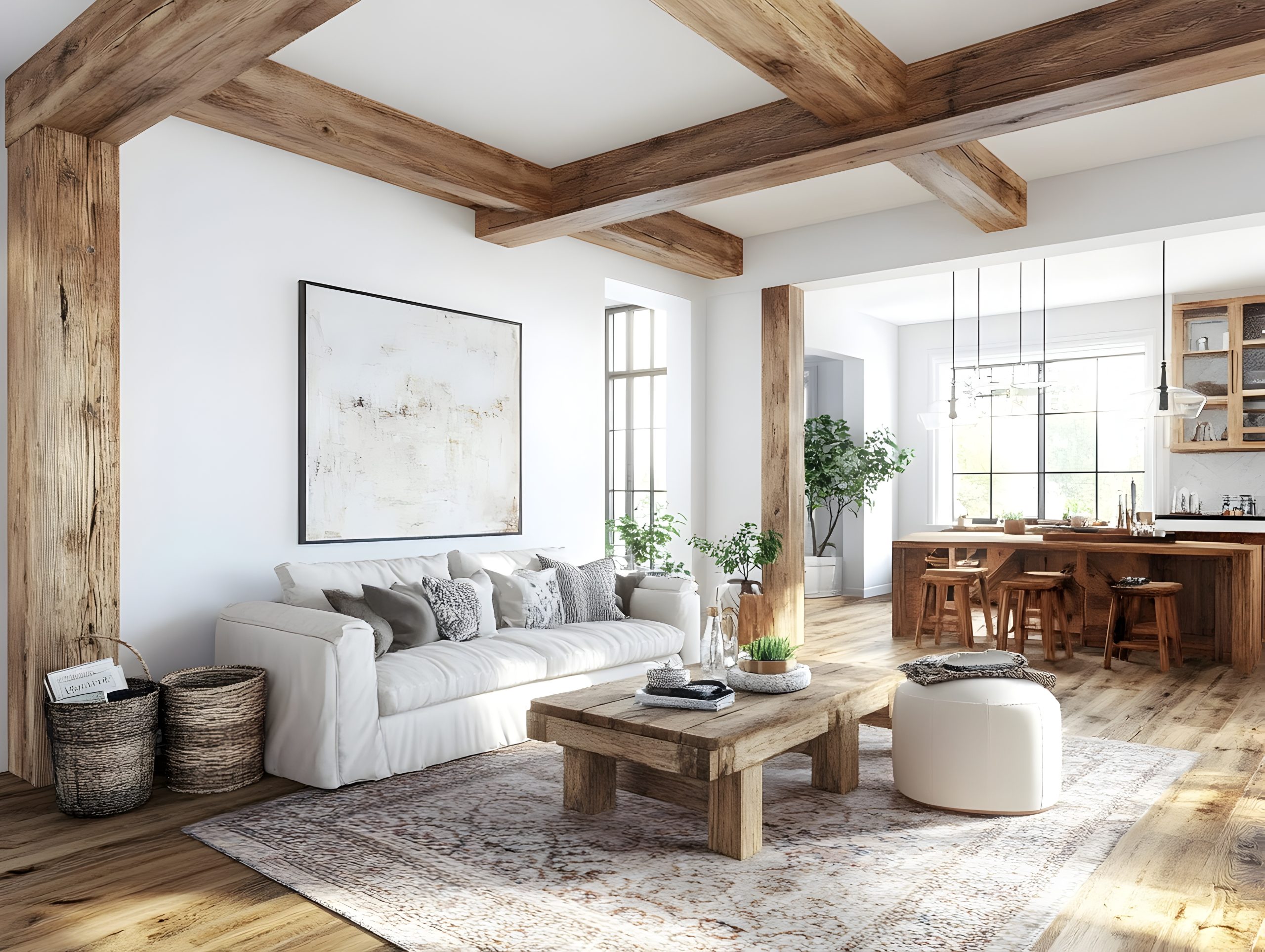
What makes Rustic style special is its ability to bring the outdoors in while creating spaces that feel both grounding and cosy. Think of it as living in harmony with nature, where every material tells a story and imperfections are celebrated rather than hidden.
Key Characteristics:
- Natural materials
- Rough textures
- Exposed beams
- Stone elements
- Weathered wood
- Organic shapes
- Hand-crafted items
- Natural colour schemes
Colour Palettes: Rustic design draws from nature’s own palette
Primary Colours:
- Wood browns
- Stone grays
- Forest greens
- Earth tones
- Warm whites
Accent Colours:
- Deep reds
- Hunter green
- Charcoal
- Leather brown
- Copper tones
Materials That Define the Style:
- Reclaimed wood
- Natural stone
- Rough-hewn beams
- Raw metals
- Leather
- Burlap
- Wool
- Branch elements
Pro Tip: When designing rustic spaces, remember that authenticity is everything. One genuine piece of weathered wood furniture will add more character than an entire room of faux-distressed items.
Furniture Elements:
- Log furniture
- Live-edge tables
- Leather seating
- Wooden benches
- Iron bed frames
- Stone-based tables
- Handcrafted pieces
- Timber storage
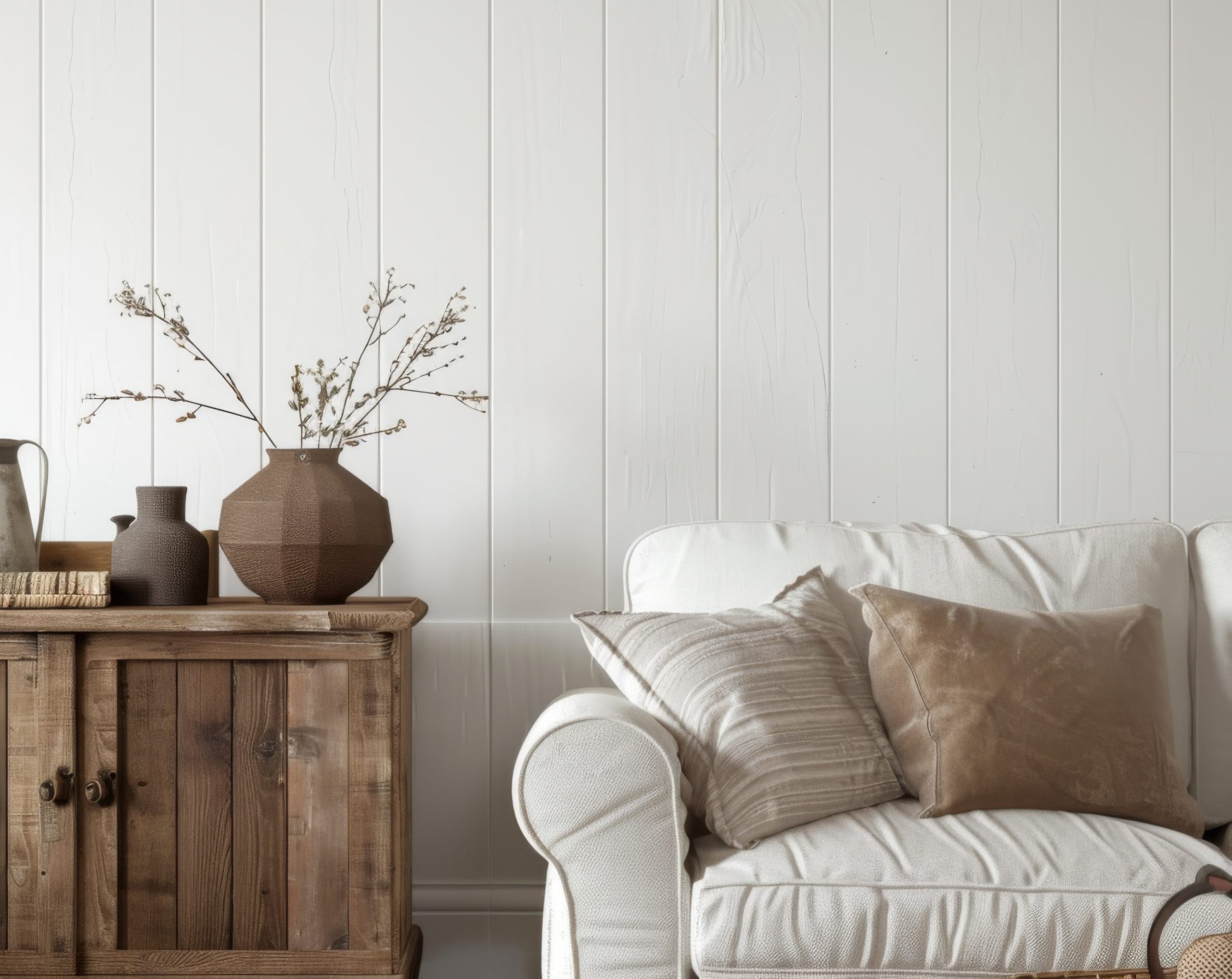
Architectural Features:
- Exposed ceiling beams
- Stone fireplaces
- Wood-planked walls
- Rough-hewn columns
- Natural floors
- Timber framing
- Wide plank flooring
- Stone accents
Styling Elements:
- Antlers
- Woven baskets
- Iron hardware
- Vintage tools
- Natural textiles
- Handwoven rugs
- Ceramic pottery
- Native plants
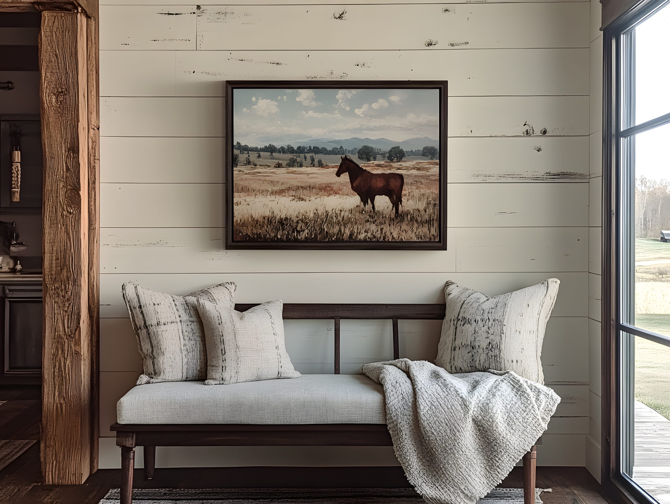
16. Modern Farmhouse
One of the most popular of our 22 different interior design styles today is Modern Farmhouse. This style perfectly balances rustic charm with contemporary convenience, and that’s exactly why people love it.
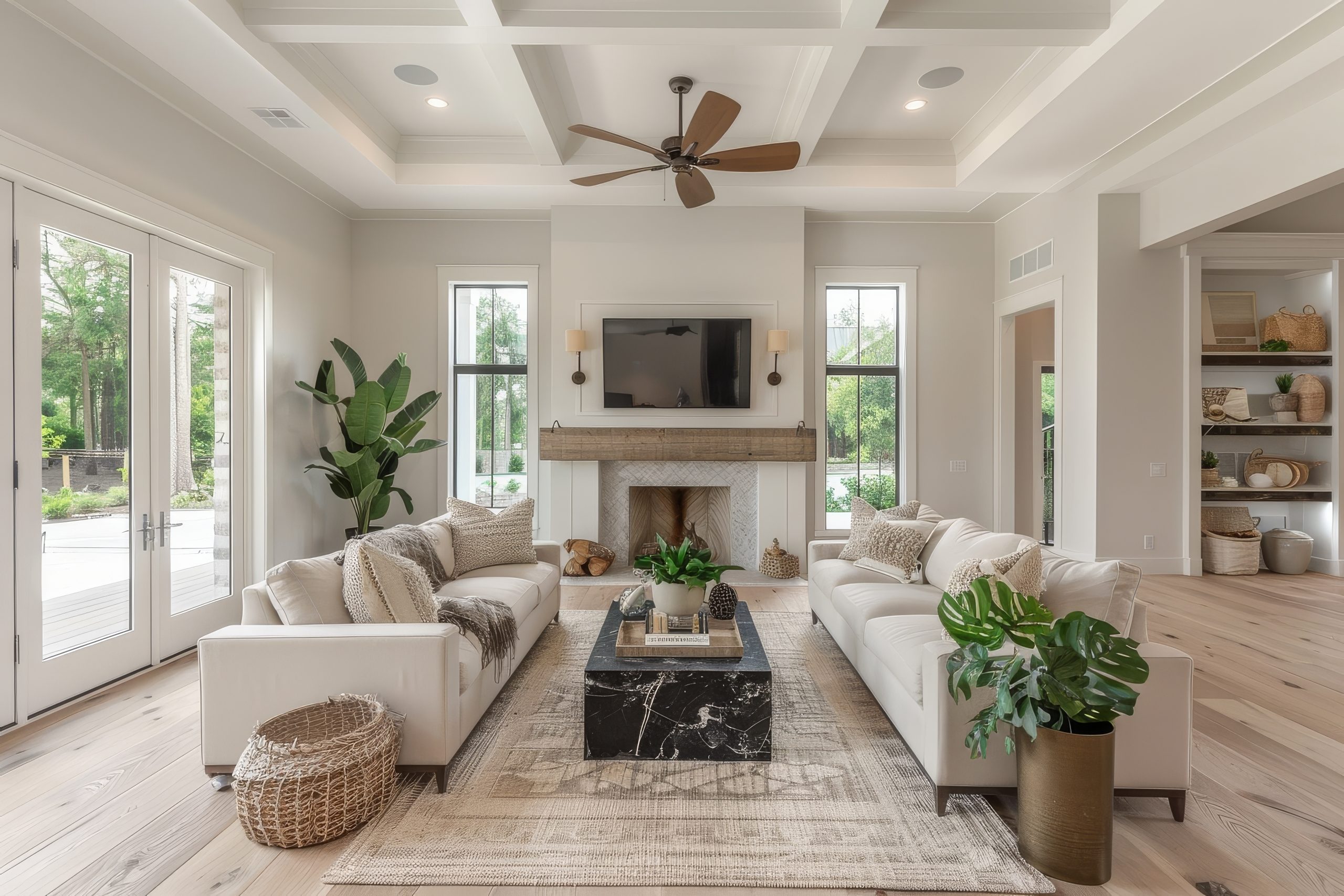
What makes Modern Farmhouse special is its ability to combine the comfort and warmth of traditional farmhouse style with clean, modern elements. Think of it as taking the best of country living and updating it for today’s lifestyle – comfortable but never cluttered, rustic but never rough.
Key Characteristics:
- Clean lines with rustic touches
- Shiplap walls
- Mixed metals
- Industrial accents
- Natural textures
- Neutral colour palette
- Vintage elements
- Modern conveniences
Colour Palettes: Modern Farmhouse embraces a refined neutral palette
Primary Colours:
- Crisp whites
- Warm greys
- Soft blacks
- Creamy neutrals
- Natural wood tones
Accent Colours:
- Navy blue
- Sage green
- Iron black
- Aged brass
- Weathered bronze
Materials That Define the Style:
- Painted wood
- Wrought iron
- Galvanized metal
- Natural fibers
- Cotton
- Linen
- Stone
- Aged brass
Pro Tip: When designing Modern Farmhouse spaces, remember that restraint is key. You want to suggest farmhouse living without creating a country theme park.
Furniture Elements:
- Slipcovered sofas
- Windsor chairs
- Industrial lighting
- Farmhouse tables
- Metal bed frames
- Open shelving
- Storage ottomans
- X-back chairs
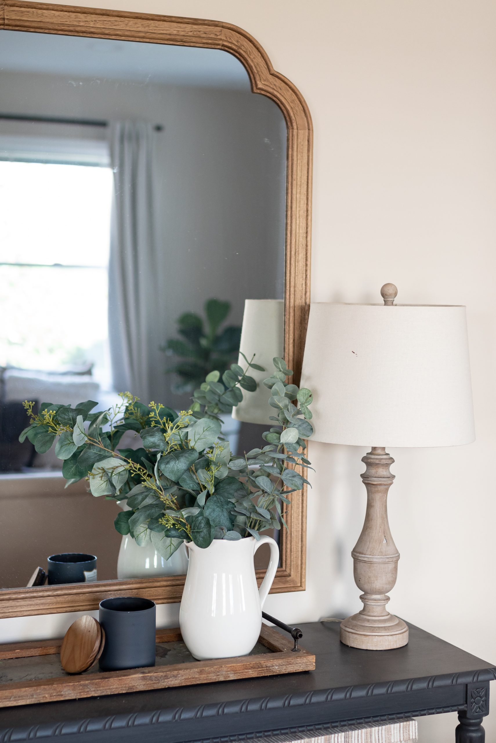
Signature Elements:
- Apron sinks
- Barn doors
- Industrial lighting
- Open shelving
- Vintage signs
- Woven baskets
- Metal hardware
- Natural textiles
Space Planning:
Modern Farmhouse spaces emphasise:
- Open concept living
- Gathering spaces
- Functional kitchens
- Mudroom areas
- Indoor-outdoor flow
- Family-friendly layouts
- Entertainment zones
- Practical storage
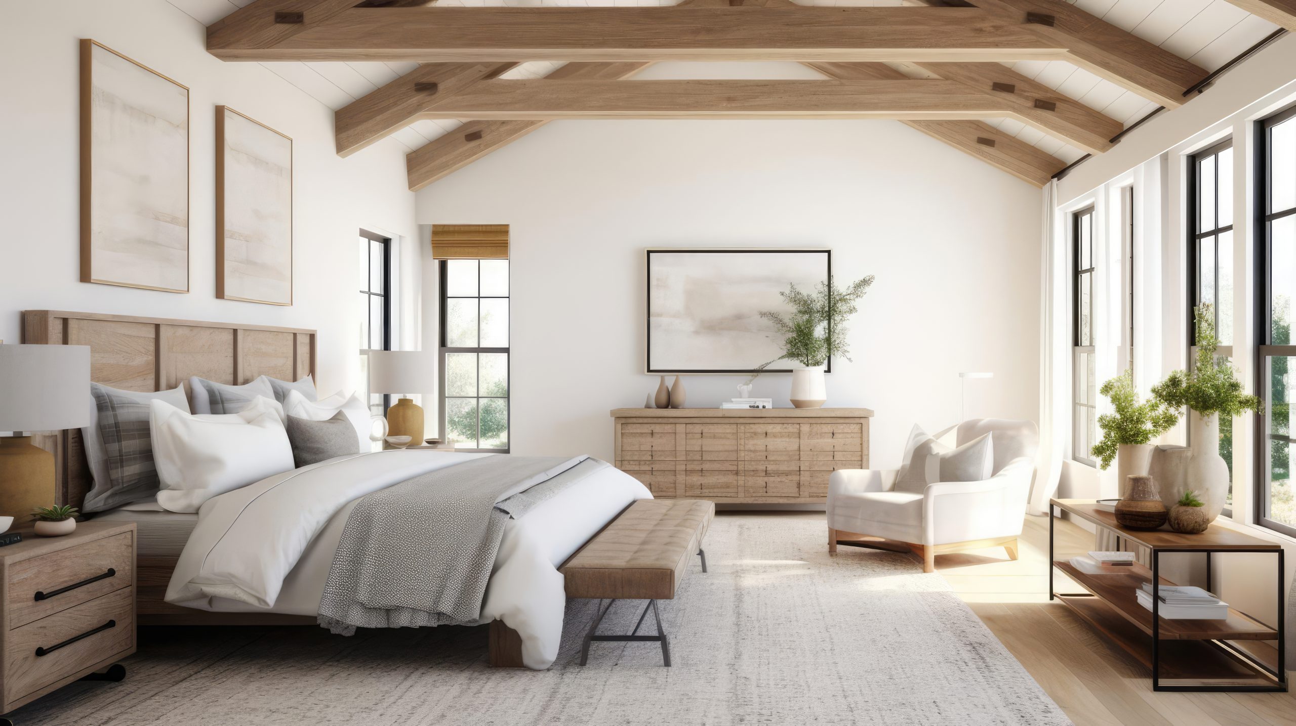
Design Details:
Essential elements include:
- Board and batten
- Shiplap walls
- Exposed beams
- Industrial hardware
- Mixed metals
- Natural wood accents
- Vintage touches
- Modern appliances
Styling Guidelines:
- Mix old and new pieces
- Layer textures thoughtfully
- Keep accessories minimal
- Include natural elements
- Add industrial touches
- Maintain clean lines
- Incorporate vintage finds
- Focus on functionality
Art Deco & Transitional Styles
Let’s explore styles that either celebrate glamorous sophistication or masterfully blend different design elements.
17. Art Deco
Among our 22 different interior design styles, Art Deco stands out for its unabashed glamour and geometric precision. This style is about celebrating luxury, modernity, and artistic expression in its boldest form.
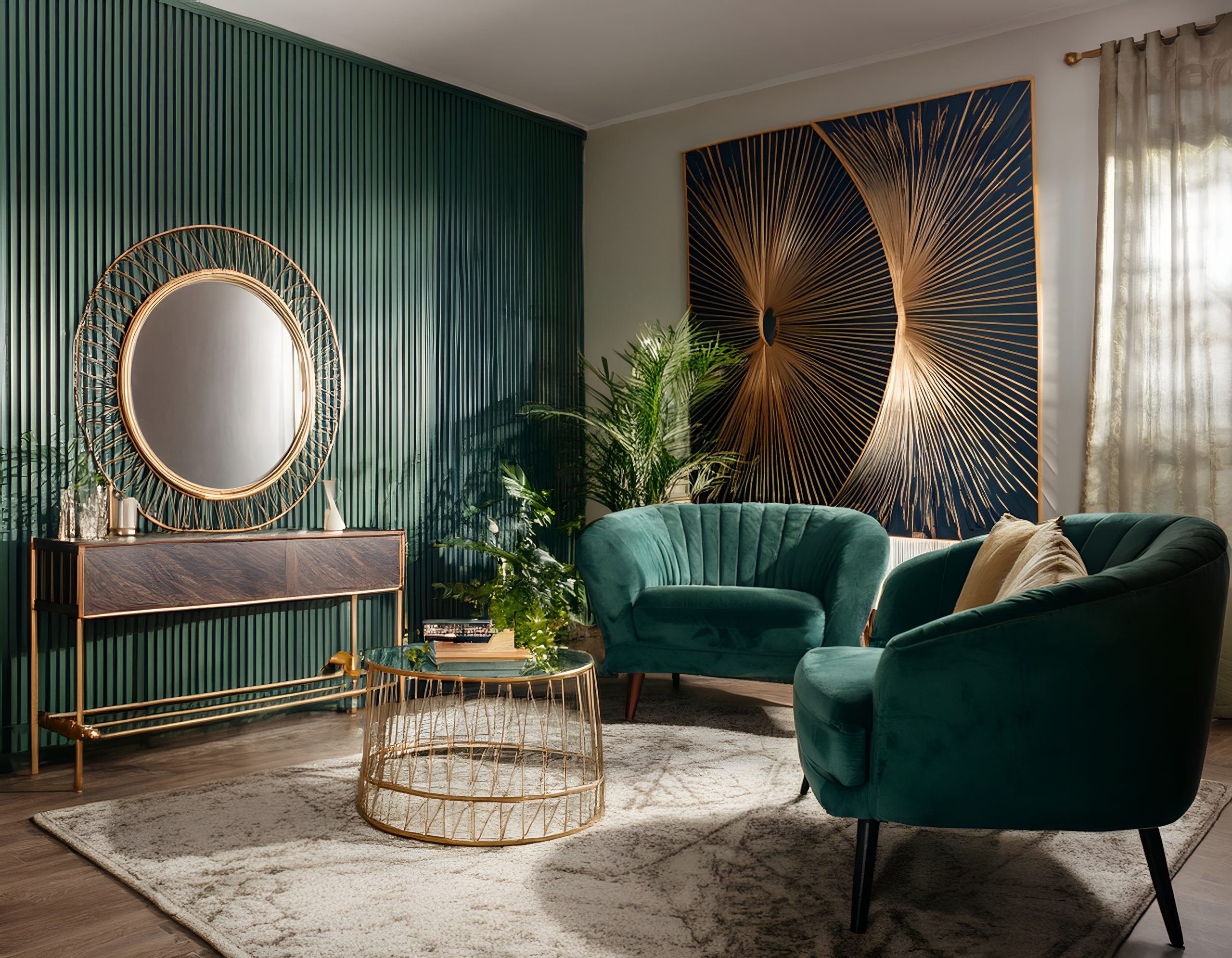
What makes Art Deco special is its perfect balance of sophistication and drama. Born in the 1920s and 1930s, this style represents the height of pre-war elegance. Think of it as the Great Gatsby of interior design – bold, confident, and unapologetically luxurious.
Key Characteristics:
- Bold geometric patterns
- Symmetrical designs
- Stepped forms
- Sunburst motifs
- High-gloss finishes
- Luxurious materials
- Strong vertical lines
- Dramatic lighting
Colour Palettes: Art Deco embraces bold, dramatic colours
Primary Colours:
- Black and white
- Gold
- Silver
- Deep greens
- Rich blues
Accent Colours:
- Ruby red
- Emerald green
- Sapphire blue
- Bronze
- Pearl white
Materials That Define the Style:
- Polished stone
- Chrome
- Brass
- Mirror
- Glass
- Exotic woods
- Lacquer
- Velvet
Pro Tip: When designing Art Deco spaces, remember that each piece should feel like a work of art. This style is about making statements, not playing it safe.
Furniture Elements:
- Curved club chairs
- Streamlined sofas
- Mirrored furniture
- Chrome-based tables
- Geometric cabinets
- High-gloss sideboards
- Built-in shelving
- Statement seating
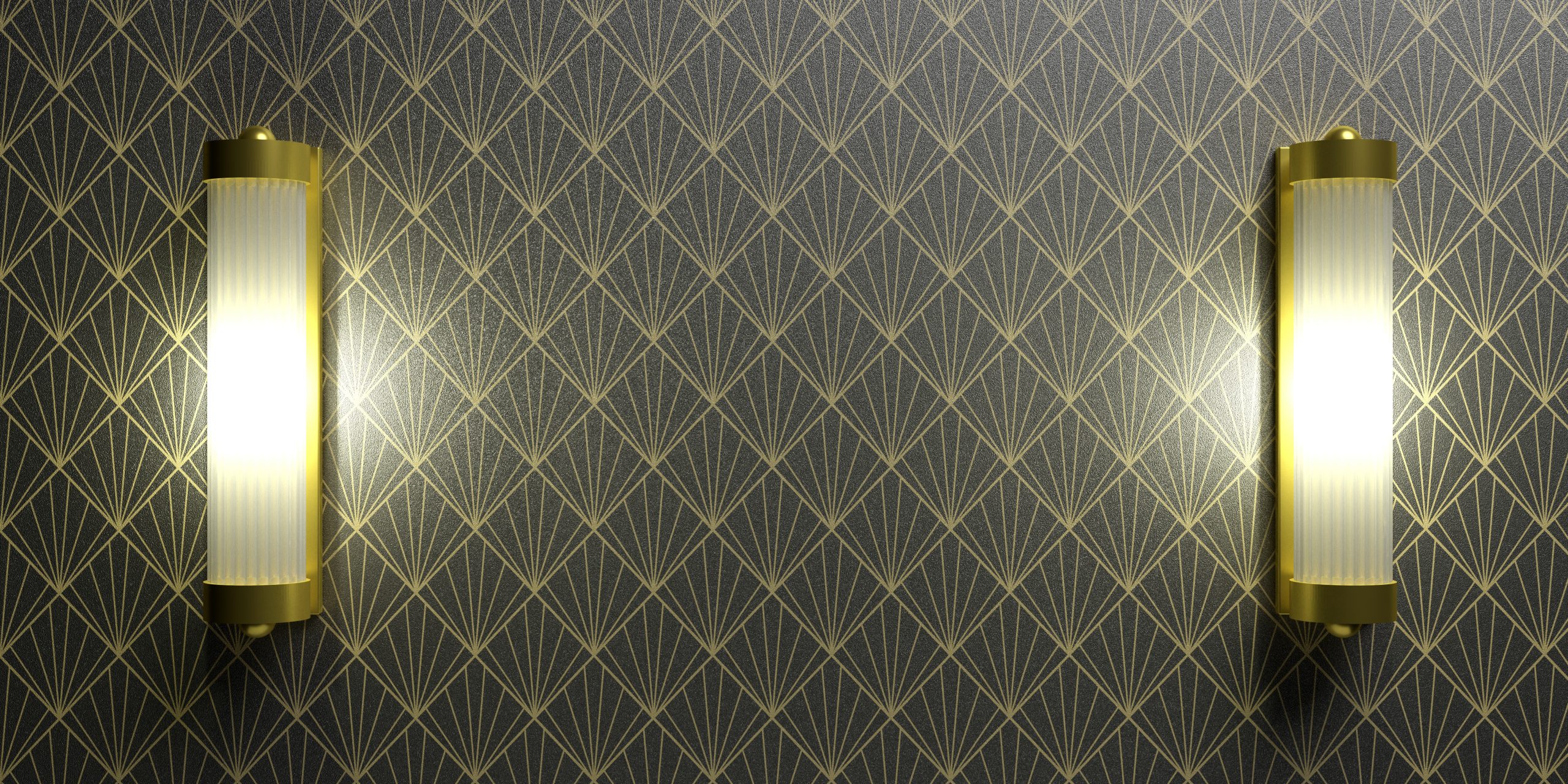
Decorative Features:
- Tiered chandeliers
- Wall sconces
- Geometric mirrors
- Abstract statuary
- Zigzag patterns
- Fan motifs
- Exotic animal prints
- Metallic sculptures
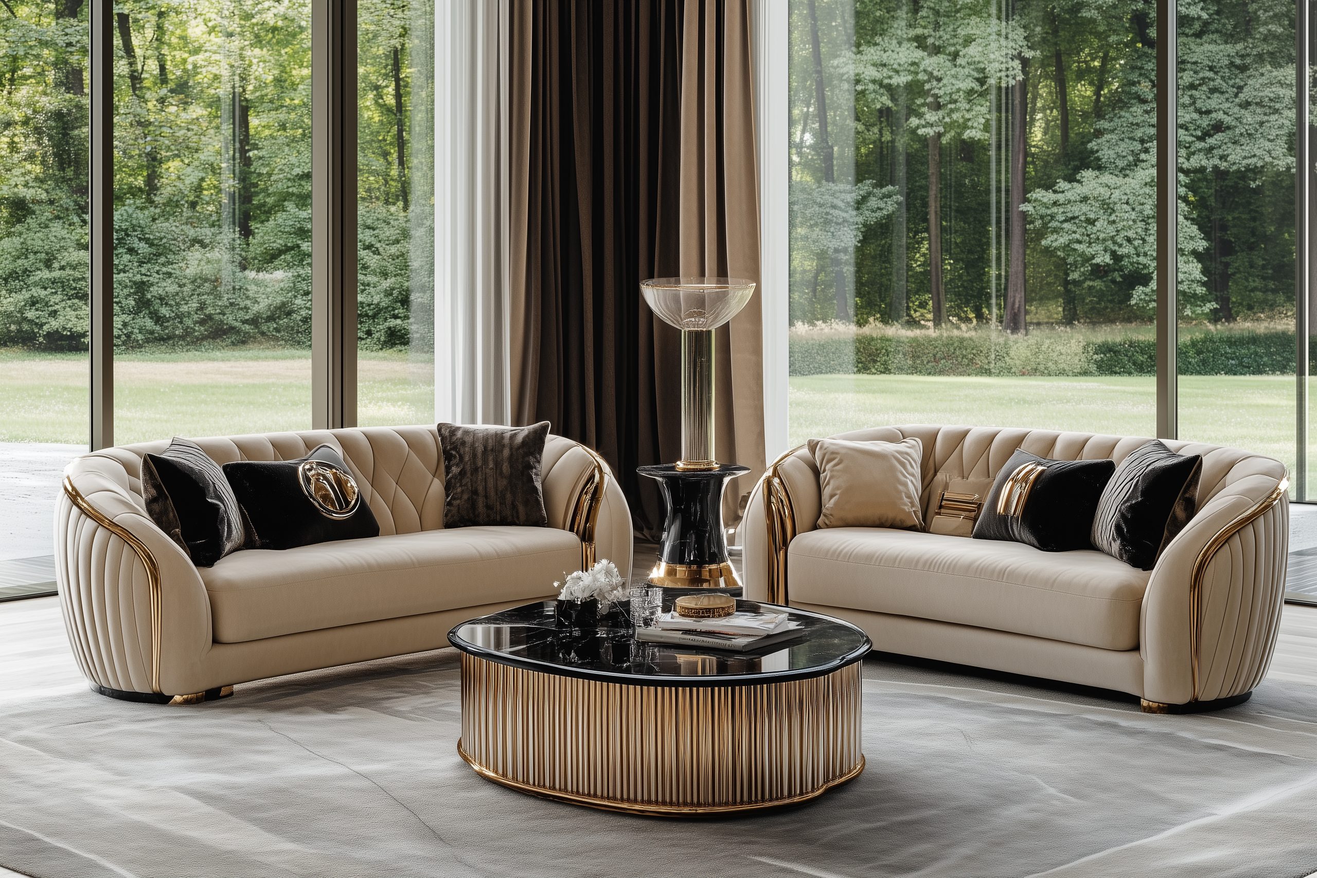
18. Transitional
Let’s explore Transitional style – one of the most versatile of our 22 different interior design styles. This style is perfect for those who appreciate both traditional and contemporary design but don’t want to commit fully to either.
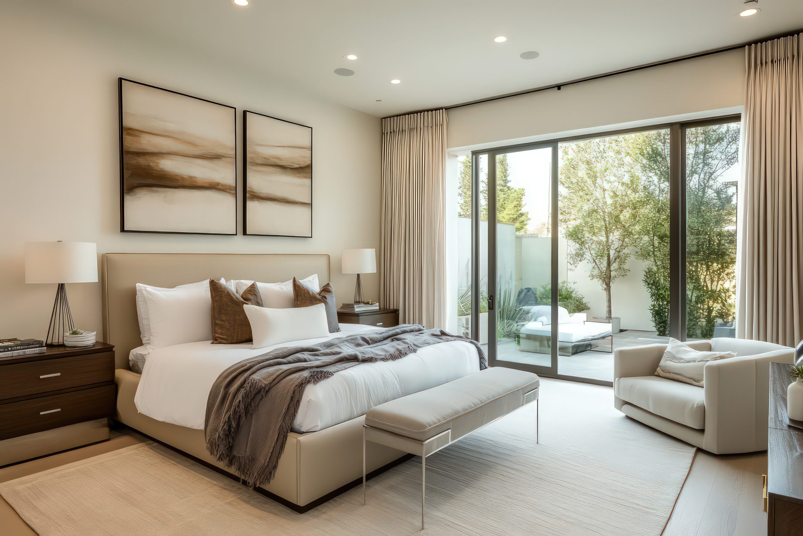
What makes Transitional style special is its ability to bridge different design eras and aesthetics. Think of it as the diplomatic mediator of interior design – it brings peace between traditional and contemporary elements, creating spaces that feel both timeless and current.
Key Characteristics:
- Balance of traditional and modern
- Clean lines with classic details
- Neutral colour palette
- Sophisticated textures
- Updated classics
- Comfortable elegance
- Refined scale
- Minimal accessories
Colour Palettes: Transitional design favours refined neutrals
Primary Colours:
- Warm greys
- Soft whites
- Rich creams
- Gentle taupes
- Subtle beiges
Accent Colours:
- Navy blue
- Chocolate brown
- Slate grey
- Muted gold
- Soft black
Materials That Define the Style:
- Polished woods
- Textured fabrics
- Leather
- Glass
- Nickel
- Bronze
- Marble
- Linen
Pro Tip: When designing transitional spaces, focus on texture rather than pattern. This style is about creating interest through layered materials rather than bold prints.
Furniture Elements:
- Clean-lined sofas
- Updated wing chairs
- Glass-top tables
- Tailored upholstery
- Modern case goods
- Traditional silhouettes
- Neutral ottomans
- Refined storage pieces
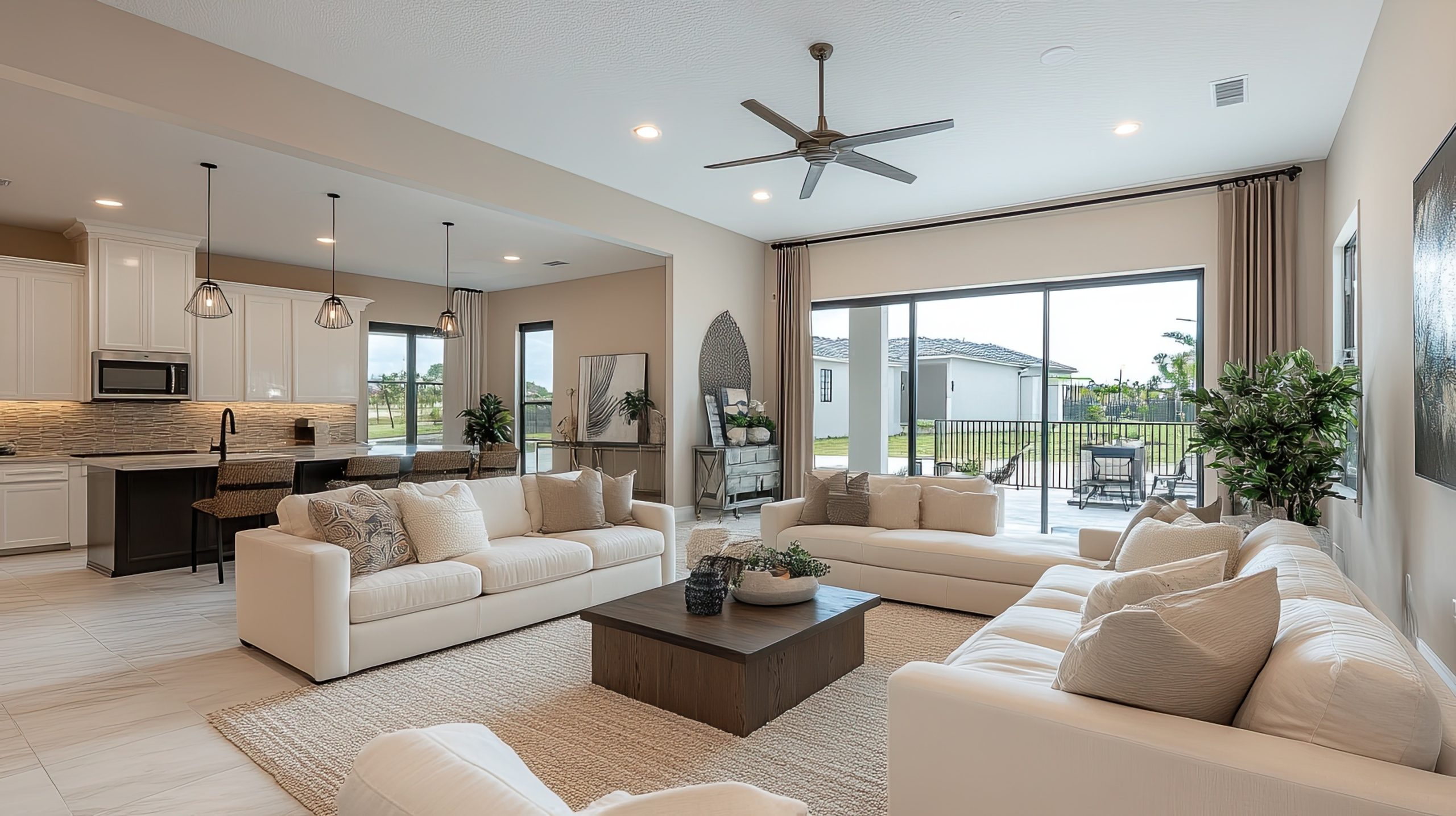
Balance Points:
Key areas where traditional meets modern:
- Curved furniture with straight lines
- Classic shapes in current fabrics
- Updated traditional lighting
- Modern art in traditional frames
- Clean-lined millwork
- Simplified traditional patterns
- Contemporary mirrors
- Mixed metal finishes
Space Planning:
Transitional spaces require:
- Balanced furniture groupings
- Conversation areas
- Clear traffic patterns
- Formal and casual zones
- Negative space
- Symmetrical layouts
- Functional flow
- Comfortable seating
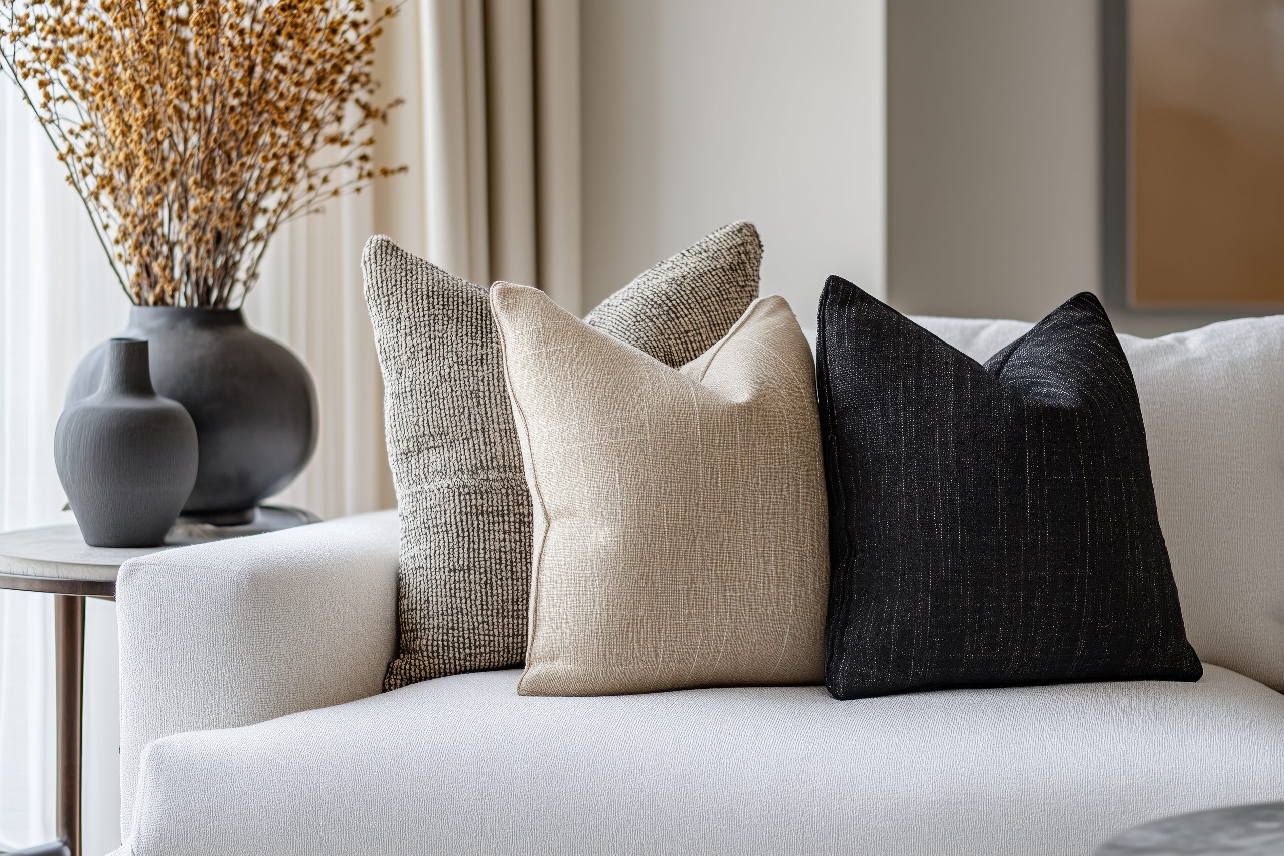
Styling Guidelines:
- Keep accessories minimal
- Focus on quality over quantity
- Mix furniture styles thoughtfully
- Layer textures carefully
- Maintain clean lines
- Include traditional touches
- Add modern elements
- Create visual balance
Common Mistakes to Avoid:
- Over-accessorising
- Using too many patterns
- Mixing too many styles
- Forgetting about comfort
- Losing balance
- Including trendy pieces
Eclectic & Contemporary Craftsman Styles
Let’s explore styles that either celebrate creative mixing or honour traditional craftsmanship with a modern twist.
19. Eclectic
Among our 22 different interior design styles, Eclectic design offers the most creative freedom. This style is like being a DJ of interior design – it’s all about mixing different elements to create something uniquely harmonious.
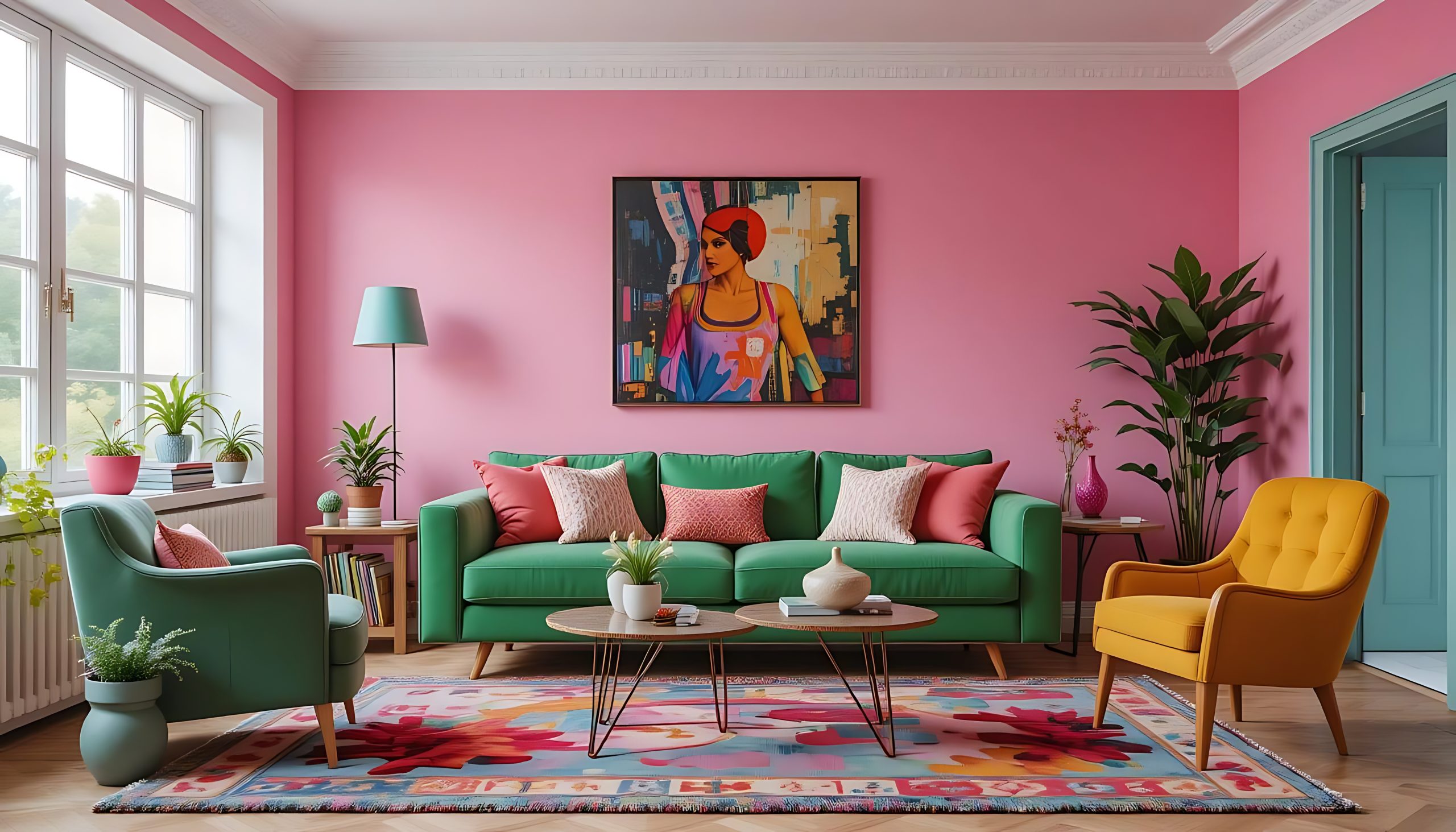
What makes Eclectic style special is its ability to combine different periods, styles, and textures while maintaining a cohesive look. Think of it as creating a beautiful symphony using instruments from different orchestras – it’s about finding harmony in diversity.
Key Characteristics:
- Mixed design elements
- Unexpected combinations
- Personal collections
- Varied textures
- Curated displays
- Multiple periods
- Artistic expression
- Thoughtful disorder
Colour Palettes: Eclectic style can embrace any colours, but typically includes
Primary Colours:
- Unifying base colour
- Rich neutrals
- Bold statement hues
- Earthy tones
- Dramatic darks
Accent Colours:
- Jewel tones
- Bright pops
- Metallic accents
- Unexpected combinations
- Personal favorites
Materials That Define the Style:
- Mixed woods
- Various metals
- Different textiles
- Glass
- Stone
- Ceramic
- Leather
- Unique finds
Pro Tip: When designing eclectic spaces, follow the 80/20 rule – 80% cohesion through colour or style, 20% surprise elements that make the space unique.
Furniture Elements:
- Different period pieces
- Statement seating
- Mixed dining chairs
- Diverse tables
- Unique storage
- Collected items
- Family heirlooms
- Modern classics
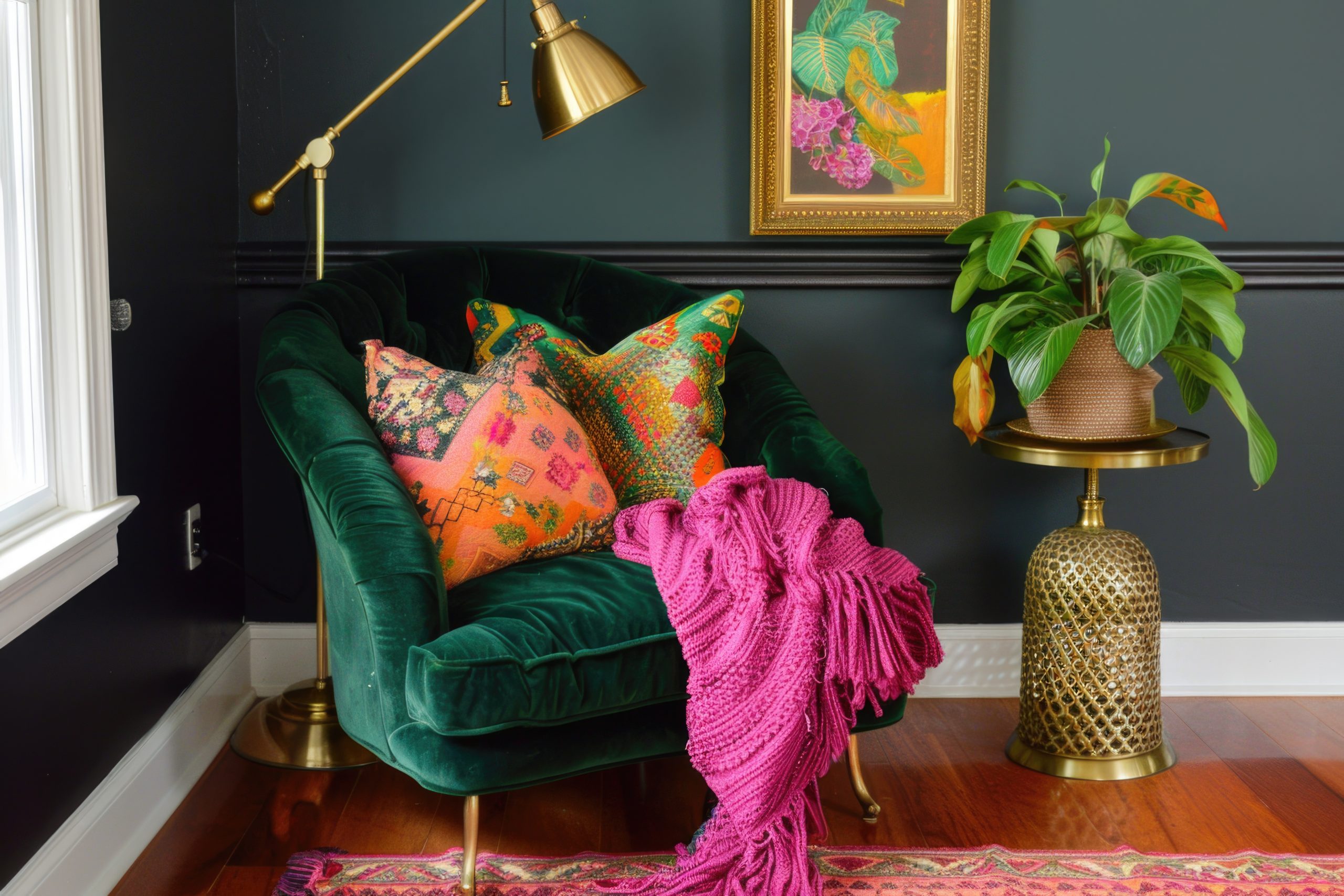
Pattern Play:
Guidelines for mixing patterns:
- Vary the scale
- Connect through colour
- Mix geometrics with organics
- Balance busy with simple
- Include texture patterns
- Combine old and new
- Layer thoughtfully
- Create rhythm
Space Planning:
Eclectic spaces need:
- Clear traffic patterns
- Defined zones
- Conversation areas
- Display spaces
- Focal points
- Balance points
- Visual breaks
- Personal corners
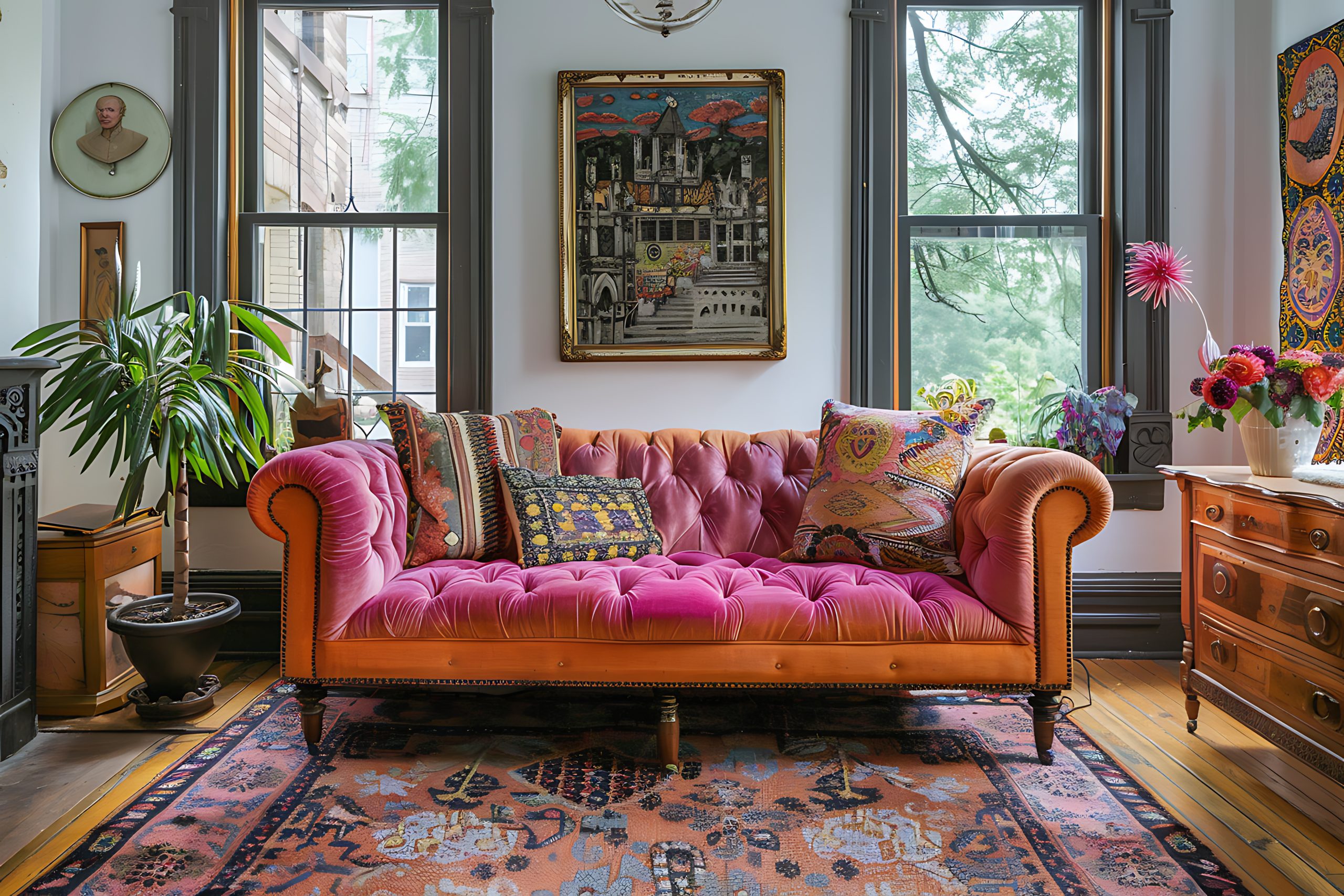
20. Contemporary Craftsman
As we continue exploring our 22 different interior design styles, let’s look at Contemporary Craftsman – a style that beautifully updates the traditional Arts and Crafts movement for modern living. This style perfectly balances historical charm with current functionality.
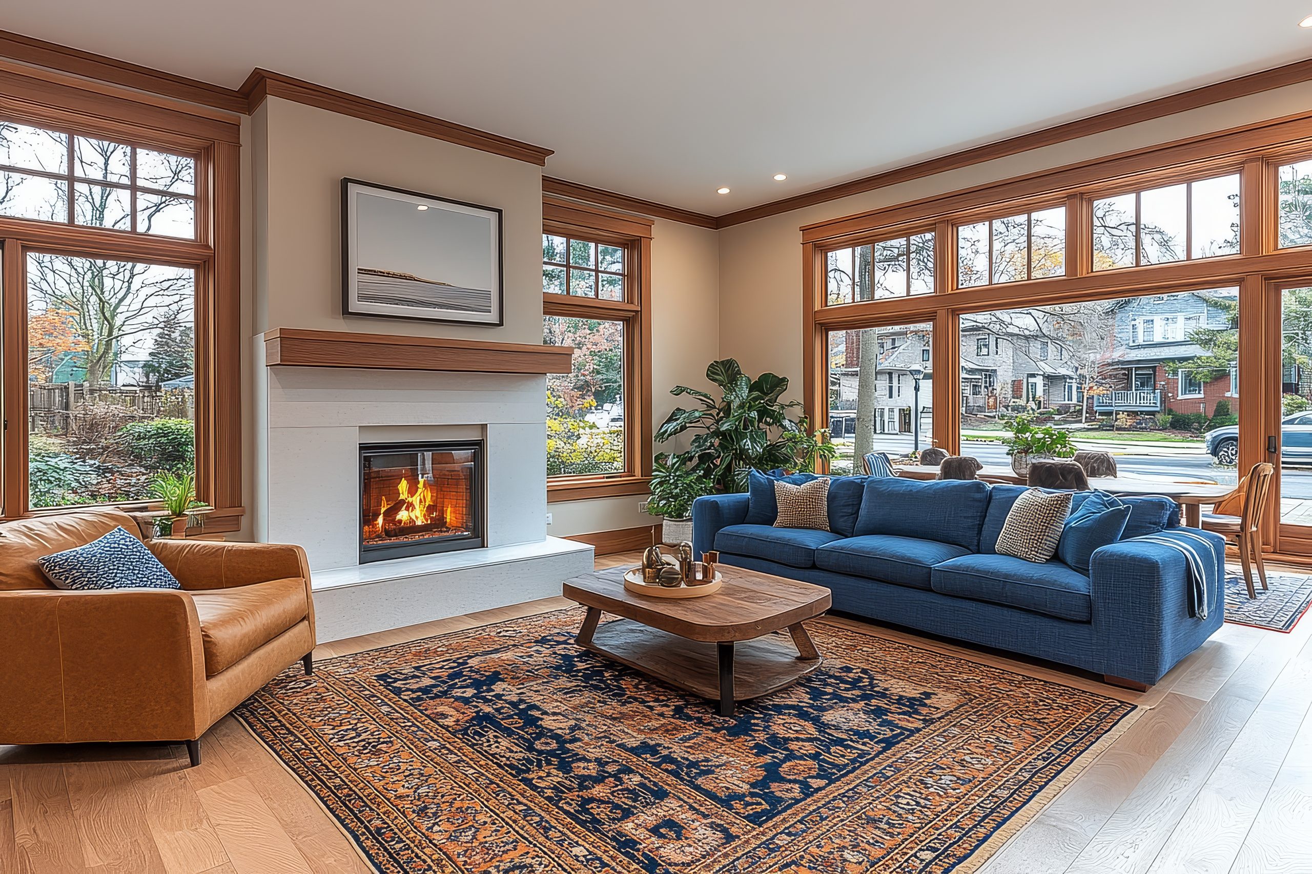
What makes Contemporary Craftsman special is its respect for handcrafted details while embracing modern conveniences. Think of it as taking the soul of the Arts and Crafts movement – quality craftsmanship and natural materials – and adapting it for 21st-century living.
Key Characteristics:
- Clean architectural lines
- Natural materials
- Handcrafted details
- Built-in features
- Wood accents
- Modern amenities
- Organic elements
- Quality craftsmanship
Colour Palettes: Contemporary Craftsman embraces nature-inspired colours
Primary Colours:
- Warm woods
- Earth tones
- Sage greens
- Deep browns
- Warm greys
Accent Colours:
- Copper red
- Forest green
- Navy blue
- Bronze
- Amber
Materials That Define the Style:
- Quarter-sawn oak
- Natural stone
- Hand-forged metal
- Ceramic tile
- Stained glass
- Copper
- Leather
- Linen
Pro Tip: When designing Contemporary Craftsman spaces, quality is everything. One well-crafted piece will add more character than multiple mass-produced items.
Furniture Elements:
- Clean-lined sofas
- Mission-style chairs
- Built-in cabinets
- Window seats
- Solid wood tables
- Storage benches
- Leather upholstery
- Modern interpretations
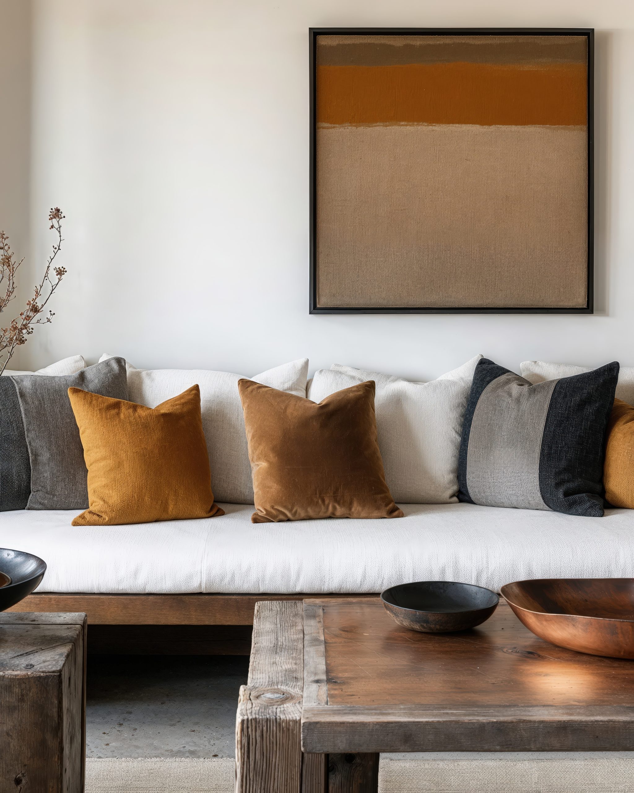
Architectural Details:
- Exposed beams
- Built-in bookcases
- Window trim
- Wainscoting
- Column details
- Modern light fixtures
- Updated hardware
- Glass accents
Design Elements:
Essential features include:
- Natural wood trim
- Geometric patterns
- Stained glass accents
- Metal hardware
- Updated lighting
- Modern technology
- Practical storage
- Indoor-outdoor connection
Space Planning:
Contemporary Craftsman spaces need:
- Open floor plans
- Defined rooms
- Built-in features
- Reading nooks
- Work spaces
- Gathering areas
- Connection to nature
- Modern functionality
Modern Interpretation:
How to update Craftsman style:
- Lighter wood tones
- Modern lighting
- Updated hardware
- Smart home features
- Contemporary fabrics
- Simplified details
- Open concept adaptation
- Modern amenities
21. Tropical
Moving through our 22 different interior design styles, let’s explore Tropical design – a style that brings the essence of paradise into everyday living. This style is about much more than just palm prints and bright colours.
What makes Tropical style special is its ability to create a permanent vacation feeling while maintaining sophistication. Think of it as capturing the essence of a luxury island resort but making it completely livable for daily life.
Key Characteristics:
- Indoor-outdoor flow
- Natural materials
- Lush greenery
- Bright, natural light
- Bold patterns
- Relaxed atmosphere
- Resort-inspired elements
- Organic textures
Colour Palettes: Tropical design embraces nature’s vibrant colours
Primary Colours:
- Warm whites
- Ocean blues
- Leafy greens
- Sandy beiges
- Natural browns
Accent Colours:
- Coral pink
- Sunny yellow
- Bright orange
- Orchid purple
- Turquoise
Materials That Define the Style:
- Rattan
- Bamboo
- Wicker
- Natural fibers
- Teak wood
- Linen
- Cotton
- Jute
Pro Tip: When designing tropical spaces, I always tell clients that balance is key – you want that paradise feeling without turning your home into a theme park resort.
Furniture Elements:
- Rattan chairs
- Bamboo tables
- Upholstered pieces
- Wooden ceiling fans
- Outdoor-inspired seating
- Plantation chairs
- Woven furniture
- Natural wood pieces
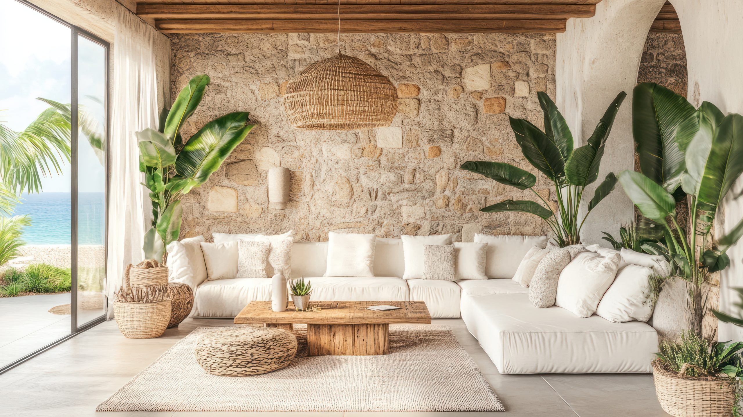
Pattern Play:
Signature tropical patterns:
- Palm leaves
- Botanical prints
- Animal prints
- Tribal motifs
- Geometric patterns
- Natural textures
- Floral designs
- Island-inspired motifs
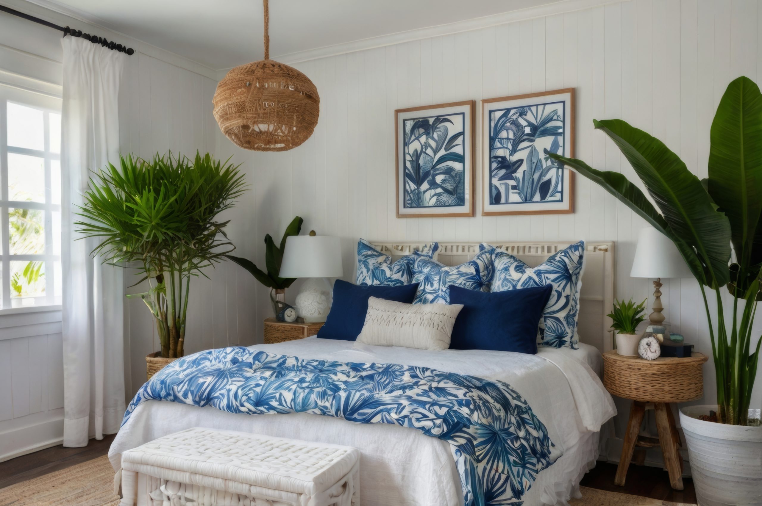
Essential Decor Elements:
- Live plants
- Natural fibre rugs
- Woven baskets
- Carved wood accents
- Shell collections
- Local artwork
- Ceiling fans
- Water features
22. Japandi
For our final style in our exploration of 22 different interior design styles, let’s discuss Japandi – a beautiful fusion of Japanese and Scandinavian design principles. This hybrid style perfectly combines minimalist aesthetics with cosy functionality.
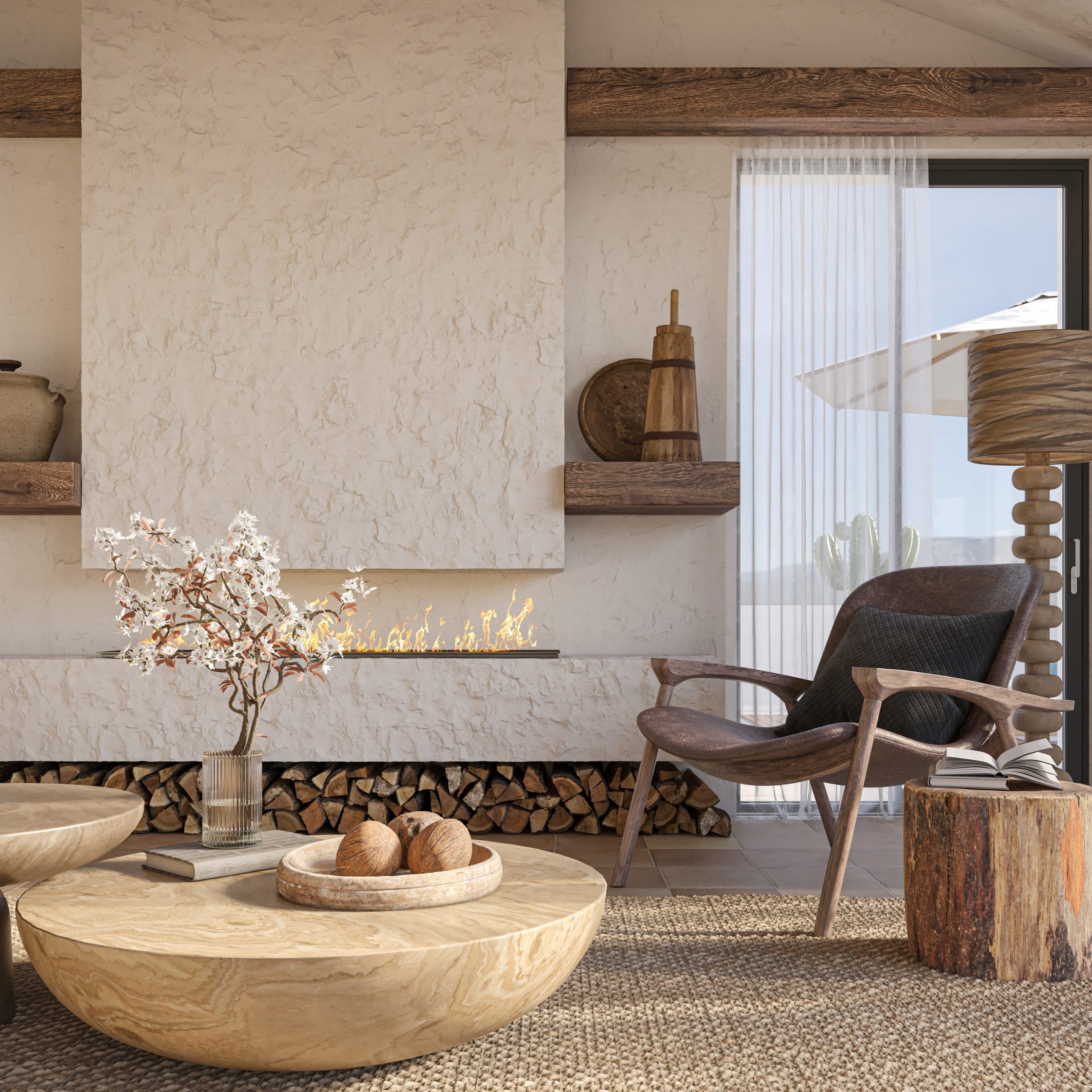
What makes Japandi special is how it marries the warmth of Scandinavian hygge with the minimalist serenity of Japanese design. Think of it as creating the perfect balance between cosy and calm, where every element serves both an aesthetic and functional purpose while maintaining a sense of tranquillity.
Key Characteristics:
- Minimalist design
- Natural materials
- Clean lines
- Neutral colours
- Thoughtful empty space
- Functional beauty
- Handcrafted elements
- Sustainable focus
Colour Palettes: Japandi embraces a refined neutral palette
Primary Colours:
- Warm whites
- Soft greys
- Natural wood tones
- Charcoal
- Earth tones
Accent Colours:
- Sage green
- Pale blush
- Deep ocean blue
- Warm rust
- Muted clay
Materials That Define the Style:
- Light and dark woods
- Natural fibers
- Paper
- Stone
- Linen
- Cotton
- Ceramic
- Bamboo
Pro Tip: When designing Japandi spaces, contrast is key – the style works best when you balance light Scandinavian elements with darker Japanese influences.
Furniture Elements:
- Low-profile sofas
- Platform beds
- Clean-lined chairs
- Minimal coffee tables
- Built-in storage
- Natural wood pieces
- Handcrafted items
- Multi-functional furniture
Essential Elements:
- Simple artwork
- Ceramic vessels
- Natural textiles
- Indoor plants
- Paper lanterns
- Woven baskets
- Minimal decor
- Textural elements
Space Planning:
Japandi spaces require:
- Uncluttered layouts
- Functional zones
- Clear pathways
- Purposeful furniture
- Natural light emphasis
- Cosy corners
- Storage solutions
- Peaceful flow
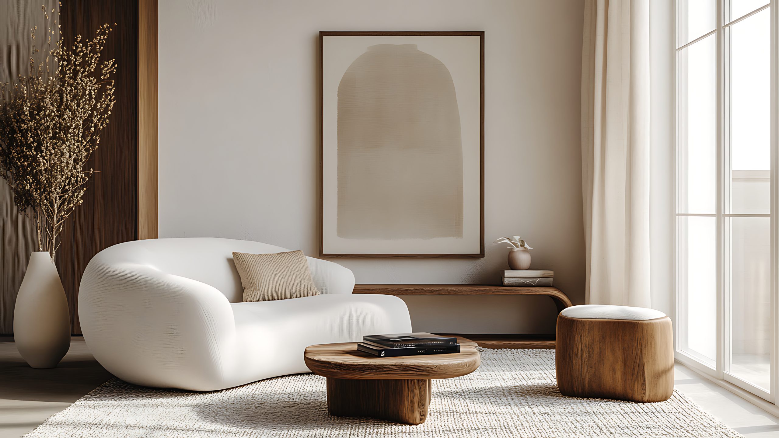
Styling Guidelines:
- Focus on quality over quantity
- Mix light and dark elements
- Layer natural textures
- Keep accessories minimal
- Include handcrafted pieces
- Add warmth through textiles
- Incorporate plants thoughtfully
- Create peaceful vignettes
Common Mistakes to Avoid:
- Over-accessorising
- Using artificial materials
- Forgetting about comfort
- Making spaces too stark
- Missing storage solutions
- Losing cultural balance
The beauty of Japandi lies in its ability to create spaces that are both practical and peaceful, minimal yet warm. It’s perfect for those who appreciate clean lines but don’t want their home to feel cold or uninviting
After exploring these 22 different interior design styles, remember that the perfect style for you might be one of these or a thoughtful combination of several. The key is to choose elements that resonate with your lifestyle and personal taste while creating a space that functions well for your needs.
How to Choose Your Style
Consider these factors when selecting your ideal design style:
- Your lifestyle needs
- The architecture of your home
- Your colour preferences
- Maintenance requirements
- Budget considerations
- Long-term livability
- Personal comfort level
- Family needs
Mixing Different Interior Design Styles
Understanding these 22 different interior design styles gives you the freedom to mix and match elements that speak to you. Here’s how to successfully blend styles:
Basic Principles for Mixing Styles:
- Choose a dominant style (about 70%)
- Add a secondary style (about 20%)
- Include accent elements (about 10%)
- Maintain a consistent colour palette
- Keep proportions in mind
- Consider the flow between rooms
- Focus on quality over quantity
- Trust your instincts
Common Successful Combinations:
- Modern + Mid-century
- Traditional + Contemporary
- Industrial + Rustic
- Scandinavian + Japandi
- Coastal + Modern Farmhouse
- Bohemian + Global
Things to Avoid When Mixing Styles:
- Too many competing elements
- Clashing colour schemes
- Inconsistent quality levels
- Forced combinations
- Overwhelming spaces
- Losing functionality
As we’ve explored these 22 different interior design styles, remember that creating your perfect space is a journey, not a destination. Whether you’re drawn to the elegance of Traditional, the clean lines of Modern, or a unique combination of several styles, the most important thing is that your home reflects who you are and how you live.
Don’t feel pressured to strictly adhere to any single style. The best spaces are often those that evolve naturally over time, incorporating elements that speak to you while maintaining functionality for your lifestyle.
by Kesaa Interiors | DESIGN GUIDES, Living Spaces, ROOMS, TRENDING
Looking for the best living room color schemes? You are at the right place for the best inspiration!
Choosing the right living room color scheme can dramatically transform the heart of your home. Color has a powerful impact on mood and atmosphere, influencing how you and your guests feel in the space.
This post will explore fresh and timeless living room color schemes that never fail, offering inspiration for creating a living room you’ll love.
Best Living Room Color Schemes!
I. Monochromatic Magic: Shades of Serenity
Monochromatic living room color schemes revolve around a single color, utilising various shades and tints to create depth and visual interest. This approach offers a calming and sophisticated atmosphere, fostering a sense of tranquillity and unity. From the deepest navy to the palest sky blue, a monochromatic blue living room color scheme, for example, can evoke a sense of peace and serenity. Similarly, exploring various shades of green can create a connection to nature, while a grayscale palette offers a sleek and modern feel. By playing with textures and patterns within your chosen color family, you can prevent a monochromatic scheme from feeling flat or one-dimensional.
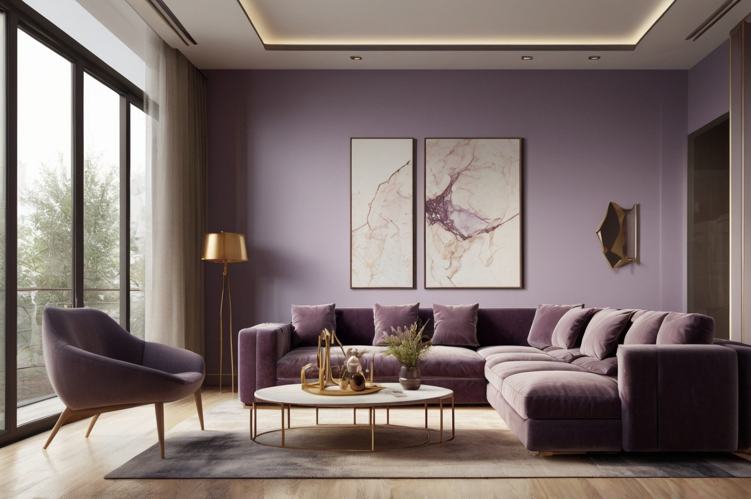
II. Earthy Neutrals: Embrace the Warmth
Earthy neutral living room color schemes offer a timeless appeal, creating a comforting and inviting atmosphere. Their versatility allows for easy integration with various decor styles, from modern farmhouse to contemporary chic. Think warm beiges, creamy whites, rich browns, and subtle hints of green or terracotta. These hues create a sense of grounding and stability, making the living room a perfect relaxing sanctuary. Layering textures, such as a chunky knit throw or a woven rug, adds depth and visual interest to an earthy neutral palette. Consider incorporating natural materials like wood and stone to further enhance the organic feel.
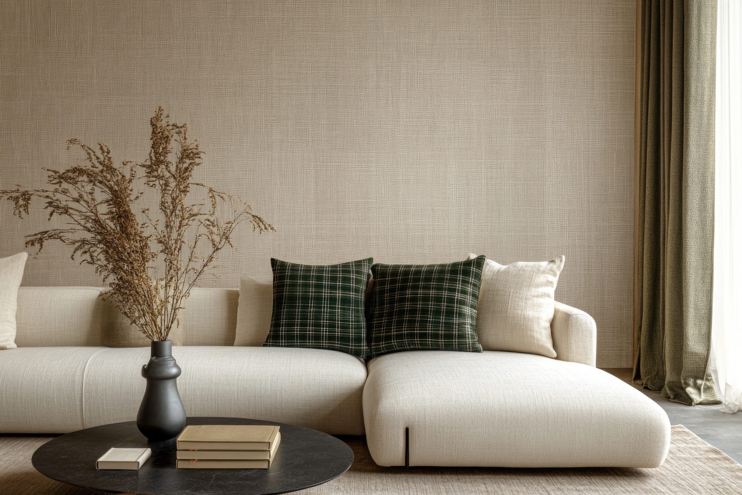
III. Coastal Calm: Breezy Blues and Whites
Transport yourself to a seaside retreat with a coastal-inspired living room color scheme. These palettes evoke a sense of tranquillity and freshness, utilizing light blues, crisp whites, and natural textures. Imagine pairing navy blue accents, like striped throw pillows or a patterned rug, with white walls and light wood furniture. Touches of beige and sandy hues can further enhance the beachy vibe. Natural light is key to achieving the airy and bright feel of a coastal space, so consider sheer curtains or blinds to maximise sunlight.
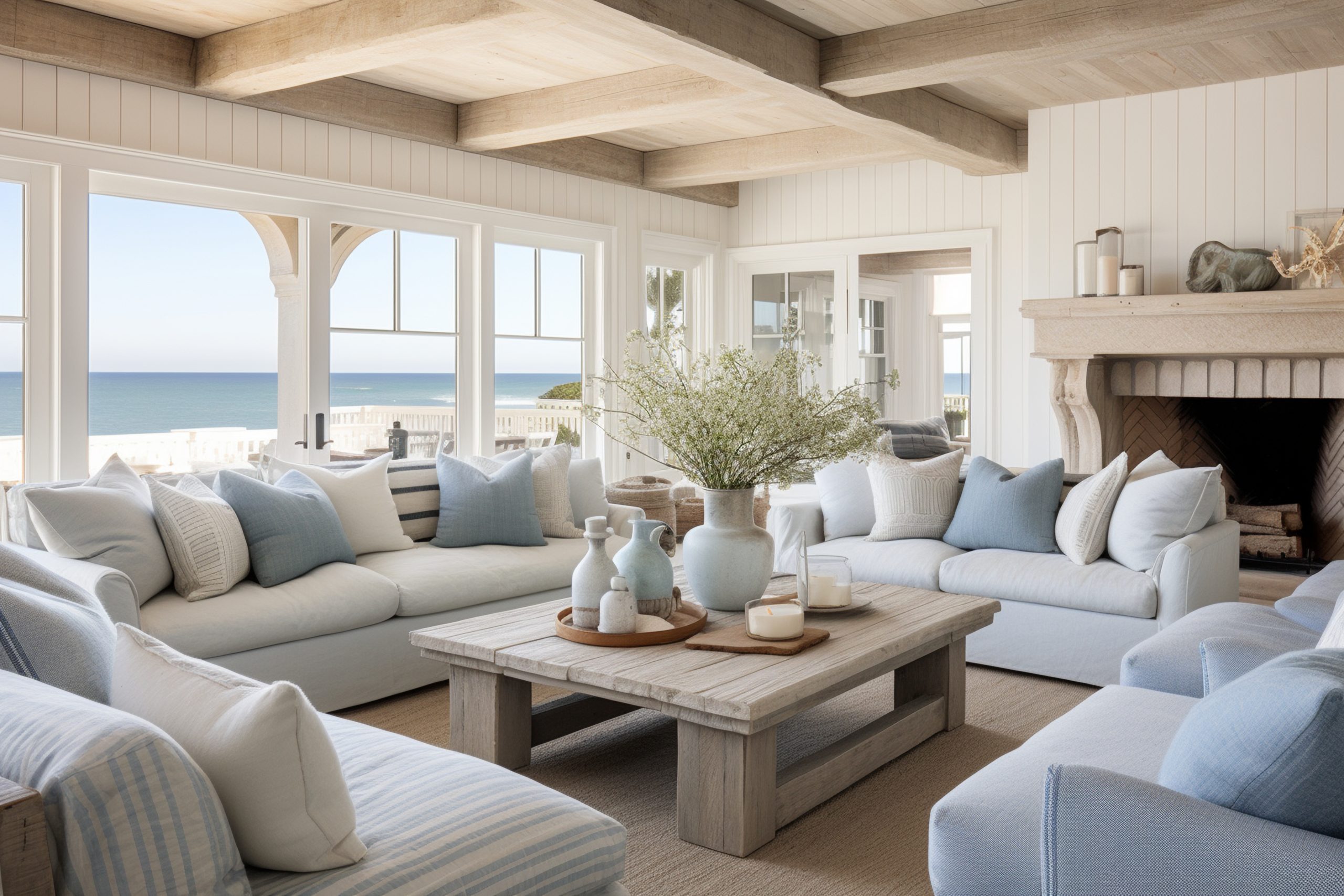
IV. Bold & Dramatic: Jewel Tones for Opulence
For a touch of luxury and drama, embrace the richness of jewel-toned living room color schemes. Emerald green, sapphire blue, ruby red, and amethyst purple can create a truly opulent atmosphere. Balance these bold colors with neutral elements, such as a light-colored sofa or white walls, to prevent the space from feeling overwhelming. Consider pairing emerald green with sapphire blue accents, or ruby red with gold accents for a touch of glamour. Luxurious fabrics like velvet and silk can further enhance the richness of the jewel tones.
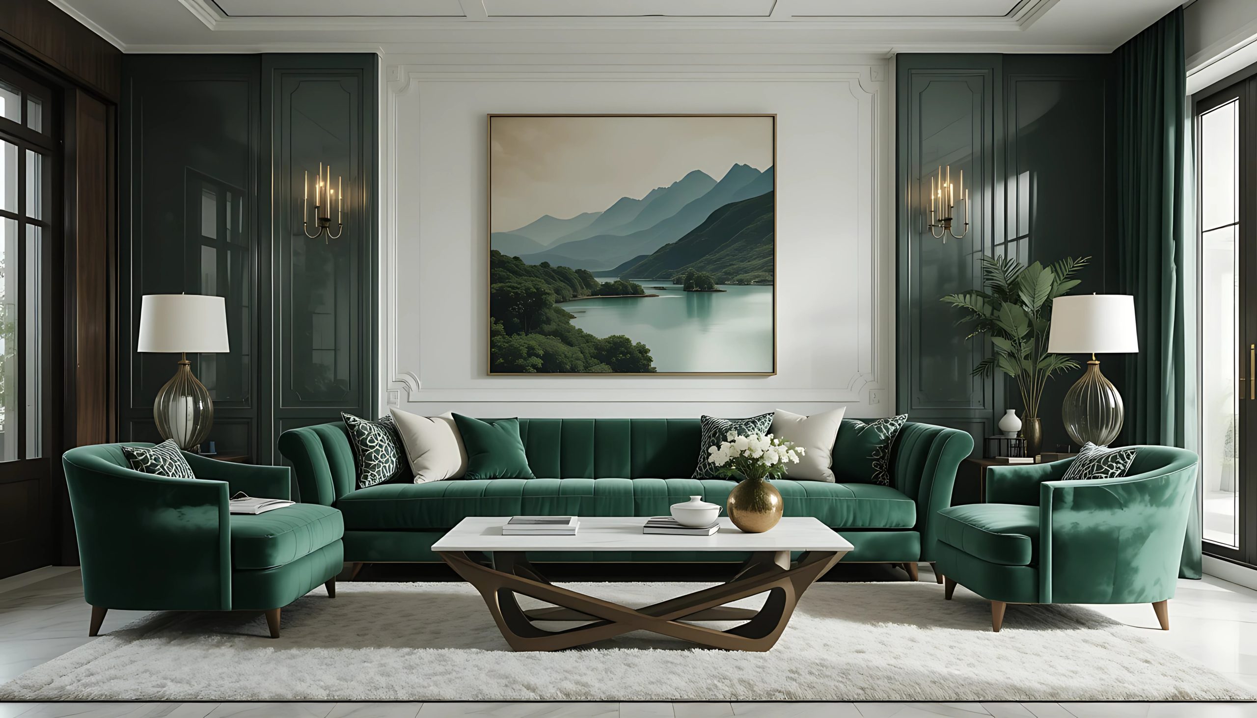
V. Modern Minimalist: Grayscale Sophistication
Grayscale living room color schemes exude elegance and sophistication. Varying shades of grey and white create depth and visual interest while maintaining a clean and uncluttered aesthetic. Incorporate metallic accents, such as silver or gold, to add a touch of glamour. Alternatively, introduce a pop of color with a vibrant piece of artwork or a brightly colored throw pillow to create a focal point. The key to a successful grayscale scheme is to play with textures and patterns to prevent the space from feeling sterile.
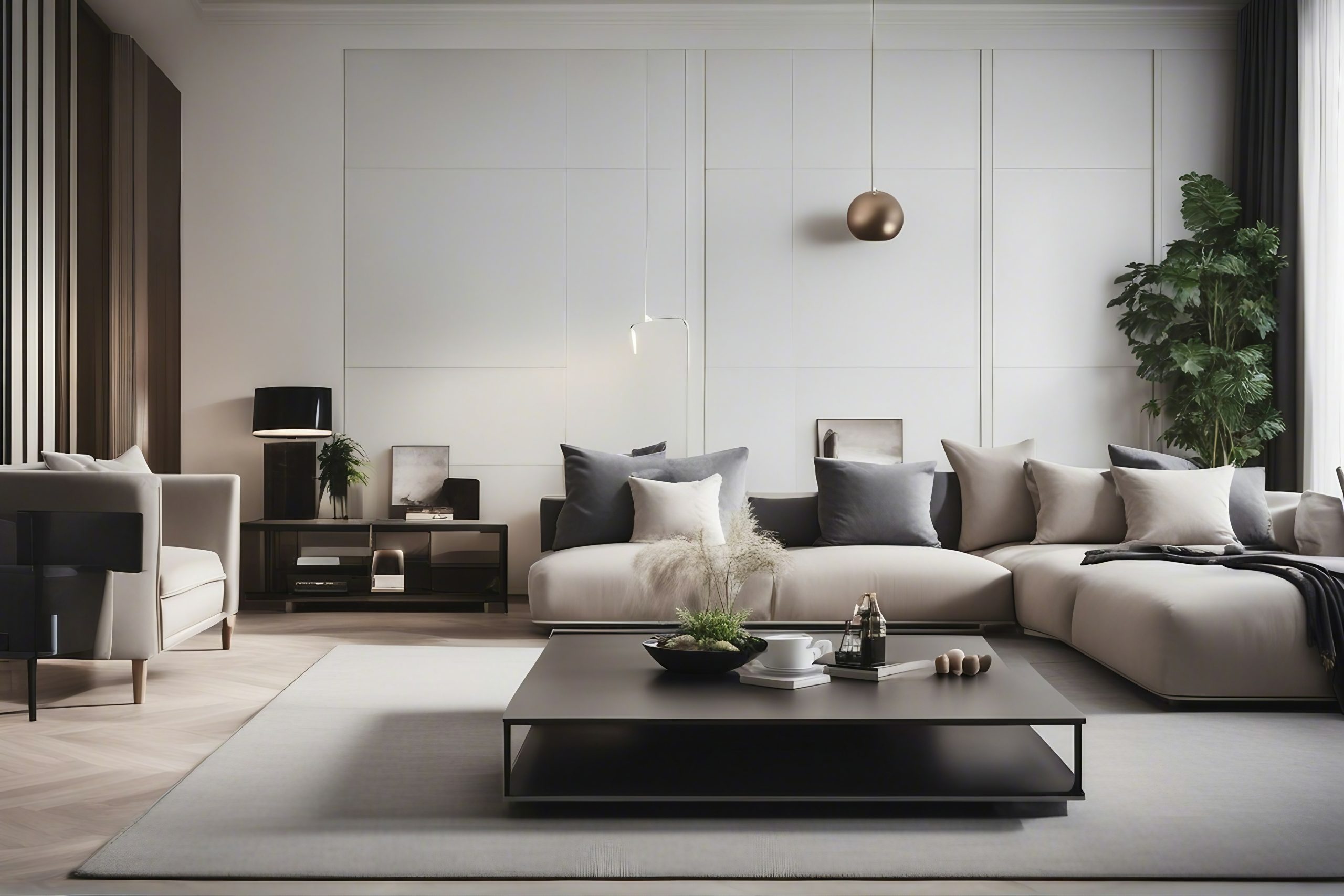
VI. Rustic Charm: Warm Woods and Earthy Tones
Create a cosy and inviting atmosphere with a rustic living room color scheme. Warm wood tones, earthy colors, and natural materials are key to achieving this style. Think browns, greens, oranges, with hints of deep red or blue. Exposed beams, stone fireplaces, and leather furniture can further enhance the rustic charm. Incorporate textured fabrics like wool and linen to add warmth and comfort.
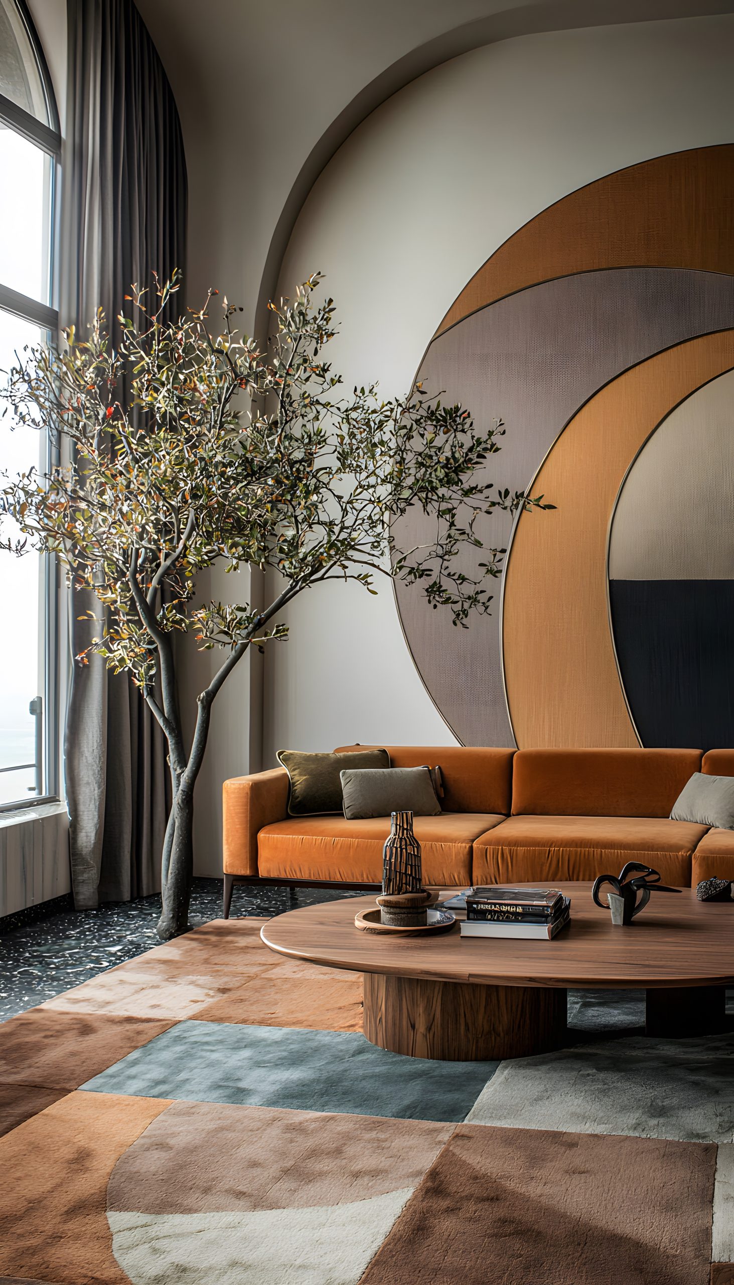
VII. Scandinavian Simplicity: Light and Airy Spaces
Embrace the minimalist aesthetic of Scandinavian design with a light and airy living room color scheme. White walls, light grey furniture, and pastel accents create a sense of calm and serenity. Natural light is essential in Scandinavian design, so maximise sunlight with sheer curtains or blinds. Incorporate natural materials like wood and wool to add warmth and texture.
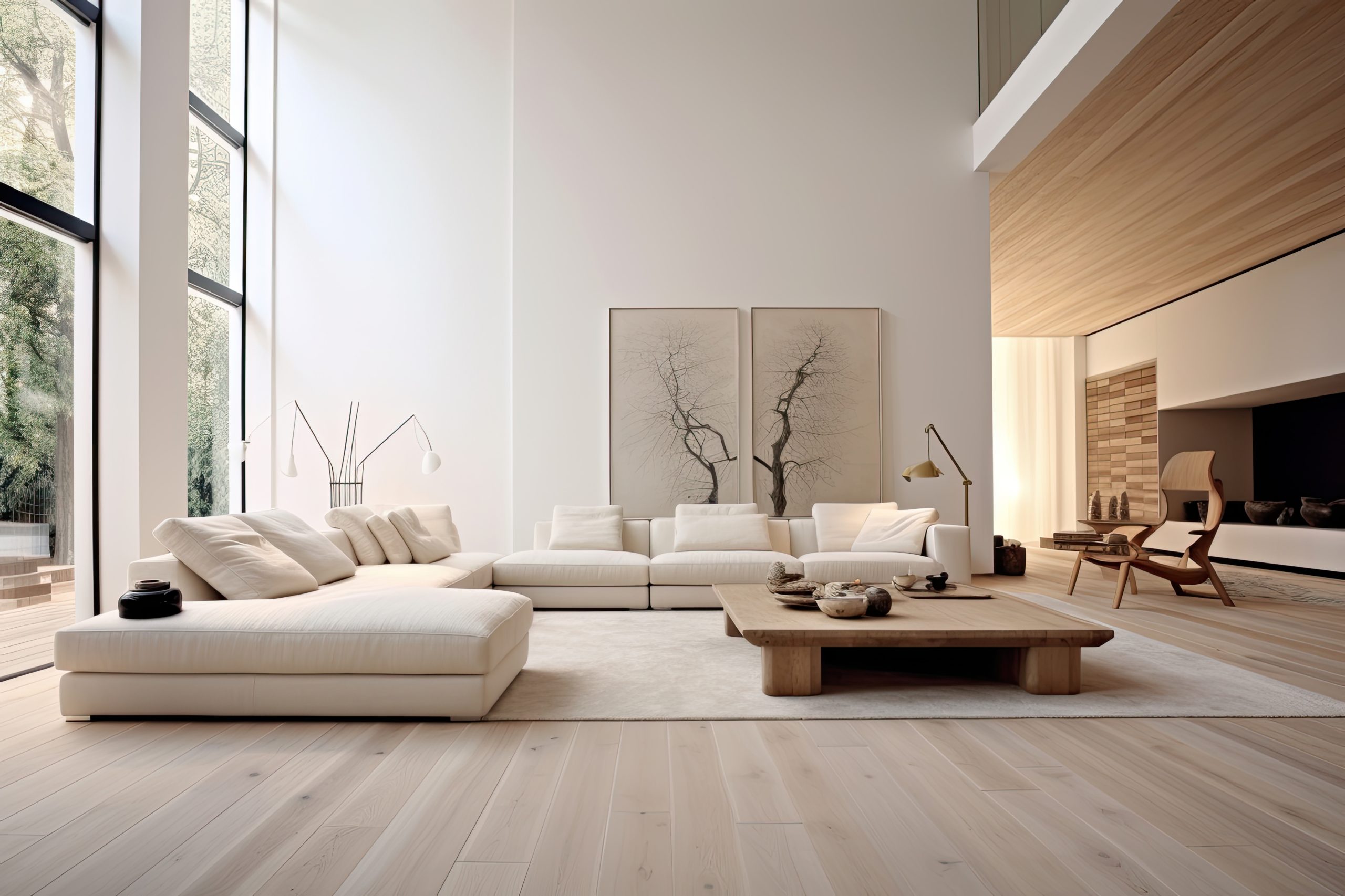
From monochromatic serenity to bold jewel tones, the possibilities for living room color schemes are endless. The key is to choose a palette that reflects your personal style and complements the size and natural light of your space. Consider the mood you want to create and the overall aesthetic you’re aiming for. Don’t be afraid to experiment and find what works best for you.
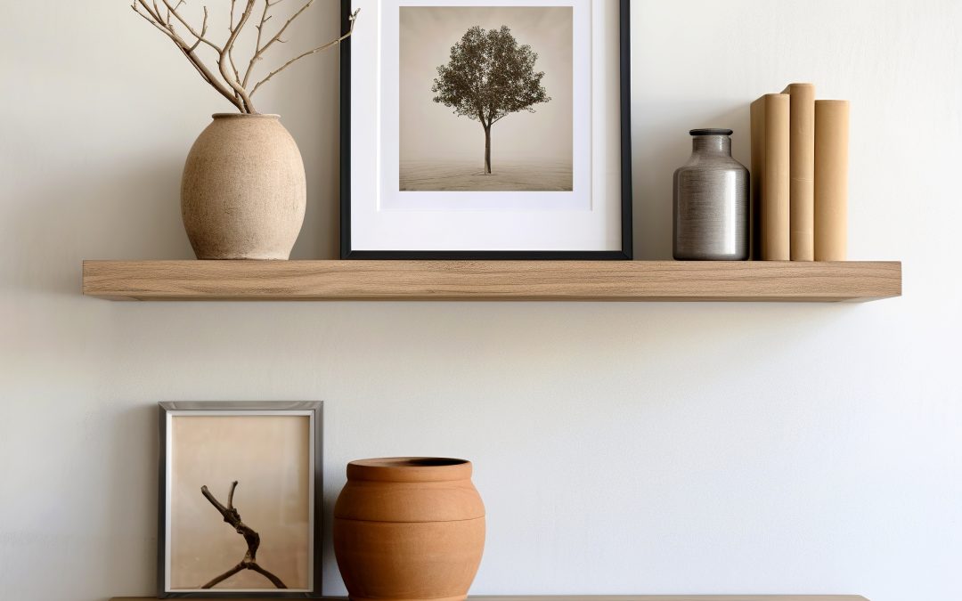
by Kesaa Interiors | DESIGN GUIDES, ROOMS, TRENDING
Learn how to style your shelf to elevate and transform your space. 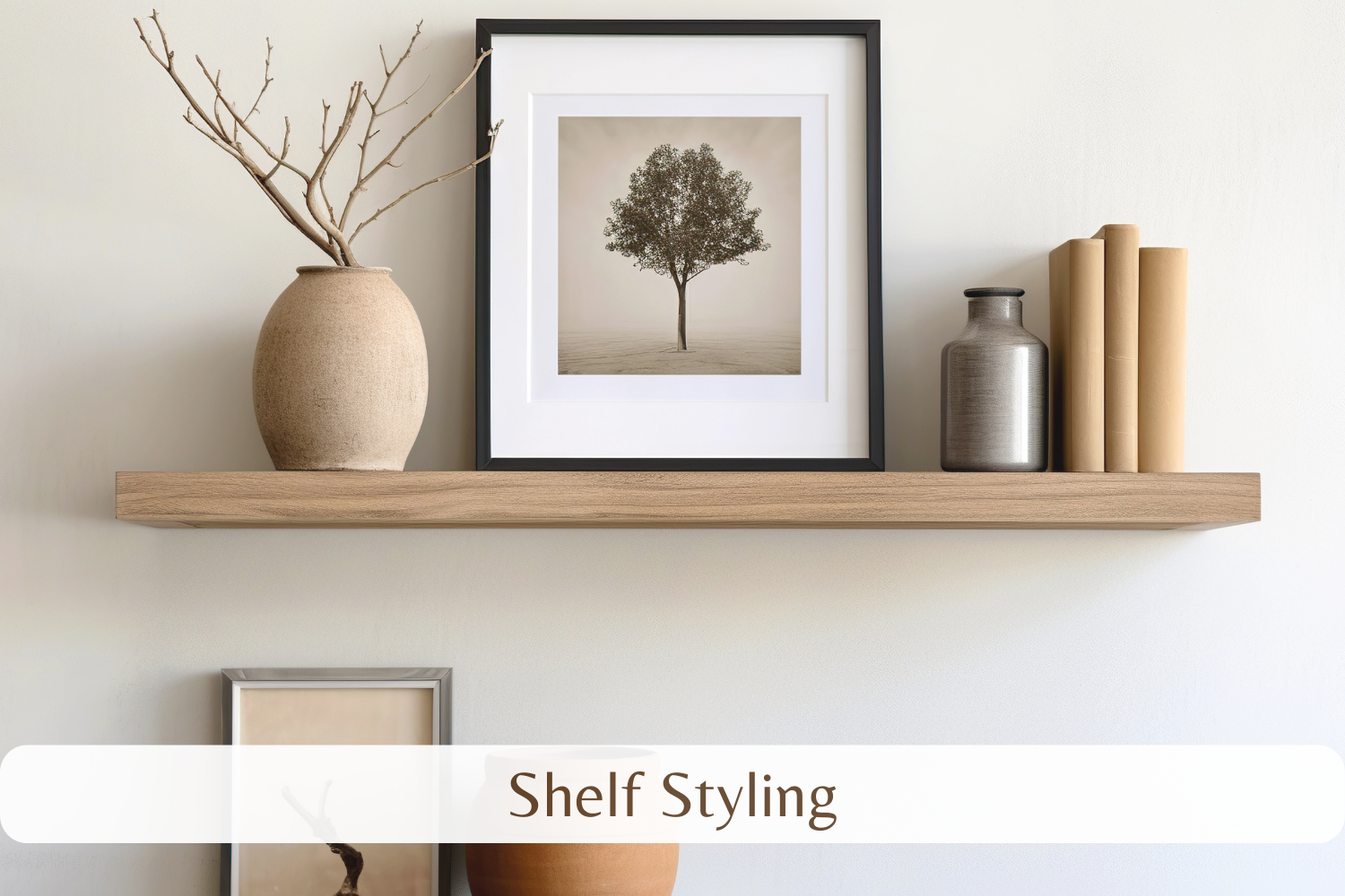
Tired of staring at bare shelves? Shelf styling can dramatically transform a room, taking it from bland to grand. It’s more than just placing objects on a surface; it’s about creating a visual story that reflects your personality and enhances your space.
This guide will equip you with expert shelf styling tips to help you curate stunning displays and elevate your interior design. Get ready to turn those empty shelves into captivating focal points!
Best Shelf Styling Tips and Tricks.
Know Your Canvas: Evaluating Your Shelf Space for Optimal Styling
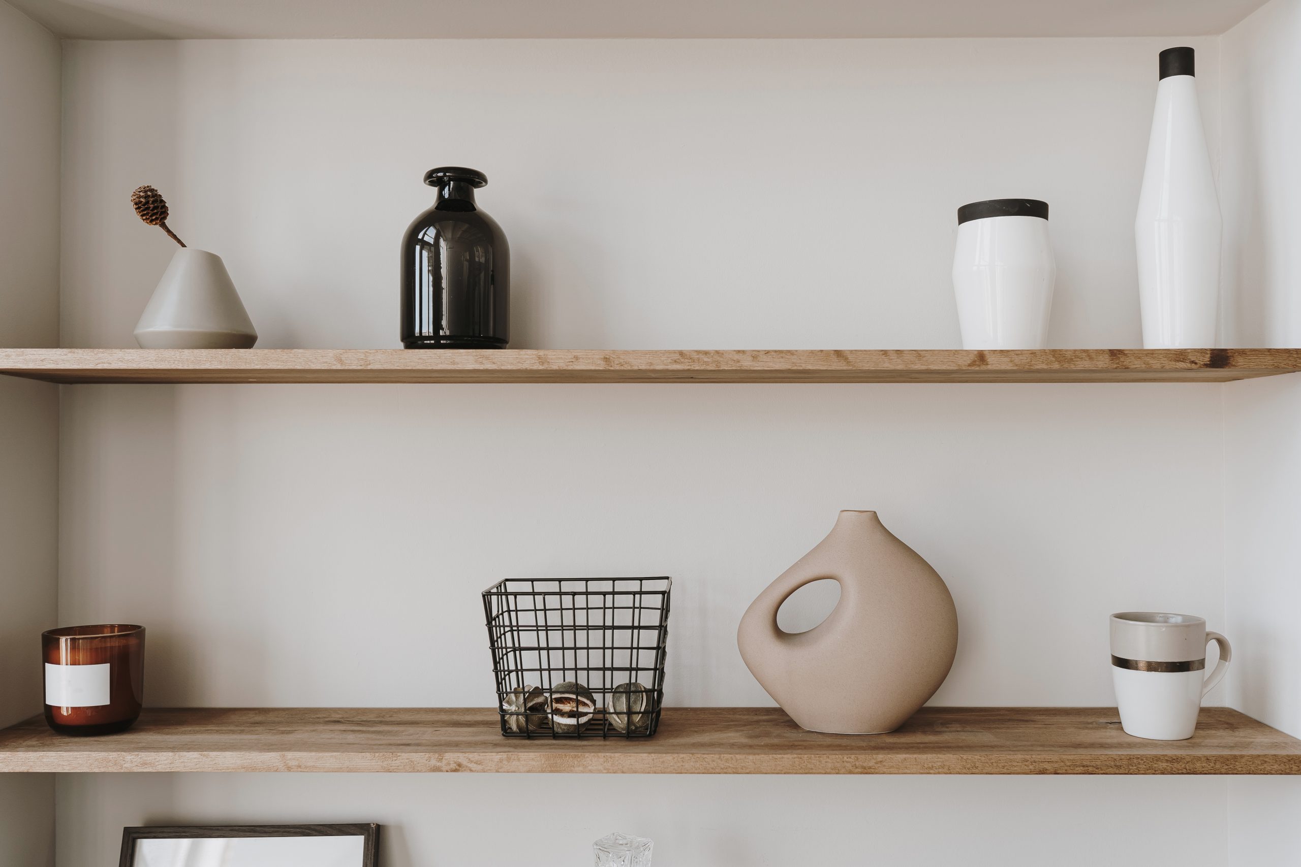
Before diving into the exciting world of shelf styling, take a moment to assess your “canvas.” Understanding your shelf space is crucial for creating a successful display. Effective shelf styling starts with knowing the dimensions and characteristics of your shelves. Consider the following:
- Size and Shape: Are your shelves long and narrow, or short and wide? Are they square, rectangular, or a unique shape? The size and shape will dictate the types and number of items you can display. Large shelves offer more flexibility, while smaller shelves require a more curated approach to shelf styling.
- Depth: How deep are your shelves? This will determine how far forward you can place items and how much layering you can achieve. Deep shelves allow for more dynamic arrangements, while shallow shelves benefit from a more streamlined shelf styling approach.
- Height: Are your shelves tall enough to accommodate larger items, or are they better suited for smaller objects? The height of your shelves will influence the overall visual balance of your shelf styling. Taller shelves can handle taller objects and create a sense of grandeur, while shorter shelves require careful consideration of height variations.
- Location and Surroundings: Where are your shelves located in the room? Are they in a prominent spot or a more secluded corner? Consider the surrounding décor and how your shelf styling can complement the overall aesthetic. Shelf styling should integrate seamlessly with the rest of your room’s design.
By carefully considering these factors, you’ll be well-equipped to make informed decisions about the types of items you choose and how you arrange them. This initial assessment is the foundation for effective shelf styling, ensuring a cohesive and visually appealing display.
Styling with Intention: Defining Your Design Goal
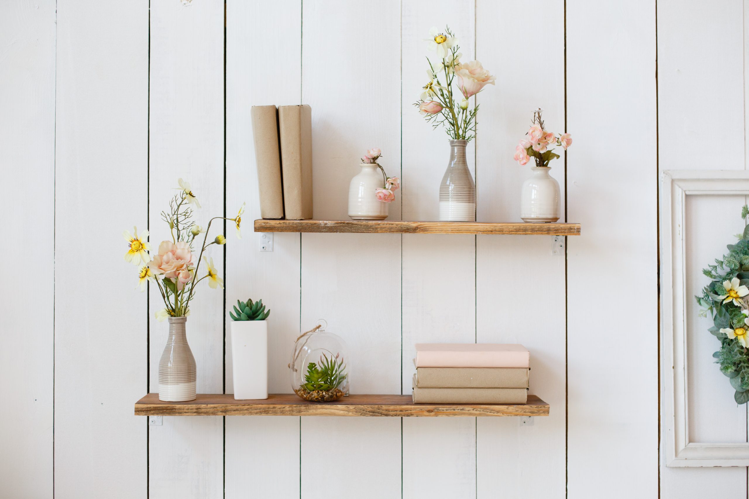
Now that you’ve assessed your shelves, it’s time to define your shelf styling vision. Just like any design project, having a clear goal in mind is essential for achieving a cohesive and impactful result. Shelf styling shouldn’t be a random assortment of objects; it should tell a story and reflect your personal style. Ask yourself:
- What overall mood or atmosphere do I want to create? Do you envision a calming and serene space, a vibrant and energetic display, or a cosy and inviting corner? Your shelf styling should contribute to the overall ambiance of the room.
- What is the existing style of my room? Is it modern, minimalist, bohemian, farmhouse, or eclectic? Your shelf styling should complement the existing décor and enhance the overall aesthetic. Consider the colours, textures, and materials already present in the room. For example, if your room has a minimalist design, your shelf styling should follow suit with clean lines and a limited colour palette.
- What specific style am I aiming for with my shelves? Do you want to create a minimalist display with a few carefully chosen objects, a maximalist arrangement with a curated collection of treasures, or something in between? Defining your shelf styling style will guide your choices and ensure a cohesive look. Some popular shelf styling themes include:
- Minimalist: Clean lines, simple objects, limited colour palette.
- Bohemian: Eclectic mix of textures, patterns, and global influences.
- Maximalist: Layered and abundant displays, showcasing collections and personal items.
- Rustic: Natural materials, earthy tones, vintage or antique accents.
- Modern: Sleek and contemporary, with a focus on geometric shapes and bold colors.
By defining your shelf styling vision, you’ll create a roadmap for your project. This will help you choose the right items and arrange them in a way that reflects your personal style and enhances your space. Effective shelf styling is about creating a cohesive and intentional display that adds personality and visual interest to your room.
The Art of Curation: Selecting Items that Tell a Story
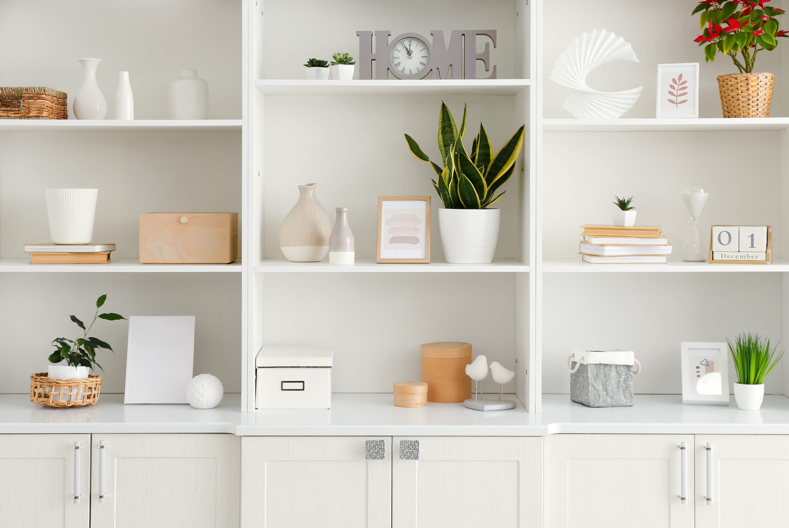
With your shelf styling vision in mind, it’s time to gather the items that will bring your shelves to life. This is where the fun begins! Curation is key to successful shelf styling. It’s not about randomly placing objects on a shelf; it’s about carefully selecting items that reflect your personality, interests, and style. Think of your shelves as a mini-gallery where you can showcase your favorite treasures and create a visual narrative.
Consider incorporating a variety of items to add depth and interest to your shelf styling:
- Books: Books are a staple in shelf styling. They add height, texture, and personality. Arrange them both vertically and horizontally to create visual interest. Choose books with covers that complement your color scheme or showcase your interests. Don’t be afraid to use books as decorative elements, even if you haven’t read them all!
- Decorative Objects: Vases, sculptures, bowls, candlesticks, and other decorative objects can add personality and visual appeal to your shelves. Choose items that complement your chosen style and colour palette. Look for unique pieces that spark joy and tell a story.
- Plants: Greenery adds life and vibrancy to any space, including your shelves. Incorporate small potted plants, trailing vines, or dried botanicals to add a touch of nature. Choose plants that thrive in the lighting conditions of your shelves.
- Personal Mementos: Shelf styling is a great opportunity to display cherished mementos and travel souvenirs. These items add a personal touch and tell a story about your life and experiences. Frame photos, display travel trinkets, or showcase handmade items.
- Art and Prints: Framed art prints, photographs, or even small canvases can add a pop of color and personality to your shelves. Choose pieces that complement your overall style and colour scheme.
Remember, thoughtful curation is key to successful shelf styling. Don’t be afraid to experiment with different combinations of items until you find an arrangement that you love. The goal is to create a display that reflects your unique style and enhances your space.
Texture Play: Incorporating a Variety of Materials for Visual Interest
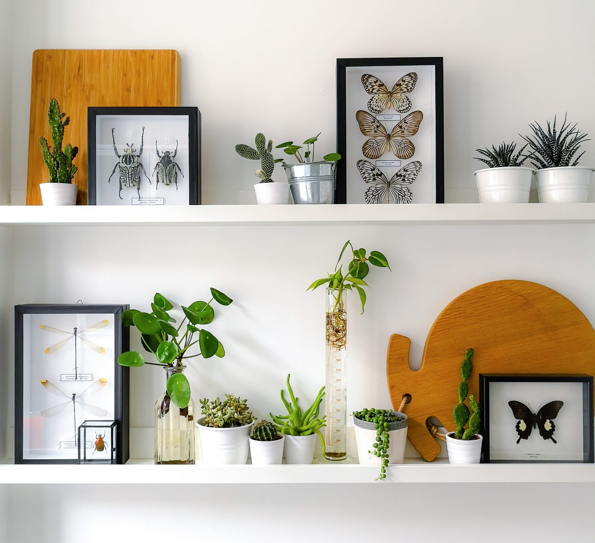
Once you’ve gathered your shelf styling treasures, it’s time to start thinking about how to arrange them. One of the key elements of successful shelf styling is incorporating a variety of textures and materials. This adds depth, dimension, and visual interest to your shelves, preventing them from looking flat or one-dimensional.
Consider the following textures and materials when styling your shelves:
- Wood: Wood adds warmth and natural beauty to your shelves. Incorporate wooden boxes, trays, bowls, or sculptures. Different types of wood, such as light oak, dark walnut, or rustic reclaimed wood, can create different moods and styles.
- Metal: Metallics add a touch of glamour and shine. Incorporate brass, copper, silver, or gold accents through candle holders, frames, or decorative objects. Metallics can also create a modern or industrial feel.
- Ceramic: Ceramic pieces, such as vases, bowls, or figurines, add a touch of artistry and craftsmanship. Consider using ceramics with different glazes and finishes to add variety.
- Glass: Glass adds a touch of elegance and reflectivity. Incorporate glass vases, jars, or decorative objects. Clear glass can create a sense of airiness, while colored glass can add a pop of color.
- Textiles: Textiles add softness and warmth. Incorporate woven baskets, small rugs, or decorative pillows. Textiles can also add pattern and colour to your shelves.
- Natural Elements: Incorporate natural elements such as shells, stones, or driftwood to add an organic touch. These elements can create a calming and grounding effect.
By mixing and matching different textures and materials, you’ll create a visually dynamic and engaging display. Don’t be afraid to experiment with different combinations until you find a balance that you love. Effective shelf styling is about creating a layered and textured look that draws the eye and adds personality to your space. Remember, the goal is to enhance your shelf styling by creating a visually rich and tactile experience.
Size Matters: Creating Visual Dynamics with Varying Heights and Scales
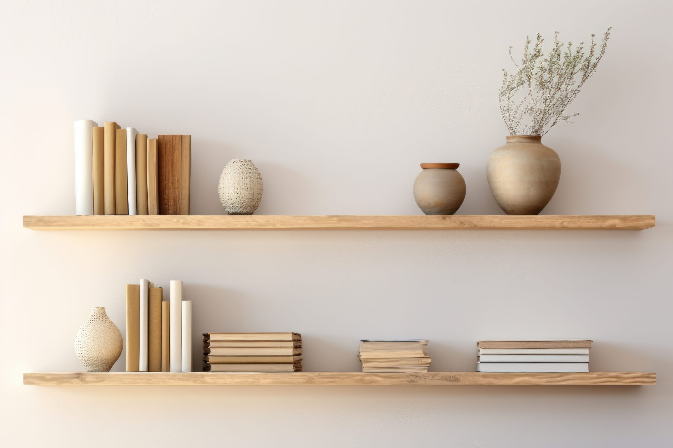
Varying the heights and sizes of your objects is another crucial element of successful shelf styling. A monotonous display of similarly sized items can look static and uninteresting. By incorporating objects of different heights and scales, you create visual interest, depth, and a sense of movement. Here’s how to play with heights and sizes for impactful shelf styling:
- Stacking: Stack books both vertically and horizontally to create different levels and add height. You can also stack boxes or other decorative objects to achieve a similar effect. Stacking adds visual weight and creates a sense of stability.
- Using Risers: Use books, boxes, or small stands as risers to elevate smaller objects and create varying heights. This allows smaller items to be seen and prevents them from getting lost among larger items. Risers also add depth and dimension to your shelf styling.
- Visual Triangles: Imagine drawing invisible triangles connecting the tallest items on your shelves. This technique, known as creating visual triangles, helps to guide the eye and create a sense of balance and harmony. Vary the heights of the triangle peaks to keep the display dynamic.
- Layering: Place smaller items in front of larger ones to create depth and layers. This prevents the display from looking flat and adds visual interest. Layering also allows you to showcase a greater number of items without overcrowding the shelves.
- Balancing Act: Avoid placing all the tall items on one side and all the short items on the other. Distribute heights and sizes evenly across your shelves to create visual balance. This prevents the display from feeling lopsided or unbalanced.
By playing with heights and sizes, you can transform your shelves from static displays into dynamic and engaging focal points. This technique adds visual interest, depth, and a sense of movement to your shelf styling, making it more appealing and captivating. Remember, effective shelf styling is about creating a visually balanced and harmonious display that draws the eye and enhances your space.
Styling Secrets: Techniques to Transform Your Shelves
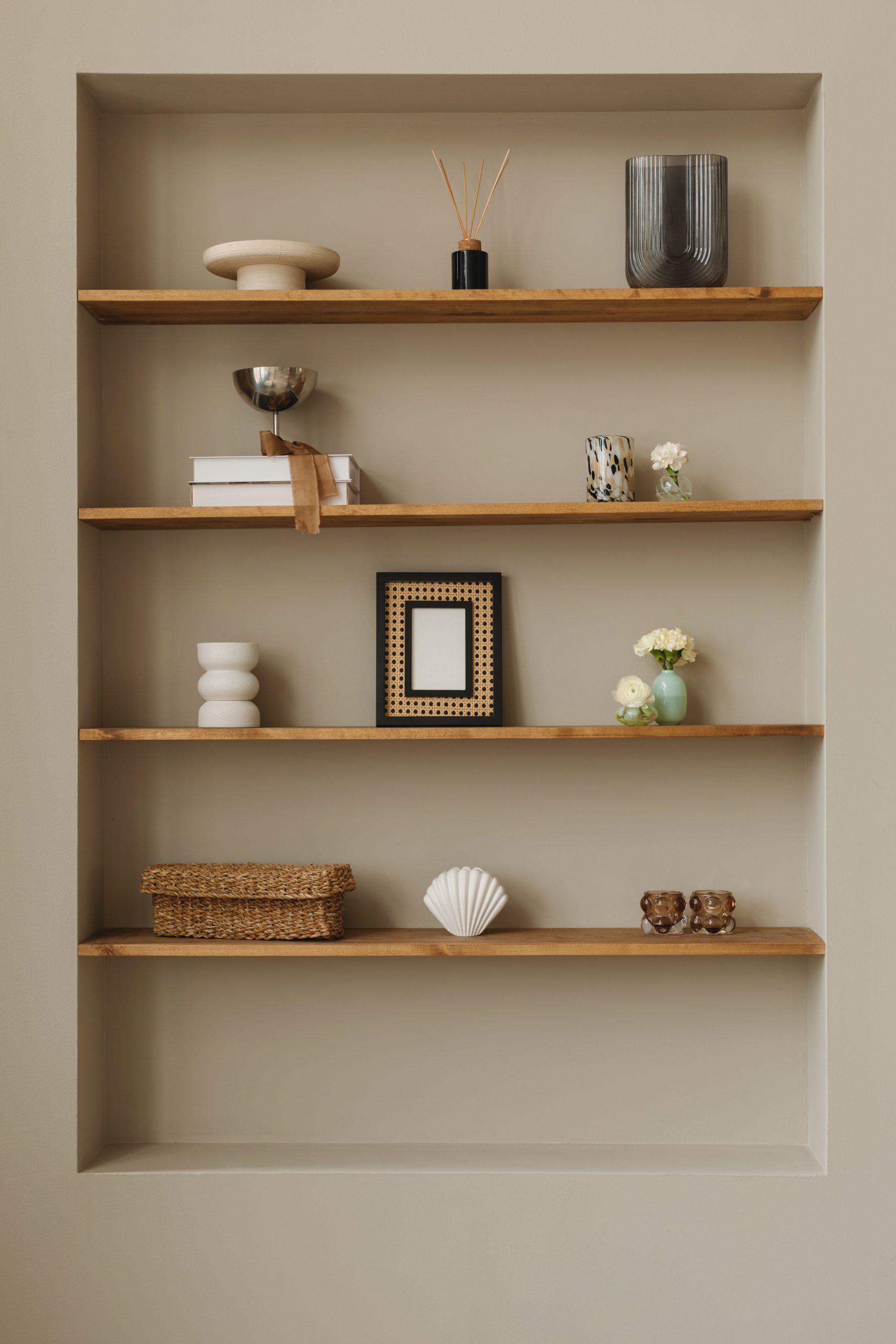
Now that you understand the importance of texture, height, and scale, let’s delve into some specific styling techniques that will bring your shelves to life. These shelf styling tips will help you arrange your curated collection in a way that is both visually appealing and reflects your personal style.
- The Rule of Thirds: Just like in photography, the rule of thirds can be applied to shelf styling. Imagine dividing your shelf into thirds both horizontally and vertically. Placing objects at the intersection of these lines creates a more visually appealing and balanced arrangement. This technique helps to avoid placing items directly in the center, which can look static.
- Visual Balance: Strive for visual balance by distributing visual weight evenly across your shelves. Balance can be achieved through symmetry, asymmetry, or radial balance. Symmetrical arrangements create a formal and traditional look, while asymmetrical arrangements are more dynamic and modern. Radial balance involves arranging items around a central point.
- Creating Depth and Layers: Layering objects adds depth and dimension to your shelves. Place smaller items in front of larger ones, and use books or boxes to create different levels. This technique prevents the display from looking flat and adds visual interest. Layering also allows you to showcase a greater number of items without overcrowding the shelves.
- Incorporating Greenery: Plants add life and vibrancy to any space, including your shelves. Incorporate small potted plants, trailing vines, or dried botanicals to add a touch of nature and freshness. Choose plants that thrive in the lighting conditions of your shelves and complement your overall style. Greenery softens the hard lines of shelves and adds a touch of organic beauty.
- Negative Space: Don’t be afraid to leave some empty space on your shelves. Negative space, also known as white space, is just as important as the objects themselves. It allows the eye to rest and prevents the display from looking cluttered. Negative space gives your curated items room to breathe and stand out.
By implementing these shelf styling techniques, you can create a display that is both visually appealing and reflects your personal style. Remember, shelf styling is an art form, so don’t be afraid to experiment and have fun with it! These techniques will help you achieve a polished and professional look, transforming your shelves into captivating focal points.
Styling Slip-Ups: Common Mistakes to Avoid
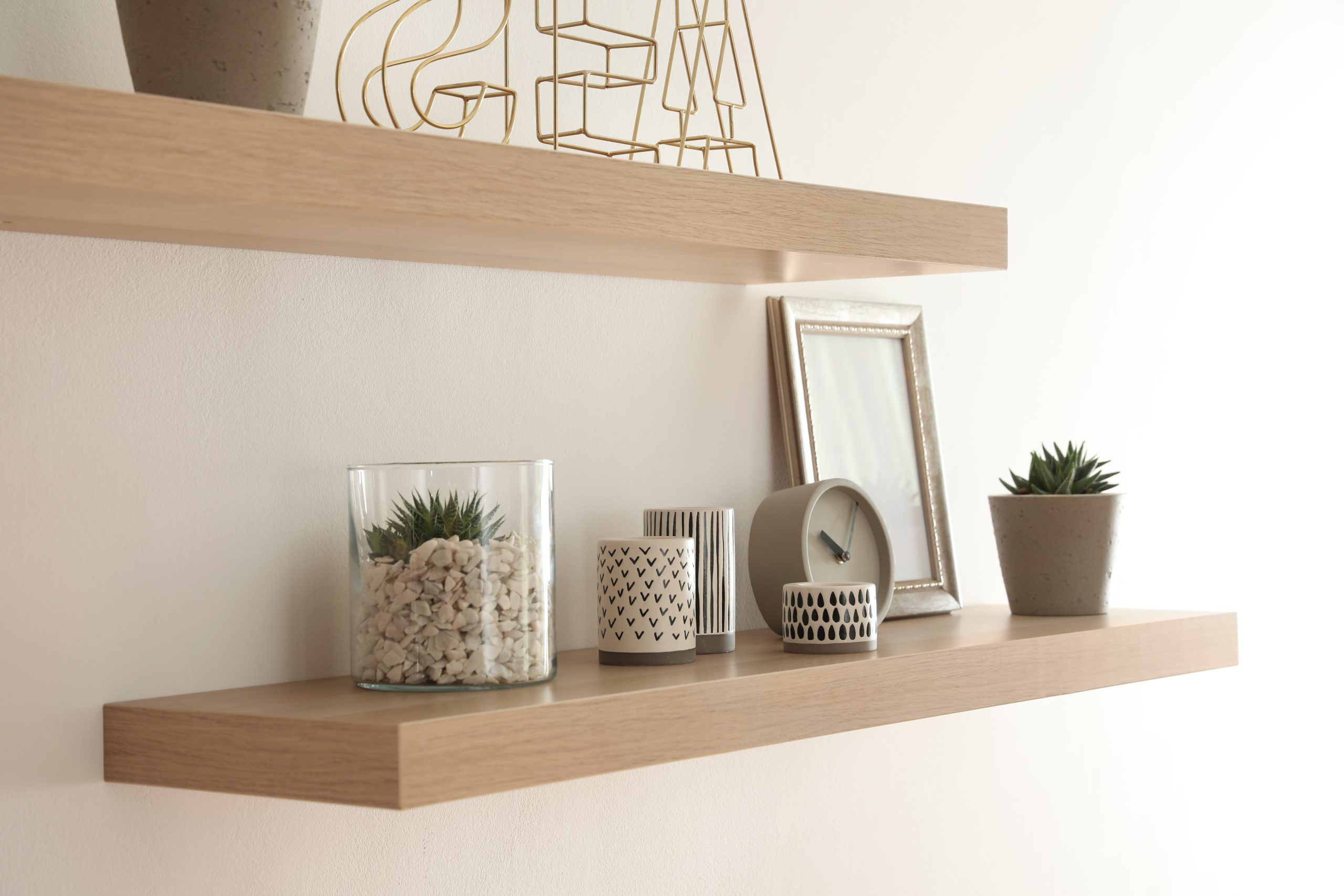
Even with the best intentions, it’s easy to make a few missteps when styling shelves. Being aware of these common shelf styling mistakes can help you avoid them and create a more polished and professional-looking display. Here are some pitfalls to watch out for:
- Overcrowding: One of the most common shelf styling mistakes is overcrowding. Too many items crammed onto a shelf can create a cluttered and chaotic look. Remember the importance of negative space. Give your objects room to breathe and allow the eye to rest. Edit ruthlessly and prioritise quality over quantity. A few well-chosen items will have a greater impact than a cluttered mess.
- Neglecting the Back of the Shelf: The back of the shelf is often overlooked, but it’s a valuable opportunity to add depth and visual interest. Consider painting the back of the shelf a contrasting colour, adding wallpaper, or using a mirrored back to create an illusion of depth. This simple step can elevate your shelf styling and make it more visually appealing.
- Lack of Cohesion and Theme: A cohesive look is essential for successful shelf styling. Avoid randomly placing items on the shelf without any thought to their relationship to each other. Choose a theme or colour palette to tie the items together and create a sense of unity. This could be a specific style, such as minimalist or bohemian, or a colour scheme that complements the room’s décor.
- Ignoring Scale and Proportion: Using items that are all the same size and scale can create a monotonous and uninteresting display. Vary the heights and sizes of your objects to create visual interest and depth. Use the visual triangle technique and incorporate risers to elevate smaller items.
- Forgetting Functionality: While aesthetics are important, don’t forget about functionality. If you’re styling shelves in a high-traffic area, make sure the items are arranged in a way that is practical and accessible. Avoid placing fragile items in unstable positions.
By avoiding these common shelf styling mistakes, you can create a display that is both beautiful and functional. Remember, shelf styling is about creating a cohesive and visually appealing arrangement that enhances your space and reflects your personal style. Avoiding these pitfalls will help you achieve a polished and professional look.
Style Showcase: Bringing Your Shelf Styling Vision to Reality
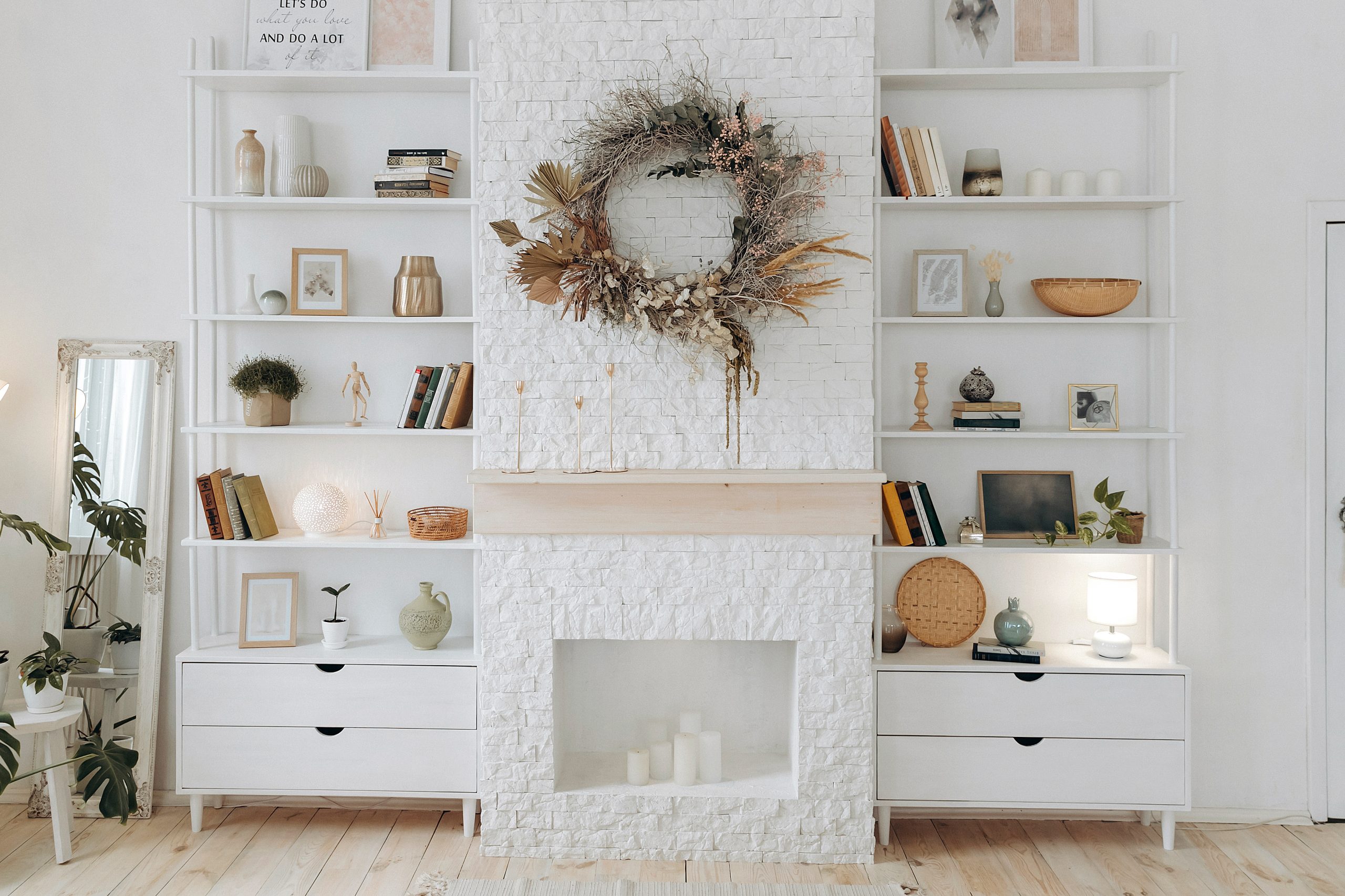
You’ve assessed your shelves, defined your vision, curated your collection, mastered styling techniques, and learned to avoid common mistakes. Now it’s time to put it all together and create a shelf styling masterpiece that truly reflects your personal style. This is where your creativity shines!
Here’s a recap of the key elements to keep in mind as you bring your shelf styling vision to reality:
- Balance: Strive for visual balance by distributing visual weight evenly across your shelves. Use the rule of thirds and visual triangle techniques to achieve a harmonious arrangement.
- Variety: Incorporate a variety of textures, materials, heights, and sizes to create a dynamic and visually interesting display. Mix and match different elements to add depth and dimension.
- Cohesion: Choose a theme or colour palette to tie the items together and create a sense of unity. This will ensure that your shelves look cohesive and intentional, rather than random and cluttered.
- Personality: Don’t be afraid to inject your personality into your shelf styling. Display items that you love and that tell a story about you. This is your chance to showcase your unique style and create a space that truly feels like home.
- Experimentation: Shelf styling is an art form, so don’t be afraid to experiment and have fun with it! Try different arrangements, move things around, and see what works best for you. There’s no right or wrong way to style a shelf, as long as you love the result.
With these expert shelf styling tips, you’re well-equipped to transform your shelves into stunning focal points. Remember, shelf styling is an ongoing process. As your style evolves and you acquire new treasures, don’t be afraid to refresh your shelves and create new displays. Embrace the opportunity to express your creativity and make your space truly your own.
Transforming your living space with stylish shelves is an achievable goal with the right guidance. From assessing your shelf space and curating a captivating collection to mastering styling techniques and avoiding common pitfalls, you now possess the knowledge to elevate your home décor. Remember, shelf styling is more than just placing objects on a surface; it’s an opportunity to express your personality, tell your story, and create a visually stunning focal point.
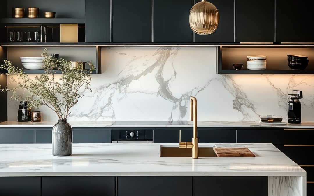
by Kesaa Interiors | DESIGN GUIDES, Kitchen, ROOMS, TRENDING
Read along for the best kitchen trends of 2025.
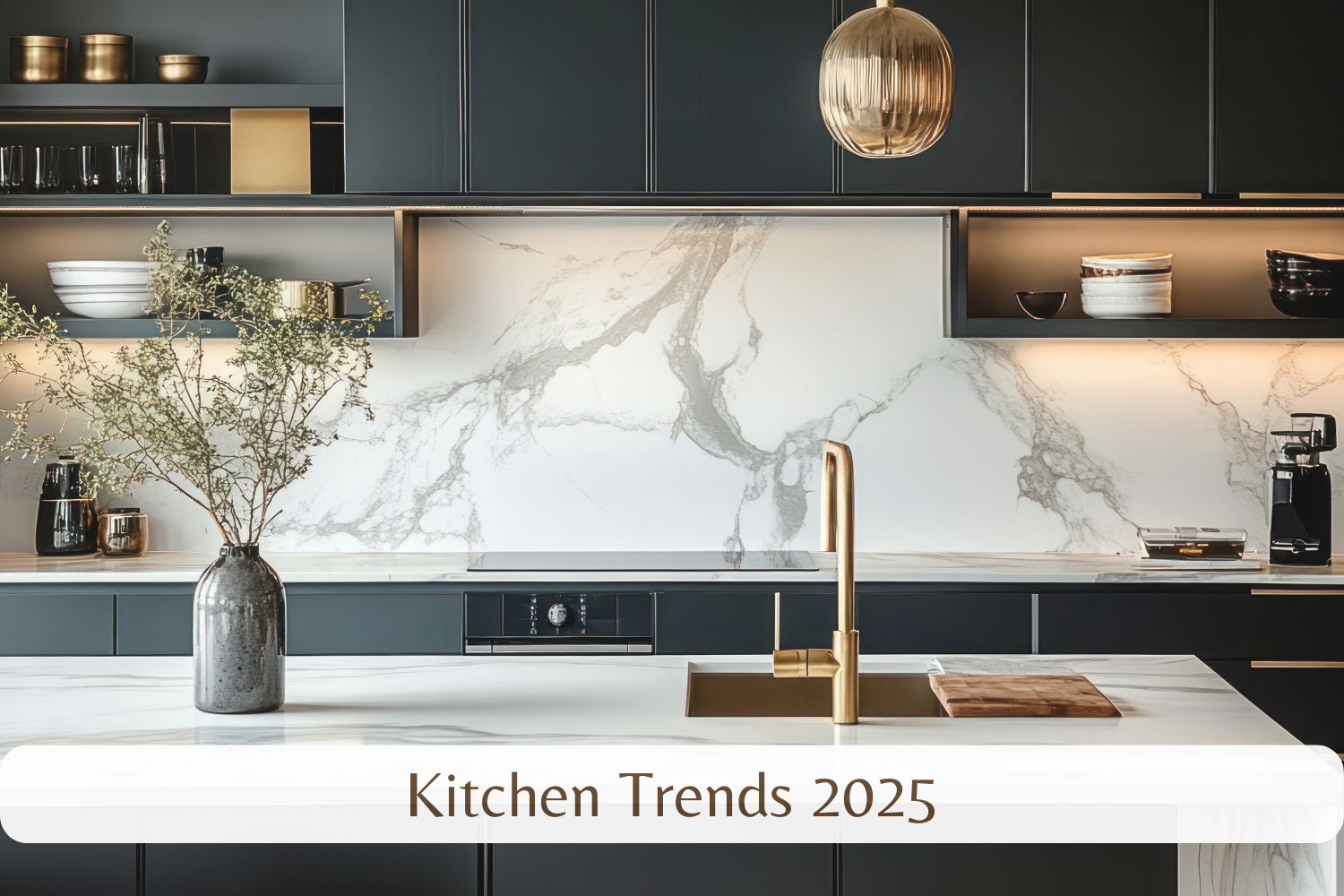
The kitchen truly is the heart of the home, a space where culinary creativity flourishes and families gather. And just like the recipes we create within them, kitchen design is constantly evolving.
So, what’s cooking in the world of interior design? This post will explore the hottest kitchen trends in 2025, offering a glimpse into the styles, materials, and technologies designers predict will dominate our kitchens in the coming years. Get ready to be inspired!
Best Kitchen Trends 2025
1. Warm Minimalism Takes Center Stage
Minimalism has been a reigning design trend for years, but kitchen trends 2025 are showing a shift towards a warmer, more inviting interpretation of this popular style. Say goodbye to stark white spaces and hello to warm minimalism. This emerging aesthetic embraces natural materials, creating a sense of organic elegance and cosy sophistication. Think light oak cabinets, honed marble countertops, and textured linen accents. The color palettes favored by kitchen trends 2025 in this style lean towards warm neutrals, earthy tones like terracotta and clay, and muted greens, creating a calming and inviting atmosphere.
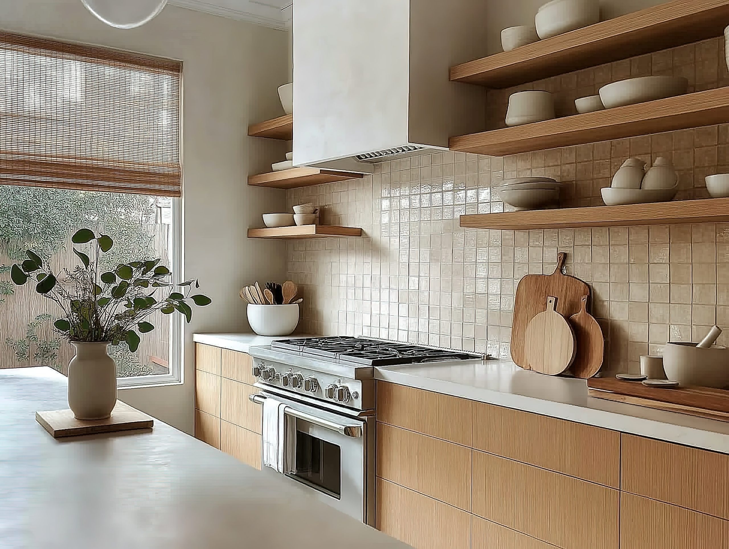
While still emphasising clean lines and decluttering, warm minimalism, a key element of kitchen trends 2025, prioritises comfort and livability. It’s about achieving a sense of balance – a space that feels both open and airy, yet grounded and inviting. Designers are predicting that this softer approach to minimalism will be a defining feature of kitchen trends 2025, offering a welcome respite from the sometimes sterile feel of traditional minimalist design.
2. Smart Kitchens Get Smarter
Technology continues to transform our lives, and the kitchen is no exception. Kitchen trends 2025 are embracing smart technology in exciting new ways, creating spaces that are not only stylish but also incredibly functional and efficient. Forget standalone gadgets; kitchen trends 2025 are all about seamless integration. Imagine smart refrigerators that track your grocery inventory and suggest recipes, voice-activated faucets that dispense precise amounts of water, automated lighting that adjusts to the time of day, and integrated sound systems that fill the space with your favorite music.

These advancements aren’t just about futuristic novelty; they genuinely enhance the kitchen experience. Smart appliances streamline cooking processes, minimise waste, and offer unprecedented levels of personalisation. From controlling your oven remotely to brewing your coffee automatically, kitchen trends 2025 are putting you in complete command of your culinary domain. Designers are recognising the growing demand for these smart features, making them a central component of their kitchen trends 2025 predictions.
3. Sustainability Shines
As awareness of environmental issues grows, sustainability is no longer a niche concept but a core value. Kitchen trends 2025 are reflecting this shift, with eco-conscious design taking center stage. This means prioritising materials and practices that minimise environmental impact without compromising on style or functionality. Expect to see a rise in the use of recycled materials, such as countertops made from recycled glass or paper composite, and cabinets crafted from sustainable bamboo. Energy-efficient appliances are also key players in kitchen trends 2025, helping homeowners reduce their carbon footprint and save on energy bills.
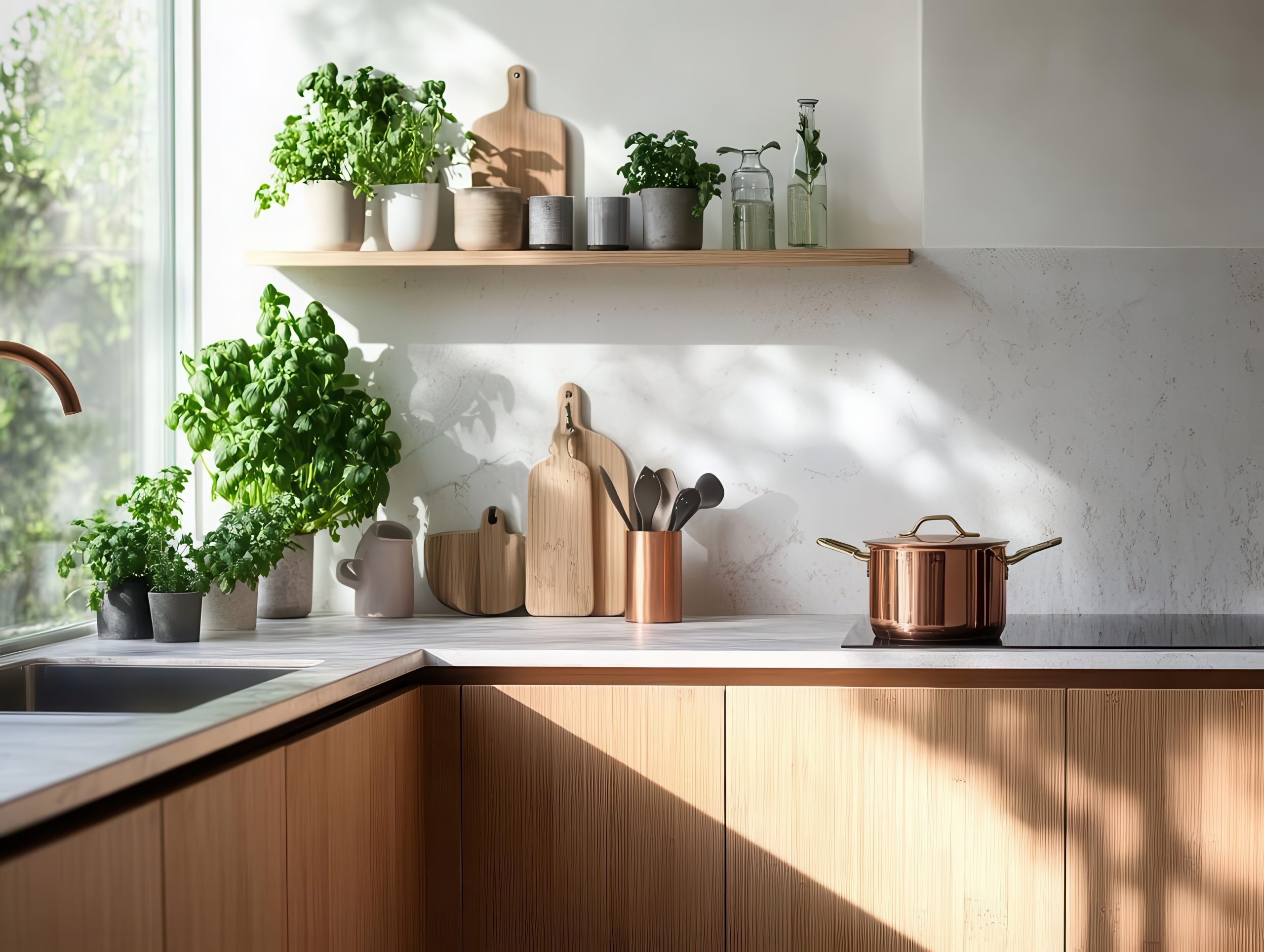
Beyond materials, kitchen trends 2025 are embracing water-saving fixtures, like low-flow faucets and dishwashers, and composting systems that reduce food waste. These choices not only benefit the planet but also contribute to a healthier and more efficient home environment. Designers are increasingly incorporating these sustainable practices into their kitchen trend visions, demonstrating that stylish design and environmental responsibility can go hand in hand.
4. Bold Colors and Patterns Make a Statement
While neutral palettes have dominated kitchen design for some time, kitchen trends 2025 are ushering in an era of bolder color choices and eye-catching patterns. This trend is all about injecting personality and visual interest into the heart of the home. Think two-toned cabinets, where contrasting colors create a dynamic and modern look. Patterned backsplashes, featuring geometric designs, vibrant mosaics, or textured tiles, are another way to add a touch of drama and artistry. Even a single accent wall in a rich jewel tone or a vibrant mural can transform the entire space.
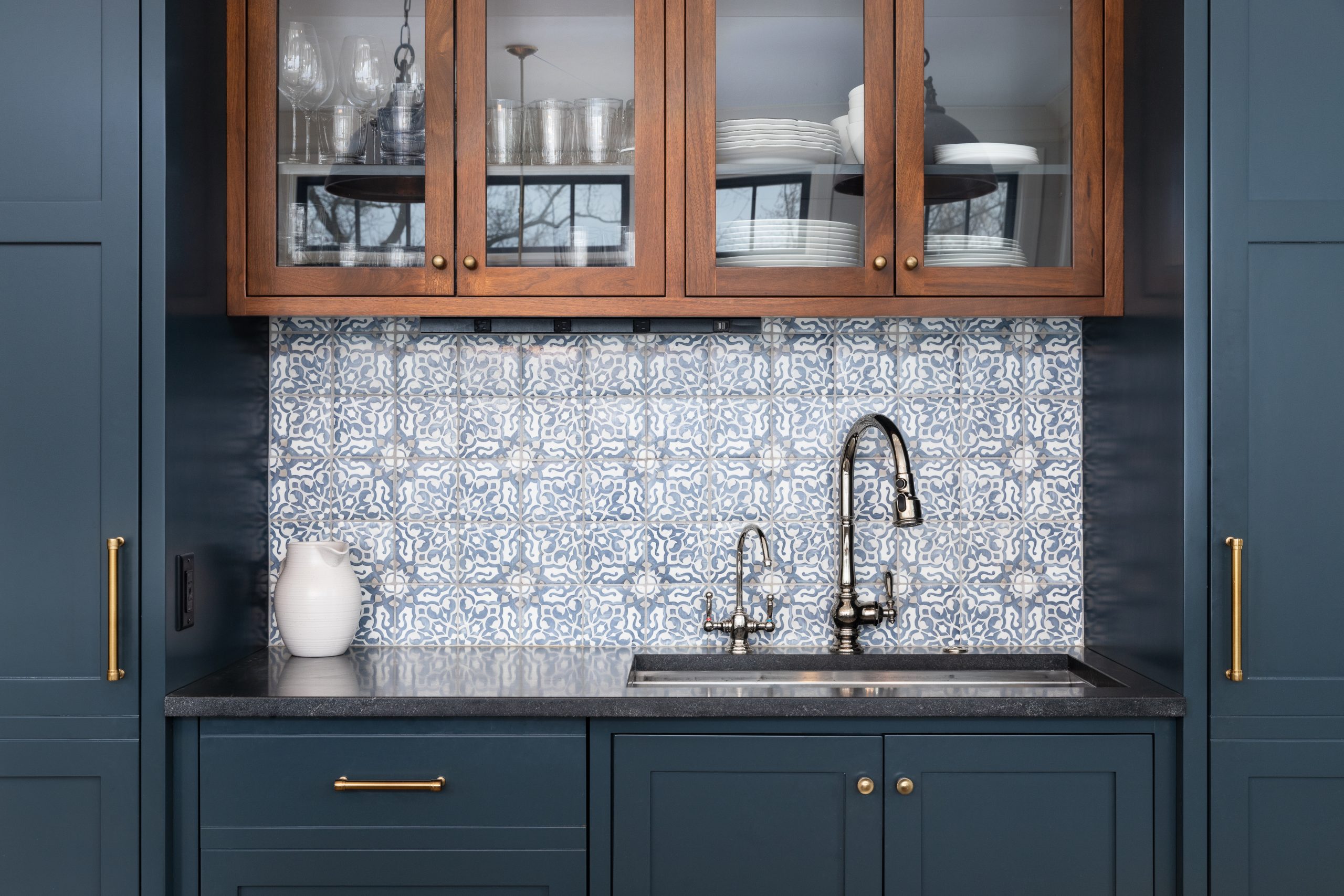
These bold elements allow homeowners to express their individual style and create a kitchen that truly reflects their personality. Whether it’s a playful pop of color or a sophisticated pattern, kitchen trends 2025 are encouraging us to embrace a more expressive approach to design. Designers are incorporating these vibrant touches into their kitchen trends 2025 forecasts, demonstrating that kitchens can be both functional and fabulous.
5. Multifunctional Spaces Reign Supreme
The kitchen is no longer just a place to prepare meals; it’s evolving into a true hub of the home. Kitchen trends 2025 are embracing this shift by prioritising multifunctional spaces that cater to a variety of needs. As open-plan living continues to gain popularity, kitchens are seamlessly integrating with other areas of the home, creating flexible spaces that can adapt to different activities throughout the day. This might involve incorporating a small home office area within the kitchen layout, complete with a desk and comfortable seating, or creating a cosy seating nook for casual dining and socialising.
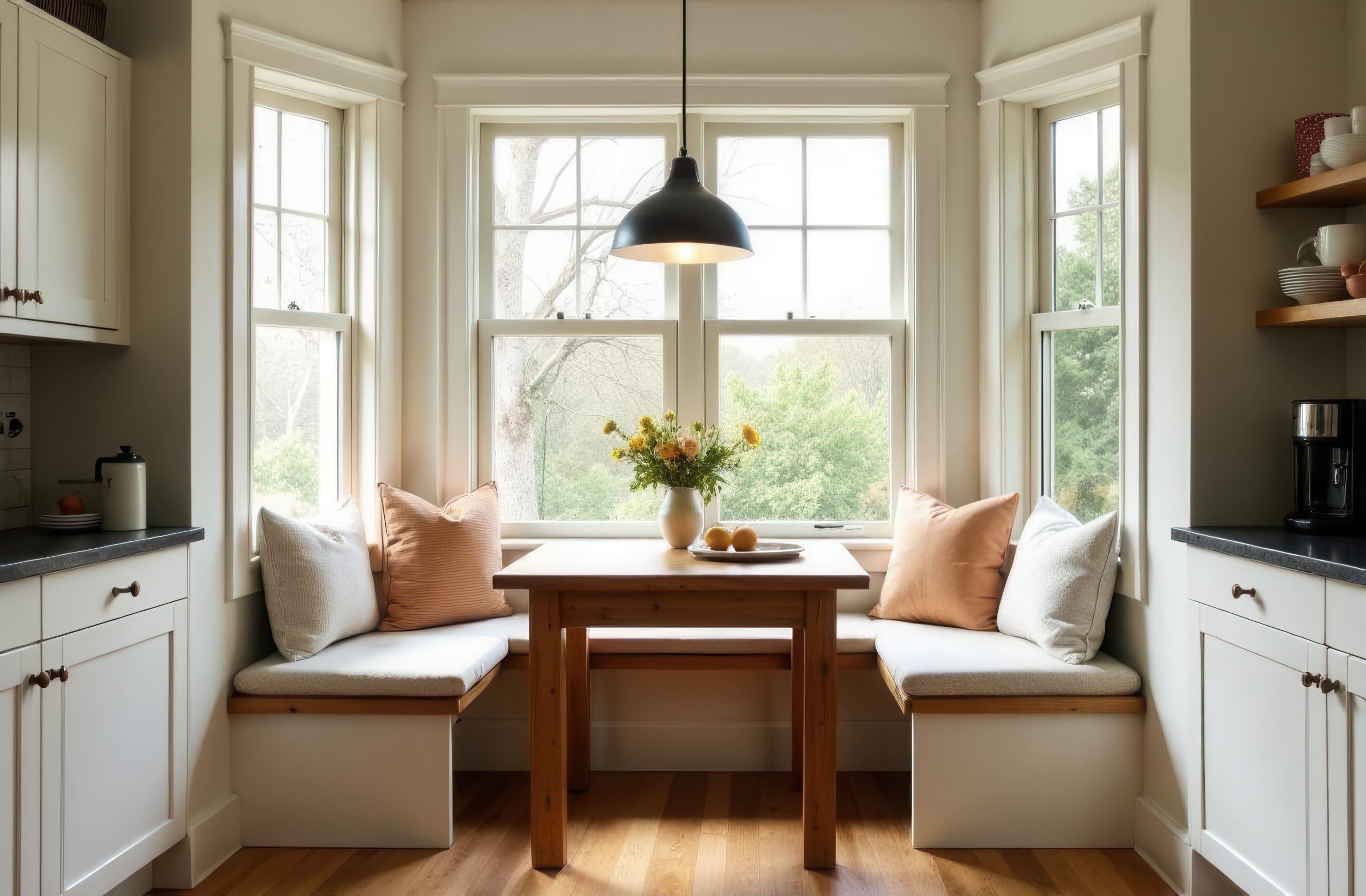
Dedicated areas for hobbies, such as baking or crafting, are also becoming increasingly common in kitchen trends 2025. Flexible furniture and clever storage solutions allow homeowners to maximise space and functionality, creating a kitchen that truly serves as the heart of the home. Designers are recognising the evolving role of the kitchen in modern life, and so kitchen trends 2025 predictions reflect this shift towards more versatile and adaptable spaces.
6. Statement Lighting Takes Center Stage
Lighting is a crucial element of any design scheme, and kitchen trends 2025 are placing a strong emphasis on statement lighting. Gone are the days of basic overhead fixtures. Now, it’s all about incorporating eye-catching pendants, sculptural chandeliers, and even integrated LED strip lighting to create ambiance and highlight key design features. Oversized pendants above kitchen islands are particularly popular, adding a touch of drama and sophistication.
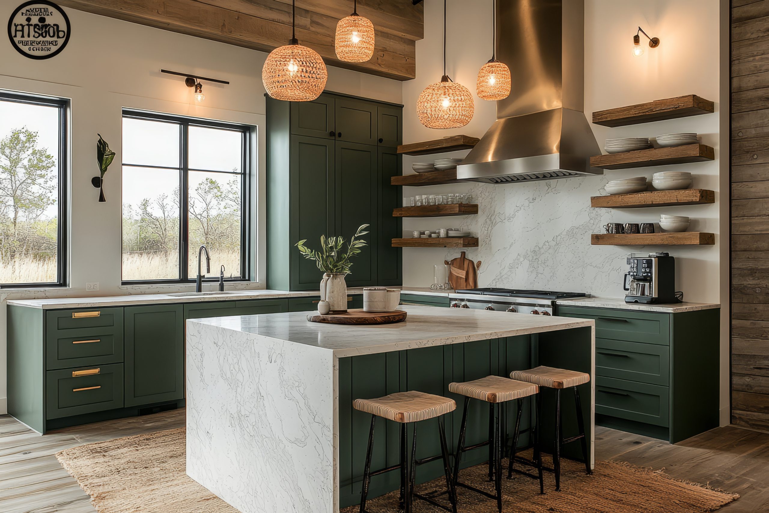
Kitchen trends 2025 are also seeing a rise in the use of layered lighting, combining ambient, task, and accent lighting to create a warm and inviting atmosphere. This allows homeowners to adjust the lighting to suit different moods and activities, from bright task lighting for meal prep to soft ambient lighting for evening gatherings.
7. Hidden Appliances for a Seamless Look
For those who crave a clean and uncluttered aesthetic, kitchen trends 2025 offer the perfect solution: hidden appliances. This trend involves seamlessly integrating appliances into the cabinetry, creating a sleek and streamlined look. Refrigerators disguised as pantry doors, dishwashers concealed behind matching panels, and microwaves tucked away in drawers are all part of this minimalist movement.
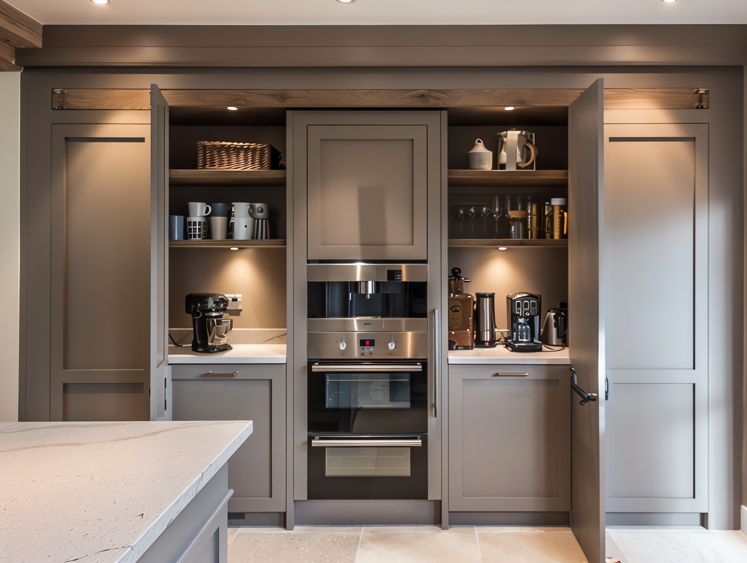
Hidden appliances not only contribute to a more visually appealing kitchen but also enhance functionality by maximising counter space and creating a more cohesive design.
8. Bringing the Outdoors In with Biophilic Design
Biophilic design, which focuses on incorporating natural elements into interior spaces, is a growing trend across all areas of design, and kitchens are no exception. Kitchen trends 2025 are embracing this concept by incorporating natural materials, such as wood, stone, and plants, to create a calming and restorative environment.
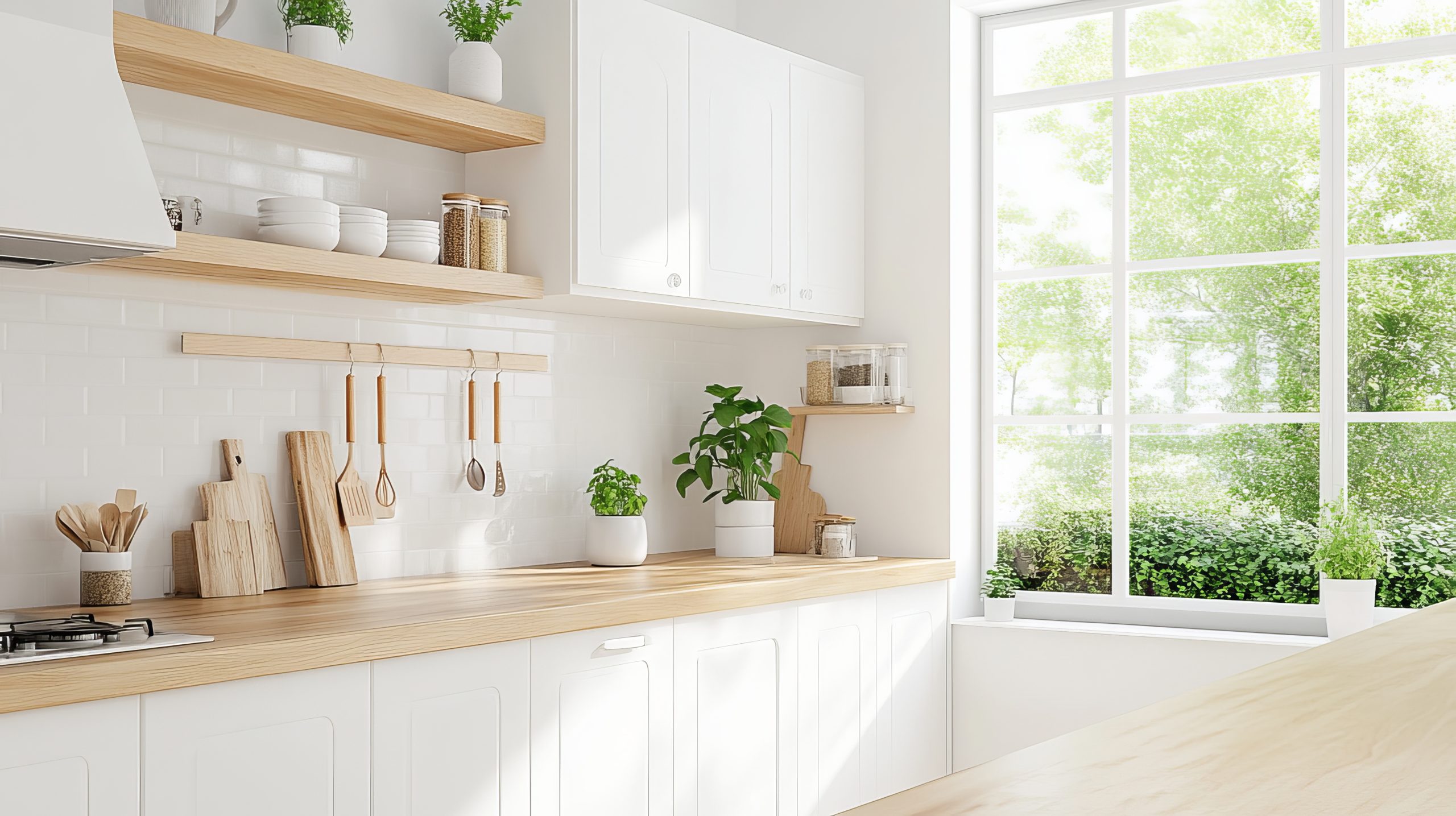
Large windows that maximise natural light, living walls filled with greenery, and natural wood accents are all key elements of biophilic design in the kitchen. These elements not only enhance the aesthetic appeal of the space but also contribute to a healthier and more relaxing atmosphere.
9. Vintage & Retro Touches Add Character
While modern design continues to be popular, kitchen trends 2025 are also seeing a resurgence of interest in vintage and retro elements. This doesn’t mean recreating kitchens of the past, but rather incorporating carefully chosen vintage-inspired pieces or antique finds to add character and personality to the space.
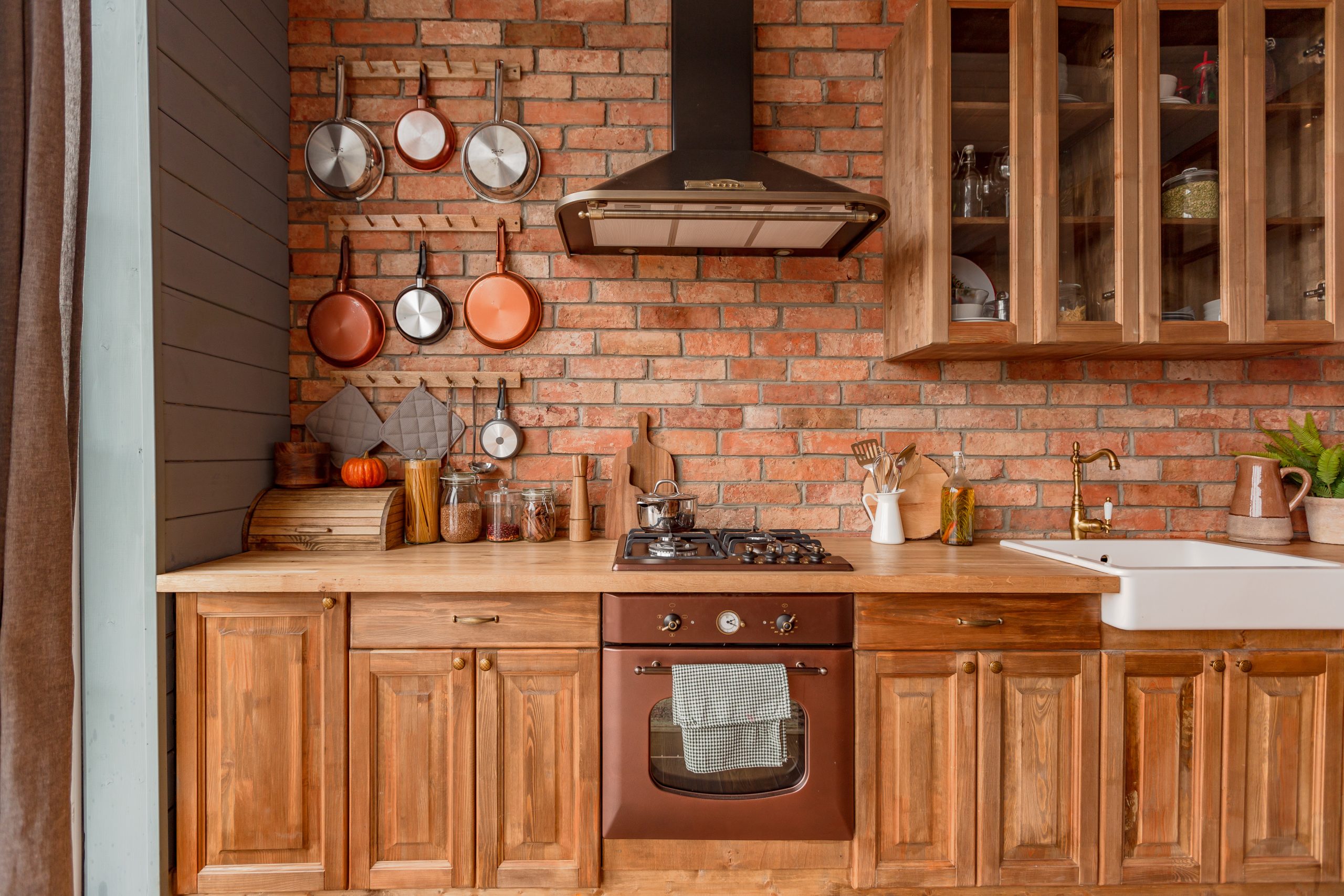
A vintage-inspired stove, antique lighting fixtures, or retro bar stools can add a touch of nostalgia and charm to a modern kitchen. These elements can be mixed and matched with contemporary pieces to create a unique and eclectic look that reflects the homeowner’s individual style. This trend is all about celebrating the past while embracing the present, creating a kitchen that is both stylish and timeless.
From warm minimalism and smart technology to sustainable practices and bold design choices, kitchen trends 2025 offer a diverse range of inspiring ideas for creating a space that is both beautiful and functional. Multifunctional layouts further enhance the kitchen’s role as the heart of the home, catering to the evolving needs of modern families. By embracing these kitchen trends 2025, you can create a kitchen that not only reflects your personal style but also enhances your everyday life.
