by Kesaa Interiors | Living Spaces, ROOMS
This post is all about Fall Decor Inspiration.
Every year, when September rolls around, I find myself drawn to richer textures and warmer tones in my design work. It’s that distinct shift in natural light—softer, more golden—that signals it’s time to help homes transition into their cosiest season. As an interior designer, I’ve learned that great fall decor inspiration comes from understanding how to layer warmth into spaces that already function well.
The beauty of autumn decorating lies in its ability to make any room feel more inviting without requiring a complete overhaul. Whether you’re working with a modern minimalist space or a traditional home full of character, the right seasonal touches can transform a room’s feel. In this guide, I’ll share the fundamental principles I use when creating fall atmospheres, room-specific strategies that actually work, and practical tips for achieving that perfectly balanced autumn look—all without breaking your budget or cluttering your space.

Essential Elements of Fall Decor: A Designer’s Foundation
Before diving into specific rooms or trendy ideas, let’s establish the core elements that make fall decorating work. These fundamentals will guide every decision you make, ensuring your fall decor inspiration translates into cohesive, livable spaces.
The Fall Colour Palette
The right colour palette forms the backbone of any seasonal design. For fall, I build around three categories that work harmoniously together:
Warm Neutrals serve as your foundation—think creamy whites, soft beiges, warm greys, and rich taupe tones. These colours ground your space and prevent it from feeling too themed or temporary. They’re particularly important if you have existing furniture or architectural elements you’re working around.
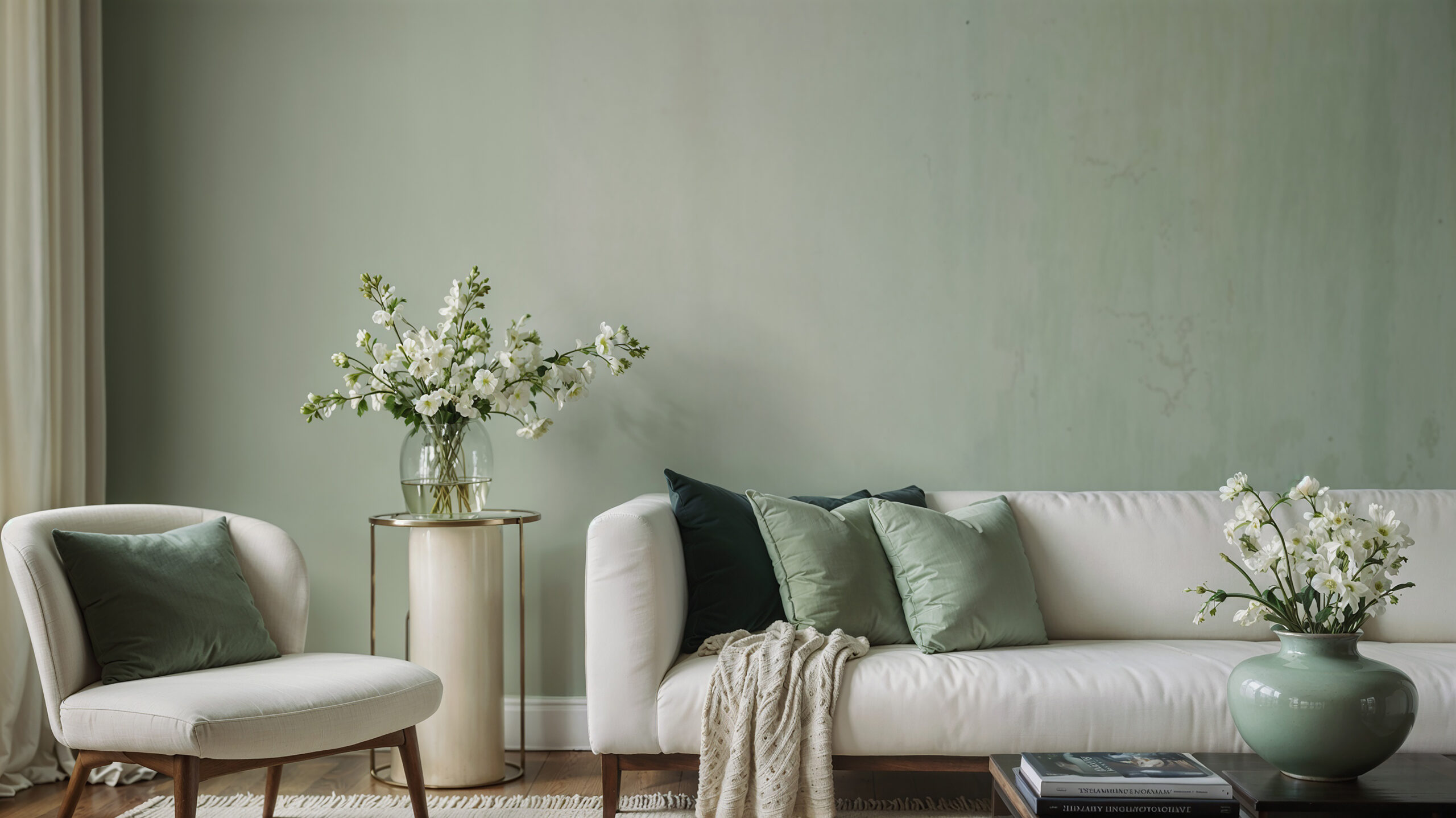
Rich Jewel Tones bring in that quintessential autumn depth. Burgundy throw pillows, burnt orange accents, deep gold accessories, and forest green elements add layers of sophistication. The key is choosing one or two of these stronger colours as accents rather than overwhelming the space with all of them.
Natural Wood Tones and Metallic Accents provide the finishing touches. Warm woods like walnut and oak naturally complement fall palettes, while brass, copper, and aged bronze metallics add subtle glamour that catches autumn’s golden light beautifully.

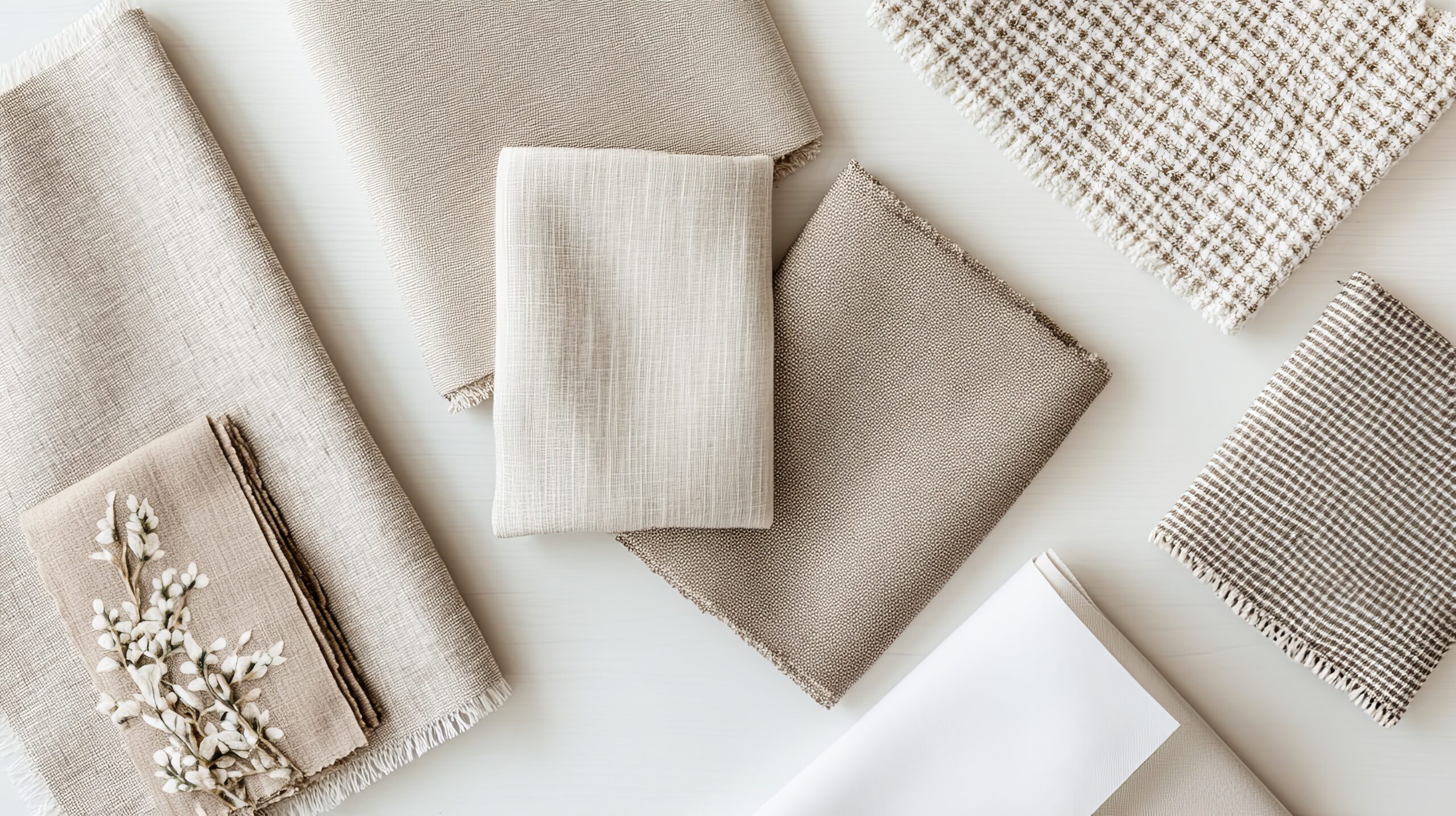
Textures That Define Autumn
Texture is where fall decor inspiration really comes to life. The goal is to create visual and tactile warmth through strategic layering:
Chunky Knits and Cable Patterns immediately signal cosiness. A substantial cable-knit throw draped over a sofa arm or chunky knit pillows nestled in chairs transform seating areas into inviting retreats. Look for pieces with interesting stitch patterns that add visual depth.
Velvet and Corduroy Fabrics bring luxurious warmth to any space. These materials work particularly well on accent pillows, ottoman covers, or even as table runners. The way they catch and reflect light adds dimension that flat fabrics simply can’t achieve.
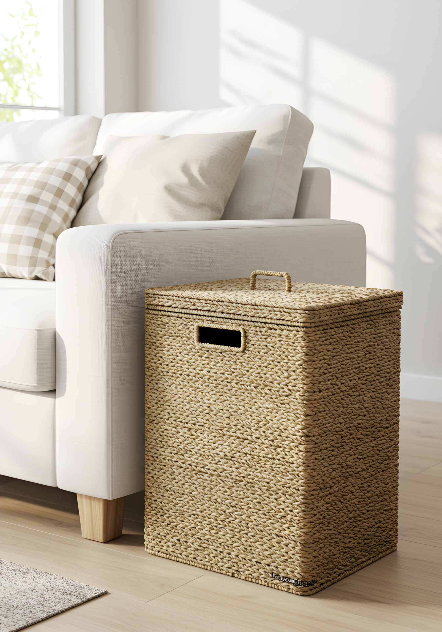
Natural Materials ground your fall decor in authenticity. Incorporate dried botanicals, wood slices, woven baskets, jute rugs, and linen fabrics. These elements prevent your seasonal decorating from feeling artificial or overdone. I often use branches from my yard or dried hydrangeas from the garden—they’re free and add genuine seasonal character.
The secret to successful texture layering is variation. Combine smooth velvets with nubby linens, soft wools with rough natural wood, shiny metallics with matte ceramics. This interplay creates the visual interest that makes a room feel professionally styled.
Key Patterns for Fall
Patterns add personality to your fall decor inspiration, but restraint is crucial. Choose one dominant pattern and support it with solids or very subtle secondary patterns:
Plaid and Tartan remain fall classics for good reason. Whether you prefer traditional Scottish tartans or modern buffalo checks, these patterns instantly evoke autumn. Use them on throw pillows, blankets, or even lampshades—but typically not all three in the same space.
Herringbone and Tweed offer sophisticated pattern options that feel less expected than plaid. These work beautifully in upholstery, throw pillows, or even as textured wallpaper in powder rooms.
Botanical Prints featuring fall leaves, branches, or abstract natural motifs can soften a space dominated by geometric patterns. Look for prints that feel artistic rather than literal—think watercolour or oak leaves rather than photographic maple leaves.
Remember that patterns should enhance your existing decor, not compete with it. If your room already features bold patterns, keep fall additions more subdued. If your space is primarily solid colours, this is your opportunity to introduce pattern through seasonal elements.

Room-by-Room Fall Decor Inspiration
Now that we’ve established the foundational elements, let’s explore how to apply these principles throughout your home. Each room presents unique opportunities for seasonal styling, and understanding these nuances makes all the difference between a space that feels thoughtfully designed versus one that’s simply decorated.
Living Room Transformation
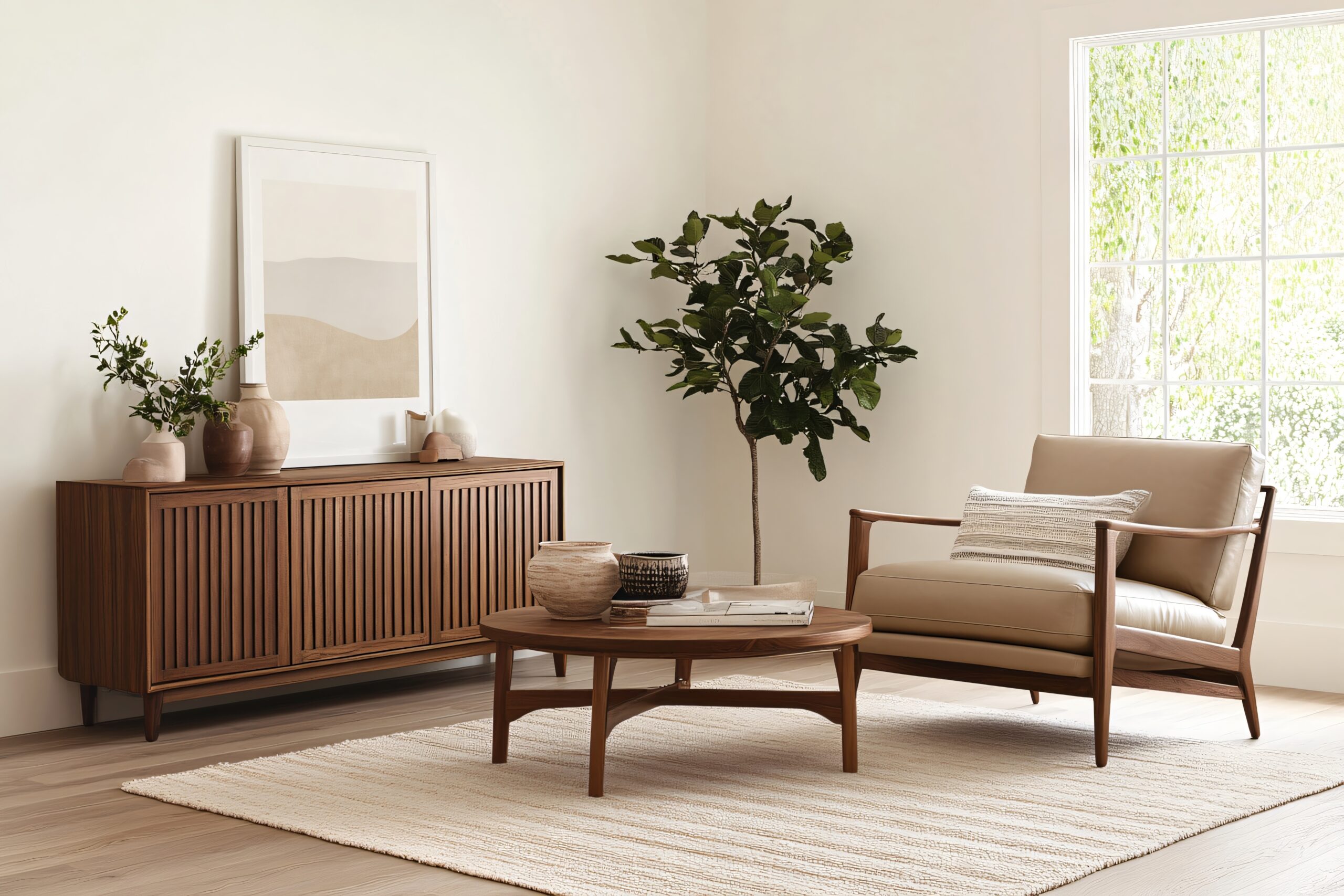
The living room typically serves as the heart of fall gatherings, making it the perfect starting point for your seasonal updates. The key is working with what you already have while adding strategic layers.
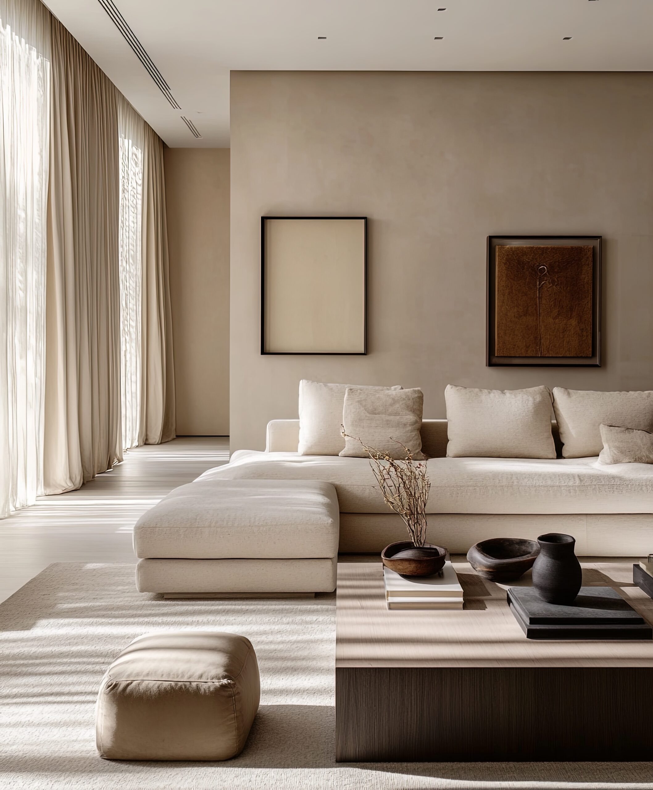
Layering Throw Pillows and Blankets is perhaps the easiest way to bring fall decor inspiration to life. Start with your largest pillows in solid, neutral tones as anchors. Add medium-sized pillows in your chosen pattern—maybe that herringbone or plaid we discussed. Finish with smaller accent pillows in rich jewel tones or interesting textures. The magic number is usually odd—three or five pillows per sofa end creates better visual balance than even numbers.
For throws, drape rather than fold. A casually draped chunky knit blanket over the back corner of a sofa looks infinitely more inviting than one folded into a perfect rectangle. Keep additional throws in a basket nearby—both practical for chilly evenings and visually appealing.
Switching Summer Slipcovers might seem like a bigger commitment, but if you already use slipcovers, the seasonal swap makes a dramatic difference. Trade white or light linen covers for warmer tones like camel, rust, or deep grey. The entire room’s atmosphere shifts with this single change.
Creating a Focal Point with Fall Mantel Styling requires restraint and intention. Start with varying heights—perhaps birch logs stood on end, hurricane lanterns of different sizes, and cascading greenery. Add preserved fall leaves or branches for natural movement. The trick is creating depth by layering items at different distances from the wall rather than lining everything up like soldiers.
Coffee Table Styling offers another opportunity for fall decor inspiration. Use a wooden tray to corral smaller items—perhaps a trio of small white pumpkins, a brass candlestick, and a small potted succulent. Stack relevant books with warm-toned covers, and add a textural element like a small wooden bowl filled with acorns or pinecones. Keep it functional—leave space for drinks and remotes.

Dining Room Fall Touches
The dining room often gets overlooked between holidays, but fall presents the perfect opportunity to make this space feel special for everyday meals and intimate gatherings alike.
Centrepiece Ideas Using Natural Elements work best when they don’t obstruct conversation. Create a low, linear arrangement down the table’s centre using a mix of mini pumpkins, gourds, and preserved eucalyptus. Weave in battery-operated fairy lights for evening ambience. For round tables, a single elevated arrangement—perhaps branches in a tall vase surrounded by votives—maintains sight lines while adding vertical interest.
Table Setting Inspiration doesn’t require new dishes. Layer what you have: start with natural woven placemats, add your everyday white plates, then top with salad plates in warm metallics or rich colours. Cloth napkins in autumnal tones, tied with jute twine and a sprig of rosemary, elevate even casual dinners. The goal is creating moments of beauty in daily life, not just special occasions.
Updating Dining Chairs can be as simple as adding seat cushions in seasonal fabrics. If your chairs already have upholstered seats, consider having slipcovers made in a fall-appropriate fabric—it’s less expensive than reupholstering and completely reversible.
Lighting Adjustments make an enormous impact on ambience. If you have a dimmer switch, use it. If not, swap clear bulbs for warm-toned ones, and incorporate candles. Taper candles in brass or wooden holders add height and elegance, while votives scattered down the table create intimate pools of light.

Bedroom Cosy Updates
The bedroom might not be where you entertain, but creating a cosy fall retreat here affects how you start and end each day. The approach should be subtle and soothing rather than heavily themed.
Bedding Layers follow a specific formula for both beauty and comfort. Start with your fitted sheet, add a flat sheet (even if you typically skip it in summer), then a lighter blanket, followed by your duvet or comforter. The final layer—a textured throw folded across the foot of the bed—adds visual weight and extra warmth for cold feet. Choose bedding in warm neutrals with perhaps one layer introducing pattern or deeper colour.
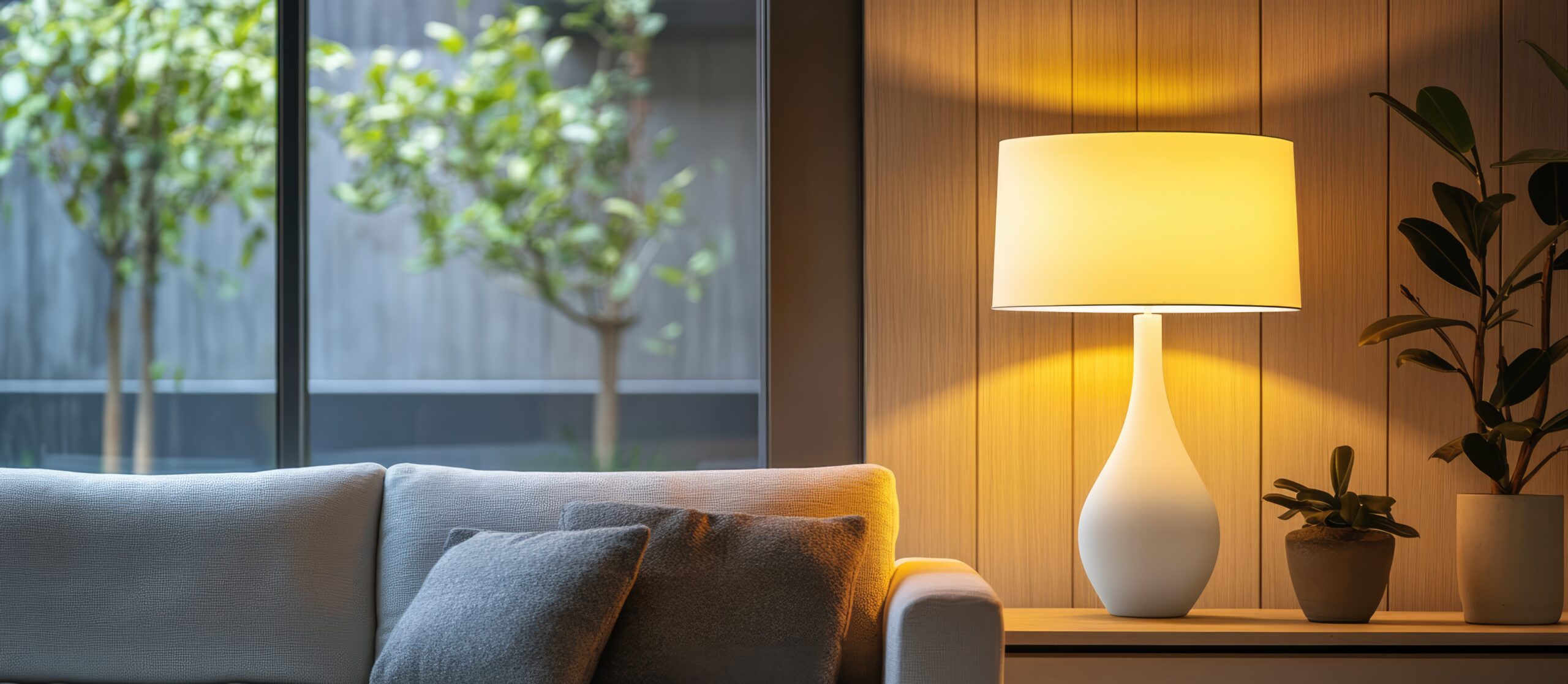
Nightstand Styling requires editing. Clear the summer’s lighter accessories and introduce a small lamp with a warm-toned shade, a small dish for jewellery in brass or wood, perhaps a small potted plant like a snake plant or pothos, and one seasonal element—maybe a small ceramic pumpkin or a candle in an autumn scent. The key is maintaining functionality while adding seasonal warmth.
Window Treatment Updates don’t necessarily mean new curtains. If you have sheers for summer, layer heavier panels over them for fall. This creates better insulation and adds visual weight to the room. If new panels aren’t in the budget, simply swapping out curtain ties for ones in fall colours or textures can refresh the look.
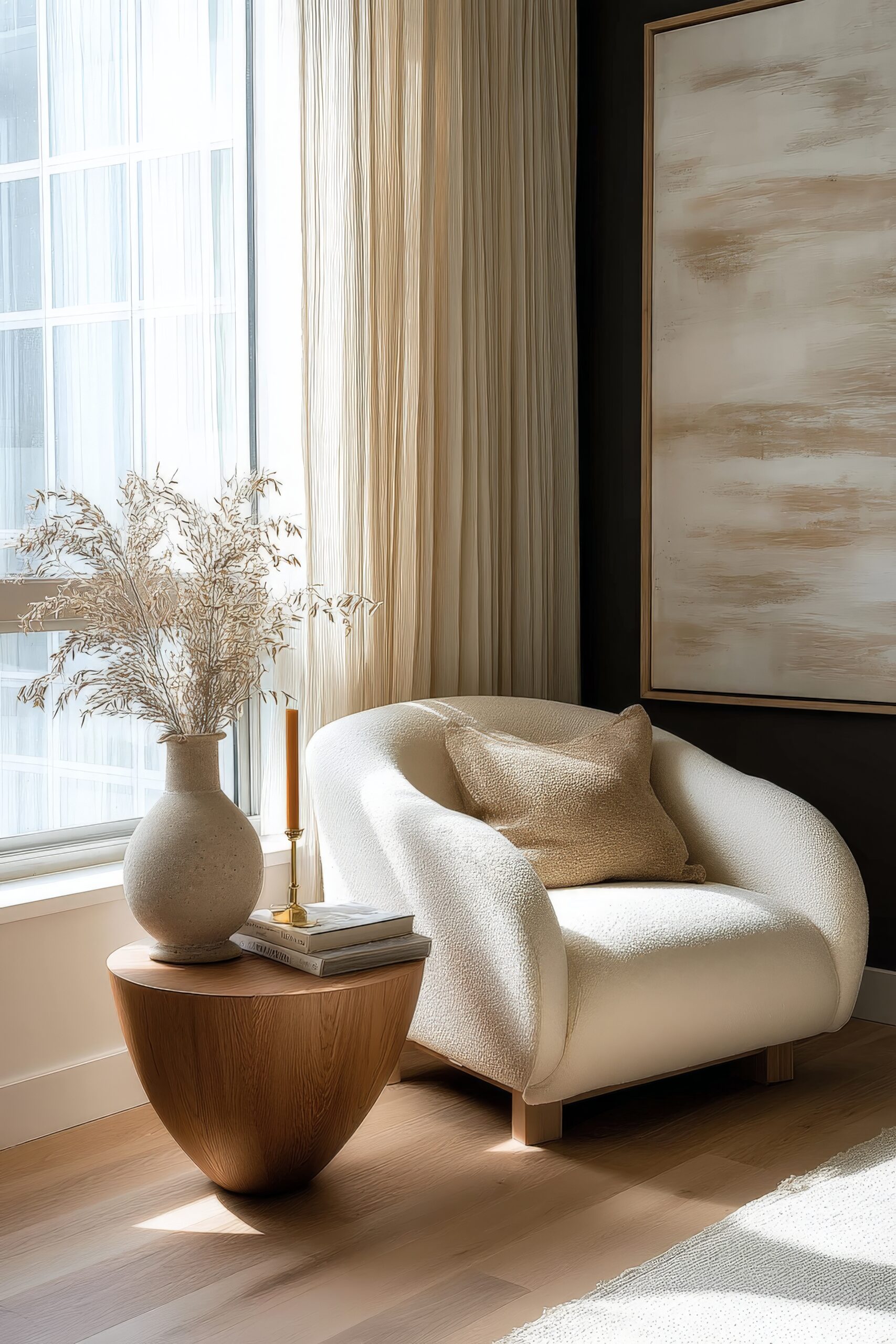
Creating a Reading Nook capitalises on fall’s earlier evenings. Position a comfortable chair near a window, add a soft throw and a lumbar pillow in a fall pattern. Place a small side table within reach for books and beverages, and ensure good lighting—either a floor lamp or table lamp with a warm bulb. This intentional space becomes a retreat within a retreat.

Kitchen & Entryway Details
These transitional spaces offer perfect opportunities for fall decor inspiration that’s both functional and welcoming.
Seasonal Kitchen Textiles provide instant updates without cluttering counters. Swap dish towels for ones in fall colours or patterns—burnt orange, deep red, or classic plaid. Add a runner to your kitchen island or peninsula in a warm, textured fabric. Replace summer’s bright oven mittens with ones in rich autumn hues. These functional items do double duty as decor.
Fall Produce as Decor serves both aesthetic and practical purposes. A wooden bowl filled with apples, pears, or pomegranates adds colour and encourages healthy snacking. Small pumpkins and gourds clustered on a cutting board create an instant vignette. Just remember to use or compost them before they spoil—nothing ruins fall ambience quite like rotting produce.
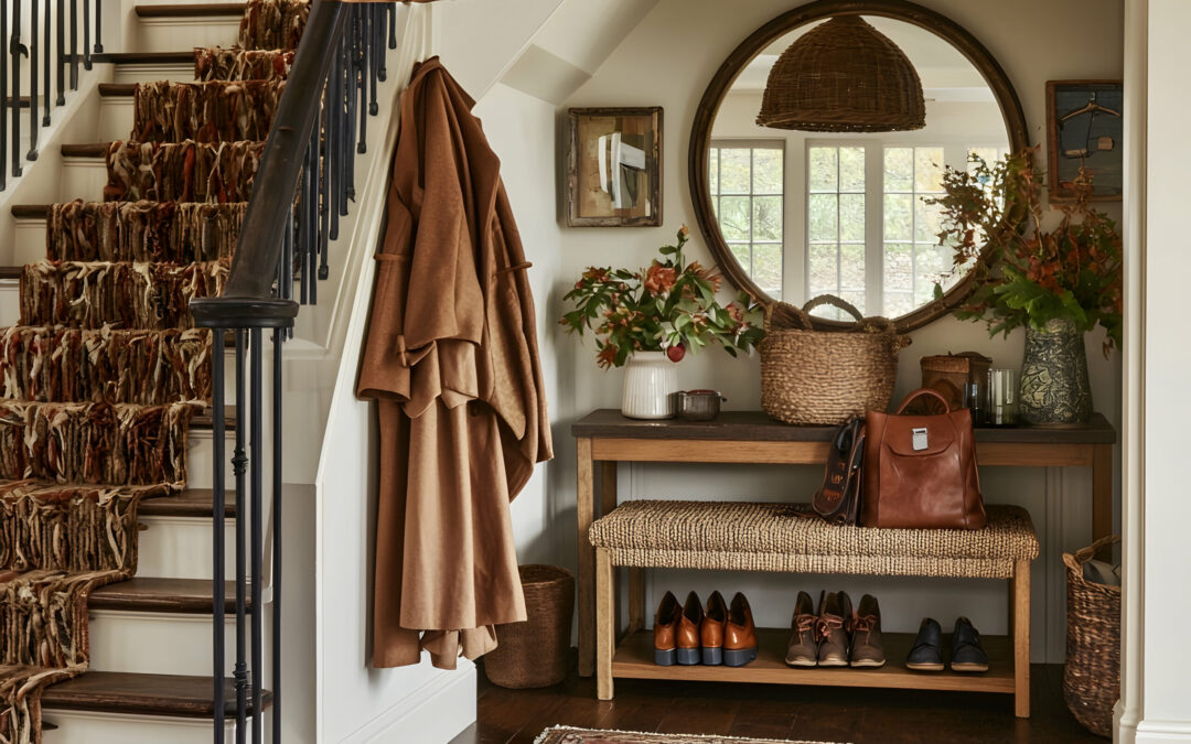
Entryway Console Styling sets the tone for your entire home. Layer a textured runner on the console, add a lamp with a warm-toned shade, and create a vignette with varying heights—perhaps a tall vase with branches, a medium-sized decorative box for keys, and a small dish for loose change. A mirror above reflects light and makes the space feel larger while providing that last-minute appearance check.
Doorway and Porch Transitions should feel cohesive with your interior choices. If you’ve used lots of natural elements inside, continue that theme with potted mums, ornamental kale, or a simple arrangement of corn stalks. A layered doormat approach—a larger neutral jute mat with a smaller printed seasonal mat on top—adds interest while maintaining functionality. Keep scale in mind; a tiny pumpkin on a large porch looks lost, while oversized decorations can overwhelm a small stoop.

Professional Styling Tips for Fall Decor
After years of creating seasonal interiors, I’ve developed certain techniques that consistently deliver polished results. These aren’t rules as much as reliable strategies that help achieve that “pulled together” look many people struggle to define.
The Rule of Three
This classic design principle applies beautifully to fall decor inspiration. Our brains naturally find odd numbers more appealing and easier to process than even groupings.
Grouping Objects for Visual Impact means thinking beyond individual pieces. Three mercury glass pumpkins of varying sizes create more interest than one large statement piece. When styling a mantel or shelf, create multiple groupings of three—perhaps three candlesticks on one end, three small gourds clustered in the centre, and a trio of preserved leaf stems on the other end.
Varying Heights and Textures within each grouping prevent monotony. If you’re arranging three pumpkins, choose different varieties—maybe one velvet, one ceramic, and one natural white pumpkin. Vary their heights by placing one on a small stack of books or a wooden riser.
Creating Vignettes Throughout the Home extends this principle beyond individual surfaces. Think of each room as needing three points of seasonal interest—in a living room, that might be the mantel, coffee table, and a side table. This creates a visual flow that guides the eye around the space.
Lighting for Autumn Ambience
Lighting often gets overlooked in seasonal decorating, but it’s absolutely crucial for achieving that warm, inviting atmosphere we associate with fall.
Layering Light Sources creates depth and eliminates harsh shadows. Combine overhead lighting (on dimmers when possible), table or floor lamps, and candles. Each source serves a purpose—overhead for general illumination, lamps for task lighting and ambient glow, candles for flickering warmth and scent.
Warm Bulb Recommendations make an immediate difference. Look for bulbs labelled “warm white” or “soft white” with a colour temperature of 2700K-3000K. These emit a golden glow that complements fall colours beautifully. Avoid anything labelled “daylight” or “cool white” during fall months—they’ll make your carefully chosen warm tones look flat and uninviting.
Candle Placement Strategies require both aesthetic consideration and safety awareness. Group pillar candles of varying heights on a tray, place votives in glass holders along a mantel, or use battery-operated candles in lanterns where real flames aren’t practical. The goal is to create pools of warm light at different levels throughout the room.

Bringing Nature Indoors
Nothing authentically captures fall decor inspiration quite like natural elements. The key is selecting materials that maintain their beauty as they dry or age.
Preserved Leaf Arrangements work best when you choose leaves at their peak colour and preserve them properly. Glycerin-preserved leaves maintain flexibility and colour far longer than those that simply dry out. Arrange them in tall vases, weave them into garlands, or scatter individual specimens across a table runner.
Branch and Twig Displays add architectural interest to any arrangement. Curly willow, birch branches, or even interesting fallen branches from your yard create height and movement. Spray them with clear sealant to prevent bark from flaking in your home.
Incorporating Pumpkins Beyond Orange expands your design possibilities dramatically. White pumpkins offer elegance, sage green varieties complement neutral palettes, and deep burgundy heirloom varieties add unexpected richness. Mix real and high-quality faux versions—guests rarely notice the difference, and you’ll extend your decorating timeline.
Dried Flower Arrangements provide lasting beauty with zero maintenance. Hydrangeas, wheat stalks, pampas grass, and ornamental grasses all dry beautifully. Combine different textures and heights for arrangements that feel gathered rather than purchased.

Budget-Friendly Fall Decor Inspiration Ideas
Creating a beautifully decorated fall home doesn’t require a designer budget. Some of my favourite seasonal touches cost little to nothing, relying more on creativity and strategic choices than spending.
DIY Projects Worth Your Time
Not every DIY project delivers professional-looking results, but these consistently do:
No-Sew Pillow Covers transform existing pillows instantly. Purchase fabric in fall patterns or textures, cut to size leaving extra for fold-overs, and use fabric tape or safety pins to secure. When the season ends, simply remove and store flat—far more space-efficient than storing entire pillows.
Mason Jar Luminaries create ambient lighting for pennies. Wrap jars with twine, add a battery-operated tea light, and fill with small seasonal elements like acorns or mini pinecones. Line them along a mantel or cluster on a tray for instant ambience.
Painted Pumpkin Alternatives let you customise colours to match your exact decor. Use chalk paint for a matte finish, metallic spray paint for glamour, or even chalkboard paint for pumpkins you can personalise with different messages throughout the season.
Foraged Material Arrangements cost nothing but time. Collect interesting branches, colourful leaves, pine cones, and acorns during walks. Arrange them in containers you already own, or simply pile them in a wooden bowl for an organic centrepiece.
Smart Shopping Strategies
Strategic shopping ensures you build a collection of quality seasonal items without overspending:
Items to Invest In vs. Temporary Pieces: Invest in neutral, high-quality basics like wool throws, versatile pillow covers, and well-made candle holders that work across seasons. Save money on trendy items, specific holiday motifs, or anything that screams “fall 2024” rather than timeless autumn.
Shopping Timeline for Best Deals: Shop end-of-season sales for next year’s decor—you’ll find 50-75% off quality items. For current season needs, shop in early September for the best selection, or wait until mid-October when retailers start discounting to make room for holiday merchandise.
Versatile Pieces That Transition to Winter: Choose items in rich neutrals, metallic finishes, or natural materials that work for both fall and winter. A chunky knit throw in cream, brass candlesticks, or wooden serving pieces provides value across multiple seasons.

Common Fall Decorating Mistakes to Avoid
Even with the best fall decor inspiration, certain pitfalls can derail your efforts. Understanding these common mistakes helps you sidestep them entirely.
Over-theming
The fastest way to make your home feel like a seasonal store display rather than a lived-in space is going overboard with themed elements.
Balancing Seasonal Elements with Existing Decor requires a light touch. Your fall additions should enhance your home’s existing style, not override it. If you have a modern minimalist space, a few carefully chosen natural elements and textured throws maintain your aesthetic while nodding to the season. For traditional homes, you have more leeway with pattern and colour, but the key is still integration rather than domination.
Avoiding the “Costume Party” Aesthetic means stepping back and evaluating your choices. If every surface features pumpkins, every textile screams “autumn leaves,” and you’ve replaced all your regular artwork with fall-themed prints, you’ve likely crossed the line. The goal is a home that feels seasonally appropriate, not a harvest festival booth.
Ignoring Scale and Proportion
Nothing undermines professional-looking decor faster than scale mistakes. This applies to everything from individual accessories to overall room composition.
Right-sizing Decorations for Your Space requires honest assessment. A massive pumpkin topiary might look stunning in a two-story foyer but ridiculous on a small console table. In contrast, tiny decorative elements get lost in large spaces. When in doubt, group smaller items together to create more visual weight, or choose fewer, larger pieces for impact.
Maintaining Visual Balance means considering the entire room, not just individual vignettes. If you create an elaborate fall display on one side of the room, balance it with simpler seasonal touches on the opposite side. This prevents the space from feeling lopsided or forcing guests to crane their necks in one direction.
Forgetting Functionality
Beautiful fall decor that interferes with daily life won’t last long before frustration sets in.
Keeping Spaces Livable While Decorated should be your primary concern. Coffee tables still need space for coffee cups. Kitchen counters require work areas. Entryway tables need room for keys and mail. Build your fall decor inspiration around how you actually use each space, not some idealised version where no one ever needs to set anything down.
Storage Solutions for Seasonal Items deserve consideration before you buy. Those gorgeous oversized glass pumpkins look wonderful in October, but where will they live the other eleven months? Prioritise items that store efficiently—fabric pieces that fold flat, nestable containers, or decorations that work across multiple seasons.
Transitioning Your Fall Decor Through the Season
Fall spans several months and holidays, each with its own character. Smart decorating acknowledges these shifts without requiring complete overhauls.
Early Fall (September-October)
Light Touches and Natural Elements work best when summer’s heat still lingers. Focus on bringing in texture through throws and pillows while keeping colour changes subtle. Fresh apples in bowls, sunflowers in vases, and lighter autumn colours like gold and coral bridge the gap between seasons gracefully.
Focus on Harvest Themes without going full Halloween. Wheat bundles, corn husks, and early autumn leaves celebrate the season’s agricultural roots. Save the darker colours and heavier textures for when temperatures truly drop.
Late Fall (November-December)
Deeper Colours and Richer Textures feel appropriate as daylight continues to shorten. Now’s the time for those burgundy velvets, forest green accents, and layered wool blankets. Replace early fall’s fresh flowers with preserved arrangements or branches with berries.
Easy Transitions to Holiday Decor save time and money. Choose fall elements that complement your holiday palette—metallic pumpkins work beautifully with Christmas metallics, burgundy throws transition seamlessly to holiday reds, and natural greenery provides a foundation for both seasons. Simply adding twinkle lights to existing fall branches or replacing pumpkins with ornaments in similar colours creates continuity.

Creating a warm, inviting home for fall doesn’t require completely reimagining your space or spending beyond your means. The best fall decor inspiration comes from understanding fundamental design principles—colour, texture, scale, and balance—then applying them thoughtfully to your unique home.
by Kesaa Interiors | Living Spaces, ROOMS
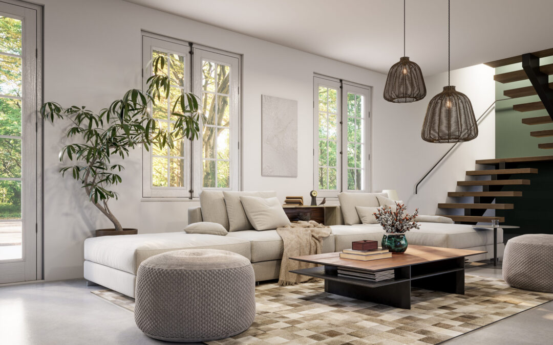
This post is all about How to decorate a living room step by step.
The living room is where life happens. It’s where we unwind after long days, gather with friends, and create countless memories. Yet for many homeowners, decorating this central space feels overwhelming. I’ve spent over a decade helping people transform their living rooms. I’ve learned that the key isn’t having an unlimited budget or innate design talent—it’s following a clear, systematic approach.
Learning how to decorate a living room step by step removes the guesswork and helps you make confident decisions. Instead of randomly buying pieces that might not work together, you’ll develop a cohesive plan that reflects your lifestyle and personality. This guide breaks down the entire process into manageable phases, from initial planning to those final styling touches that pull everything together.
Whether you’re starting with an empty room or refreshing an existing space, these steps will help you create a living room that’s both beautiful and functional. No design degree required—just a willingness to follow the process and trust your instincts along the way.
Step 1: Assess Your Space and Set Clear Goals
Before choosing a single paint colour or furniture piece, you need to understand what you’re working with. This foundational step often gets skipped, but it’s crucial for decorating a living room that actually works for your life.
Taking Stock of Your Space
Start by grabbing a measuring tape and a notebook. Document every dimension—wall lengths, ceiling height, window and door placements—and note where your electrical outlets and cable connections are located. These practical details will guide every decision you make later.
Pay attention to architectural features too. That awkward corner or structural column might seem like a challenge now, but it could become a design opportunity. Maybe it’s the perfect spot for a reading chair or a place to showcase tall plants. Understanding your room’s quirks helps you work with them rather than against them.
Understanding How You’ll Actually Use the Room
Here’s where many people get tripped up—they design for a fantasy lifestyle instead of their real one. If you have young kids, that pristine white sofa might not be your best choice. Love hosting game nights? You’ll need flexible seating arrangements and good lighting. Work from home occasionally? Consider incorporating a small desk area that doesn’t dominate the space.
Think about your daily routines. Do you watch TV every evening? The layout should support comfortable viewing angles. Prefer reading? Plan for task lighting and a cosy corner. When you understand how to decorate a living room step by step based on actual use, you create a space that enhances your life rather than complicating it.
Analysing Natural Light Patterns
Spend a day observing how light moves through your room. Where does the morning sun hit? Which areas stay dim in the afternoon? This information shapes everything from paint colour choices to furniture placement. North-facing rooms need warmer colours to counteract cool light, while south-facing spaces can handle cooler tones.
Setting a Realistic Budget
Money talk isn’t glamorous, but it’s essential. Determine your total budget, then break it down: roughly 30% for major furniture, 20% for lighting, 15% for window treatments, 15% for accessories and art, and keep 20% as a buffer. This framework keeps you from blowing everything on a gorgeous sofa while forgetting you need lamps and curtains.
Remember, you don’t need to buy everything at once. Prioritise the essentials—seating, lighting, and window treatments—then layer in accessories over time. Quality basics with budget-friendly accents often look better than trying to furnish everything cheaply at once.
Creating Your Project Timeline
Decorating doesn’t happen overnight, especially if you’re doing it right. Map out a realistic timeline. Furniture delivery alone can take 8-12 weeks for custom pieces. Paint needs proper drying time between coats. If you’re planning any electrical work for new lighting, that needs to happen before painting.

By thoroughly assessing your space and setting clear goals, you’ve laid the groundwork for every decision ahead. This might feel like a lot of prep work, but trust me—spending time on this foundation saves countless headaches later. Now you’re ready to move into the fun part: defining your style and making design choices that bring your vision to life.
Step 2: Define Your Design Style and Create a Vision
Now that you understand your space and needs, it’s time to figure out what you actually want your living room to look and feel like. This step is where many people freeze up, worried about making the “wrong” choice. Here’s the thing—there’s no wrong choice if it reflects who you are and how you live.
Discovering Your Personal Style
Start by collecting images of living rooms that make you stop scrolling. Pinterest, design magazines, even screenshots from your favourite shows—gather them all. After collecting 20-30 images, patterns will emerge. Maybe you’re drawn to rooms with lots of natural wood and cosy textiles. Or perhaps sleek lines and minimal colour palettes keep catching your eye.
Don’t worry about naming your style yet. Focus on identifying what elements consistently appeal to you:
- Colour preferences (bright and bold vs. neutral and subtle)
- Material choices (warm woods vs. cool metals)
- Overall feeling (cosy and layered vs. clean and minimal)
- Pattern tolerance (mix of prints vs. solid colours)
Understanding Major Design Styles
While you don’t need to follow any style rigidly, knowing the basics helps you communicate what you want and shop more effectively. Here are the styles I see requested most often:
Modern/Contemporary: Clean lines, neutral colours, minimal accessories. The furniture has simple silhouettes, and the overall feel is uncluttered. Great for those who find peace in simplicity.
Traditional: Classic furniture shapes, rich colours, balanced symmetry. Think rolled-arm sofas, matching table lamps, and formal arrangements. Perfect if you love timeless elegance.
Transitional: The sweet spot between traditional and contemporary. You get the comfort of classic pieces with cleaner lines and updated colours. This style is incredibly livable and never looks dated.
Scandinavian: Light woods, white walls, cosy textures, and functional beauty. If you want a bright, airy space that still feels warm, this might be your direction.
Industrial: Raw materials, exposed elements, darker colours. Metal and wood combinations, vintage pieces, and an urban edge define this look.
Creating Your Vision Board
Once you’ve identified your preferences, create a focused vision board for your specific living room. This isn’t just pretty pictures—it’s your roadmap for how to decorate a living room step by step. Include:
- 3-5 full-room images that capture your desired vibe
- Close-ups of textures and materials you love
- Your colour palette (we’ll refine this in the next step)
- Furniture styles that appeal to you
- Lighting fixtures that fit your aesthetic
Digital tools like Canva or even a simple Pinterest board work great. The goal is to have a visual reference you can check when making decisions. That gorgeous velvet chair might be on sale, but does it fit your vision?
Avoiding Common Style Pitfalls
The biggest mistake I see? Trying to incorporate too many styles because you like elements of each. Your living room isn’t a design museum—it needs cohesion. Follow the 80/20 rule: 80% of your room should reflect your primary style, with 20% for accent pieces that add personality.
Another trap is choosing a style that doesn’t match your lifestyle. That all-white, minimalist living room looks stunning in photos, but if you have three dogs and love surrounding yourself with books and plants, you’re setting yourself up for frustration.
Considering Your Home’s Architecture
Your living room doesn’t exist in isolation. Consider your home’s architectural style and the flow from adjacent spaces. An ultra-modern living room might feel jarring in a 1920s bungalow with original mouldings. This doesn’t mean you can’t have contemporary furniture, but you’ll want to choose pieces that respect the home’s character.
Making It Personal
Whatever style direction you choose, remember that the best living rooms tell a story about the people who live there. Your style foundation should leave room for:
- Travel souvenirs and meaningful objects
- Family photos and personal artwork
- Collections and hobbies
- Books, plants, and things that bring you joy
These personal touches are what transform a styled space into a home. They’re not afterthoughts—plan for them from the beginning.
By the end of this step, you should have a clear vision of your living room’s style direction. This vision will guide every choice from here on, making the process of learning how to decorate a living room step by step much more straightforward. Next, we’ll translate this vision into a functional floor plan that brings your style to life.
Step 3: Plan Your Layout and Traffic Flow
With your style vision clear, it’s time to tackle one of the most crucial aspects of living room design—the layout. Even the most beautiful furniture and decor won’t save a room with poor flow. Getting this right transforms how your space functions daily.
Finding Your Focal Point
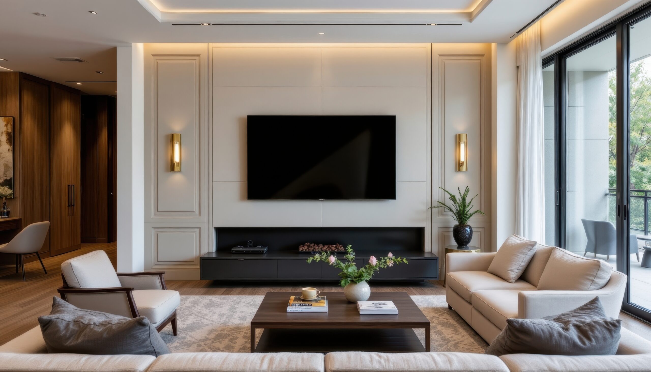
Every well-designed living room needs a focal point—that one element that naturally draws the eye and anchors the entire space. Sometimes it’s obvious: a fireplace, a wall of windows with a stunning view, or built-in shelving. Other times, you’ll need to create one.
If your room lacks a natural focal point, consider these options:
- A large piece of artwork or a gallery wall
- An entertainment centre or a mounted TV
- A statement furniture piece
- An accent wall with bold colours or wallpaper
Once identified, your furniture arrangement should acknowledge and enhance this focal point, not compete with it. That doesn’t mean everything faces one direction like a waiting room—it means creating a layout that feels balanced around this anchor.
Understanding Conversation Flow
The best living rooms encourage easy conversation. When figuring out how to decorate a living room step by step, remember that seating arrangements make or break the room’s social function. Keep these guidelines in mind:
- Place seating 8-10 feet apart for comfortable conversation
- Avoid forcing people to shout across the room or crane their necks
- Create multiple seating groups in larger rooms
- Ensure every seat has a surface nearby for drinks or books
Think about how conversations naturally happen. People need to see each other without straining, but also want the option to break eye contact naturally. Angled chairs, L-shaped sectionals, and mixed seating types all help create this dynamic.
Mapping Traffic Patterns
Before placing a single piece of furniture, trace the natural paths through your room. How do you enter? Where do you go from there? Are there doorways to other rooms? These invisible pathways need to stay clear, at least 3 feet wide for main routes, and 2 feet for secondary paths.
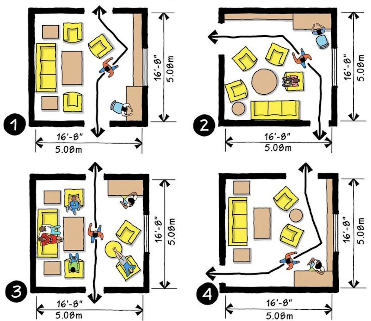
Common traffic flow mistakes include:
- Blocking the natural path from entry to seating
- Creating obstacle courses around coffee tables
- Forcing people to squeeze between furniture
- Ignoring the path to frequently used areas (like built-ins or windows)
The Power of Floating Furniture
Here’s where I see the biggest transformation in rooms—pulling furniture away from walls. Yes, even in small spaces. Floating your sofa even 12 inches from the wall creates depth and improves flow. It also gives you space for a console table, better lamp placement, or simply easier cleaning.
In larger rooms, floating furniture becomes essential. Create intimate zones rather than lining everything against the perimeter. A sofa floating in the centre with a console table behind it can define the living area while maintaining flow to other parts of the room.
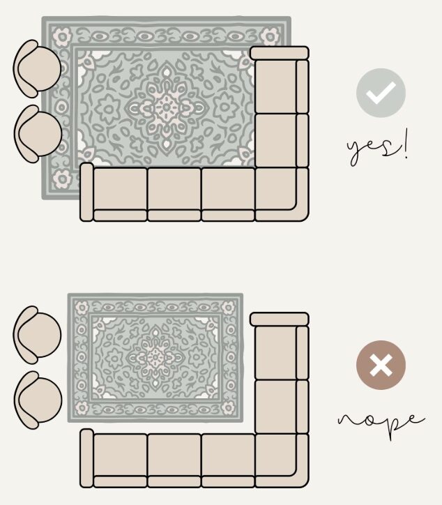
Using Rugs to Define Spaces
Area rugs are your secret weapon for layout success. They ground furniture groupings and define zones within larger spaces. The key is sizing—too small, and your room looks disjointed. Follow these rules:
- The front legs of all major seating should sit on the rug
- Leave 8-24 inches of bare floor around the rug’s perimeter
- In small rooms, a large rug can make the space feel bigger
- Multiple rugs can define different zones in open-plan spaces
Testing Your Layout
Before moving heavy furniture, test your layout plan. Use painter’s tape to mark furniture footprints on the floor. Live with it for a day. Walk through your normal routines. Sit in the taped “chairs” and check sightlines. This simple step saves backaches and prevents costly mistakes.
For tech-savvy planners, free apps like Floorplanner or even graph paper work well. Draw your room to scale (1/4 inch = 1 foot is standard), then cut out scaled furniture pieces to arrange and rearrange.
Accommodating Different Activities
Modern living rooms multitask. Your layout needs to support various activities without requiring furniture reshuffling. Consider:
For TV watching: Ensure comfortable viewing angles from the main seating. The TV centre should be at seated eye level, typically 42-48 inches from the floor.
For reading: Position a chair near natural light with a side table for books and drinks. Add a floor lamp for evening reading.
For games or homework: An ottoman with a tray or nesting tables provides surfaces that can disappear when not needed.
For entertaining: Create seating clusters that can merge for larger gatherings. Lightweight accent chairs or poufs offer flexible extra seating.
Small Room Strategies
Decorating a small living room step by step requires extra attention to the layout. Every inch counts, but that doesn’t mean cramming in undersized furniture. Instead:
- Choose one normal-sized sofa over multiple small chairs
- Use vertical space with tall bookcases or floating shelves
- Select furniture with exposed legs to maintain sight lines
- Consider dual-purpose pieces like storage ottomans
The goal is to make your small room feel as spacious as possible while meeting all your needs.
With your layout planned, you’ve created the bones of a functional living room. This foundation ensures that no matter how beautiful your colour choices or accessories, the room will work for daily life. Next, we’ll build on this practical layout with colour choices that bring your style vision to life.
Step 4: Choose Your Colour Palette
Colour sets the entire mood of your living room. It’s what people subconsciously react to first, even before they notice your furniture or layout. The right palette can make a small room feel spacious, a dark room feel bright, or a cold room feel cozy. Let’s break down how to decorate a living room step by step through strategic colour choices.
Understanding the 60-30-10 Rule
This classic design principle takes the guesswork out of colour distribution. Here’s how it works:
- 60% Dominant Colour: This is your room’s main colour, typically used on walls and large furniture pieces. Usually a neutral or muted tone that won’t overwhelm you.
- 30% Secondary Colour: Found in upholstery, curtains, and larger accessories. This colour supports and complements your dominant shade.
- 10% Accent Colour: Your pop of personality through pillows, artwork, and small accessories. This can be bold since it’s used sparingly.
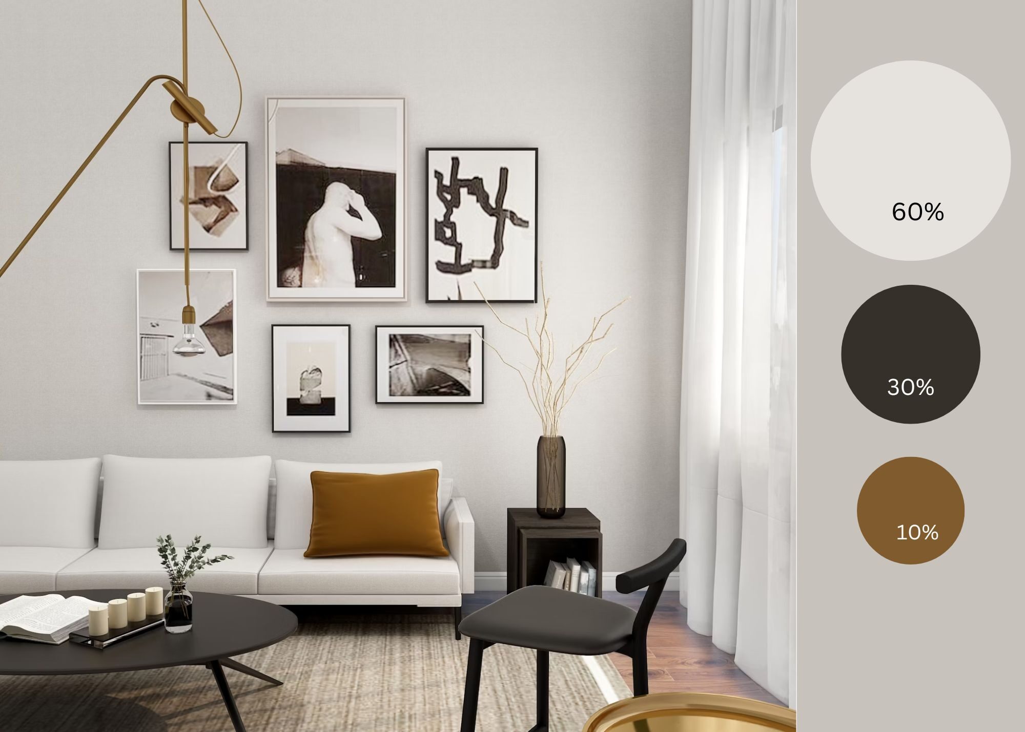
For example, you might have soft grey walls and a grey sofa (60%), navy curtains and a patterned rug incorporating navy (30%), and mustard yellow pillows with brass accents (10%). The proportions keep everything balanced while allowing personality to shine through.
Building Your Palette
Start with what you can’t change. Do you have wood floors? Their undertone (warm or cool) influences everything else. Keeping a favourite sofa? Its colour becomes part of your palette. Working around existing elements is part of learning how to decorate a living room step by step in real-world situations.
Consider these factors when selecting colours:
Natural Light: North-facing rooms get cool, indirect light that can make colours appear greyer. Warm these spaces with colours that have yellow or red undertones. South-facing rooms get warm, direct light and can handle cooler colours.
Room Size: Light colours reflect light and make spaces feel larger. Dark colours absorb light, creating intimacy but potentially making rooms feel smaller. That said, a small room painted in a rich, dark colour can feel incredibly sophisticated—it’s about intention.
Ceiling Height: Paint ceilings lighter than walls to add perceived height. In rooms with very high ceilings, a darker ceiling colour can make the space feel more intimate.
Testing Colours in Your Space
Never choose paint colours under store lighting. What looks perfect at the hardware store can be completely different in your living room. Here’s my tested process:
- Buy samples of your top 3-4 paint choices
- Paint large swatches (at least 2×2 feet) on different walls
- Observe them at different times of day
- Live with them for at least 48 hours
- Notice how they look with your lighting on
Pay attention to undertones—that “perfect grey” might look purple in your north-facing room or green next to your warm wood floors. This testing phase prevents expensive mistakes and disappointment.
Working with Neutrals
Neutrals get a bad reputation for being boring, but they’re actually complex and sophisticated. Today’s neutrals go far beyond beige:
- Warm Neutrals: Creams, taupes, warm greys, and greiges create cosy, inviting spaces
- Cool Neutrals: Pure whites, cool greys, and soft blacks offer a modern, crisp feel
- Natural Neutrals: Colours pulled from nature, like sage, clay, or sand, add subtle personality
The beauty of a neutral base? You can completely change your room’s personality by swapping accessories. That neutral sofa becomes bohemian with colourful pillows or sophisticated with monochromatic styling.
Adding Colour Strategically
If you love colour but feel nervous about commitment, start small. Ways to incorporate colour without it getting overwhelming:
- Accent Wall: One colourful wall creates impact without dominating
- Colourful Sofa: A statement piece that anchors the room
- Window Treatments: Curtains or Roman shades add softness and colour
- Area Rug: Brings multiple colours together at floor level
- Artwork: Large pieces or gallery walls introduce colour at eye level
Remember, colour doesn’t mean bright. Deep jewel tones, muted historical colours, or sophisticated earth tones all add richness without screaming for attention.
Creating Colour Flow
Your living room shouldn’t feel disconnected from the rest of your home. Create flow by:
- Repeating one colour from adjoining spaces
- Using varying intensities of the same colour family
- Carrying neutral base colours throughout
- Adding consistent accent colours in different rooms
This doesn’t mean every room matches—it means they have a conversation with each other.
The Psychology of Colour
Understanding how colours affect mood helps you create the right atmosphere:
Blues and Greens: Calming, peaceful, good for relaxation
Warm Neutrals: Comforting, versatile, broadly appealing
Rich Jewel Tones: Sophisticated, dramatic, creates intimacy
Bright Colours: Energising but potentially overwhelming in large doses
Monochromatic Schemes: Serene, sophisticated, easy to execute
Common Colour Mistakes to Avoid
- Matching everything too perfectly (it looks flat)
- Ignoring undertones when mixing colours
- Choosing colours in isolation without considering the whole room
- Following trends that don’t suit your space or style
- Being too safe and ending up with a bland, personality-free room
Your colour palette is the thread that ties your entire living room together. With these colours established, you’re ready to select furniture that brings your vision to life while working within your carefully planned layout. The next step transforms your colour palette and floor plan into a fully furnished, functional space.
Step 5: Select and Purchase Furniture
This is where your planning pays off. With your layout mapped and colours chosen, furniture selection becomes strategic rather than overwhelming. The key to learning how to decorate a living room step by step is making each furniture decision build upon the last, creating a cohesive whole.
Starting with the Sofa
Your sofa is the living room’s anchor piece—get this right, and everything else falls into place. Consider these factors:
Size: Measure your doorways, hallways, and stairs before falling in love with anything. That perfect sectional won’t matter if it can’t make it into your room. For the room itself, your sofa should be proportional—not so large it dominates, not so small it looks lost.
Style: Your sofa should align with your chosen design direction but remain somewhat timeless. Trendy shapes date quickly, and sofas are expensive to replace. Classic silhouettes with updated fabric choices give you flexibility.
Comfort: Sit on it. Really sit on it—the way you actually lounge at home. Deep seats work for tall people, but can be uncomfortable for shorter folks. Firm cushions maintain their shape but might feel stiff to some. There’s no universal “comfortable” sofa.
Fabric: Consider your real life. Performance fabrics have revolutionised upholstery—they look like linen or velvet but resist stains and wear. Leather develops character over time but requires specific care. Patterns hide wear but limit your accessory options.
Choosing Secondary Seating
Once your sofa is selected, add seating that complements without matching. Options include:
- Accent Chairs: Introduce pattern, colour, or texture. Swivel chairs add function.
- Ottoman: Provides extra seating, a footrest, or a coffee table alternative
- Bench: Great for narrow spaces or under windows
- Pouf: Lightweight, movable seating for flexible arrangements
Mix heights and shapes for visual interest. Two identical chairs flanking a fireplace create formal balance, while mismatched chairs feel more collected and casual.
Coffee Table Considerations
The coffee table often trips people up. Follow these guidelines:
Height: Should be within 2 inches of your sofa seat height (typically 16-18 inches)
Length: About 2/3 of your sofa’s length looks proportional
Distance: 14-18 inches from the sofa—close enough to reach, far enough to walk around
Shape: Round or oval tables improve flow in tight spaces. Rectangular works in most settings. Consider nesting tables for flexibility.
Material matters, too. Glass keeps sight lines open in small spaces. Wood adds warmth. Stone or metal brings sophisticated weight. Consider how the material relates to other elements in your room.
Storage Solutions
Living rooms need to be beautiful AND functional. Build in storage from the start:
Media Storage: Even in our streaming age, you need somewhere for remotes, game controllers, and that router you’re hiding. Media consoles with closed storage keep clutter invisible.
Display Storage: Open shelving, bookcases, or étagères showcase books and treasures while adding vertical interest. Mix displayed items with hidden storage boxes for practical balance.
Hidden Storage: Ottomans with lift tops, side tables with drawers, or console tables with baskets underneath. Every piece can work harder.
Quality Versus Budget
Here’s where I’ll be straight with you—furniture quality matters, but you need to be strategic about where to splurge. My priority list for how to decorate a living room step by step on any budget:
Splurge on:
- Sofa (you’ll use it daily for years)
- One quality accent chair (better than two cheap ones)
- Window treatments (custom often looks significantly better)
Save on:
- Accent tables (easily updated as styles change)
- Decorative accessories
- Throw pillows (buy covers, not whole pillows)
- Lamps (unless they’re statement pieces)
Consider vintage or secondhand for:
- Wood furniture (often better quality than new)
- Accent chairs (reupholstering costs less than buying quality new)
- Unique pieces that add character
Online Versus In-Store Shopping
Both have advantages. Online offers endless options and often better prices, but you can’t assess comfort or true colour. In-store lets you experience pieces but limits selection. My approach:
- Visit stores to understand what styles and scales work for you
- Sit on sofas and chairs to know what feels comfortable
- Order fabric samples online before purchasing
- Read reviews focusing on comfort and durability
- Check return policies carefully
- Measure everything twice
Timing Your Purchases
Furniture shopping requires patience. Custom pieces take 8-16 weeks. Even in-stock items might need 2-4 weeks for delivery. Plan accordingly:
- Order your sofa first (longest lead time)
- Purchase a rug and window treatments
- Add tables and secondary seating
- Layer in lighting and accessories
This staged approach also helps your budget and lets you live in the space before making final decisions.
Making It All Work Together
As you select each piece, reference your vision board and colour palette. Every furniture item should feel like part of the same story. That doesn’t mean matching sets—it means intentional coordination. Mix wood tones but keep them in the same warmth family. Vary shapes but maintain similar visual weight. Combine different metals, but limit yourself to two finishes.
With your major furniture pieces selected and ordered, your room is taking shape. The bones are in place. Next, we’ll add the lighting layers that will truly bring your space to life, making it functional for every activity and beautiful at every time of day.
Step 6: Layer Your Lighting
Good lighting transforms a living room from flat and one-dimensional to warm and inviting. Yet it’s often treated as an afterthought. When learning how to decorate a living room step by step, lighting deserves as much attention as your sofa selection. Done right, it makes every other design choice look better.
Understanding the Three Layers
Professional designers think about lighting in layers, each serving a different purpose:
Ambient Lighting: This is your general illumination—the replacement for natural light when the sun goes down. Usually comes from overhead fixtures, recessed lights, or torcheres that bounce light off the ceiling. Without good ambient light, rooms feel cave-like.
Task Lighting: Focused light for specific activities. Reading lamps beside chairs, picture lights above artwork, or pendant lights over a console. Task lighting prevents eye strain and makes your room functional.
Accent Lighting: The jewellery of lighting—purely decorative elements that add sparkle and highlight special features. Think uplights behind plants, LED strips under floating shelves, or decorative sconces flanking artwork.
Planning Your Lighting Layout
Start by mapping activities in your room. Where will people read? Where do you need light for games or puzzles? Which architectural features deserve highlighting? This functional approach ensures beautiful lighting that actually works for daily life.
For most living rooms, aim for 5-7 light sources. That might sound excessive, but remember—you won’t use them all at once. Multiple sources give you the flexibility to create different moods. A typical layout might include:
- Overhead fixture or recessed lights (4-6 in larger rooms)
- Table lamps flanking the sofa
- Floor lamp by the reading chair
- Accent light for artwork or plants
- Console or buffet lamp for an ambient glow
Choosing the Right Fixtures
Overhead Lighting: If you’re stuck with a builder-grade ceiling fan or dated fixture, replacing it makes an immediate impact. Choose a size that relates to your room—too small looks skimpy, too large overwhelms. For 12-foot ceilings or higher, consider a fixture with adjustable height.
Table Lamps: Height matters more than style. When seated, the bottom of the shade should be at eye level. This prevents glare while providing good reading light. For sofa end tables, 26-30 inches tall usually works. Matching pairs create formal symmetry while coordinating but different lamps feel more collected.
Floor Lamps: These add height and can illuminate dark corners. Arc floor lamps reach over seating without requiring a side table. Pharmacy-style lamps offer adjustable task lighting. Torcheres provide ambient light by washing walls and ceilings.
The Dimmer Difference
If you do one electrical upgrade, make it dimmers. They transform basic fixtures into mood lighting and extend bulb life. Every overhead light should be dimmable. For lamps, use three-way bulbs or smart bulbs you can control from your phone.
Speaking of smart bulbs—they’re game changers for renters or anyone who can’t rewire. Change the colour temperature from energizing daylight to cozy warm white. Set scenes for different activities. Some even sync with movies or music.
Getting Colour Temperature Right
Nothing ruins a carefully designed room faster than mismatched light colours. All bulbs in view together should be the same temperature:
- 2700 K- 3000 K (Warm White): Cozy, residential feel. Flatter’s warm colour palettes.
- 3500 K- 4000 K (Neutral White): Clean but not harsh. Works with any colour scheme.
- 5000K+ (Daylight): Energising but can feel commercial. Best for task lighting only.
Most living rooms look best in the 2700 K- 3000 K range, especially in the evening. If you need a brighter light for tasks, use adjustable fixtures rather than mixing temperatures.

Common Lighting Mistakes
Over-relying on overhead lights: One ceiling fixture creates harsh shadows and unflattering light. Layer multiple sources instead.
Ignoring scale: Tiny lamps on massive tables or huge fixtures in small rooms throw off proportions.
Placing lamps too low: Table lamps shorter than 24 inches rarely provide good light. Stack books underneath if needed.
Forgetting about outlets: Plan lamp placement around existing outlets or budget for adding more. Extension cords running everywhere ruin the look.
All matching fixtures: While coordinating finishes is good, identical fixtures everywhere feel like a hotel.
Natural Light Management
Don’t forget about controlling natural light. How to decorate a living room step by step includes managing daylight too:
- Sheer curtains filter harsh sun while maintaining brightness
- Blackout shades on windows that get direct sun to prevent glare and fading
- Mirrors positioned opposite windows amplify natural light
- Light-coloured walls and ceilings bounce daylight deeper into rooms
Creating Lighting Scenes
The magic happens when you combine different light sources for different moods:
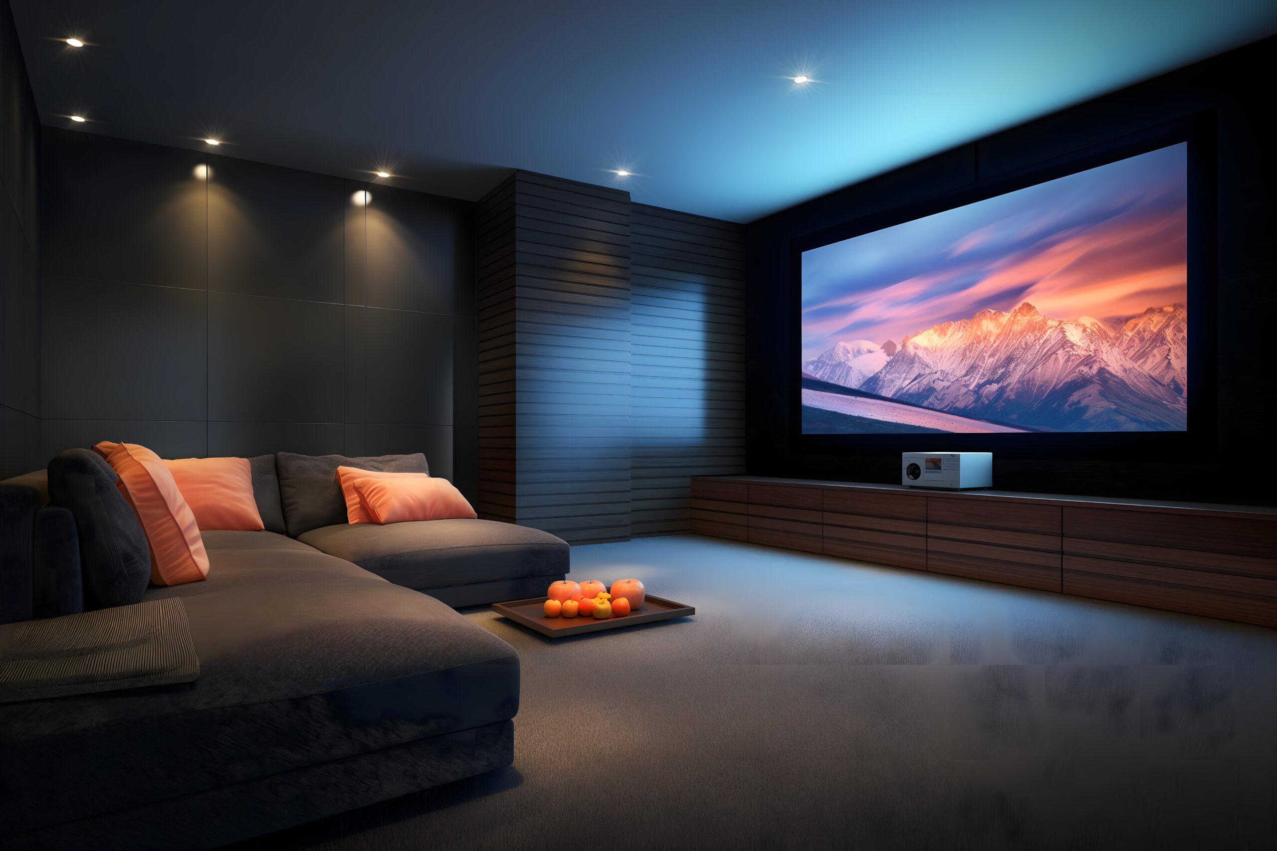
Entertaining: All ambient lights at 75%, accent lights on, task lights off
Movie watching: All lights dimmed to 25% or off, bias lighting behind the TV
Reading: Task light on, ambient lights at 50%, others off
Everyday evening: Mix of ambient and task at comfortable levels
Budget-Friendly Lighting Updates
Great lighting doesn’t require rewiring or expensive fixtures:
- Replace lampshades for instant updates (white or cream lining reflects more light)
- Add battery-operated picture lights to highlight artwork
- Use plug-in pendant lights for rental-friendly ceiling fixtures
- Install dimmer switches (easier than you think)
- Add LED strips under shelves or behind furniture for an ambient glow
With your lighting plan in place, your room can transition from bright and energising during the day to warm and intimate at night. This flexibility is what makes a living room truly livable. Next, we’ll add the finishing touches that make your well-lit room feel complete and personally yours.
Step 7: Add Window Treatments
Window treatments do triple duty in your living room—they control light, provide privacy, and contribute significantly to your design aesthetic. Yet they’re often an afterthought, purchased in a rush when you realise neighbours can see straight in. When learning how to decorate a living room step by step, planning window treatments early ensures they enhance rather than detract from your overall design.
Function First
Before falling for beautiful fabrics, determine what you actually need from your window treatments:
Privacy Requirements: Street-level windows facing neighbours need different solutions than second-story windows overlooking trees. Consider when you need privacy—just at night, or during the day too?
Light Control: Do you get harsh afternoon sun that makes TV watching impossible? Morning light that wakes you too early if you’re near the living room? Or do you have precious little natural light you want to maximise?
Insulation: Windows are major sources of heat loss in winter and heat gain in summer. The right treatments can significantly impact your comfort and energy bills.
Sound Dampening: If you live on a busy street, heavy curtains can help muffle outside noise.
Choosing Your Style
Once you understand your functional needs, select treatments that align with your design aesthetic:
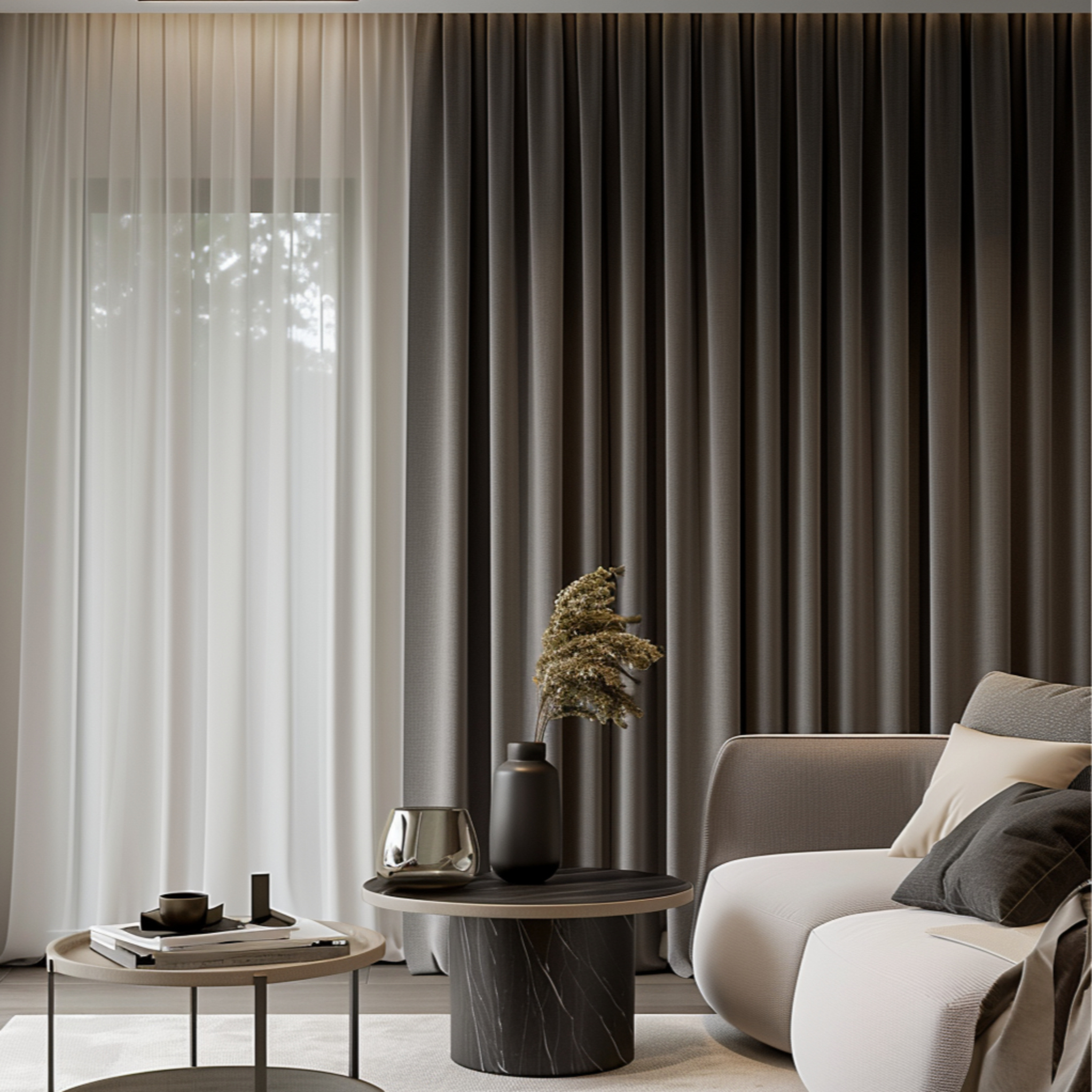
Curtains/Drapes: Soft and traditional, they add texture and can make windows appear larger when mounted high and wide. Full-length panels create elegance, while cafe curtains offer charm. Choose lined curtains for better light control and a more polished appearance from the outside.
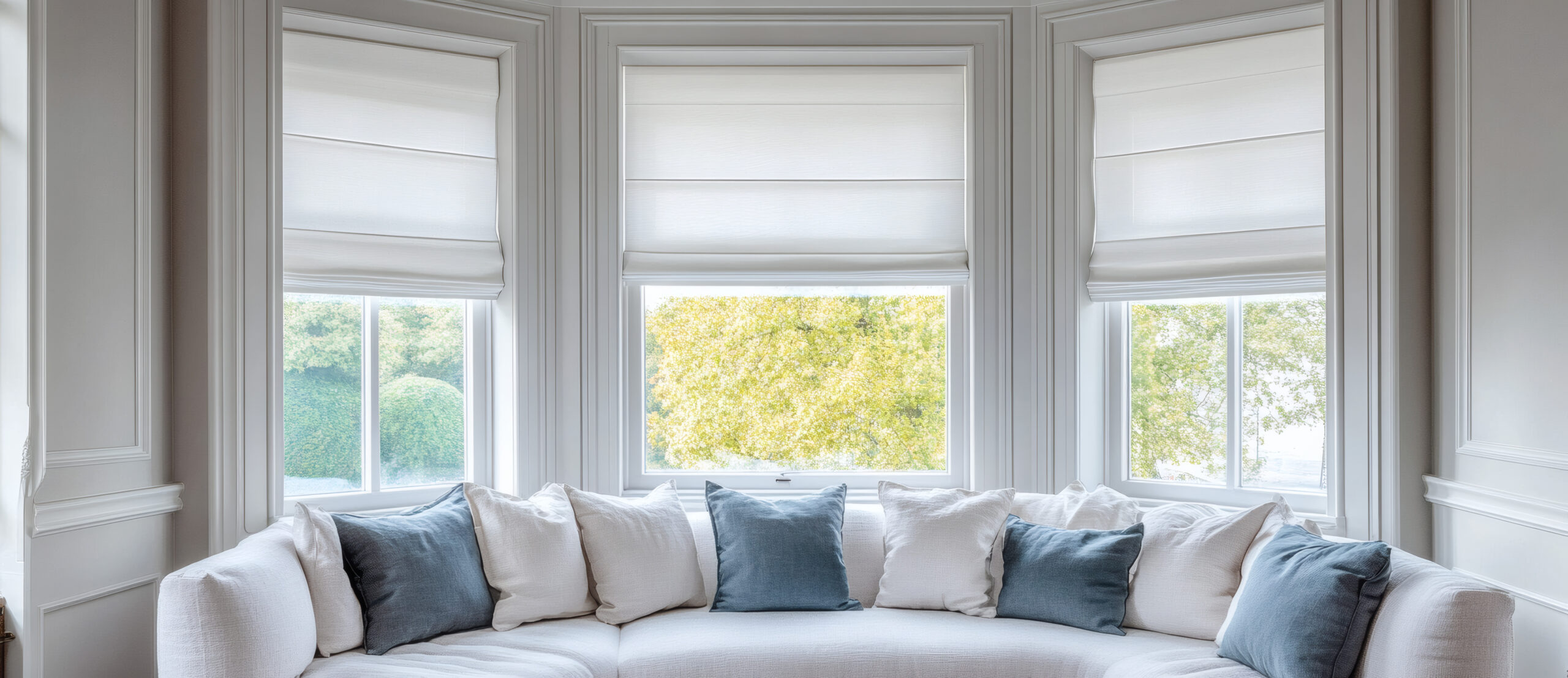
Roman Shades: Tailored and classic, they provide a clean look when raised and good coverage when lowered. Available in countless fabrics to coordinate with any design style. Inside mount for a built-in look, outside mount to make windows appear larger.
Roller/Solar Shades: Modern and minimal, perfect for contemporary spaces. Solar shades filter light while maintaining views. Blackout options are available for media rooms. Motorised versions offer ultimate convenience.
Blinds: Wood blinds add warmth and work with many design styles. Faux wood offers durability and moisture resistance. Avoid aluminium mini-blinds—they rarely look high-end.
Layering: Combine treatments for maximum flexibility. Sheers for daytime privacy with curtains for nighttime. Blinds for light control with decorative panels for softness.
Getting Measurements Right
Incorrect measurements are the fastest way to make expensive window treatments look cheap. Here’s how to measure for professional results:
For Curtains:
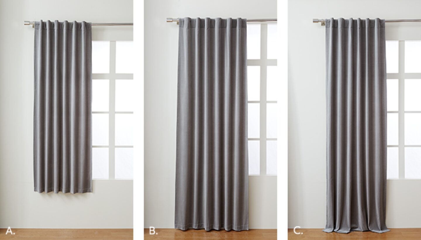
- Mount brackets 4-6 inches above the window frame (or halfway between the window and the ceiling for drama)
- Extend the rod 8-12 inches beyond the frame on each side
- For length, choose kissing the floor (1/2 inch above), breaking slightly (1-2 inch puddle), or floating (ending at the sill or apron)
- Order panels that are 2- 2.5x your window width for proper fullness
For Shades and Blinds:
- Inside mount: Measure width at the top, middle, and bottom—use the narrowest measurement
- Outside mount: Add 2-3 inches on each side for light blockage
- Consider obstacles like window cranks or locks
Never assume windows are the same size—measure each one individually.
Material Considerations
Fabric choice impacts both function and appearance:
Linen: Casual elegance, filters light beautifully, wrinkles naturally
Cotton: Versatile, easy to clean, good for any style
Velvet: Luxurious, excellent insulation, blocks light well
Silk: Formal and elegant, but fades in direct sun (consider faux silk)
Polyester Blends: Durable, fade-resistant, often budget-friendly
Colour and Pattern Strategy
Your window treatments should enhance your colour scheme, not fight with it:
- Matching walls: Makes windows recede and rooms feel larger
- Contrasting colour: Creates focal points and adds drama
- Patterns: Use solid treatments if you have patterned furniture, or vice versa
- Texture: Even solid colours can add interest through texture
Remember to order fabric samples and view them in your actual room light before committing to expensive treatments.
Professional Touches
Details separate custom-looking treatments from obviously store-bought:
Proper Hanging: Iron or steam before hanging. Curtains should hang straight, not bunch at the bottom.
Quality Hardware: Rods and brackets should complement your room’s metal finishes. The diameter should relate to fabric weight—heavier fabrics need substantial rods.
Finishing Details: Curtain rings make panels easy to open and close. Tiebacks or holdbacks keep panels neat when open. Valances can hide mechanics but are used sparingly—they can date a room.
Common Window Treatment Mistakes
Hanging too low: Mounting right at the window frame makes the ceiling feel lower
Skimpy panels: Narrow curtains that barely cover windows when closed look cheap
Wrong length: Too-short curtains are the equivalent of flood pants
Ignoring the view from outside: Mismatched treatments look chaotic from the street
Over-accessorising: Skip the swags, jabots, and excessive layers
Budget-Friendly Options
Great window treatments don’t require custom pricing:
- Buy longer, inexpensive panels and hem them for the perfect length
- Use electrical conduit or plumbing pipes for industrial-style curtain rods
- Layer inexpensive sheers with ready-made panels for a custom look
- Paint or stain wooden blinds to coordinate with your colour scheme
- Buy basic roman shades and add trim for personality
Timing and Installation
Order window treatments early in your decorating process, custom options can take 6-8 weeks. Install them before arranging furniture to avoid disrupting your layout. If drilling into walls makes you nervous, many handypeople can install treatments quickly and ensure they’re level.
With window treatments in place, your room’s envelope is complete. Natural light is controlled, privacy is ensured, and your windows enhance rather than detract from your design. Now comes the fun part—adding the art, accessories, and personal touches that transform a well-designed room into your unique living space.
Step 8: Incorporate Art and Accessories
This is where your living room transforms from a furniture showroom into a home with personality. Accessories and art are what tell your story, but they’re also where many people freeze up or go overboard. The key to mastering how to decorate a living room step by step is approaching accessories with the same intentionality you brought to furniture selection.
Starting with Art
Art doesn’t have to mean expensive gallery pieces. What matters is choosing pieces that resonate with you and displaying them thoughtfully:
Scale Matters: The most common mistake is hanging art that’s too small. Above a sofa, artwork should be 2/3 to 3/4 of the sofa’s width. Over a console, leave 4-8 inches of space on each side. When in doubt, go larger or create a grouping.
Hanging Height: The centre of the artwork should hit at eye level—typically 57-60 inches from the floor. In living rooms where people are usually seated, you might hang slightly lower. Above furniture, leave 6-8 inches between the piece’s top and the art’s bottom.
Creating Gallery Walls: These add major personality but require planning:
- Cut paper templates of your frames and tape them to the wall first
- Keep 2-3 inches between pieces for breathing room
- Mix sizes but maintain visual balance
- Include non-art elements like mirrors or dimensional objects
- Stick to a consistent frame colour or style for cohesion
Beyond Framed Art: Think creatively:
- Textile art or vintage rugs as wall hangings
- Floating shelves with rotating displays
- Large-scale photography or maps
- Sculptural pieces on pedestals
- Oversized mirrors that act as art
Styling Surfaces
Every flat surface in your living room is a styling opportunity, but restraint prevents clutter:
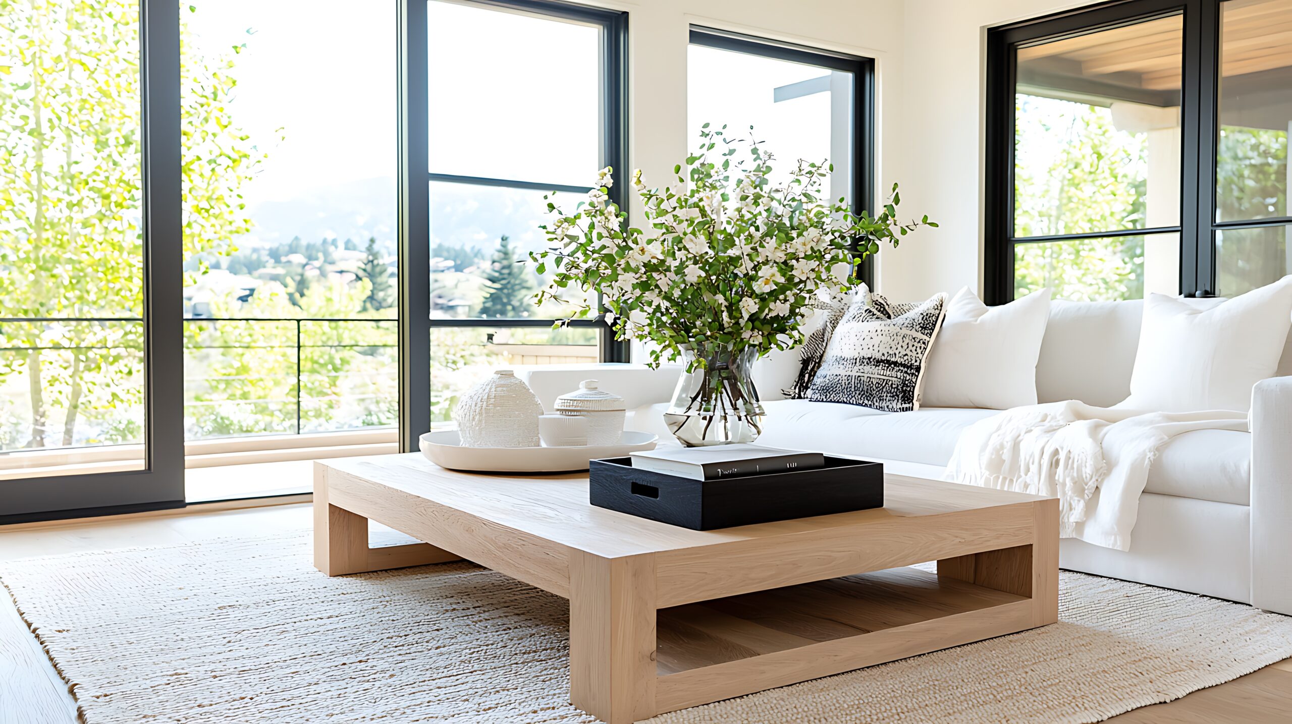
Coffee Table Styling:
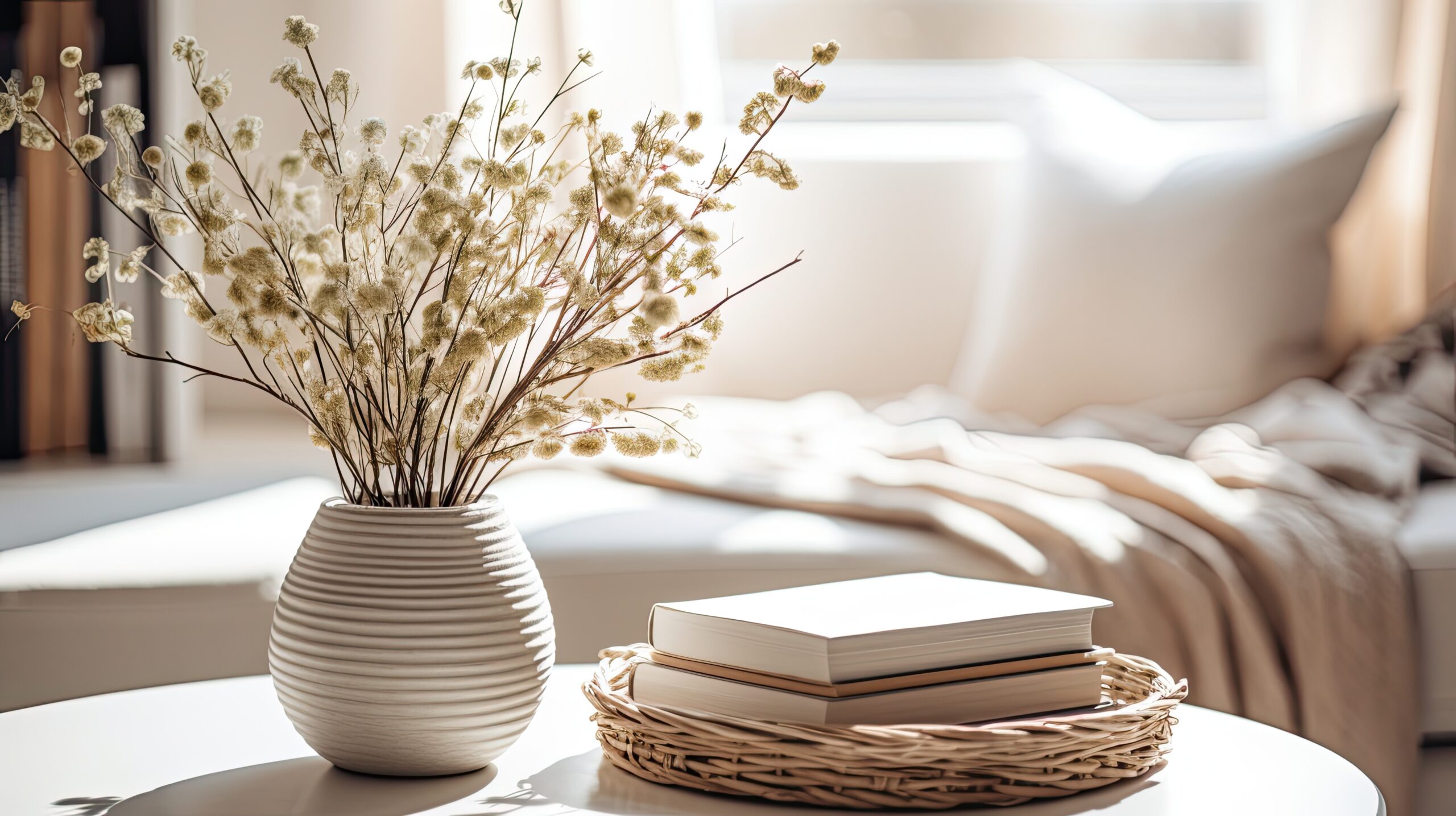
- Start with a tray to corral smaller items
- Layer heights: books stacked horizontally, a small object on top, something tall like flowers
- Include something living (a plant or flowers)
- Leave 2/3 of the surface clear for function
- Mix materials: wood, metal, glass, ceramic
Console and Side Tables:
- Create triangular compositions with varying heights
- Anchor with a lamp or a tall object
- Add medium-height items like picture frames or small plants
- Include low elements like decorative boxes or stacked books
- Keep the scale proportional to the furniture
Bookshelf Styling:
- Mix vertical and horizontal book placement
- Break up books with decorative objects
- Leave some breathing room—don’t pack every inch
- Group books by colour for impact or mix for a casual feel
- Hide clutter in attractive boxes or baskets
The Power of Plants
Nothing brings life to a room quite like actual living things. Plants add colour, texture, and improve air quality:
Choosing the Right Plants:
- Consider light levels: snake plants and pothos tolerate low light, while fiddle leaf figs need bright conditions
- Match plant size to space: a single large floor plant makes more impact than scattered small ones
- Mix heights and leaf shapes for interest
- Use consistent planters that coordinate with your colour scheme
Placement Strategy:
- Fill empty corners with tall floor plants
- Add height to console displays with medium plants
- Cluster small plants on shelves or window sills
- Hang plants in corners to draw the eye up
Incorporating Personal Items
The difference between a styled space and a home is personal meaning. Include items that tell your story:
Displaying Collections: Whether it’s pottery, vintage cameras, or seashells, group collections for impact rather than scattering them. Odd numbers feel more natural. Display on shelves, in shadow boxes, or on dedicated surfaces.
Family Photos: Mix frame styles within the same colour family. Create gallery walls mixing sizes, or display a collection on a console. Avoid cluttering every surface with photos—choose key locations for maximum impact.
Travel Souvenirs: Display thoughtfully rather than creating a cluttered “museum.” Group items by colour, material, or region. Rotate displays seasonally to enjoy everything without overwhelming the space.
Textile Layers
Soft accessories add comfort and tie colour schemes together:
Throw Pillows:
- Use odd numbers for casual appeal (3 or 5 per sofa)
- Mix patterns by varying scale: one large pattern, one medium, one small or solid
- Include different textures: smooth cotton, nubby linen, plush velvet
- Don’t match your sofa exactly—coordinate instead
- Invest in quality inserts, change covers seasonally
Throws:
- Drape casually over sofa backs or arms
- Fold neatly and place over the ottoman corners
- Choose materials that invite touching
- Keep one easily accessible for actual use
Editing and Restraint
The secret to professional-looking accessorising? Knowing when to stop:
The Rule of Three: Group accessories in odd numbers, typically three. Three different heights, three complementary colours, and three varying textures.
Negative Space: What you don’t fill is as important as what you do. Every surface doesn’t need styling. Not every wall doesn’t needs art. Let your room breathe.
Rotation Strategy: Own more accessories than you display. Rotate seasonally or when you need a refresh. This prevents accumulation and keeps your room feeling fresh.
Common Accessory Mistakes
- Pushing everything against the walls instead of layering depths
- Hanging art too high (remember, eye level!)
- Using accessories that are too small for the space
- Matching everything too perfectly (looks catalogue-stiff)
- Ignoring the view from your room’s entrance
Pulling It All Together
Step back and evaluate your accessorised room:
- Does it feel balanced from different viewpoints?
- Are your colours distributed throughout, not clustered in one area?
- Is there a mix of heights, textures, and materials?
- Can you still use the surfaces functionally?
- Does it feel like you, not a showroom?
With art and accessories in place, your living room should feel complete but not cluttered, styled but still functional. The final steps will ensure your beautifully designed room stays that way while serving your daily life.
Step 9: Final Styling and Bringing It All Together
You’ve selected furniture, layered lighting, hung window treatments, and added art. Now comes the crucial final phase—the styling details that elevate your living room from “nicely decorated” to magazine-worthy. This is where learning how to decorate a living room step by step really pays off, as you fine-tune each element to work in harmony.
The Final Layer: Sensory Details
Great rooms engage all the senses, not just sight. These finishing touches make spaces feel truly lived-in:
Scent: A subtle room fragrance creates an immediate impression. Skip overwhelming air fresheners for:
- Quality candles in complementary vessels
- Fresh flowers or eucalyptus stems
- Reed diffusers tucked discreetly on shelves
- Cedar blocks in baskets for natural freshness
Sound: Consider your room’s acoustics. Hard surfaces echo; soft furnishings absorb sound. If your room feels echo-y, add:
- Thick curtains
- Upholstered furniture
- Area rugs
- Wall tapestries or fabric art
Touch: Vary textures throughout the room to create interest and comfort:
- Smooth leather next to nubby linen
- Soft velvet against rough jute
- Cool metal with warm wood
- Plush areas balanced with sleek surfaces
Creating Cohesion
With all elements in place, ensure everything feels intentional and connected:
Colour Threading: Your accent colour should appear at least three times around the room at different heights. If you have navy pillows, perhaps add a navy lampshade and navy binding on your curtains. This creates visual flow.
Metal Consistency: Limit yourself to two metal finishes maximum. If your lighting is brass and chrome, ensure all visible metals fall into these categories. Mixed metals work when intentional, and look sloppy when random.
Style Consistency: Every piece doesn’t need to match your dominant style perfectly, but outliers should feel intentional. That antique chest works in your modern room if other elements bridge the gap, perhaps through colour or material.
Styling for Real Life
The best-designed living rooms work for everyday life, not just photo shoots:
Functional Beauty:
- Keep attractive baskets near seating for quick toy cleanup
- Use beautiful boxes on consoles to hide remotes
- Choose coffee table books you actually want to read
- Place coasters within reach of every seat
Easy Maintenance:
- Washable pillow covers for easy refreshing
- Scotch-guard treatment on susceptible fabrics
- Furniture pads under all legs to protect the floors
- Storage solutions that make tidying natural
The Photography Test
Step outside and re-enter your room with fresh eyes. Then take photos from multiple angles—cameras reveal what our eyes overlook:
- Is there visual balance from the entrance?
- Do sight lines feel clear or cluttered?
- Are there any “dead zones” that need attention?
- Does the lighting photograph well?
Photos also help you remember what works when you need to reassemble after cleaning or rearranging.
Seasonal Adjustments
A well-designed room can transition through seasons with minimal changes:
Summer: Lighten throw pillows, swap heavy throws for linen, add fresh flowers, maximise natural light
Fall: Introduce warmer textures, layer cosy throws, add amber lighting, and display seasonal branches
Winter: Maximum cosiness with faux fur, rich textures, candlelight, darker accent colours
Spring: Fresh colours in accessories, lighter curtains if layered, bright flowers, simplified surfaces
These changes keep your room feeling fresh without major overhauls or expenses.
Living In Your Design
The first few weeks in your newly decorated room are crucial. Pay attention to:
What’s Working:
- Which seats get used the most?
- Is task lighting adequate?
- Can you reach surfaces easily?
- Does traffic flow feel natural?
What Needs Adjusting:
- Lamps that need relocating for better function
- Art that needs raising or lowering
- Furniture that blocks pathways
- Accessories that create clutter
Don’t be afraid to make adjustments. How to decorate a living room step by step includes refining based on real use.
Maintaining Your Design
A beautiful room stays that way with simple routines:
Daily (5 minutes):
- Fluff and arrange pillows
- Fold and place the throws
- Clear surfaces of daily clutter
- Quick straightening of accessories
Weekly (20 minutes):
- Dust surfaces and vacuum
- Water plants
- Refresh flowers if needed
- Wipe down the coffee table and side tables
Monthly:
- Vacuum under furniture
- Clean lampshades
- Dust art and high shelves
- Rearrange accessories slightly for freshness
Seasonally:
- Deep clean upholstery
- Wash pillow covers and throws
- Edit accessories
- Update seasonal elements
When to Call in Help
Sometimes professional help makes sense:
- Mounting heavy art or mirrors safely
- Custom window treatment installation
- Electrical work for new outlets or fixtures
- Upholstery cleaning for investment pieces
The cost often prevents bigger mistakes or damage.
Embracing Evolution
Your living room should grow with you. The beauty of following a thoughtful process is that you can:
- Swap accessories as your taste evolves
- Update paint colours without starting over
- Change one major piece while maintaining cohesion
- Add new finds that complement your foundation
Your Living Room Transformation
Congratulations—you’ve learned how to decorate a living room step by step and created a space that’s both beautiful and functional. From that initial assessment through final styling, each phase is built upon the last to create a cohesive, personal space.
Remember:
- Good design takes time—don’t rush the process
- Function always trumps form—beauty that doesn’t work isn’t beautiful
- Your room should reflect your life, not magazine perfection
- Small adjustments can make big differences
- Living rooms are for living—enjoy yours!
The best part? You now have the knowledge and confidence to tackle any room in your home. The principles you’ve learned—assessing needs, defining style, planning layouts, layering elements, and styling with purpose—apply everywhere. Your living room was just the beginning.
by Kesaa Interiors | Living Spaces, ROOMS, TRENDING
This post is all about How to Mix Patterns in a Room!
Pattern mixing is one of those design skills that separates rooms with real personalities from spaces that feel like they’re playing it safe. After years of working with patterns in every imaginable combination, I’ve learned that most people avoid mixing patterns not because they don’t want to—but because they’re terrified of getting it wrong. The fear of creating visual chaos keeps so many beautiful rooms stuck in solid-colour limbo.
Here’s what I know for certain: learning how to mix patterns in a room isn’t about following rigid rules or copying what you see in magazines. It’s about understanding a few core principles that give you the confidence to experiment. Once you grasp these fundamentals, you’ll start seeing pattern opportunities everywhere—and more importantly, you’ll know exactly how to bring them together.
In this guide, we’ll walk through the essential do’s and don’ts that professional designers use daily, plus the common mistakes that even experienced decorators sometimes make. By the end, you’ll have a clear framework for mixing patterns like you’ve been doing it for years.

Why Pattern Mixing Matters in Interior Design
Let’s address the elephant in the room first: yes, you can absolutely create a beautiful space using only solids. But here’s what you’re missing out on—patterns add layers of visual interest that solid colours simply can’t achieve on their own. They create movement, establish rhythm, and give your eye interesting places to land as it travels around the room.
When you understand how to mix patterns in a room properly, you’re essentially adding another dimension to your design toolkit. Think about it this way: using only solid colours is like cooking with salt as your only seasoning. Sure, it works, but you’re missing out on so much flavour and complexity.
Pattern mixing also solves a common design challenge: how to make a room feel cohesive without being boring. When done right, mixed patterns create visual connections between different elements in your space. That geometric throw pillow suddenly makes sense with your floral curtains when they share a common colour. Your striped rug grounds everything when its scale complements rather than competes with other patterns in the room.
The biggest misconception I encounter is that patterns need to match or come from the same collection. This matchy-matchy approach actually works against you, creating spaces that feel more like showrooms than homes. Real pattern mixing is about finding harmony in diversity, and that’s exactly what we’re going to explore.
The Golden Rules of Pattern Mixing
After working with countless pattern combinations over the years, I’ve noticed that the most harmonious rooms follow three fundamental principles. These aren’t arbitrary rules—they’re based on how our eyes naturally process visual information. Master these, and you’ll have the foundation for mixing patterns in any space.
1. The Scale Rule
This is your starting point for understanding how to mix patterns in a room without creating visual competition. The concept is straightforward: vary the scale of your patterns by choosing large, medium, and small designs that complement rather than fight each other.
Picture a large-scale floral wallpaper paired with medium-sized geometric pillows and a small-scale striped throw. Each pattern has its own visual weight and breathing room. When patterns are too similar in scale, they compete for attention and create that chaotic feeling everyone wants to avoid.
Here’s how I approach scale: your largest pattern should be your anchor—maybe it’s on your curtains, an area rug, or an accent wall. Medium patterns work beautifully on furniture upholstery or larger pillows. Small-scale patterns shine on accent pieces like lampshades, small cushions, or ottoman tops.

2. The 60-30-10 Colour Rule
You’ve probably heard of this ratio for colour schemes, but it’s equally powerful when learning how to mix patterns in a room. The principle remains the same: 60% dominant colour, 30% secondary colour, and 10% accent colour—but now you’re threading these proportions through your patterns.
Start by identifying a colour that will appear in most (if not all) of your patterns. This becomes your visual thread, the element that ties everything together. Maybe it’s navy blue appearing in your striped curtains, geometric rug, and floral pillows. The key is ensuring this dominant colour shows up consistently enough to create cohesion.
Your secondary colour should appear in about a third of your patterns, while that 10% accent colour adds just enough pop without overwhelming the palette. This approach gives you structure while still allowing creative freedom.
3. The Odd Number Rule
There’s something inherently pleasing about odd numbers in design, and pattern mixing is no exception. Three patterns feel balanced but not predictable. Five patterns create richness without chaos. Even numbers, particularly two or four, often feel either too sparse or too symmetrical.
When working with three patterns, I typically choose one as the star, one as the supporting player, and one as the accent. This natural hierarchy prevents patterns from competing for the spotlight. With five patterns, you have more flexibility, but the principle remains: create a clear visual hierarchy so your eye knows where to focus first.

The beauty of these rules is that they work together. When you combine varied scales with thoughtful colour distribution and odd-numbered groupings, you create spaces that feel intentional rather than random. These principles give you the structure to experiment confidently, knowing you have a solid foundation to build on.
Types of Patterns and How to Combine Them
Understanding pattern categories is like learning a new language—once you know the vocabulary, you can start creating sentences that actually make sense. Each pattern type brings its own energy and visual weight to a room, and knowing how they interact is crucial for mastering how to mix patterns in a room.
Pattern Categories:
Geometric Patterns include stripes, chevrons, lattices, and Greek keys. These patterns bring structure and often have a modern or crisp feeling. They’re incredibly versatile because they can act as either a neutral base or a bold statement, depending on their scale and colour contrast.
Organic Patterns encompass florals, botanicals, abstract shapes, and anything with flowing natural lines. These soften spaces and add movement. Don’t limit yourself to traditional flowers—modern botanical prints and abstract organics can work in any style of room.
Traditional Patterns like damask, toile, paisley, and medallions carry historical weight and formality. They’re perfect for adding sophistication, but they also mix surprisingly well with contemporary patterns when you play with scale and colour.
Textural Patterns are the unsung heroes of pattern mixing. Think subtle herringbone, nubby linens, or tone-on-tone designs. These add visual interest without demanding attention, making them perfect bridges between bolder choices.
Foolproof Combinations:
Stripes + Florals + Geometric
This classic trio works because each pattern has a distinct personality. The linear nature of stripes provides structure, florals add softness, and a geometric pattern (like a small-scale lattice) bridges the gap between the two. The key to making this combination work is ensuring they share at least two colours.
Large Floral + Small Polka Dot + Solid
Here’s where scale really shines. A large-scale floral commands attention, while small polka dots add whimsy without competing. The solid grounds everything and gives your eye a place to rest. This combination feels fresh and approachable in any room.
Plaid + Toile + Stripe
This might sound traditional, but it’s all about execution. A modern plaid in unexpected colours paired with an updated toile and a simple stripe creates sophisticated layers. The linear elements in both plaid and stripe create natural harmony, while the scenic toile adds narrative interest.
When figuring out how to mix patterns in a room using these combinations, remember that colour is your best friend. Pull one or two colours from your anchor pattern and repeat them throughout your other choices. This creates cohesion even when the patterns themselves are quite different.

The magic happens when you start seeing beyond the obvious combinations. A geometric doesn’t always have to be bold—a subtle Greek key trim can act almost like a solid. An organic pattern doesn’t have to mean grandmother’s roses—abstract watercolours and modern botanicals open up entirely new possibilities.
I’ve found that the most interesting rooms often break expected pattern partnerships. Try mixing a traditional damask with a modern geometric, or pair an ethnic ikat with contemporary stripes. When the scale relationships are right and the colours connect, these unexpected combinations create rooms with real personalities.
The goal isn’t to memorise every possible combination but to understand why certain patterns work together. Once you grasp the interplay between structure and flow, tradition and modernity, bold and subtle, you’ll start seeing pattern possibilities everywhere.
The Do’s of Pattern Mixing
Let’s get into the practical strategies that make pattern mixing work every time. These aren’t just suggestions—they’re the techniques I rely on to create rooms that feel cohesive rather than chaotic.
DO: Start with a Statement Pattern
Every well-designed room needs an anchor, and when you’re learning how to mix patterns in a room, your statement pattern serves this purpose. Choose one pattern that you absolutely love—maybe it’s a bold floral fabric you’ve been eyeing or a geometric wallpaper that speaks to you. This becomes your starting point, the pattern that sets the tone for everything else.
Your statement pattern should be the largest or most prominent in the room. From there, pull colours and complement its style with your supporting patterns. If your anchor is a large-scale traditional damask, your secondary patterns might include a coordinating stripe and a small geometric that echoes one of the damask’s background colours.
DO: Use Solids as Breathing Space
Here’s something that took me years to fully appreciate: solid colours aren’t cop-outs when mixing patterns—they’re essential breathing spaces. Aim for about 40% solids in your overall scheme. These might be solid-coloured walls, a neutral sofa, or simple window treatments. They give your patterns room to shine without overwhelming the senses.
Think of solids as the punctuation in your pattern story. Without them, everything runs together in one exhausting visual sentence.
DO: Repeat Colours Throughout
Colour repetition is your secret weapon for making disparate patterns feel intentional. When the same blue appears in your curtains, throw pillows, and area rug—even if the patterns are completely different—your brain registers the connection and sees harmony instead of chaos.
This doesn’t mean everything needs to match exactly. In fact, slight variations in shade often look more sophisticated than perfect matches. The goal is to create visual threads that tie your patterns together.
DO: Consider Pattern Placement
Where you place patterns matters as much as which patterns you choose. Larger patterns typically work better on larger surfaces, such as area rugs, curtains, or upholstered furniture. Smaller patterns excel on accent pieces where their detail can be appreciated up close.
Also, consider sight lines and how patterns interact as you move through the space. A bold pattern on curtains might overwhelm you if it’s the first thing you see when entering a room, but it could be perfect on an accent chair in the corner.

DO: Test with Samples First
This might sound basic, but it’s crucial: always test patterns together before committing. Order fabric samples, paper swatches, or even print-out patterns you’re considering. Tape them up in your actual space and live with them for a few days.
Natural light, artificial lighting, and the room’s existing colours all affect how patterns look and interact. What seems like a perfect combination online might feel completely different in your space. Testing saves you from expensive mistakes and builds confidence in your choices.
The Don’ts of Pattern Mixing
Understanding what to avoid is just as important as knowing what works. These common mistakes can derail even the most promising pattern combinations.
DON’T: Use All Bold Patterns
This is the fastest route to visual chaos. When every pattern screams for attention, nothing stands out and the room becomes exhausting. Even if you love bold patterns, incorporating quieter options creates the necessary contrast.
If you’re drawn to high-impact patterns, balance them with subtle textures or tone-on-tone designs. A room with a bold floral, a loud geometric, and a high-contrast stripe needs calming elements to work. Replace one of those with a subtle textural pattern, and suddenly the whole room breathes easier.
DON’T: Forget About Texture
Texture functions as a subtle pattern that adds depth without overwhelming. When learning how to mix patterns in a room, remember that smooth and rough, matte and shiny, flat and dimensional all create visual interest.
A nubby linen sofa, smooth cotton pillows, and a plush velvet throw each contribute pattern through texture. These elements bridge the gap between your more obvious patterns and add sophisticated layering.
DON’T: Match Everything Perfectly
Nothing says “amateur” quite like patterns that all come from the same collection. You know the look—matching curtains, pillows, and bedding all in the same print, just in different scales. This catalogue approach lacks personality and sophistication.
Instead, aim for coordination without being matchy-matchy. Patterns should converse with each other, not echo each other exactly. When patterns share colours or themes but come from different sources, the result feels collected and intentional.

DON’T: Ignore the Room’s Architecture
Your room’s existing elements—architectural details, flooring, built-ins—all contribute to the pattern and must be considered in your overall scheme. A highly patterned wood floor, for instance, already adds visual texture that needs to be balanced, not competed with.
Work with what you have rather than against it. If your room has ornate crown moulding, that decorative element counts as a pattern. Strong architectural lines from windows or built-ins create geometric patterns that influence your fabric and décor choices.
DON’T: Rush the Process
Pattern mixing is a skill that develops over time. Start small—maybe with throw pillows or a single patterned chair—and build your confidence gradually. Living with patterns for a while helps you understand what you truly enjoy versus what just looked good in the moment.
The rooms that feel most successful are often those that evolved naturally, with patterns added thoughtfully over time rather than all at once. Give yourself permission to experiment, adjust, and even change your mind as you develop your pattern-mixing skills.
Room-by-Room Pattern Mixing Guide
Every room has its rhythm and purpose, which directly influences how patterns should work within the space. Let’s walk through specific strategies for each area of your home.
Living Room
The living room is where most people want to make a pattern statement, and for good reason—it’s typically the largest space and the one where you entertain. Start with your biggest piece: the sofa. If you’re going with a patterned sofa, keep it to a medium or large-scale design that won’t feel busy when you’re sitting on it for hours.
For a solid sofa, you have more freedom with pillows and throws. Try this reliable formula: one large-scale pattern on your biggest pillows, a medium geometric on smaller pillows, and a textural throw that bridges everything together. Your rug can handle patterns if your furniture is mostly solid, but if you have patterned upholstery, consider a subtle textural rug instead.
Window treatments offer another opportunity for pattern, but consider their relationship to your seating. Busy patterns at eye level can be distracting, so if your curtains hang near seating areas, opt for subtle patterns or solids with interesting textures.

Bedroom
Bedrooms require a more delicate approach to pattern mixing. While you want visual interest, the space still needs to feel restful. The bed naturally becomes your focal point, so start there when figuring out how to mix patterns in a room designed for sleep.
Layer patterns on the bed, starting with your largest scale on the duvet or comforter. Add medium-scale patterns through Euro shams or decorative pillows, then incorporate small-scale patterns or textures in accent pillows and throws. The key is creating layers that can be adjusted—you might want all the patterns during the day but prefer simplicity at night.
If you’re using patterned curtains in the bedroom, ensure they complement rather than compete with your bedding. A good rule: if your bedding is bold, keep window treatments subtle, and vice versa. An upholstered headboard in a small-scale pattern or interesting texture adds another layer without overwhelming the space.

Dining Room
Dining rooms offer unique opportunities for pattern play because you’re working with different elements than in living spaces. Chair upholstery is your primary canvas—consider a medium-scale pattern that’s sophisticated but not so busy it competes with food presentation or table settings.
For formal dining rooms, mixing patterns through table linens adds flexibility. You can change the mood entirely by switching between patterned and solid table runners, placemats, and napkins. If your chairs are patterned, keep table linens simpler. Solid chairs? Go bold with your table settings.
Don’t forget the walls—dining rooms can handle more dramatic pattern choices since you typically spend less continuous time in them. A bold wallpaper or large-scale art creates a stunning backdrop for dinner parties.

Small Spaces
Small rooms require strategic thinking about pattern scale and placement. The old rule about keeping small rooms simple? Ignore it. Small spaces can absolutely handle patterns—you just need to be thoughtful about scale and contrast.
In powder rooms, entries, and other compact spaces, one statement pattern can actually make the room feel larger by creating a focal point. The key is choosing patterns with movement and depth rather than flat, repetitive designs. A wallpaper with perspective or a pattern that draws the eye upward can visually expand the space.
For small bedrooms or living areas, focus on how to mix patterns in a room without cluttering. Use the same colour palette throughout your patterns to create flow, and ensure at least one pattern has plenty of negative space to prevent the room from feeling cramped.
Advanced Pattern Mixing Techniques
Once you’re comfortable with the basics, these advanced strategies will elevate your pattern game even further.
The Bridge Pattern Method
This technique uses transitional patterns that share elements from your other patterns, creating seamless connections throughout the room. For example, if you have a floral with blue and green plus a geometric in blue and white, your bridge pattern might be a subtle stripe incorporating all three colours.
Bridge patterns often work best in smaller doses—on lampshades, small ottomans, or throw pillow piping. They’re the supporting actors that help your star patterns shine while creating cohesion.
The Neutral Pattern Base
Starting with patterns in neutral colours—think cream-on-white damask, grey herringbone, or taupe geometric—creates a sophisticated foundation. These patterns add visual texture without committing to colour, giving you the flexibility to layer in colourful patterns through easily changeable elements.
This approach works particularly well if you like to update your space seasonally or if you’re still developing confidence in mixing patterns. Build your neutral pattern base through larger investments like rugs and upholstery, then play with colourful patterned accessories.
Cultural Pattern Mixing
Combining patterns from different design traditions creates rooms with real character and depth. A Persian rug, African mud cloth pillows, and Scandinavian geometric throws might sound chaotic, but when unified by colour or scale, they create globally inspired spaces that feel collected over time.
The key is respecting each pattern’s cultural significance while creating harmony through your mixing principles. Avoid using sacred or ceremonial patterns as simple decoration, and research the meanings behind patterns that interest you.

Common Pattern Mixing Mistakes to Avoid
Even experienced decorators stumble over these pattern-mixing pitfalls. Recognising them helps you sidestep issues before they derail your design.
Competing Focal Points happen when multiple patterns fight for dominance. If your eye doesn’t know where to land first, you’ve created competition rather than harmony. Every room needs a clear hierarchy—one pattern leads, others support. When two bold patterns of similar scale occupy the same sightline, neither can properly shine.
Ignoring the Room’s Purpose leads to pattern choices that work against how you actually use the space. A home office filled with busy, high-contrast patterns might look stunning in photos but prove distracting during work hours. Similarly, ultra-formal patterns in a family room where kids play daily creates unnecessary stress. Always consider function alongside form.
Forgetting About Existing Furniture is surprisingly common when people get excited about pattern mixing. That wood grain dining table? It’s adding a pattern. Your leather sofa’s texture contributes visual weight. Before adding new patterns, catalogue what you already have—including wood tones, metal finishes, and textural elements that affect your overall pattern story.
Scale Mishaps in Small Rooms occur when people automatically default to tiny patterns in compact spaces. Counterintuitively, one large-scale pattern often works better than several small ones in tight quarters. Small, busy patterns can make a room feel cramped and cluttered, while a single bold pattern can actually expand the visual space.
Quick Pattern Mixing Formulas
Think of these formulas as training wheels—use them to build confidence, then adapt as you develop your own style. Each formula shows you how to mix patterns in a room with guaranteed harmony.
Classic Formula: 1 Geometric + 1 Floral + 1 Solid
This timeless combination works in any style of room. Your geometric provides structure (stripes, lattice, or Greek key), your floral adds organic movement (contemporary or traditional), and your solid grounds everything. The key is ensuring these three elements share at least two colours.
Modern Formula: 2 Abstracts + 1 Linear + Textural Solids
Perfect for contemporary spaces, this formula plays with artistic patterns. Choose two abstract patterns in different scales—perhaps a large watercolour-inspired print and a small organic dot pattern. Add one clean linear element like stripes or a grid, then balance with textural solids in linen, wool, or nubby cotton.
Eclectic Formula: 1 Ethnic + 1 Contemporary + 1 Traditional
This formula creates a collected-over-time appeal. Mix a global pattern (ikat, suzani, or mud cloth), a contemporary geometric, and a traditional element like toile or damask. The unexpected combination works when unified by a consistent colour story or similar pattern weights.
[Image placement: Visual formula guide showing each combination with real room examples and pattern swatches]
Remember, these formulas are starting points, not rules. Once you understand why they work—the balance of structure and flow, the varied scales, the unifying elements—you can create your own combinations with confidence.
Mastering how to mix patterns in a room transforms your decorating from safe to sophisticated. We’ve covered the essential principles—varying scale, following the 60-30-10 colour rule, and working in odd numbers. You now understand how different pattern categories interact and have specific formulas to try in your own space.
by Kesaa Interiors | Living Spaces, ROOMS, Storage & Organization
Creating a functional kids’ toy room requires thoughtful planning that balances organisation with imagination. A well-designed play space not only keeps toys contained but also fosters creativity, independence, and development.
Whether you’re working with a dedicated room or carving out a corner of your living space, the principles of effective toy room design remain consistent: accessible storage, defined activity areas, and systems that grow with your child.
1. Planning Your Kids Toy Room: The Essentials
Before purchasing storage containers or deciding on a colour scheme, take time to evaluate your specific needs. The most successful kids’ toy room designs begin with thoughtful planning.
- Assess your available space – Measure your area and note any architectural features that could impact your design
- Observe play patterns – Watch how your child interacts with their toys and what activities they gravitate toward
- Consider traffic flow – Allow adequate movement space between activity zones
- Plan for flexibility – Design a kids’ toy room that can evolve as interests change
- Establish a realistic budget – Prioritise essential organisational elements before decorative features
The most effective kids’ toy room designs balance visual appeal with practical functionality. Begin by dividing your space into activity zones based on how your child plays. A reading corner, building zone, creative area, and active play space create natural divisions that help children understand where different activities take place.
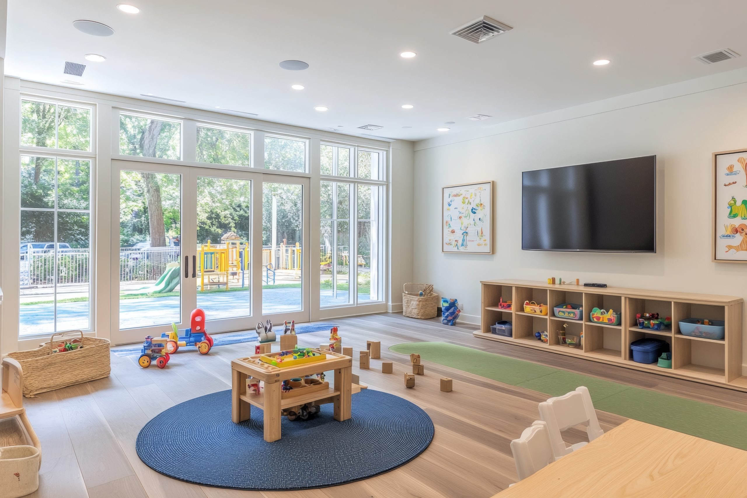
Pro tip: Before purchasing new storage solutions, take inventory of what toys need organising. Categories often include building blocks, creative supplies, books, pretend play items, and active toys.
2. Storage Solutions That Grow With Your Child
The foundation of any successful kids’ toy room is appropriate storage. Effective toy organisation systems should be both accessible to children and visually appealing.
Open shelving works particularly well for frequently used items and can double as display space in your kids’ toy room. Consider these options for different toy categories:
- Low, open shelves for daily-use toys that encourage independent access
- Closed cabinets for items that require adult supervision or create visual clutter
- Clear bins for collections like building blocks or toy vehicles
- Soft baskets for stuffed animals and dress-up clothes
- Book displays that show covers rather than spines for young readers
What makes a kids’ toy room truly functional is a labelling system appropriate for your child’s age. For pre-readers, use picture labels with corresponding images on bins. As children grow, transition to written labels that they can read independently.
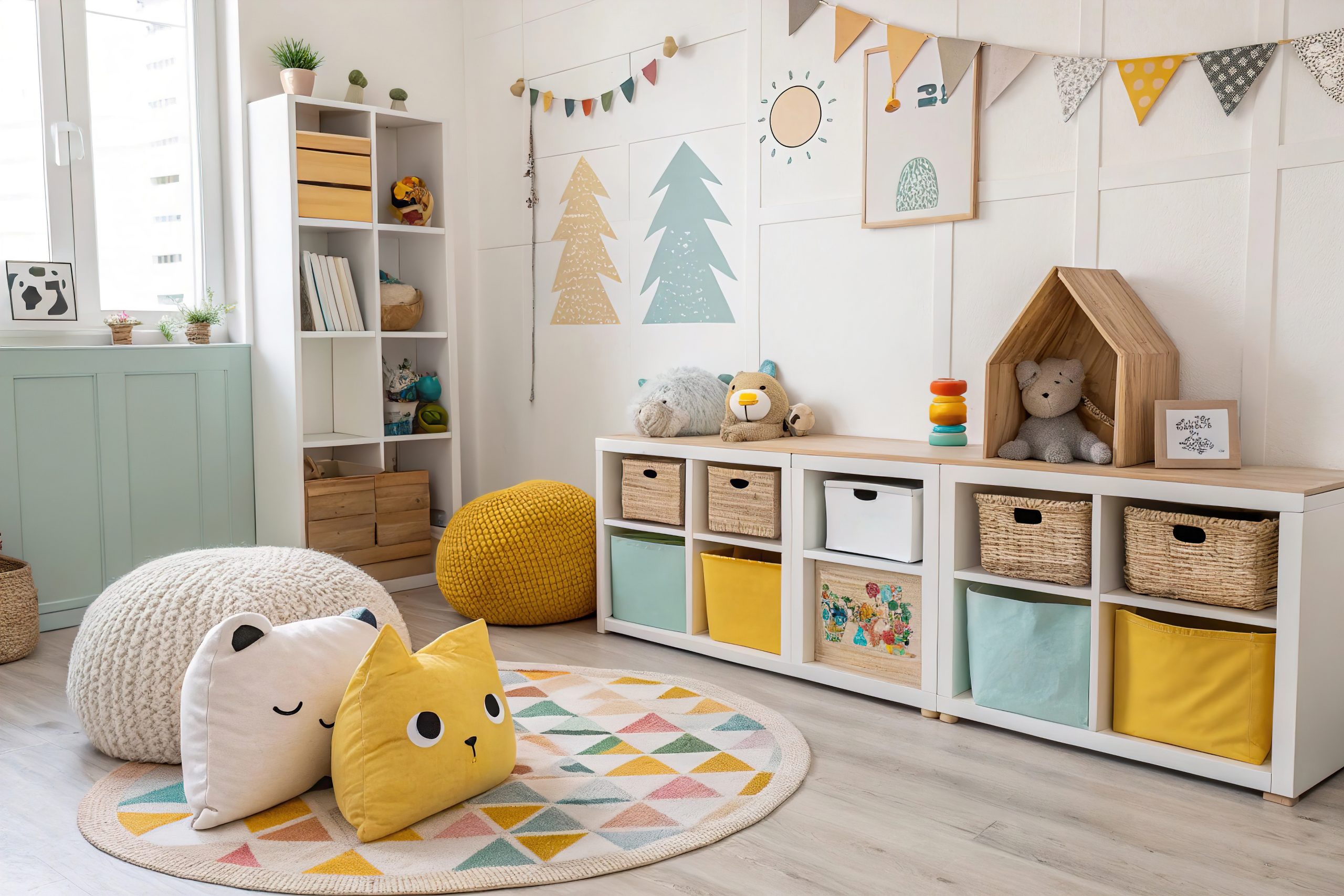
Pro tip: Modular storage systems allow your kids’ toy room to evolve as your child grows. Choose pieces that can be reconfigured or repurposed rather than age-specific furniture with limited longevity.
3. Flooring and Surface Considerations
The physical foundation of your kid’s toy room deserves careful consideration. Flooring needs to withstand creative messes, active play, and frequent cleaning.
Ideal flooring options for a kids’ toy room include:
- Luxury vinyl planks – Waterproof, durable, and available in attractive designs
- Low-pile carpeting – Offers comfort for floor play while being relatively easy to clean
- Large washable area rugs – Provide comfort over hardwood or tile
- Interlocking foam tiles – Create cushioned areas for active play
- Laminate flooring – Offers durability at a lower price point than hardwood
Wall surfaces in a kids’ toy room should balance aesthetics with practicality. Consider washable paint in a satin or semi-gloss finish that allows for wiping away inevitable marks. Magnetic paint or chalkboard sections create interactive areas that contain creative expression in designated spaces.

Pro tip: In multi-purpose spaces, use area rugs to define the kids’ toy room zone within a larger room. This creates a visual boundary that helps children understand where playthings belong.
4. Creating Activity Zones in Your Kids’ Toy Room
A well-designed kids’ toy room incorporates distinct areas that support different types of play. Each zone should include appropriate storage, surfaces, and materials specific to the activity.
Reading Nook Essentials
Create a cosy reading corner in your kids’ toy room with:
- Comfortable seating (child-sized armchair, floor cushions, or bean bags)
- Good lighting (preferably natural light supplemented with task lighting)
- Forward-facing book displays that highlight covers
- Soft textiles that invite settling in with a book
Art and Craft Corner Setup
Dedicate a creative space in your kids’ toy room with:
- A washable work surface at an appropriate height
- Organised supplies in accessible containers
- Display space for completed artwork
- Adequate lighting for detail work
- Protective covering for surfaces if needed
Building and Construction Zone
Support constructive play in your kids’ toy room with:
- Clear containers organised by piece type or set
- Flat building surfaces (LEGO tables, play mats)
- Display shelves for completed constructions
- Comfortable floor space for larger structures
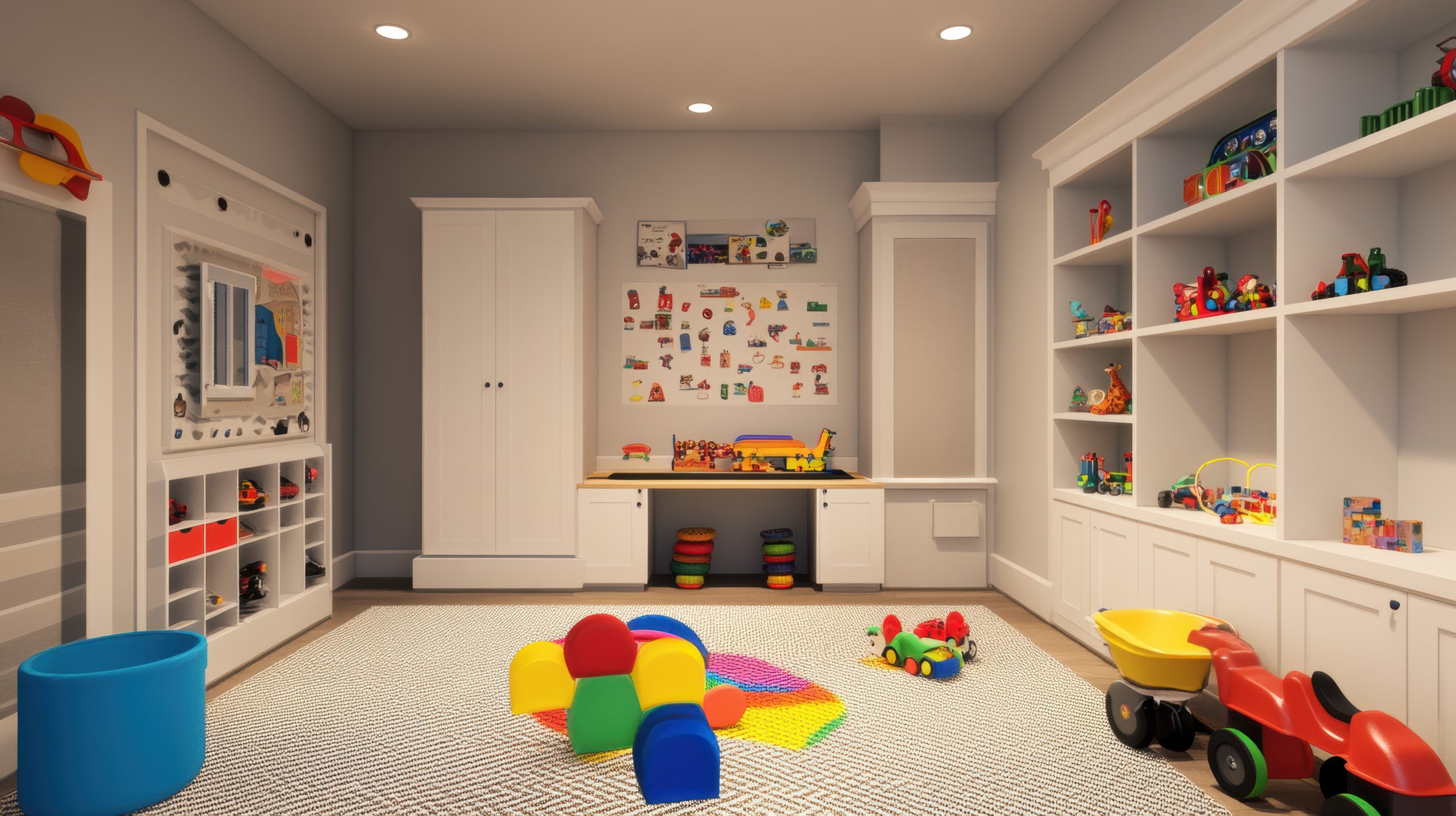
Pro tip: When designing zones in your kid’s toy room, consider acoustic properties. Place quieter activities like reading further from active play areas to allow simultaneous use by multiple children.
5. Display and Rotation Systems
A thoughtfully designed kids’ toy room includes intentional display areas that showcase special items and children’s creations. These displays serve multiple purposes: highlighting achievements, inspiring creativity, and creating visual interest in the space.
Effective display solutions for a kids’ toy room include:
- Gallery wall systems with easily changeable frames for rotating artwork
- Floating shelves at child height for displaying collections or creations
- Shadow boxes for three-dimensional items or special collections
- Wire systems with clips for frequently changing displays
- Museum-style display stands for showcasing current building projects
Implementing a toy rotation system keeps your kids’ toy room fresh and engaging while preventing overwhelm. Consider storing approximately one-third of toys out of sight, rotating them every few weeks to maintain interest while keeping the volume of visible toys manageable.
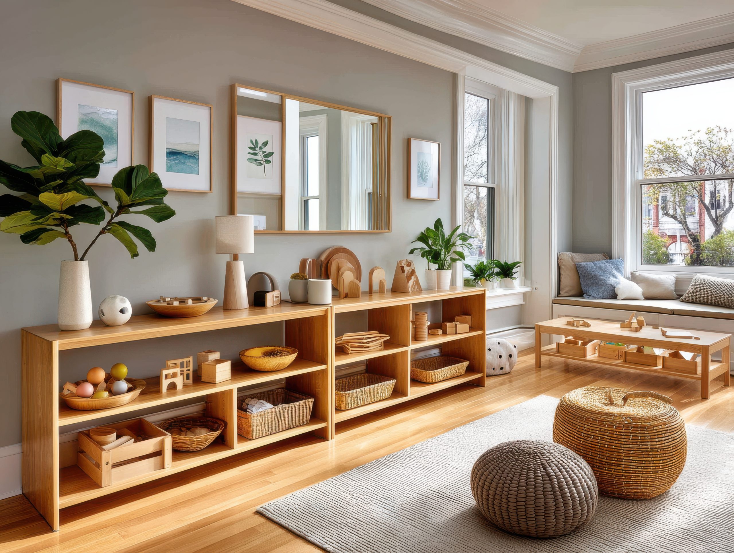
Pro tip: When designing your kids’ toy room, create a dedicated “display zone” where children can showcase their current projects without fear of them being dismantled or put away during cleanup time.
6. Lighting Your Kids’ Toy Room
Proper lighting transforms a kids’ toy room from functional to inspirational. A well-lit play space supports different activities while creating atmosphere and visual interest.
Consider these lighting elements for your kids’ toy room:
- Natural light – Position activity areas near windows when possible
- Overhead lighting – Provide even, ambient illumination throughout the space
- Task lighting – Add directed light for reading corners and craft areas
- Decorative lighting – Incorporate string lights or novelty fixtures that enhance the room’s theme
- Night lighting – Install dim options for evening transitions or nighttime comfort
The most effective kids’ toy room lighting plans include multiple sources at different heights. This layered approach creates a warm environment while ensuring adequate brightness for different activities.

Pro tip: In a kids’ toy room, consider cord management and safety features when selecting lighting. Wall-mounted options eliminate floor cords, while LED fixtures provide brightness without heat concerns.
7. Small Space Solutions
Not every home can accommodate a dedicated kids’ toy room, but even small spaces can incorporate organised play areas with strategic planning.
Maximise limited space with these kids’ toy room solutions:
- Vertical storage – Utilise wall space with tall bookcases and mounted organisers
- Under-bed storage – Choose beds with built-in drawers or use rolling containers underneath
- Door-hanging organisers – Use over-door systems for small toys or supplies
- Dual-purpose furniture – Select ottomans with storage, desks with shelving, or benches with bins
- Corner solutions – Maximise overlooked corner spaces with custom shelving or activity stations
When creating a kids’ toy room in a shared space, clearly define boundaries using area rugs, bookcases as room dividers, or designated cabinets that close when playtime ends.
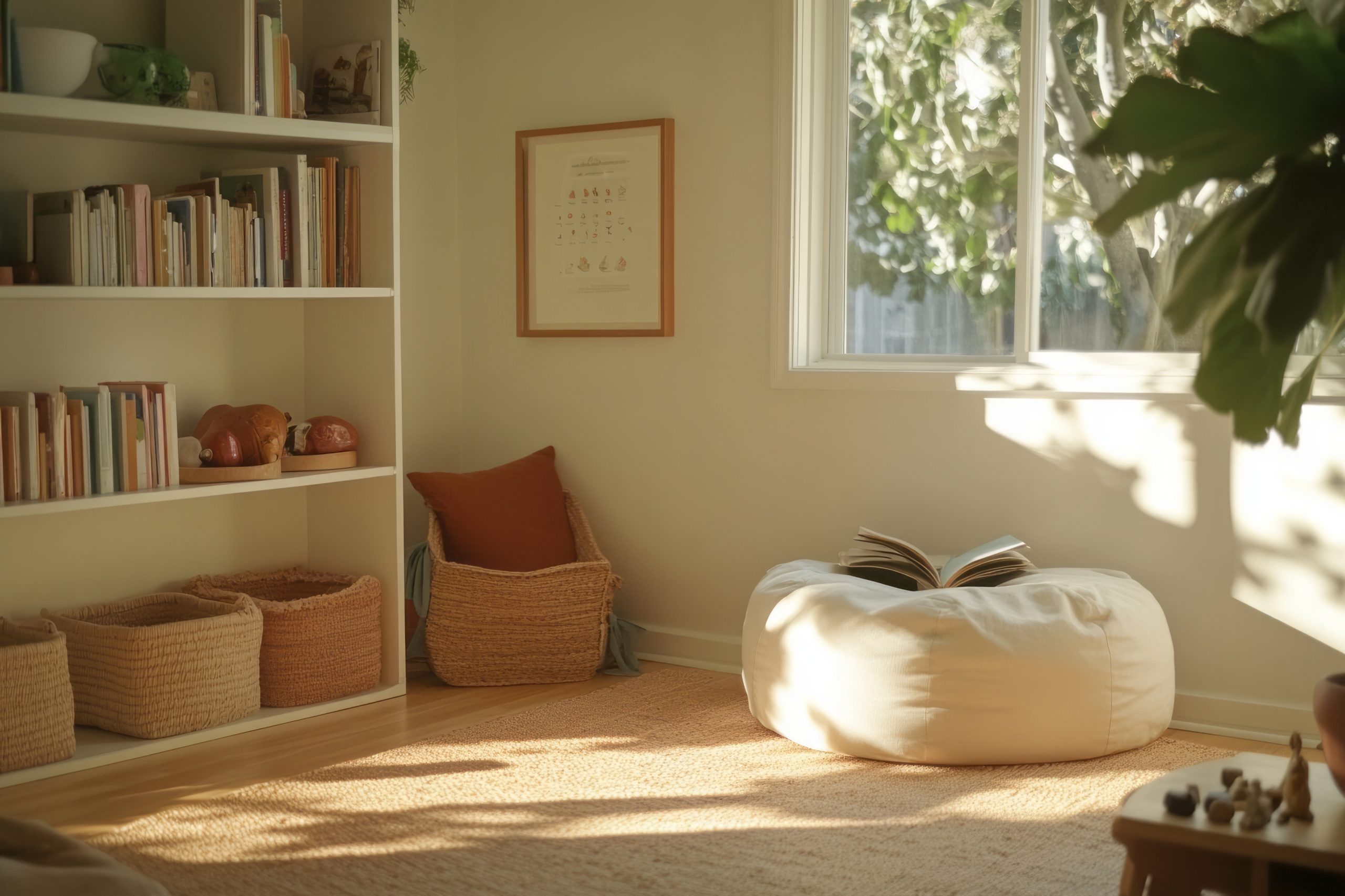
Pro tip: In apartments or small homes, create a “portable kids toy room” concept using dedicated containers that can be moved between spaces as needed, maintaining organisation while adapting to space limitations.
8. Theme and Décor Ideas That Inspire Play
Aesthetics matter in a kids’ toy room—not just for visual appeal, but because thoughtful design can stimulate imagination and engagement. The most successful play spaces balance personality with functionality.
When selecting a theme for your kids’ toy room, consider:
- Longevity – Choose concepts that can evolve as your child grows
- Neutrality – Select base elements that work with changing interests
- Flexibility – Incorporate themes through easily-changed accessories rather than permanent fixtures
- Child input – Involve children in age-appropriate decisions to increase their ownership of the space
- Colour psychology – Understand how different hues affect mood and behaviour
A well-designed kids’ toy room often uses colour strategically rather than overwhelmingly. Consider a neutral base palette with colourful accents that can be updated. This approach creates a visually calm environment while still offering personality and interest.
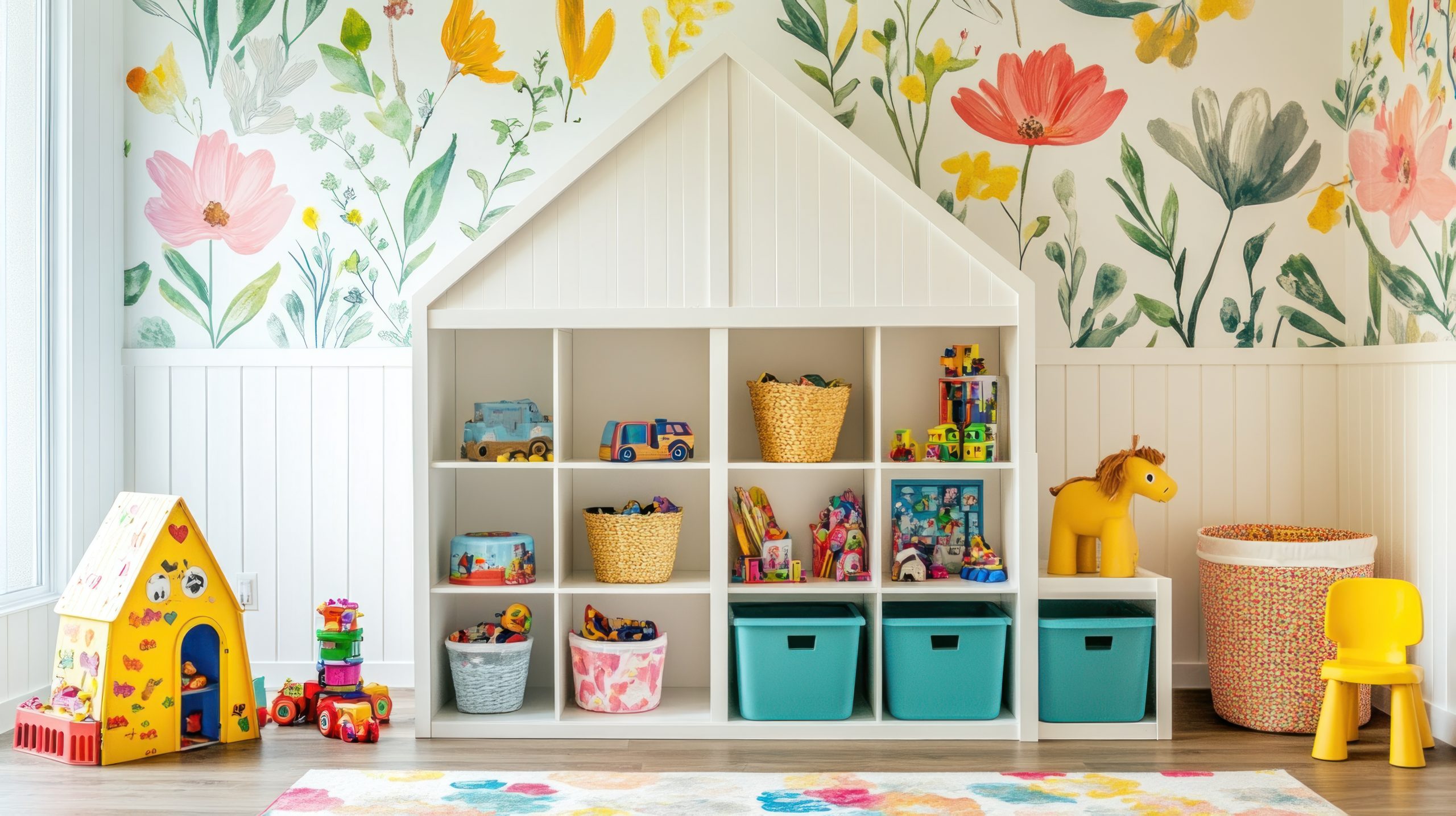
Pro tip: Rather than character-specific themes that may quickly fall out of favour, consider concept-based themes for your kids’ toy room, such as nature, adventure, or creativity, that can adapt as interests evolve.
9. Organisation Systems That Work
Creating a kids’ toy room is one achievement; maintaining it is another. Successful play spaces incorporate systems that make ongoing organisation manageable for both parents and children.
Effective kids’ toy room maintenance strategies include:
- Consistent categories – Group similar items together in logical categories
- Clear visual systems – Use consistent colours, labels, or symbols for different toy types
- Appropriate independence – Design storage that children can manage without assistance
- Regular reset times – Establish daily quick-cleanup and weekly deeper organisation routines
- One-in-one-out policy – Maintain toy volume by removing items when new ones enter the rotation
Labelling deserves special attention in any kids’ toy room organisation system. For younger children, use picture labels that clearly show what belongs where. As children develop reading skills, transition to word labels that support literacy development.
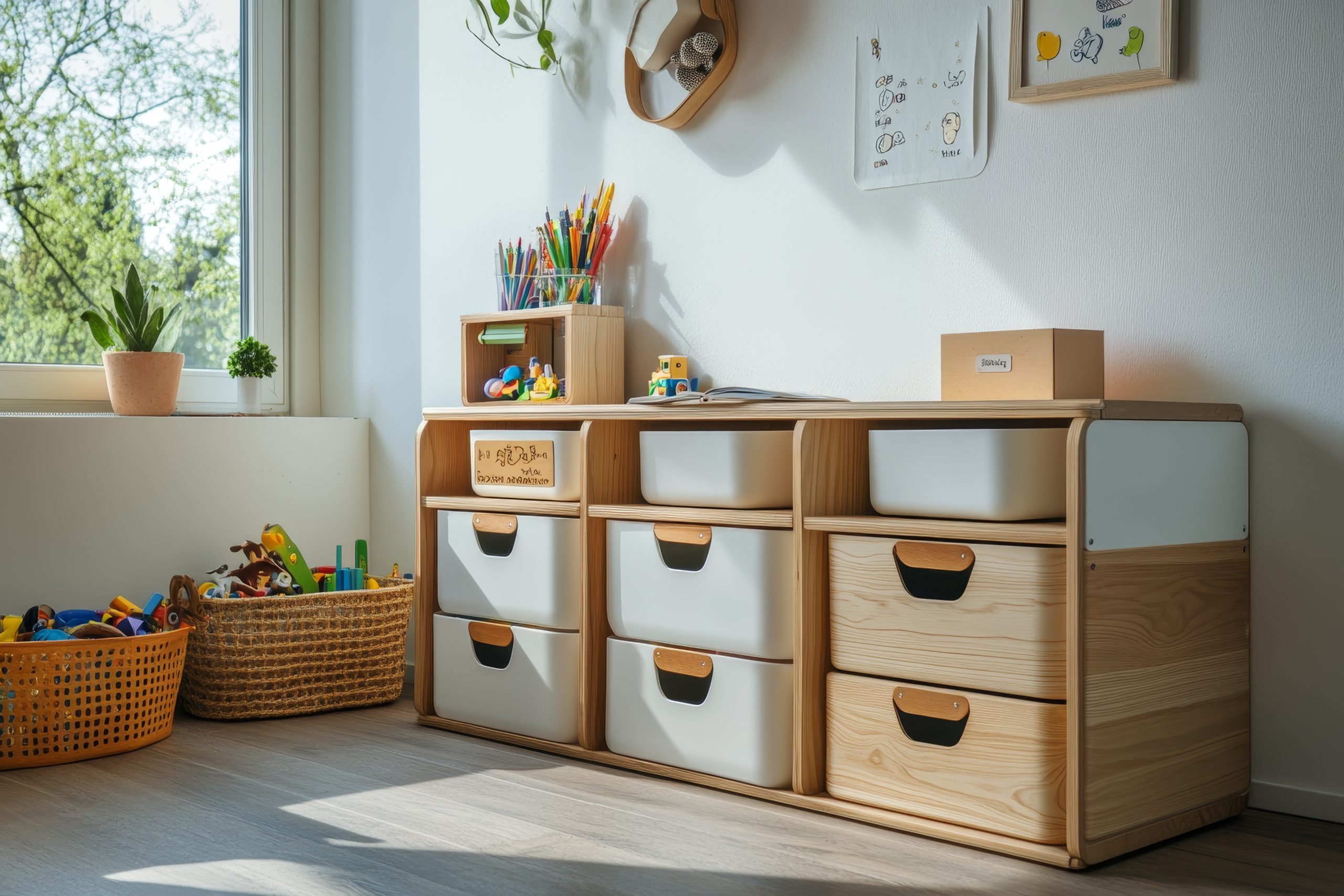
Pro tip: In a well-designed kids’ toy room, incorporate a “halfway house” basket for items that need parental help to put away. This teaches responsibility while acknowledging developmental capabilities.
10. Real Family Examples: Kids Toy Rooms That Work
While every family’s needs differ, examining successful kids’ toy room solutions provides valuable inspiration. The following examples demonstrate how core principles adapt to different situations.
Small Space Solution
A 6×8-foot dedicated area transformed into a complete kids’ toy room by:
- Using full-height wall storage
- Implementing a fold-down activity table
- Creating vertical display systems
- Utilising under-furniture storage
- Employing a strict rotation system to limit visible toys
Shared Sibling Space
A kids’ toy room designed for multiple ages incorporating:
- Colour-coded storage for each child
- Height-appropriate activity zones
- Lockable storage for materials needing supervision
- Flexible furniture arrangement for varying play styles
- Designated personal spaces within the shared room
Budget Transformation
An impressive kids’ toy room created with limited funds by:
- Repurposing existing furniture with paint
- Using inexpensive plastic bins with custom labels
- DIY wall organisation systems
- Strategic lighting upgrades
- Creative use of wall space for both storage and play
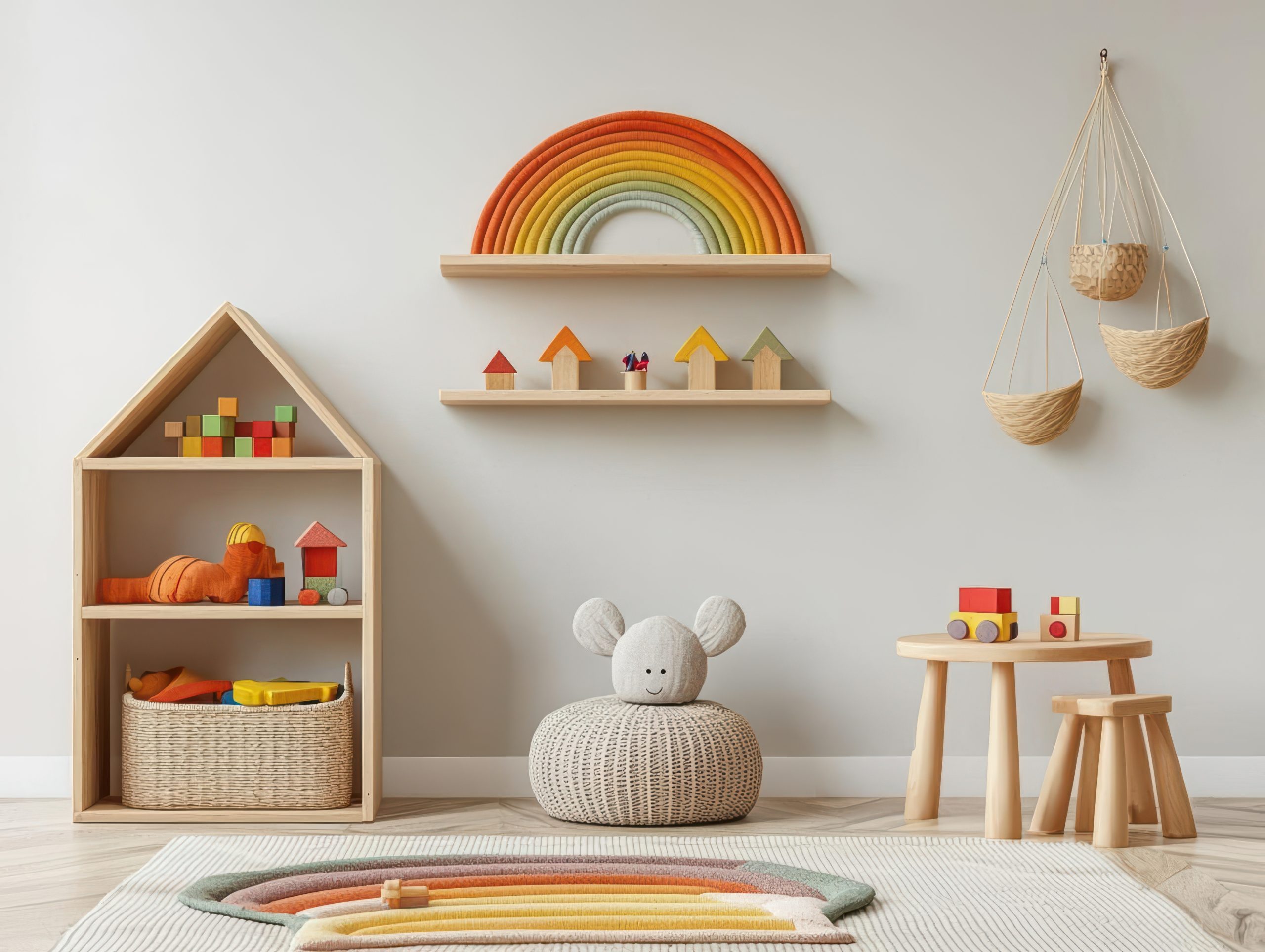
Pro tip: The most successful kids’ toy room designs prioritise organisational infrastructure first, with decorative elements added after the functional systems are established.
Conclusion
Creating an effective kids’ toy room involves balancing practical organisation with spaces that inspire creativity and independent play. The most successful designs consider not just current needs but how the space will evolve as children grow.
Key takeaways for designing your kids’ toy room include:
- Start with clear zones based on your child’s play patterns
- Prioritise accessible, intuitive storage systems
- Create visual calm through thoughtful design choices
- Implement maintenance routines that grow with your child
- Allow flexibility for changing interests and developmental needs
Remember that a well-designed kids’ toy room serves multiple purposes: containing toy clutter, supporting development through appropriate play opportunities, and creating an environment where children can exercise independence and creativity.
By applying these principles, you can create a kids’ toy room that works for your unique space, budget, and family needs, transforming toy chaos into an organised, inspiring environment that benefits both children and parents.
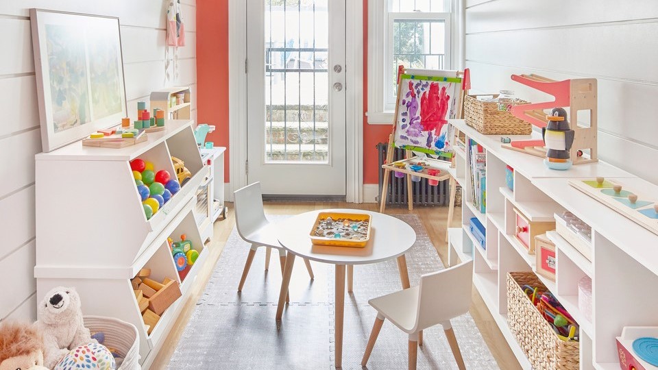
by Kesaa Interiors | DESIGN GUIDES, Living Spaces, TRENDING
There’s something undeniably magical about Art Deco interior design that keeps drawing me back to this style. I’ve seen how incorporating Art Deco home interior design ideas can transform an ordinary space into something extraordinary. The style’s perfect blend of glamour and sophistication has captivated homeowners and designers alike for decades. I’m thrilled to share my favourite ways to bring this timeless aesthetic into your home.
I’ll walk you through 15 stunning Art Deco home interior design ideas that can help you achieve that perfect luxe look. Whether you’re planning a complete renovation or looking to add just a touch of that signature Art Deco glamour, these tips will help you create the space you’ve been dreaming of.
Geometric Patterns and Bold Lines
If there’s one element that truly defines Art Deco home interior design, it’s the bold use of geometric patterns. These dramatic designs are the heart and soul of the style, and they have an incredible way of transforming even the most basic room into something spectacular.
Here’s my approach to incorporating these patterns:
- Start with one bold geometric element as your focal point. I always suggest beginning with either wallpaper or a large area rug – these anchor pieces set the tone for the entire space.
- Layer in angular furniture pieces that echo your main pattern. Think zigzag-patterned throw pillows or a stunning cabinet with geometric overlay.
- Mix different scales of patterns, but keep them in the same colour family. One of my favourite combinations is pairing a large-scale geometric wallpaper with smaller-patterned cushions or curtains.
Pro tip: If you’re nervous about committing to bold geometric wallpaper, try starting with removable wallpaper panels or focus on incorporating geometric patterns through art pieces and textiles. This is a fantastic way to experiment with Art Deco home interior design ideas without making permanent changes.
Remember, the key to successful Art Deco pattern play is confidence – this isn’t a style for the timid! I always tell my clients that if they’re going to embrace Art Deco, they should embrace it. The beauty of these geometric patterns is that they create an instant focal point and set the stage for all your other Art Deco elements to shine.
These striking patterns aren’t just decorative; they’re conversation starters. The impact of a bold geometric design element is undeniable – it’s exactly the kind of statement we’re looking for with Art Deco home interior design. These patterns command attention and exude confidence, creating spaces that feel both sophisticated and dramatic.
Luxurious Metallics
Nothing says Art Deco home interior design quite like the gleam of metallic finishes. The way metals catch and reflect light adds that essential layer of glamour that’s so characteristic of this style. Gold, brass, and chrome are the holy trinity of Art Deco metallics, and I never tire of seeing how they can elevate a space.
Here’s how I love to incorporate these luxurious elements:
- Start with your hardware: Door handles, cabinet pulls, and light switches in polished brass or chrome make for an immediate Art Deco upgrade.
- Layer in larger metallic pieces: Think mirrors with metal frames, side tables with brass legs, or chrome-finished bar carts.
- Mix your metals thoughtfully: While traditional Art Deco favoured single metal tones, modern interpretations can beautifully blend different metallics – just keep them in the same temperature family.
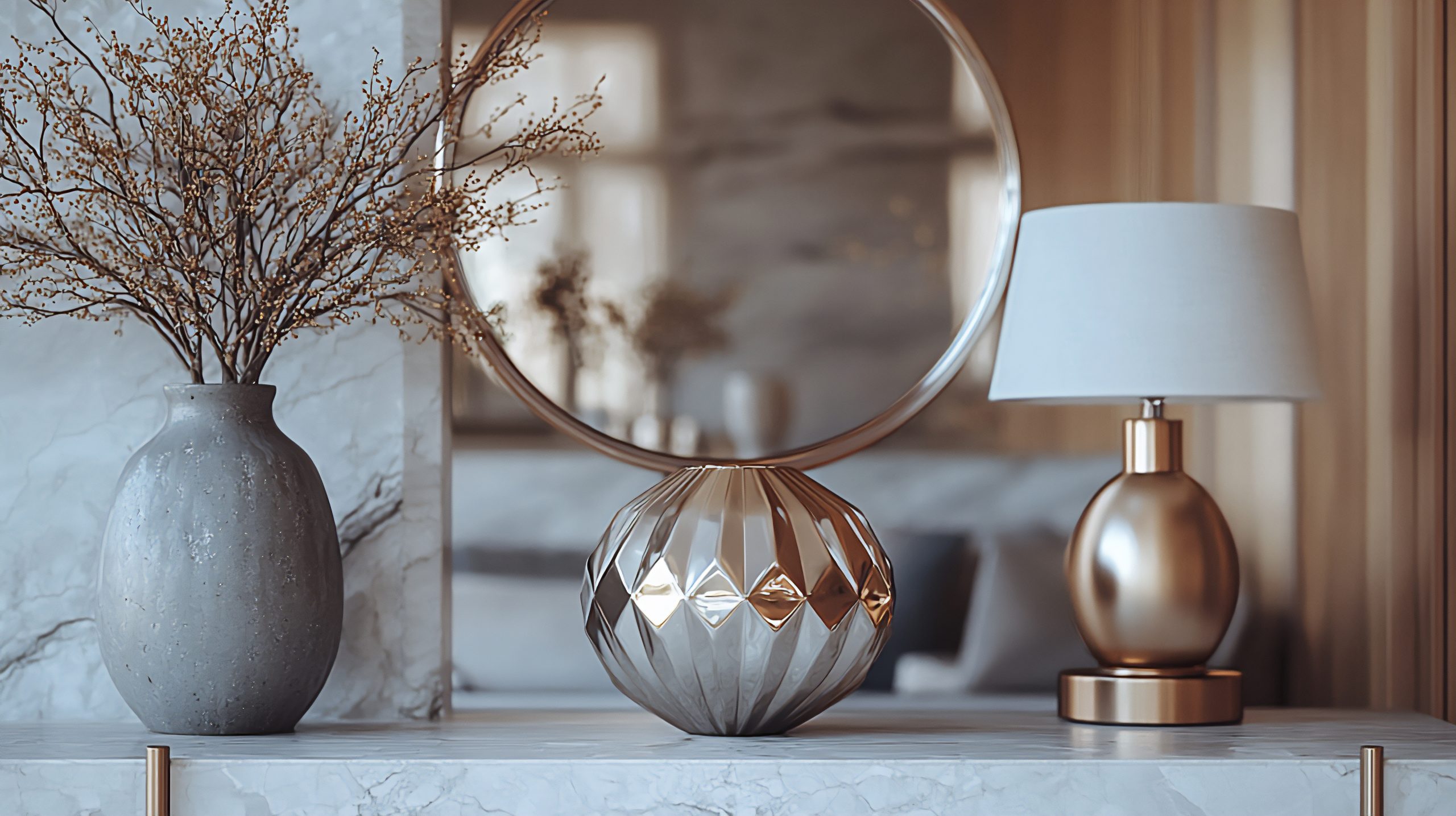
The key is to distribute these metallic elements evenly throughout your space. I find that treating metals like jewellery for your room works perfectly – they should enhance rather than overwhelm. A metallic ceiling medallion paired with matching wall sconces, for instance, creates a cohesive look that draws the eye around the room.
Pro tip: When incorporating metallics into your Art Deco home interior design ideas, remember that a little shine goes a long way. Balance these gleaming surfaces with rich, matte textures like velvet or wool to create depth and visual interest.
One of my favourite ways to make a statement is with a large metallic piece – perhaps an oversized sunburst mirror or a striking gold-leafed cabinet. These signature pieces become natural focal points while embodying the luxury and drama that make Art Deco so appealing.
Statement Lighting
If there’s one element that can make or break your Art Deco home interior design, it’s lighting. Art Deco lighting fixtures are like functional sculptures, commanding attention whether they’re switched on or off.
The most impactful Art Deco lighting features include:
- Tiered chandeliers with geometric glass panels
- Sconces with stepped designs and metallic finishes
- Pendant lights featuring clean lines and frosted glass
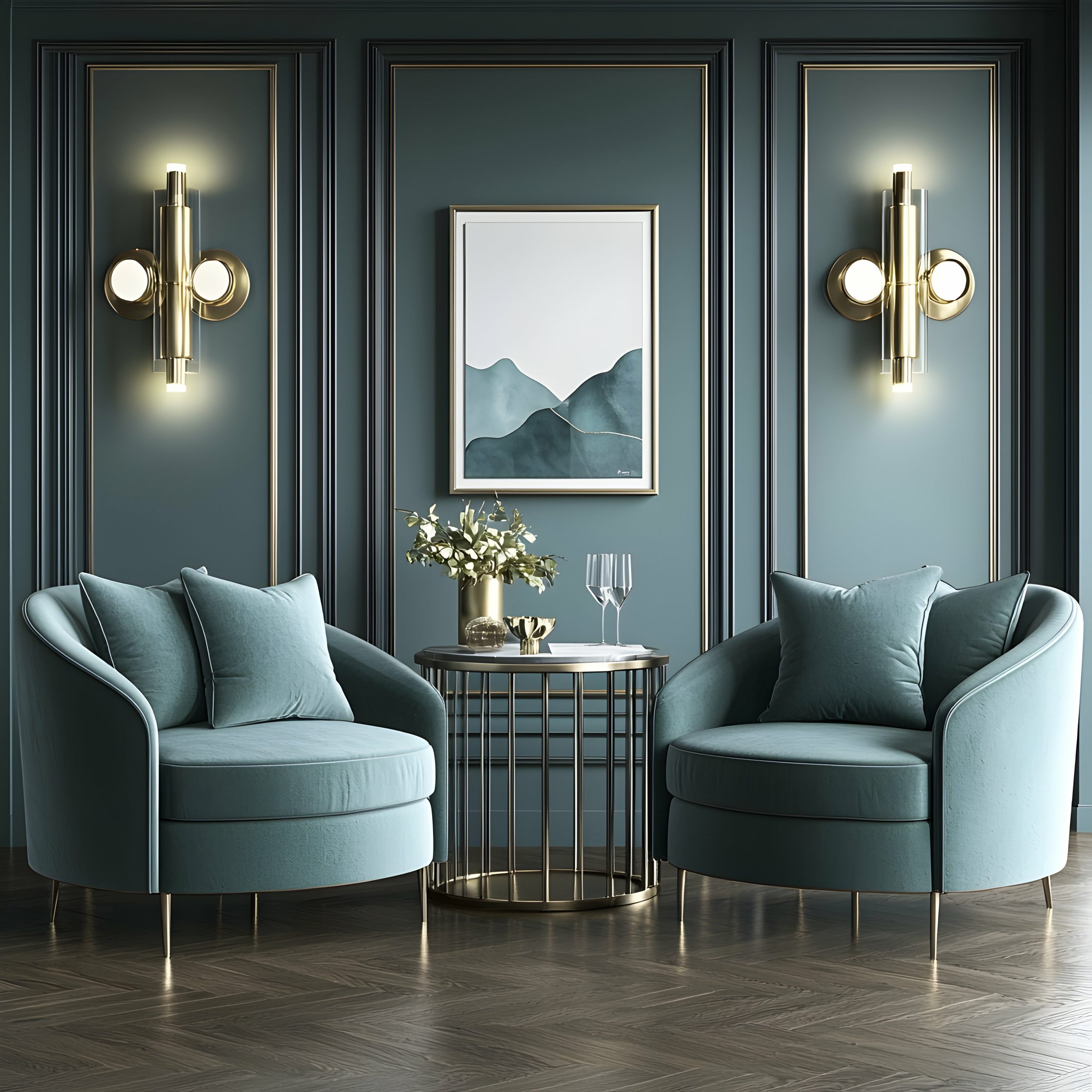
When selecting lighting, look for pieces that incorporate typical Art Deco motifs – sunbursts, fan shapes, and geometric patterns. The right fixture can become the cornerstone of your entire design scheme, informing the rest of your decor choices.
What makes Art Deco lighting so special is its ability to serve as both illumination and art. During the day, these fixtures act as sculptural elements, while at night, they create dramatic shadow plays and lighting effects that transform your space.
Remember, the placement of your lighting is just as important as the fixtures themselves. Consider creating layers of light with a mix of ceiling fixtures, wall sconces, and table lamps. This layered approach not only provides practical illumination but also adds depth and drama, which are essential elements in Art Deco home interior design.
Rich Colour Palettes
The colours you choose for your Art Deco home interior design set the stage for drama and sophistication. What I love most about Art Deco colour schemes is their boldness – these aren’t your typical safe, neutral palettes. Instead, we’re talking about colours that make a statement and leave an impression.
The most striking Art Deco colour combinations include:
- Deep emerald green paired with gold and black
- Sapphire blue with silver and cream
- Ruby red combined with chrome and white
- Rich tobacco brown with bronze and ivory
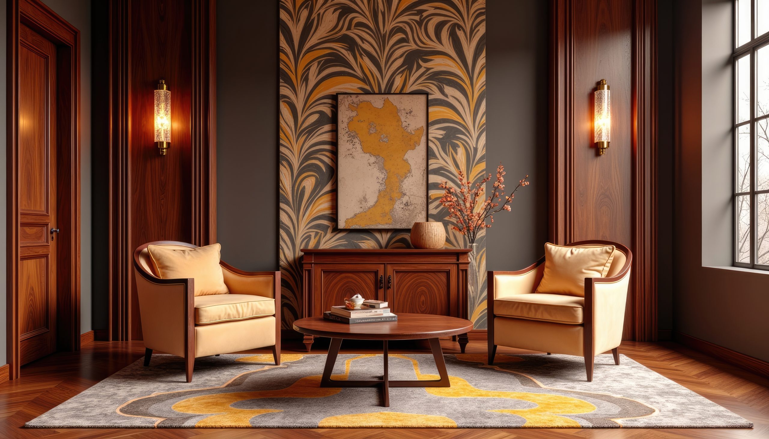
When working with these bold colours, I find it’s best to follow the 60-30-10 rule: 60% of your space in a dominant colour, 30% in a secondary colour, and 10% in an accent colour. This creates balance while maintaining that signature Art Deco drama.
Pro tip: Start with one bold colour you absolutely love and build your palette around it. The walls don’t always need to be the boldest element – a deep-coloured velvet sofa can be just as impactful against neutral walls.
Mirrored Surfaces
Nothing captures the glamour of Art Deco home interior design quite like the strategic use of mirrors and mirrored surfaces. These reflective elements add depth, light, and a touch of Hollywood golden age glamour to any space.
Key ways to incorporate mirrored elements:
- Install mirror panels with geometric divisions
- Choose furniture pieces with mirrored accents
- Add mirrored trays and decorative objects
- Consider an Art Deco-style mirror as wall art
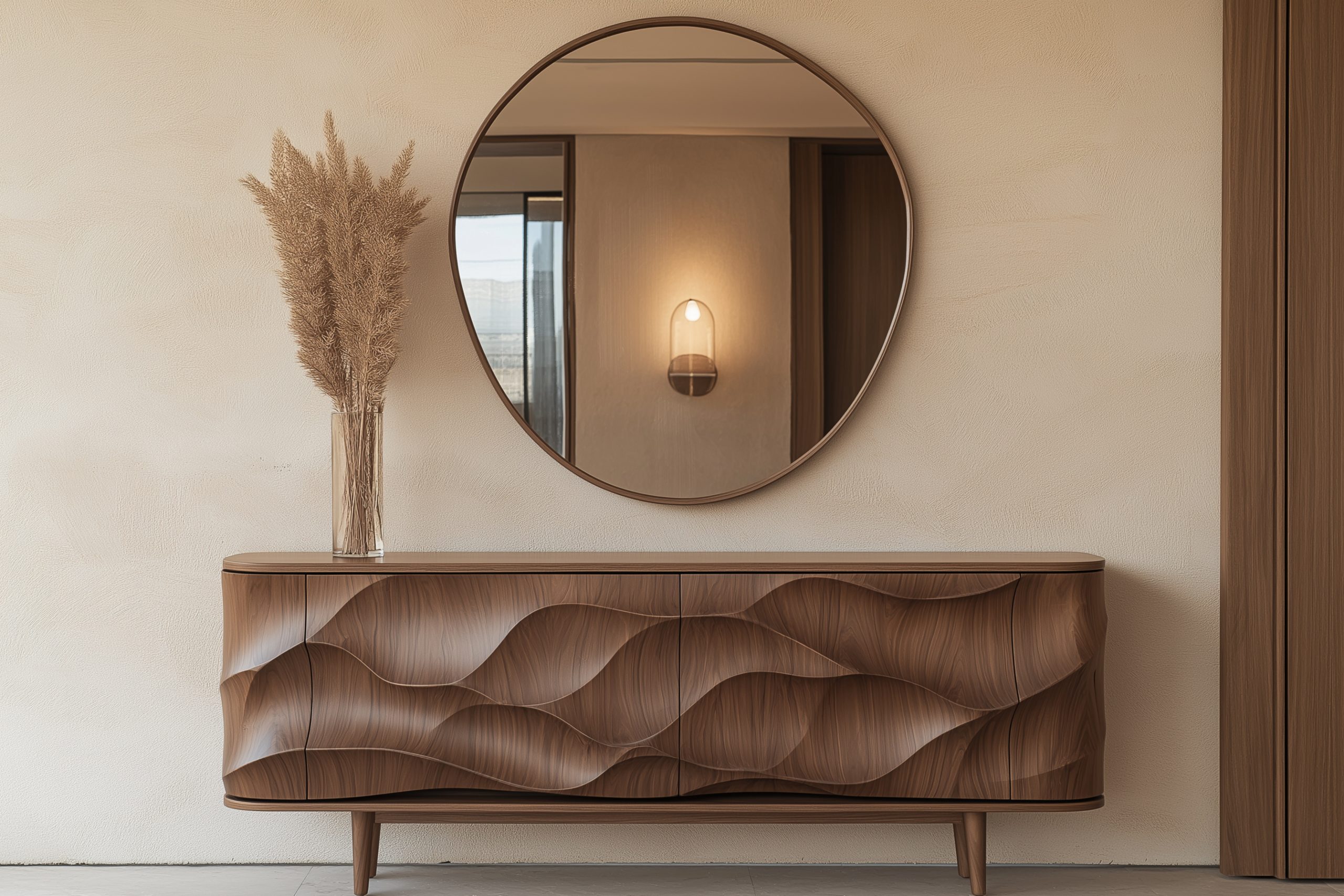
The trick with mirrors is to place them thoughtfully. Position them to reflect something interesting – perhaps your statement lighting or a beautiful piece of art. This doubles the impact of your best decorative elements while creating that sought-after Art Deco sparkle.
One word of caution: while mirrors are fantastic, too many can feel overwhelming. I always suggest choosing one or two significant mirrored pieces rather than filling every surface with reflection.
Sophisticated Materials
The materials you choose for your Art Deco home interior design are crucial for creating that luxurious feel. This style is all about combining different textures and surfaces to create a rich, layered effect.
Essential Art Deco materials include:
- Polished woods (especially exotic varieties)
- Plush velvets
- Smooth lacquer finishes
- High-gloss marble
- Sleek glass
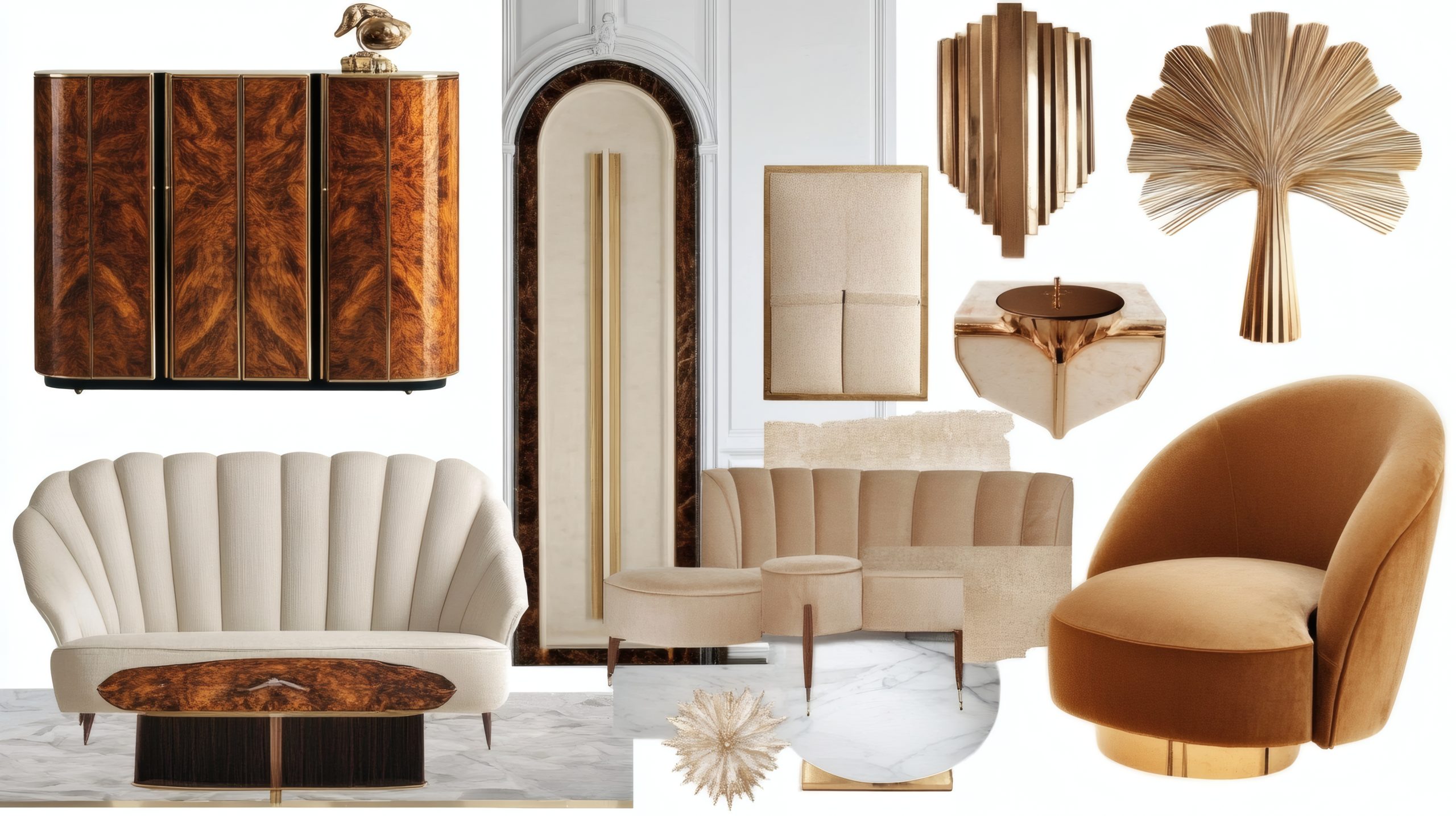
The key to working with these materials is contrast. Pair smooth, glossy surfaces with soft, tactile fabrics. Consider a lacquered sideboard topped with velvet-covered boxes, or marble floors softened by a plush geometric rug.
When selecting furniture pieces, look for:
- High-sheen wood finishes
- Upholstery in luxurious fabrics
- Pieces combining different materials
- Clean lines with sophisticated details
Remember, quality matters in Art Deco design. While there are always ways to achieve the look on a budget, investing in a few key pieces made from authentic materials will elevate your entire space.
Bold Artwork and Wall Panels
Art Deco home interior design isn’t complete without making a statement through your wall treatments. The artwork and wall details of this era were never meant to fade into the background – they’re intended to be bold, dramatic, and impossible to ignore.
Key elements to consider:
- Large-scale artwork featuring geometric patterns
- Stylised figures and motifs
- Decorative wall panels with stepped designs
- Bold murals with metallic accents
- Sculptural wall installations
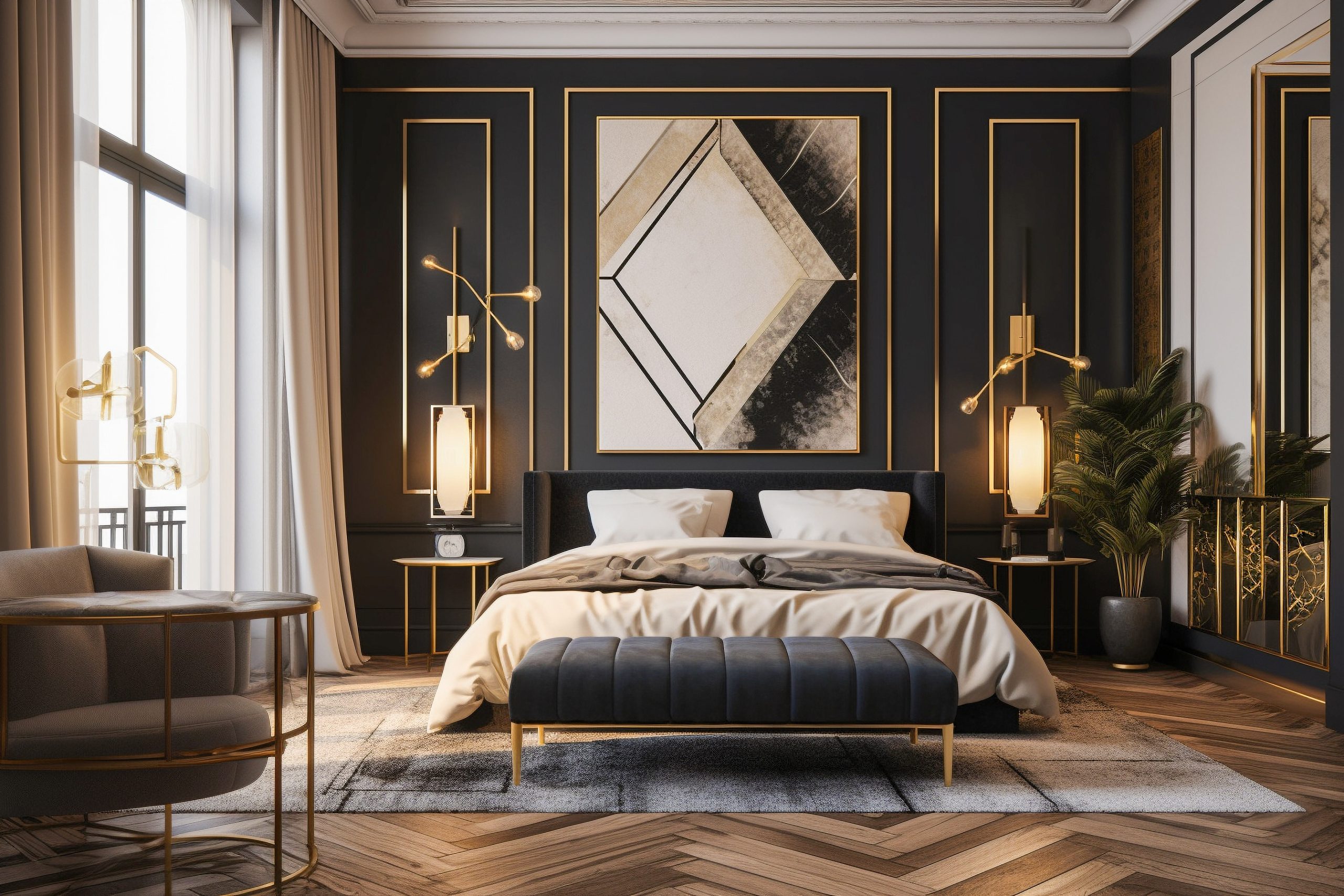
When selecting artwork, look for pieces that embrace typical Art Deco themes: sunbursts, chevrons, stylised animals, and figurative works with elongated forms. I particularly love how oversized pieces can transform an entire wall into a focal point.
For wall panels, consider:
- Wood panels with geometric inlays
- Upholstered panels in luxe fabrics
- Metal or mirror panels with decorative overlays
- Painted panels with metallic details
The beauty of Art Deco wall treatments is their versatility. You might opt for a single dramatic mural behind your sofa, or create an entire wall of geometric panels. Whatever you choose, make sure it complements rather than competes with your other Art Deco elements.
Streamlined Furniture
The furniture in Art Deco home interior design tells a story of elegance through form. These pieces are all about clean lines and curved edges, creating a sense of movement while maintaining sophistication.
Essential furniture characteristics include:
- Curved sofas and club chairs
- Streamlined silhouettes
- Built-in seating nooks
- Furniture with stepped or waterfall edges
- Pieces that combine different materials
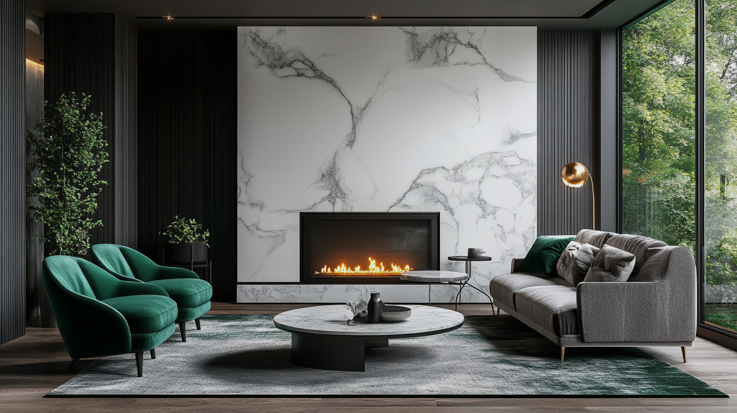
When selecting furniture, I always recommend focusing on:
- Low-profile pieces with strong horizontal lines
- Rounded corners and smooth curves
- Symmetrical arrangements
- Pieces that make a statement without being bulky
The key to successful Art Deco furniture placement is balance. Create conversation areas that feel intimate yet sophisticated, and don’t be afraid to mix curved pieces with angular ones – this contrast is what makes Art Deco so dynamic.
Pro tip: If you’re working with a smaller space, choose fewer, more impactful pieces rather than trying to squeeze in too many elements. A single spectacular curved sofa can have more impact than multiple smaller pieces.
Remember, comfort shouldn’t be sacrificed for style. The best Art Deco rooms combine visual drama with practical livability. Look for pieces that invite you to sit and stay while maintaining those classic Art Deco lines.
When it comes to upholstery, opt for:
- Rich, solid colours
- Geometric patterns
- Luxurious textures
- High-quality fabrics that will stand the test of time
The beauty of Art Deco furniture lies in its ability to be both functional and sculptural. Each piece should work as part of your overall design while being striking enough to stand on its own.
Exotic Wood Finishes
The use of luxurious woods is one of the most distinctive features of Art Deco home interior design. These aren’t your everyday wood finishes – we’re talking about spectacular grains and rich colours that immediately elevate a space’s sophistication level.
Key wood varieties to consider:
- Macassar ebony with its dramatic striped grain
- Bird’s eye maple for its unique spotted pattern
- Zebra wood offers bold, natural stripes
- Burled walnut with its swirling patterns
- Rosewood for its deep, rich tones
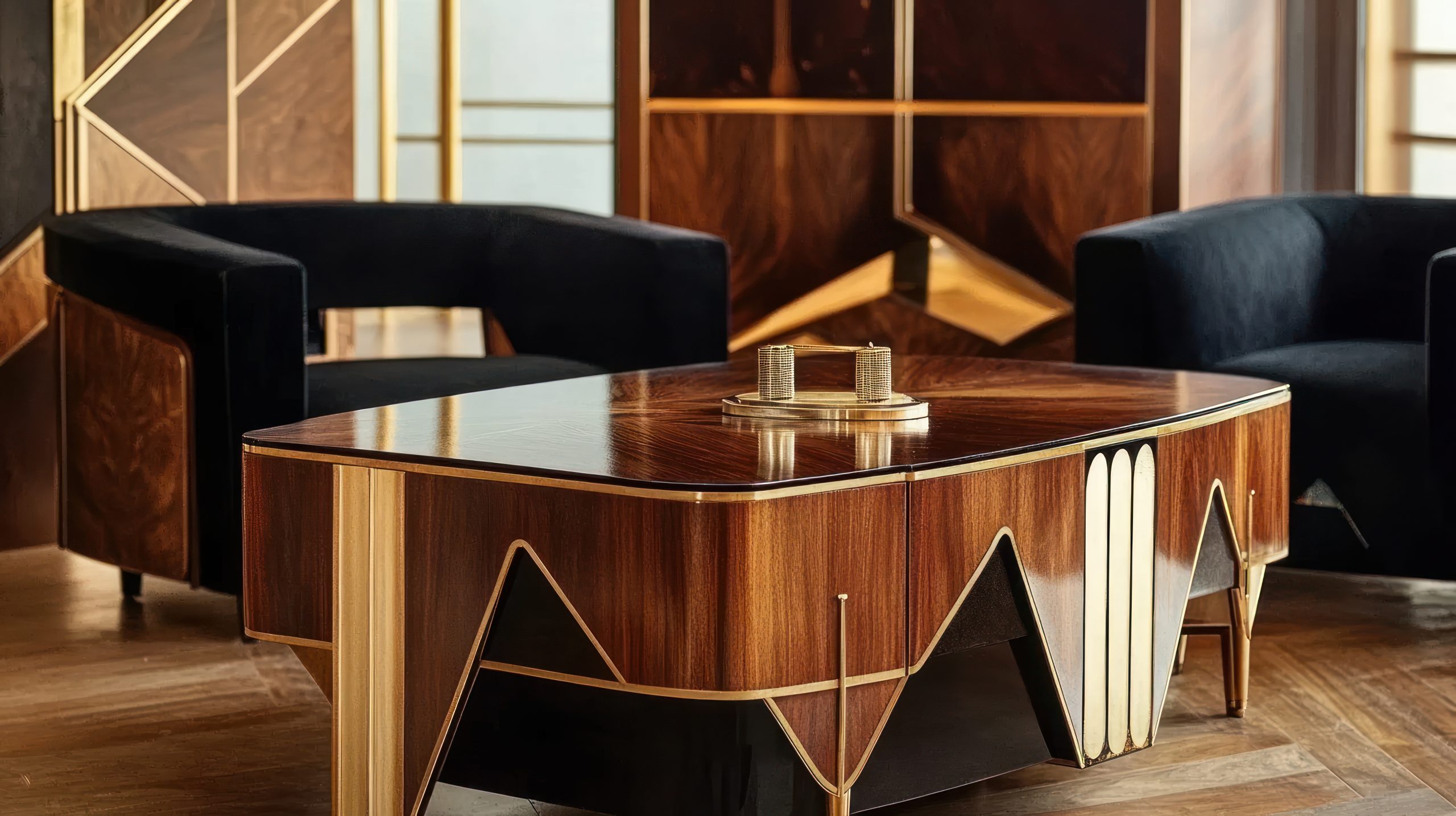
The beauty of these woods lies in their natural patterns. Whether it’s through furniture pieces, wall panels, or built-ins, these materials add organic geometry to your Art Deco scheme. I particularly love how they catch the light and create depth in a space.
Using exotic woods effectively:
- Choose one statement piece as your anchor
- Mix different woods while keeping finishes consistent
- Balance dark and light wood tones
- Consider wood inlays for added detail
Pro tip: If authentic exotic woods are beyond your budget, there are excellent veneers and alternatives available that can create a similar effect. The key is choosing options with strong, distinctive grain patterns.
Statement Staircases
In Art Deco home interior design, staircases aren’t just functional elements – they’re architectural showpieces that can define an entire space. Whether you’re working with a grand curved staircase or a more modest design, there are plenty of ways to incorporate Art Deco elements.
Essential staircase features include:
- Geometric railings with repeated patterns
- Chrome or brass handrails
- Stepped details in the balustrades
- Dramatic runner patterns
- Contrasting materials
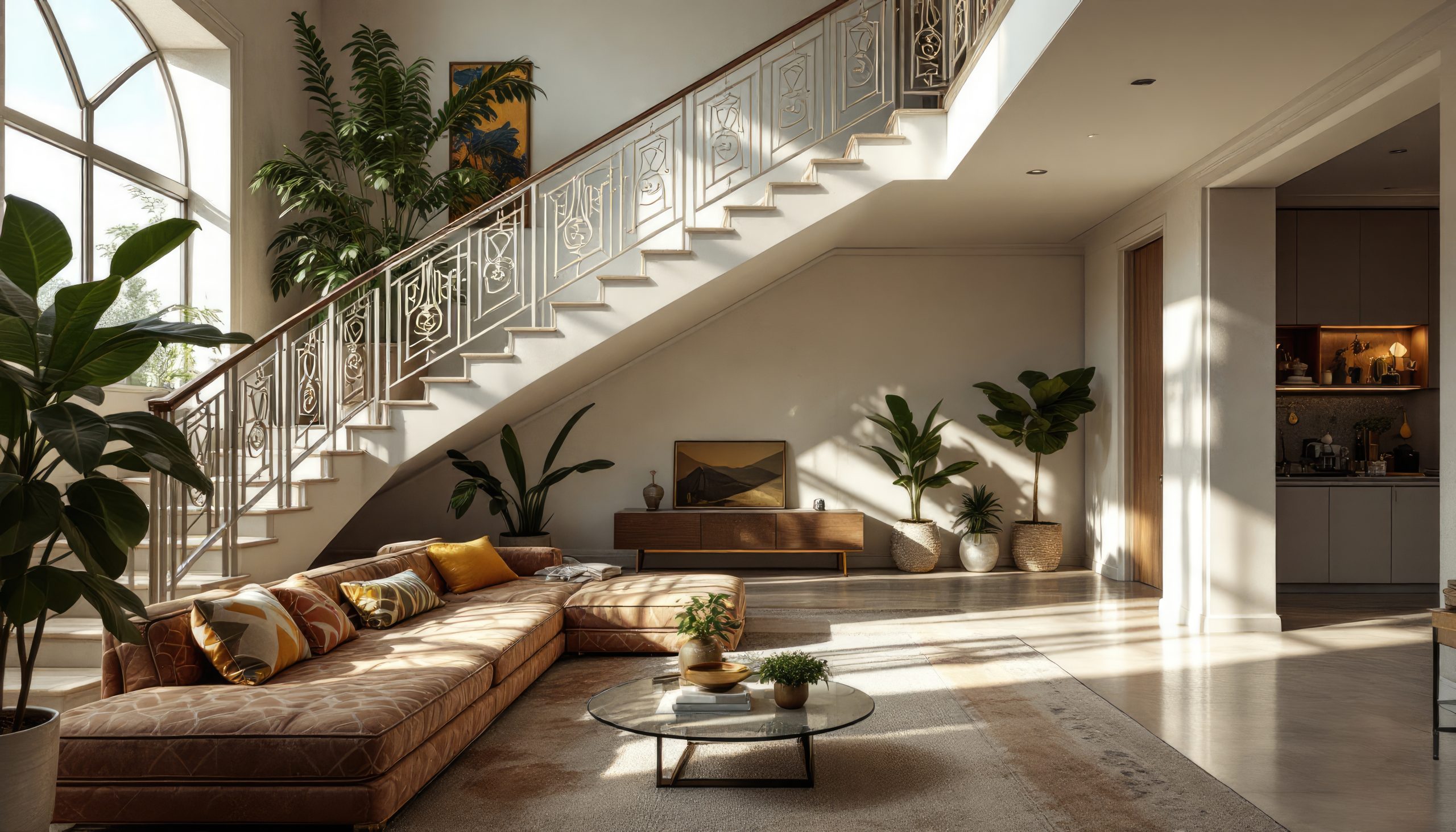
The most impactful staircase elements combine:
- Clean lines with decorative details
- Mixed materials like wood and metal
- Strategic lighting to highlight design features
- Pattern play through flooring or runners
When designing or updating a staircase, consider:
- The visual weight of different elements
- How light plays off metallic surfaces
- The balance between plain and decorative components
- The transition between different levels of your home
Even if you’re working with an existing staircase, there are ways to add Art Deco flair:
- Update balusters with geometric designs
- Add metallic accents to handrails
- Install a bold geometric runner
- Create drama with wall treatments alongside the stairs
Remember, your staircase should work in harmony with your other Art Deco elements while still making its own statement. Think of it as a piece of functional sculpture that helps tell your home’s design story.
The real magic happens when you combine these architectural elements with thoughtful lighting and decorative details. A well-designed Art Deco staircase catches the eye while guiding it upward, creating a sense of anticipation for what’s to come.
Luxe Window Treatments
Window treatments in Art Deco home interior design are never an afterthought – they’re an integral part of the room’s architecture and overall drama. The right window treatments can frame your views while adding that essential layer of Art Deco sophistication.
Key elements to consider:
- Layered treatments with sheer and heavy fabrics
- Strong horizontal banding
- Metallic hardware and finials
- Geometric patterns in fabric choices
- Dramatic height with floor-to-ceiling designs
When selecting window treatments, think about:
- Heavy silk or velvet for the main curtains
- Sheer panels with subtle geometric patterns
- Metal rods with decorative ends
- Valances with stepped or angular designs
- Automated systems hidden behind pelmets
Pro tip: Height is crucial in Art Deco design. Mounting curtains close to the ceiling and letting them fall to the floor creates that sought-after sense of drama and luxury.
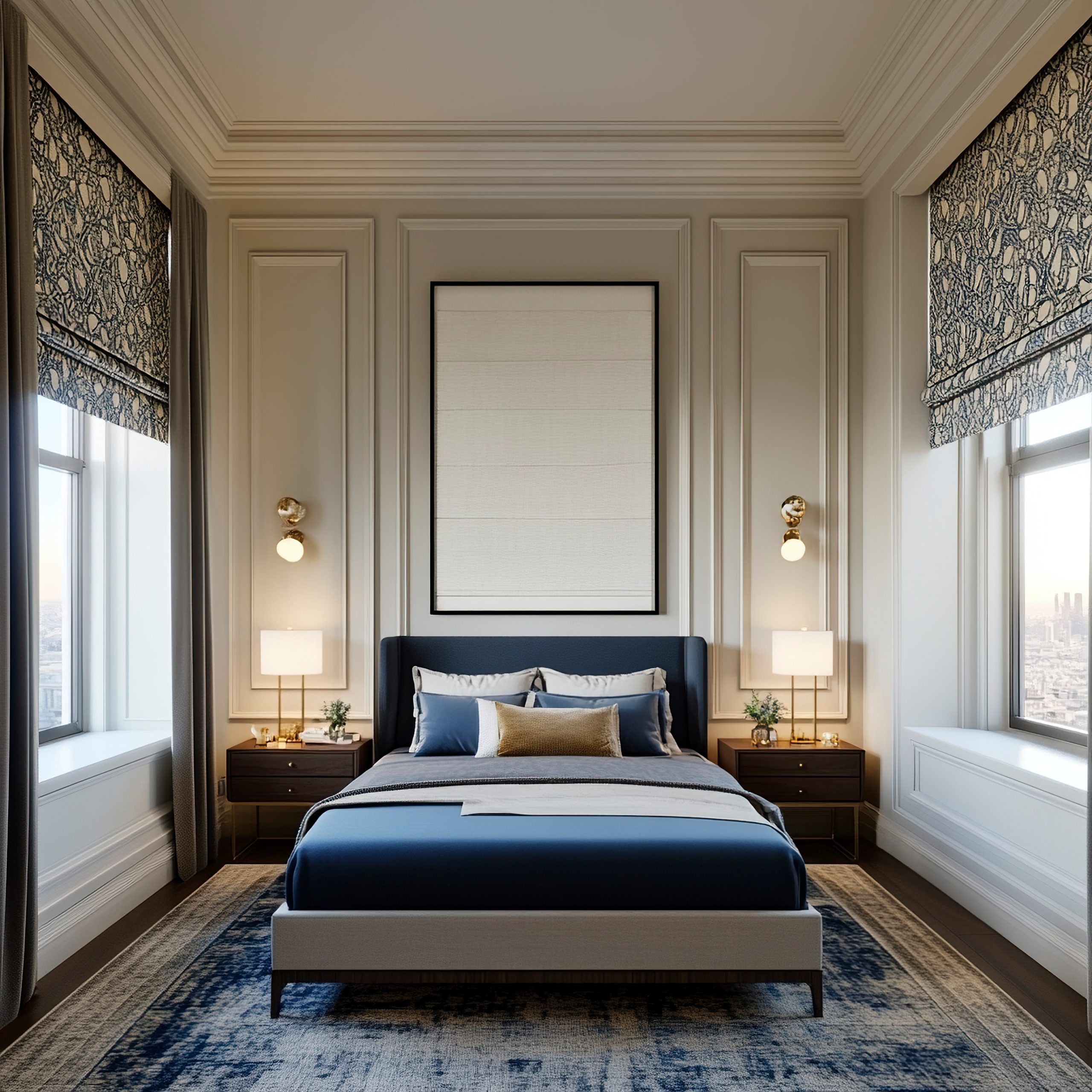
The hardware you choose is just as important as the fabric:
- Choose bold finials that echo other room elements
- Consider chrome, brass, or black metal finishes
- Look for geometric shapes in curtain rings and holdbacks
- Don’t shy away from substantial curtain rods
Floor Design
The floor is your room’s largest surface area, and in Art Deco home interior design, it deserves special attention. A well-designed floor creates a foundation that supports and enhances all your other decorative elements.
Signature flooring options include:
- Geometric pattern tiles
- Inlaid wood designs
- Bold marble patterns
- High-contrast combinations
- Luxurious carpets with Art Deco motifs
The key to successful Art Deco flooring lies in:
- Strong pattern definition
- Careful material selection
- Thoughtful layout planning
- Balance with other room elements
When working with hard surfaces, consider:
- Contrasting materials like wood and marble
- Geometric inlays that define spaces
- Borders that frame room areas
- Patterns that direct traffic flow
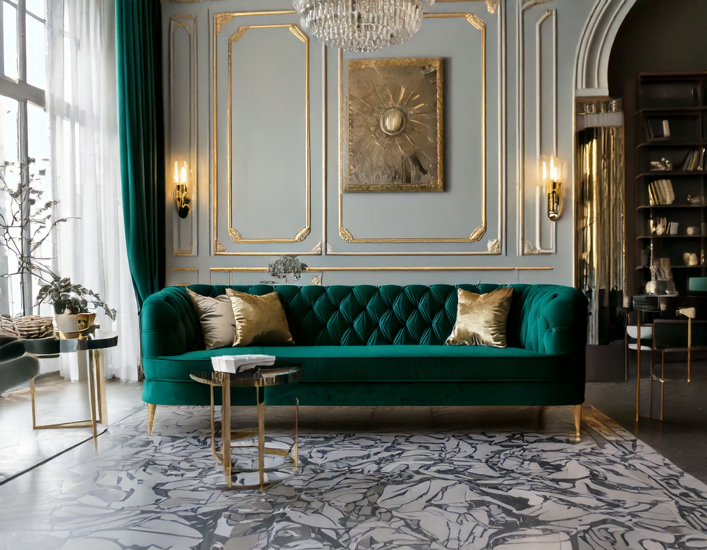
For those working with carpets and rugs:
- Choose bold geometric patterns
- Look for high-quality materials
- Consider custom designs for the perfect scale
- Use rugs to define separate areas within a space
Remember, your flooring should work in harmony with your wall treatments and furniture. While it can be bold, it shouldn’t compete with other key elements in your space. Think of it as the sophisticated canvas upon which your Art Deco story unfolds.
Pro tip: If you’re hesitant about committing to permanent patterned flooring, start with a dramatic Art Deco rug. It can provide the same impact while offering flexibility for future changes.
Bathroom Glamour
The bathroom presents a perfect opportunity to fully embrace Art Deco home interior design in all its glamorous glory. This is one space where you can really indulge in luxury and create a stunning private retreat.
Essential Art Deco bathroom elements:
- Black and white tile combinations
- Geometric tile patterns
- Beveled mirrors
- Chrome or gold fixtures
- Marble vanity tops
- Stepped architectural details
What makes an Art Deco bathroom special is attention to detail:
- Consider a statement vanity mirror with a geometric design
- Install wall sconces with frosted glass shades
- Choose fixtures with clean, angular lines
- Add metallic accents through hardware and accessories
When selecting tiles, think about:
- Classic black and white combinations
- Geometric patterns for feature walls
- Marble with strong veining
- Contrasting border details
- Small hexagonal tiles for an authentic period feel
Pro tip: Even in smaller bathrooms, you can create impact through thoughtful material choices and strategic placement of mirrors. The key is to maintain balance while incorporating those signature Art Deco elements.
Ceiling Details
In Art Deco home interior design, the ceiling is often referred to as the fifth wall, and it deserves just as much attention as any other surface. A well-designed ceiling can completely transform the feel of a room.
Key ceiling elements include:
- Stepped crown moulding
- Geometric ceiling medallions
- Painted or applied patterns
- Coffered details
- Integrated lighting designs
When planning your ceiling design, consider:
- The room’s height and proportions
- How light fixtures will integrate
- The balance with wall treatments
- The overall scale of patterns
Lighting plays a crucial role in ceiling design:
- Centre medallions that complement chandeliers
- Cove lighting to highlight architectural details
- Recessed lighting positioned to enhance patterns
- Wall sconces that create interesting shadows
Remember that ceiling treatments should enhance rather than overwhelm your space. The goal is to draw the eye upward naturally, creating a sense of height and grandeur while maintaining harmony with the rest of your design elements.
For rooms with lower ceilings:
- Use lighter colours to create height
- Keep patterns scaled appropriately
- Consider subtle metallic details
- Focus on lighting to create depth
Pro tip: If architectural ceiling details aren’t possible in your space, consider using paint or wallpaper to create pattern and interest. Even simple geometric designs can make a significant impact when executed well.
Accessorising
The art of accessorising in Art Deco home interior design is about selecting pieces that both complement and elevate your space. These finishing touches are what bring personality and completeness to your Art Deco vision.
Key decorative elements to consider:
- Sculptural table objects in metal or glass
- Geometric bookends and vases
- Sunburst or fan-shaped wall decorations
- Period-inspired clocks
- Crystal or cut glass decanters
- Abstract figurines
When selecting accessories, focus on:
- Quality over quantity
- Strong shapes and clean lines
- Materials that reflect light
- Pieces that tell a story together
- Scale and proportion
Pro tip: Group accessories in odd numbers and vary their heights. This creates more interesting compositions while maintaining that essential Art Deco balance between order and drama.
Remember, every piece should serve a purpose:
- Choose items that reflect light and add sparkle
- Include both decorative and functional pieces
- Mix materials for visual interest
- Create small vignettes throughout your space
Practical Tips Section
Now that we’ve covered the essential elements, let’s talk about how to bring it all together successfully in your Art Deco home interior design.
Key considerations for implementation:
Budget-Friendly Approaches:
- Start with one statement piece and build around it
- Use paint to create geometric patterns
- Incorporate metallic finishes through accessories
- Choose quality reproductions for larger pieces
- Focus on lighting as a transformative element
Mixing Modern and Art Deco:
- Keep the colour palette consistent
- Choose modern pieces with Art Deco-inspired lines
- Use contemporary artwork that echoes Art Deco patterns
- Balance old and new elements carefully
- Maintain clean lines throughout
Common mistakes to avoid:
- Overcrowding spaces with too many patterns
- Mixing too many different metals
- Choosing undersized lighting fixtures
- Forgetting about negative space
- Overlooking the importance of quality materials
Pro tip: When in doubt, edit. Art Deco style is about making bold statements, but each element needs room to breathe and be appreciated.
Creating a successful Art Deco home interior design isn’t just about following a checklist – it’s about understanding how all these elements work together to create something truly spectacular. Whether you’re incorporating just a few Art Deco touches or going all-in with a complete transformation, the key is to maintain balance while embracing the style’s inherent drama.
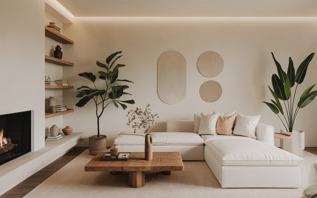
by Kesaa Interiors | DESIGN GUIDES, Living Spaces, ROOMS
Looking for tips to take your cozy living room decor in your small apartment to the next level? You have come to the right place!
Living in a small apartment doesn’t mean you have to sacrifice style or comfort. In fact, creating cozy living room decor in a small apartment can be a really fun challenge! It’s all about making smart choices and getting creative with your space.
I’m excited to share some of my favorite tips and tricks for maximizing every square inch and creating a stylish and inviting living room, perfect for those of us dealing with limited square footage. Get ready to transform your small space into a cozy haven!
The Best Cozy Living Room Decor for Small Apartment!
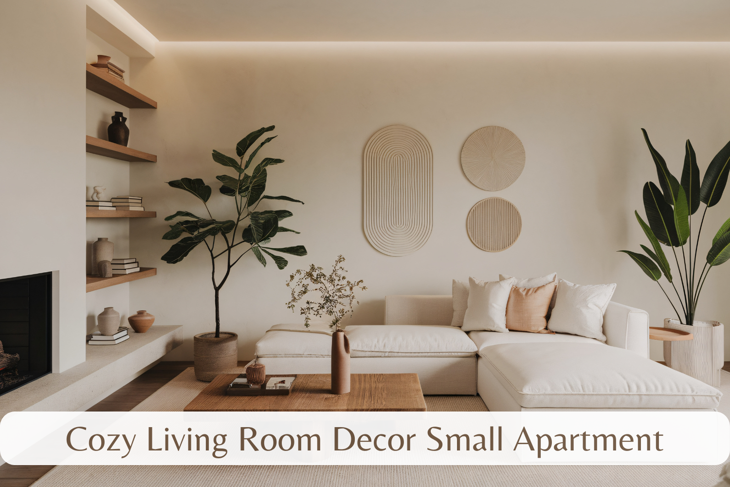
Furniture that Fits Your Footprint
When it comes to cozy living room decor for a small apartment, choosing the right furniture is absolutely crucial. It’s easy to get carried away with a beautiful sofa or a comfy armchair, but if it’s too big for your space, it’s going to make your living room feel cramped and cluttered. Here’s how to choose furniture that will make your small living room feel bigger and more inviting:
-
Scale is Key: Before you even start looking at furniture, grab a measuring tape and get to work! Seriously, measuring your living room is the first and most important step in creating cozy living room decor for a small apartment. This will help you determine the maximum size of furniture you can comfortably fit without overwhelming the space. Think apartment-sized sofas, loveseats instead of large sectionals, and slimline chairs. For example, a standard sofa might be 84 inches long, but a loveseat is typically around 60 inches, saving you valuable floor space. Choosing appropriately scaled furniture is the foundation for successful cozy living room decor in a small space.
-
Multi-Functional Marvels: In a small apartment, every piece of furniture needs to pull its weight. Look for pieces that serve double duty, like a sofa bed with built-in storage underneath for bedding. This is a game-changer for overnight guests! An ottoman with a hidden compartment for blankets and pillows is another great way to sneak in extra storage without sacrificing style. A coffee table that lifts to become a dining table is another fantastic option for maximizing functionality in a small apartment living room, especially if you don’t have a separate dining area. Think creatively about how each piece can serve multiple purposes.
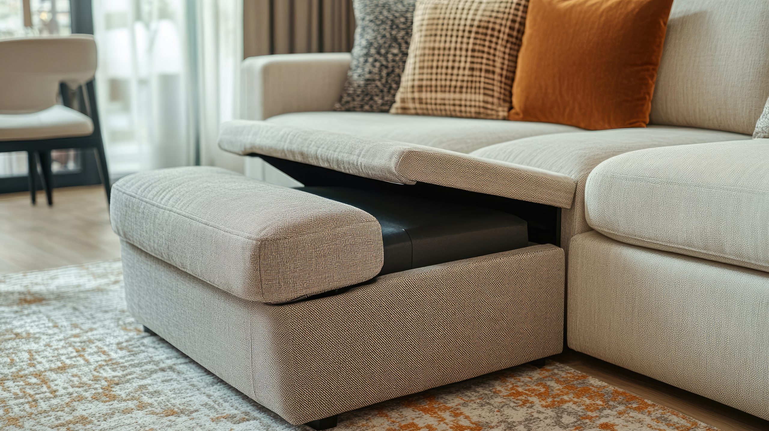
-
Measure Twice, Buy Once: I can’t stress this enough – measure your space before you buy any furniture! It’s so much easier to measure than to try and squeeze a too-large sofa through your apartment door, trust me! Creating a simple floor plan sketch can also be incredibly helpful when planning your living room decor. You can even use online tools or apps to create a virtual floor plan and experiment with different furniture arrangements.
-
Leggy Looks: Furniture with legs creates a sense of airiness and visual space, which is essential in a small living room. The light can flow underneath the furniture, making the room feel less cluttered and more open. When you’re aiming for cozy living room perfection, consider opting for sofas, armchairs, and coffee tables with raised legs. Even a small elevation can make a big difference in how spacious your living room feels. Think sleek, tapered legs for a modern look, or ornately carved legs for a more traditional feel.
- Vertical Space is Your Best Friend: Don’t forget to look up! In a small living room, vertical space is prime real estate. Tall, narrow bookshelves or wall-mounted units are a great way to add storage and display decorative items without taking up valuable floor space. Styling these shelves with a mix of books, plants, and personal items can really elevate your living room decor. Consider using wall-mounted shelves to display artwork or create a mini indoor herb garden – it’s a great way to add personality and functionality to your space.
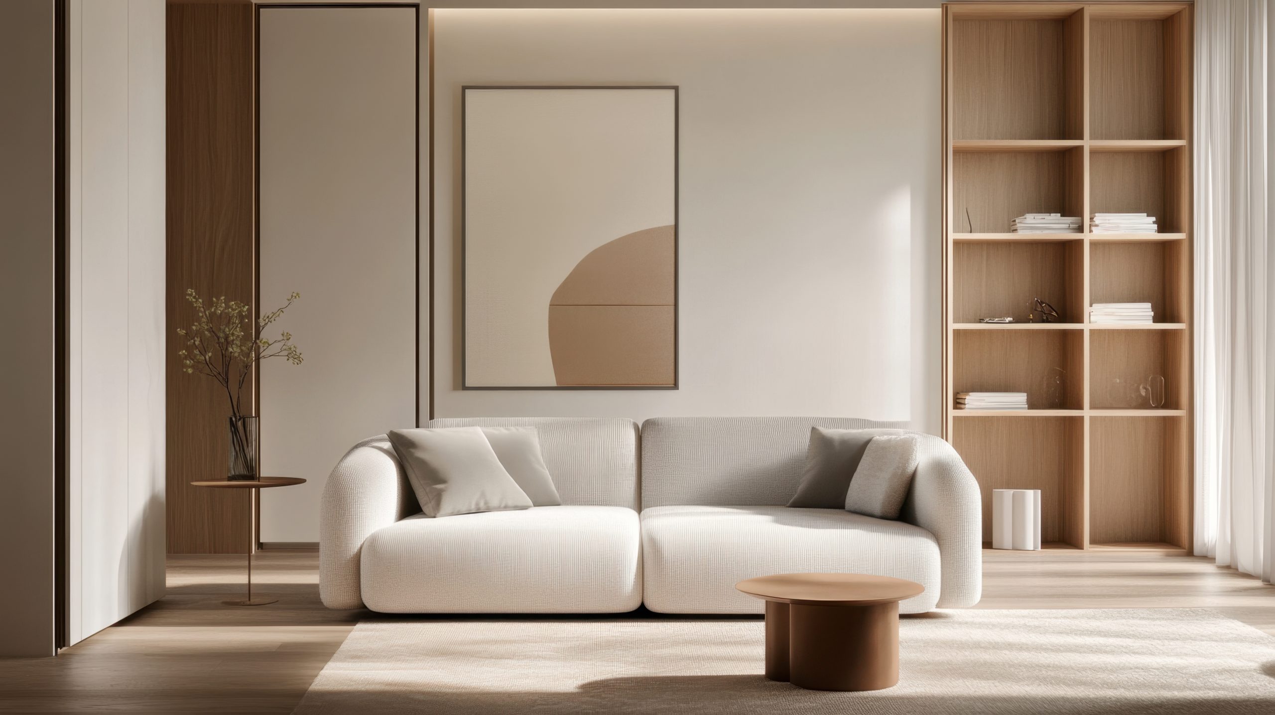
-
Clear the Clutter: Less is definitely more in a small space. Be mindful of how much furniture you bring into your living room. Avoid overcrowding the space, and focus on a few key pieces that are both functional and stylish. A minimalist approach can work wonders for creating a cozy living room in a small apartment. Regularly decluttering and getting rid of items you no longer need or use will help keep your living room feeling open and inviting. Consider incorporating stylish storage solutions, like baskets and decorative boxes, to keep clutter at bay. A clutter-free space is key to achieving a truly cozy and relaxing atmosphere.
Creating a Cozy Atmosphere with Textiles
Textiles are the secret weapon for creating a truly cozy living room, especially in a small apartment. They add warmth, texture, and personality, transforming a plain space into a welcoming haven. When considering cozy living room decor, small apartment style, think beyond just functionality – textiles offer a powerful way to enhance the ambiance and express your personal style.
-
Texture is King: In a small living room, texture is paramount. It adds depth and dimension, fooling the eye and making the space feel larger and more inviting. Think beyond smooth surfaces and incorporate a variety of tactile elements. A chunky knit throw draped over the arm of your sofa instantly adds a sense of warmth and comfort. Plush velvet cushions invite you to sink in and relax. A soft, shaggy rug underfoot creates a luxurious and inviting feel. Don’t be afraid to mix and match different textures – a nubby wool throw paired with a smooth velvet cushion creates a dynamic and interesting look. Consider the seasons too – lighter, breathable linens for summer and heavier wools and faux furs for winter can enhance the cozy factor.
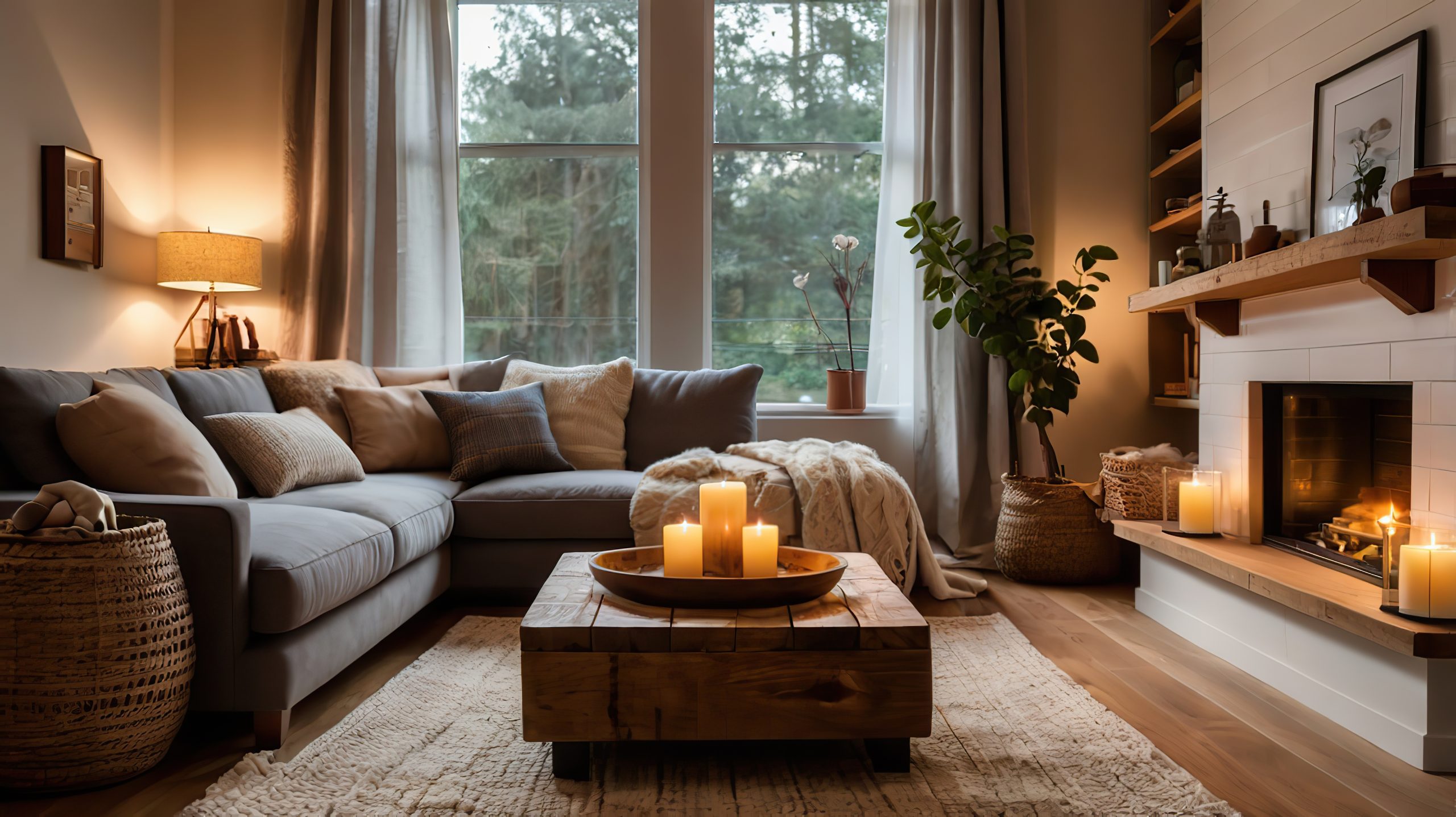
-
Natural Beauty: Natural materials like wool, cotton, and linen are not only soft and comfortable against the skin, but they also offer inherent breathability, which is crucial in a small apartment. These materials also bring a touch of organic elegance to your living room decor. A chunky hand-knit wool throw draped over the back of your sofa adds a touch of rustic charm, while a crisp linen cushion introduces a sense of understated sophistication. Look for natural fiber rugs like jute or sisal to add texture and warmth underfoot.
-
Color Psychology: Color has a profound impact on mood and atmosphere. For a cozy living room decor in a small apartment, lean towards warm, inviting colors that create a sense of intimacy and comfort. Soft neutrals like cream, beige, and gray provide a calming backdrop, while earthy tones like terracotta, olive green, and warm brown evoke a sense of groundedness and tranquility. Rich jewel tones like emerald green, sapphire blue, or ruby red can add a touch of opulence and warmth without overwhelming the space. Consider using a color palette of two or three complementary colors to create a cohesive and harmonious look.
-
Layering for Depth: Layering textiles is a designer’s trick for adding visual interest and depth to a small living room. Start with a base layer, like a rug, and then build upon it with throws, cushions, and even curtains. Don’t be afraid to mix and match different patterns and textures – a geometric patterned rug paired with a solid-colored throw and a textured cushion creates a dynamic and inviting look. Layering also allows you to easily change the look and feel of your living room by swapping out different textiles with the seasons or your changing tastes.
-
Rugs Define the Space: In a small apartment, a rug is essential for visually defining the living area and adding warmth underfoot. Choose a rug that is large enough to anchor the main furniture pieces, such as the sofa and armchairs, but not so large that it overwhelms the room. Ideally, the front legs of your furniture should rest on the rug, creating a sense of connection and cohesion. A rug can also introduce a pop of color or pattern to your cozy small living room decor, tying the space together and adding personality.
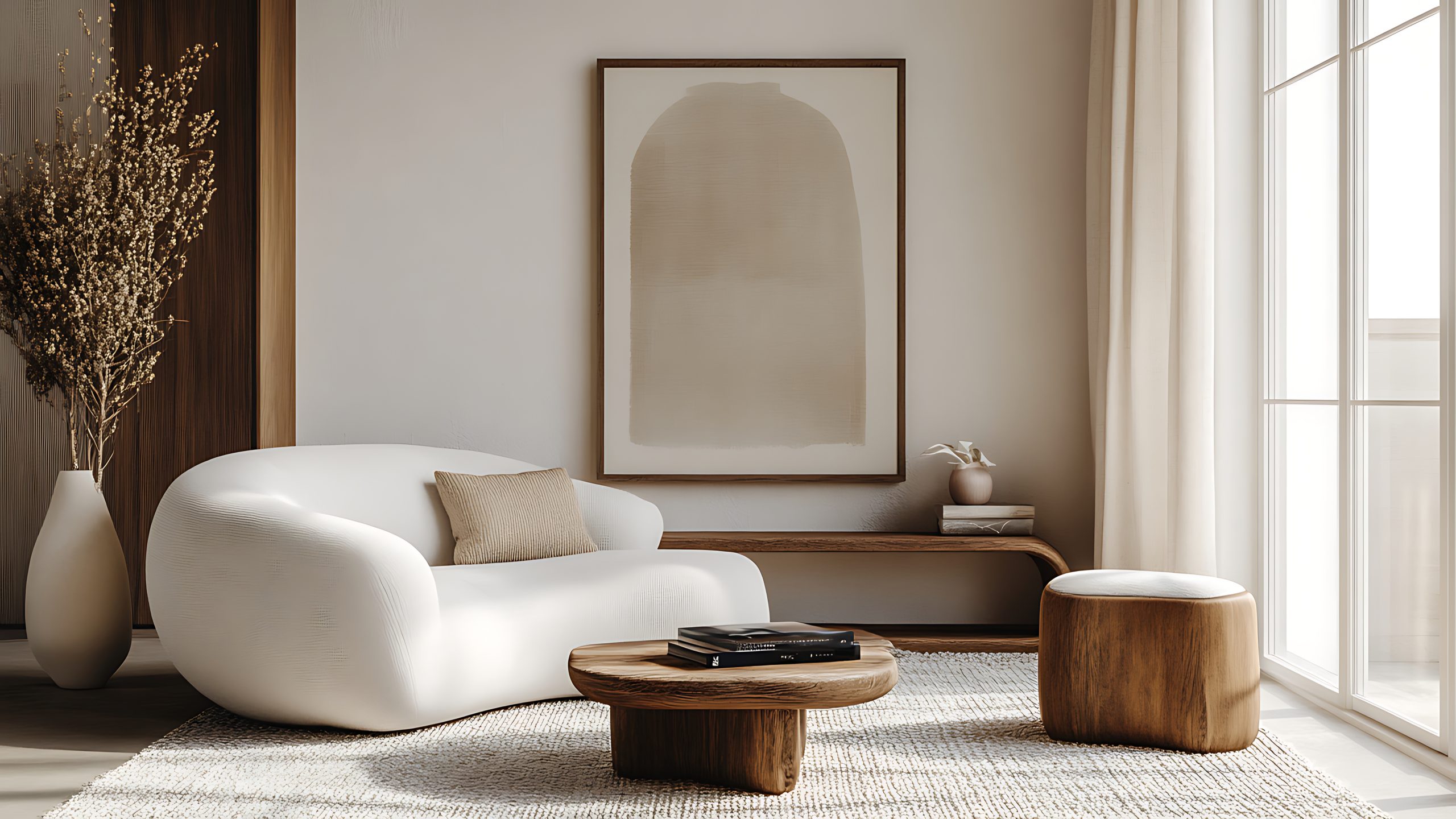
Lighting Up Your Small Space
Lighting is a critical element in any cozy living room decor for a small apartment. It sets the mood, enhances functionality, and can even make the space feel larger. Here’s how to light up your small living room for maximum coziness:
-
Natural Light is Your Friend: Natural light is a precious commodity in a small apartment. Maximize it by keeping window treatments light and airy. Sheer curtains or blinds allow natural light to filter through while still providing privacy. Avoid heavy drapes or blinds that block light and make the space feel smaller. Consider using mirrors strategically to reflect natural light deeper into the room.
-
Layered Lighting Magic: Creating a warm and inviting atmosphere relies on layered lighting. Combine ambient lighting (general overhead lighting), task lighting (for reading or working), and accent lighting (to highlight specific features) for a well-lit and functional space. A floor lamp next to your reading chair provides focused light for reading, while a table lamp on a side table creates a soft, ambient glow. Pendant lights over the coffee table add a touch of style and provide focused light for conversations or games. Dimmer switches allow you to adjust the brightness of your lighting to suit different moods and activities.
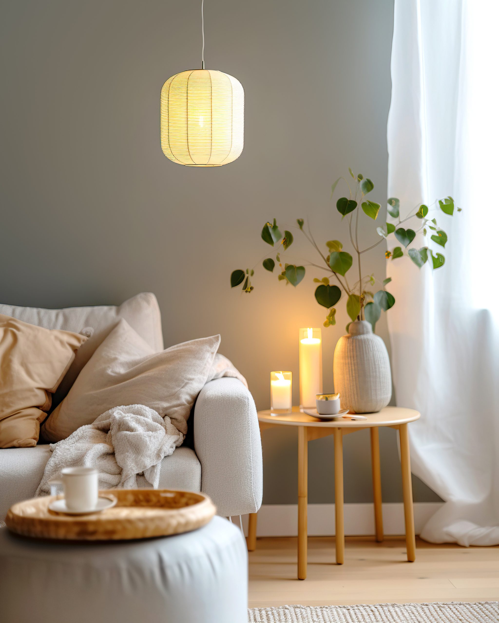
-
Light and Bright Color Schemes: Light and bright wall colors can significantly impact how spacious your small living room feels. Opt for shades of white, cream, or light gray to create a neutral backdrop that reflects light and makes the space feel open and airy. You can then add pops of color with your textiles and accessories. A light and airy color scheme is essential for successful cozy living room decor in a small apartment.
-
Statement Lighting Fixtures: A statement light fixture can be the jewelry of your living room, adding personality and style without taking up valuable floor space. Choose a fixture that complements your overall decor and provides adequate lighting for the space. A unique pendant light over the coffee table or a stylish chandelier can become a focal point and elevate the entire room. Consider the scale of the fixture – a large, oversized fixture can overwhelm a small space, while a smaller, more delicate fixture can add a touch of elegance without feeling overpowering.
- Mirror, Mirror on the Wall: Mirrors are a small space decorator’s best friend. They reflect light, creating the illusion of more space and making your living room feel larger and brighter. A large statement mirror above the sofa can visually double the size of the room, while a gallery wall of smaller mirrors adds a touch of eclectic style and reflects light from multiple angles. Consider placing a mirror opposite a window to maximize natural light reflection.
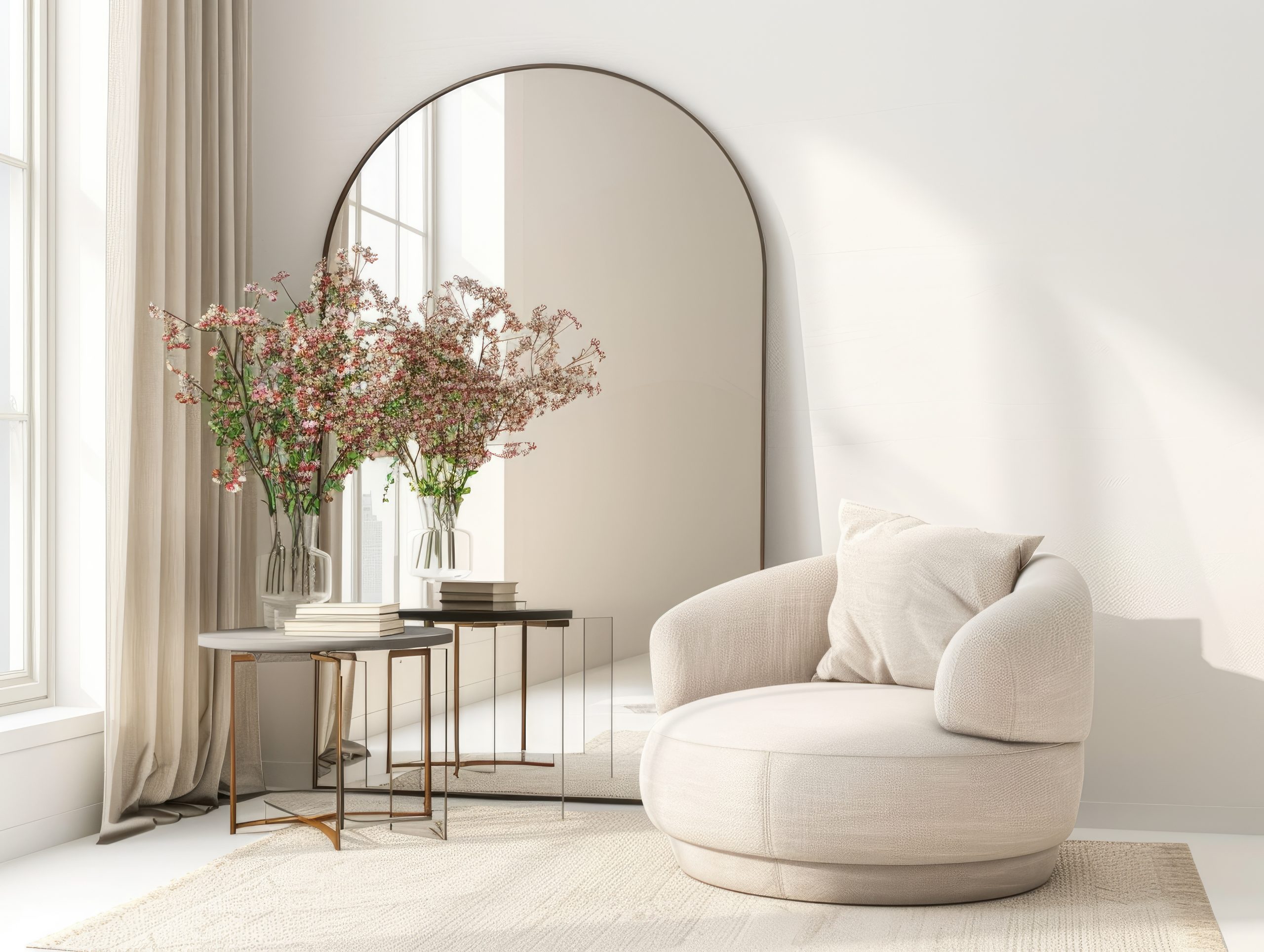
Decorative Touches for a Stylish Space
Decorative touches are what truly personalize your space and make it feel like home. In a small apartment, it’s important to be selective and intentional with your decor choices to avoid cluttering the space. Here’s how to add style and personality to your cozy living room decor:
-
Curated Collections: Resist the urge to fill every surface with decorative objects. Instead, choose a few carefully curated pieces that you truly love and that reflect your personal style. This could include a collection of vintage books, a grouping of framed family photos, a few treasured travel souvenirs, or a small display of handcrafted pottery. Grouping similar items together creates a more impactful visual statement than scattering individual items around the room. Consider using trays or decorative bowls to display smaller items and keep surfaces looking organized.
-
Focal Point Focus: Every living room needs a focal point – a visual anchor that draws the eye and gives the space a sense of purpose. In a small living room, the focal point can be a fireplace, a piece of statement art, a gallery wall, a large window with a beautiful view, or even a striking piece of furniture. Once you’ve identified your focal point, arrange your furniture and decor to highlight it. For example, if your focal point is a fireplace, arrange your seating area to face it.
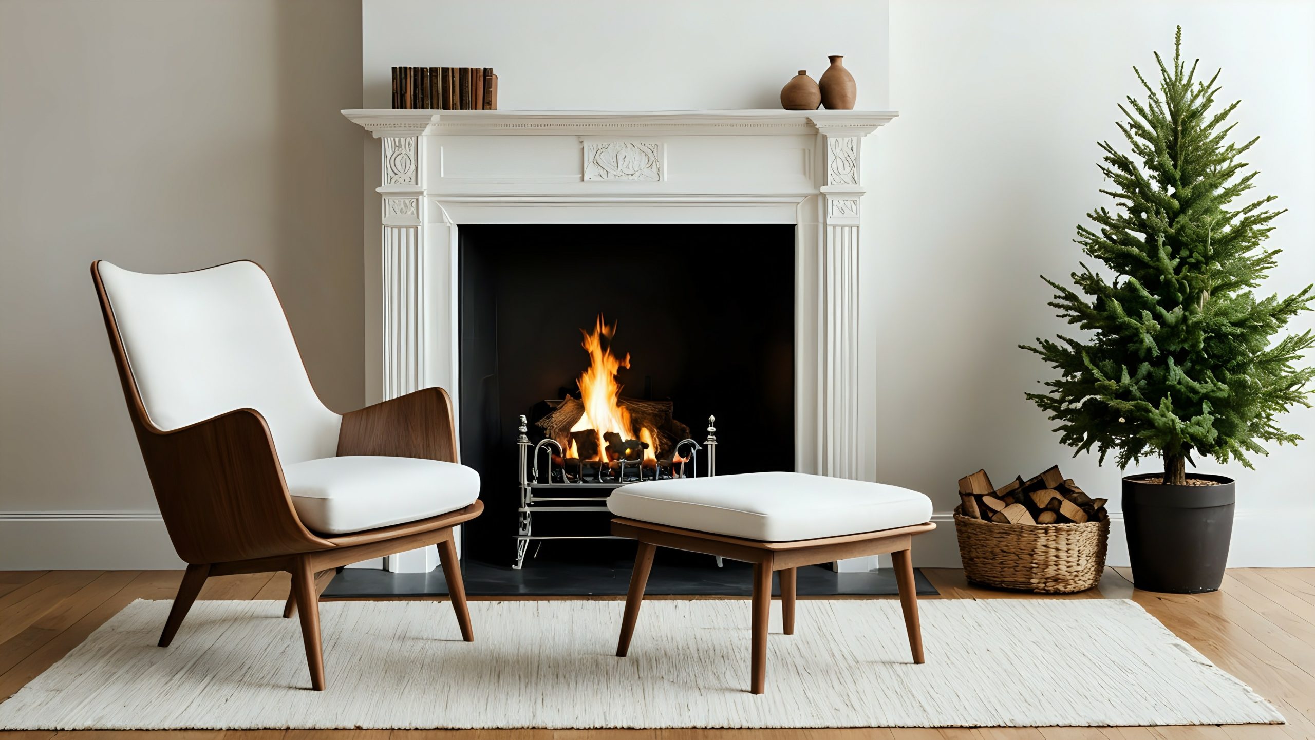
-
Decluttering is Key: Clutter is the enemy of coziness, especially in a small apartment. Regularly declutter your living room, getting rid of anything you no longer need, use, or love. A clutter-free space feels more open, airy, and inviting. Invest in stylish storage solutions, such as baskets, decorative boxes, and ottomans with hidden storage, to keep clutter contained and out of sight. Make decluttering a regular habit to maintain a sense of calm and order in your living room.
-
Greenery Brings Life: Plants add a touch of life and vibrancy to any space, and they’re especially beneficial in a small living room. They can help to purify the air, improve indoor air quality, and create a more calming and inviting atmosphere. Choose low-maintenance plants that thrive in indoor environments, such as snake plants, pothos, or spider plants. Place plants strategically around the room to add pops of color and texture. A tall, leafy plant in a corner can visually expand the space, while a small succulent on a coffee table adds a touch of natural beauty.
-
Personal Touches: The most important decorative touches are the ones that reflect your personality and make your space feel like home. Don’t be afraid to display items that have special meaning to you, whether it’s a collection of vintage postcards, a framed concert ticket, or a handmade quilt from your grandmother. These personal touches are what truly make your space unique and special.
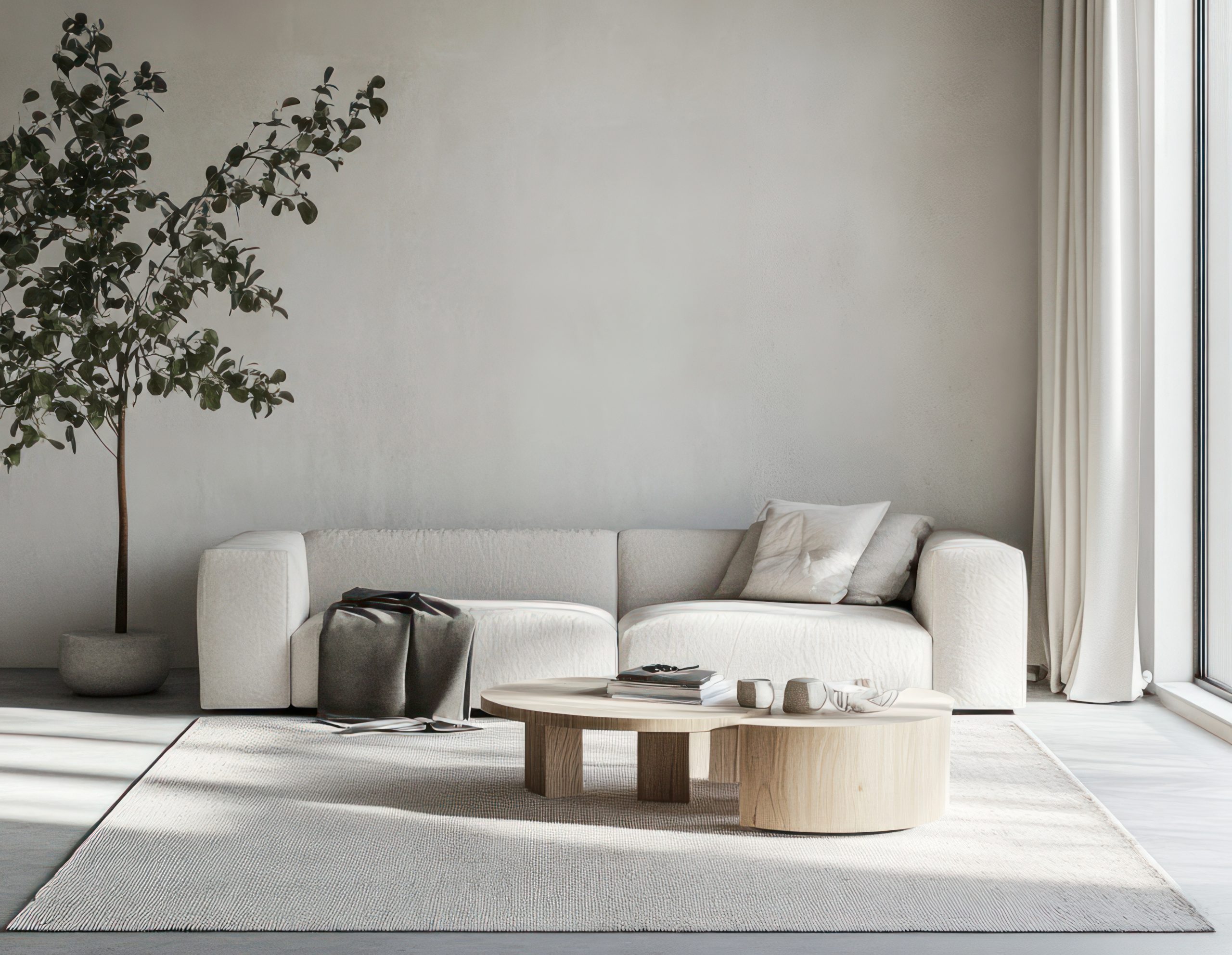
Making the Most of Vertical Space
In a small apartment, maximizing vertical space is essential for creating a functional and stylish living room. Think upwards and utilize every inch of wall space to your advantage. Here’s how to make the most of your vertical real estate:
-
Think Vertical: Train your eye to look up! Before adding furniture or decor, consider how you can utilize the vertical space in your living room. This might involve installing shelves, hanging artwork, or using tall furniture to draw the eye upwards and create the illusion of height.
-
Floating Shelves: Floating shelves are a versatile and stylish way to add storage and display decorative items without taking up valuable floor space. Install them above the sofa, next to the TV, or in any other awkward corner. Use floating shelves to display books, plants, framed photos, or small decorative objects. Arrange items in a visually appealing way, leaving some negative space to avoid a cluttered look.
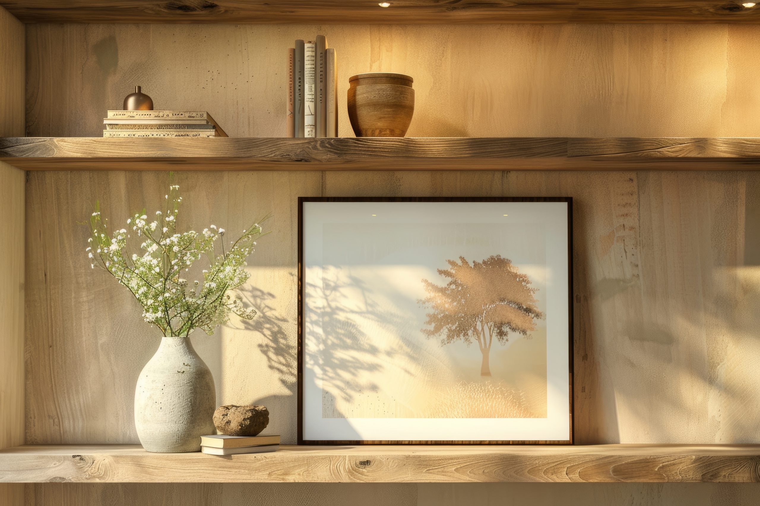
-
Bookcase Bliss: Tall, narrow bookcases are a classic way to maximize storage and display books, decorative objects, and even small plants. They can also add a touch of elegance and sophistication to your living room. Choose a bookcase that complements your existing furniture and decor. Arrange books and objects in a visually appealing way, mixing horizontal and vertical stacks to create visual interest.
-
Wall-Mounted Magic: Explore other wall-mounted options beyond shelves and bookcases. Hanging planters can add a touch of greenery without taking up floor space. Wall-mounted sconces provide ambient lighting and free up valuable surface area on tables and shelves. Hanging artwork or a large mirror can create a focal point and add personality to your space. Consider mounting your TV on the wall to also free up space on a media console.
-
Vertical Stripes: Incorporating vertical stripes, whether in wallpaper, rugs, or curtains, can visually elongate the room and make your ceilings appear higher. This is a subtle but effective trick for maximizing visual space in a small living room. Choose a stripe pattern that complements your existing decor and doesn’t overwhelm the space. Vertical stripes can add a touch of classic elegance or a more modern, graphic feel, depending on the color and width of the stripes.
By following these tips and focusing on maximizing space, incorporating cozy textiles, layering lighting, adding personal touches, and utilizing vertical space, you can transform your small apartment living room into a stylish and inviting sanctuary. Remember, cozy living room decor for a small apartment is all about creating a space that feels comfortable, personal, and perfectly suited to your needs and aesthetic.
